

LAW OF SIMPLICITY
-
-
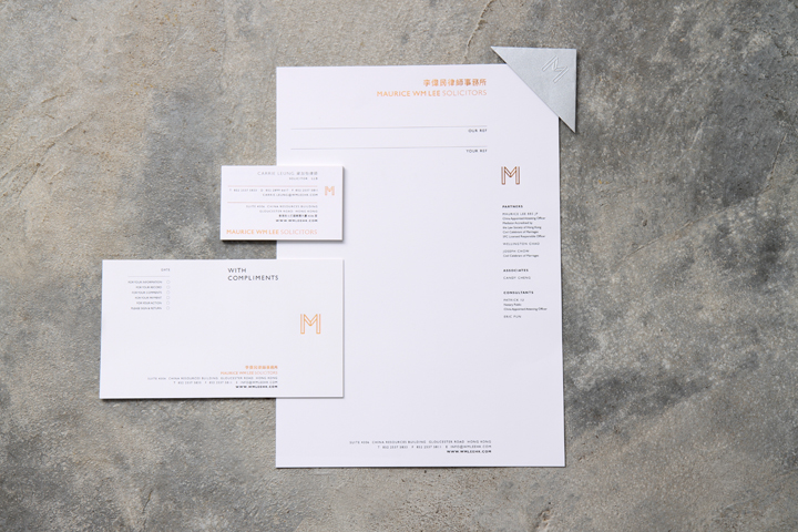
With an extensive use of clean lines and sharp edges, the M-shaped logo, tailored for Hong Kong law firm Maurice WM Lee Solicitors, has been designed to exude an authoritative vibe. The letter's silhouette is strategically modified to resemble a grand gate, subtly implying that the firm's door is always open clients who come to the right place for legal services.
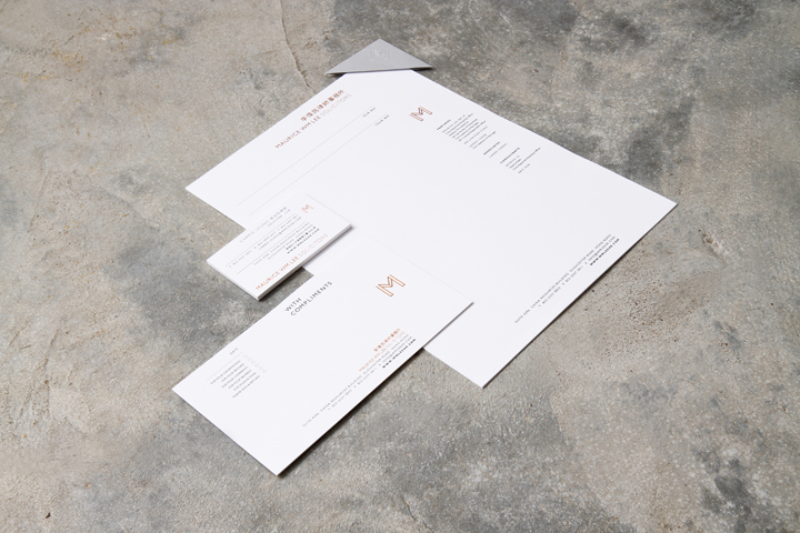
This initial-based logo is printed on every item in the full brand identity set accented with copper foil detailing, carrying the same minimalist and classy tone over.
The Chinese logotype, meanwhile, is also custom-made to further contemporize the law firm’s new image. Subtle adjustments of the strokes rid the law firm of the industry’s typically conservative image, and revitalize the brand with a modern facelift.
-
-

