
Retina began as a commission for the stock listings of the Wall Street Journal. To contend with blurry printing at tiny sizes, I turned to past experiments. How much information do we need to interpret letters at their tiniest? I enlarged the unique features of each letter, so each one could be small yet unmistakably itself. By embracing and amplifying these differences, Retina cooperates with the reader’s eye rather than challenging it. Notches and tapers anticipate the “squeeze” of ink that can obscure overall shapes and hinder the reader. Designed 2000–2016


Retina comes in two optical sizes: MicroPlus (above) for the smallest sizes and most difficult environments, and Standard (below) for larger sizes

In the MicroPlus size, all weights were drawn occupy the same width, so changes in weight will not cause text reflow.

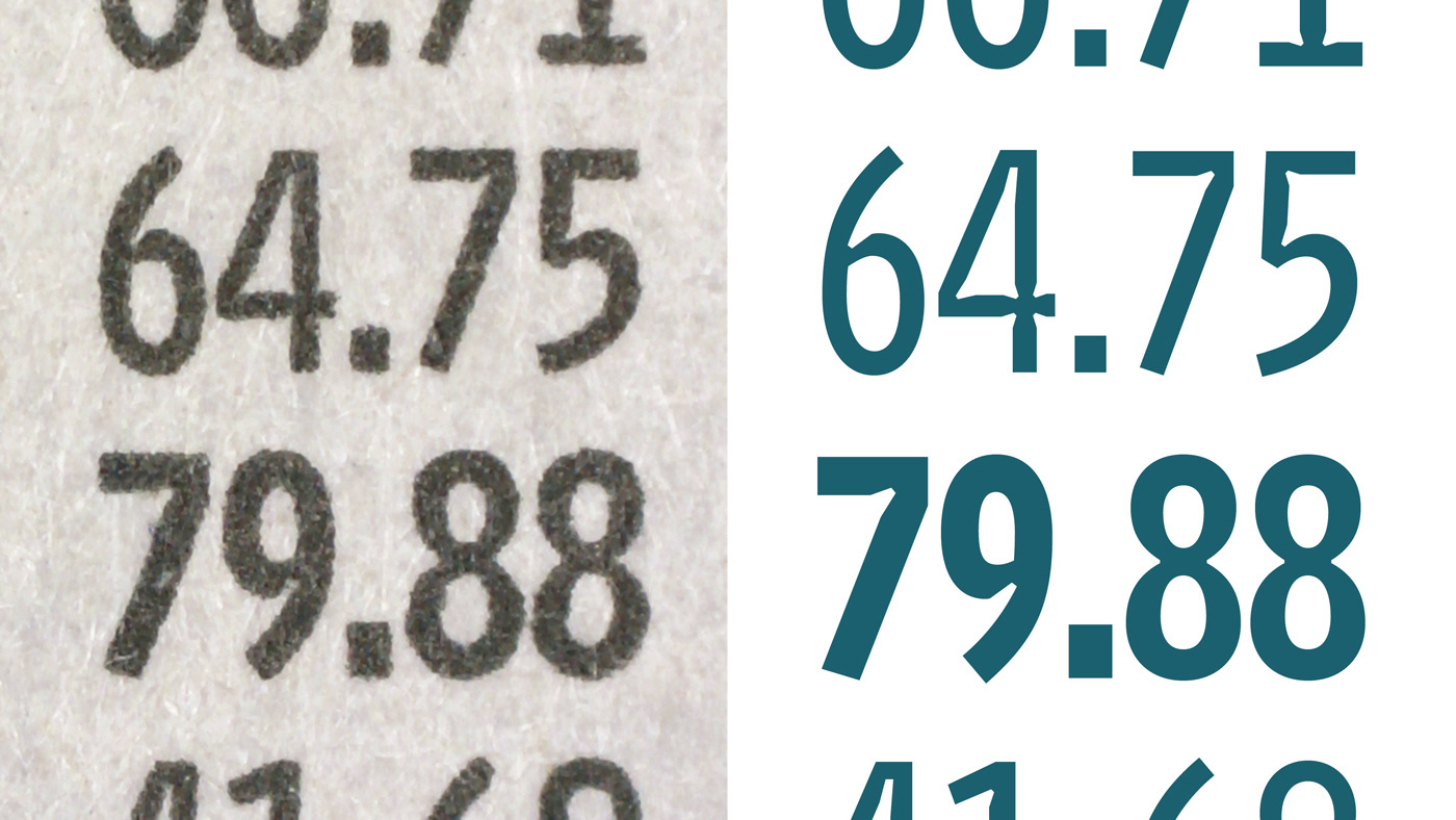
Enlargements from press tests

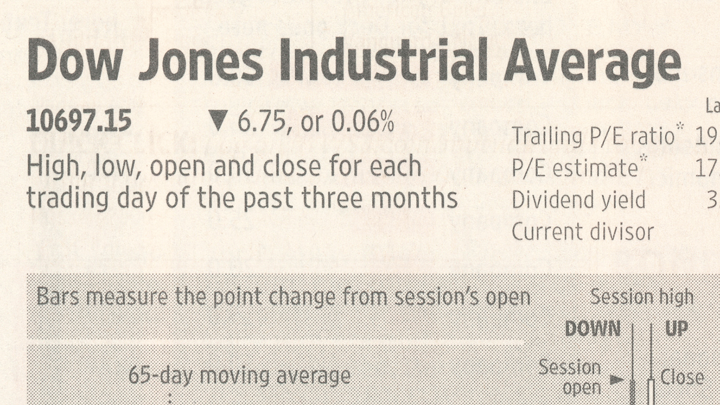
Retina in use: pages from The Wall Street Journal
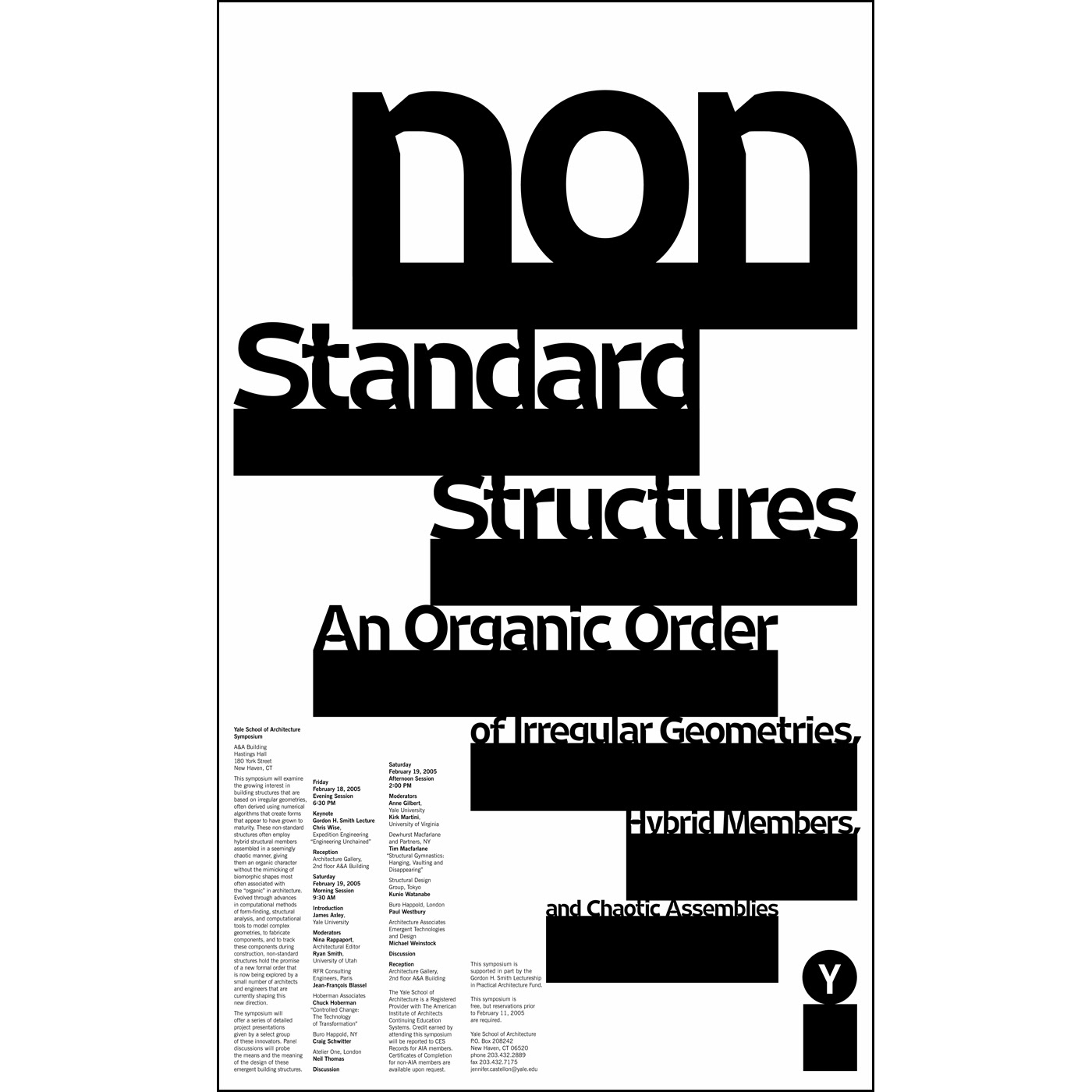
Retina in use: poster for Non-Standard Structures symposium, by Michael Bierut / Pentagram
