METATISSUE
DIVIDE, MULTIPLY AND CONQUER
WHAT WE DID:
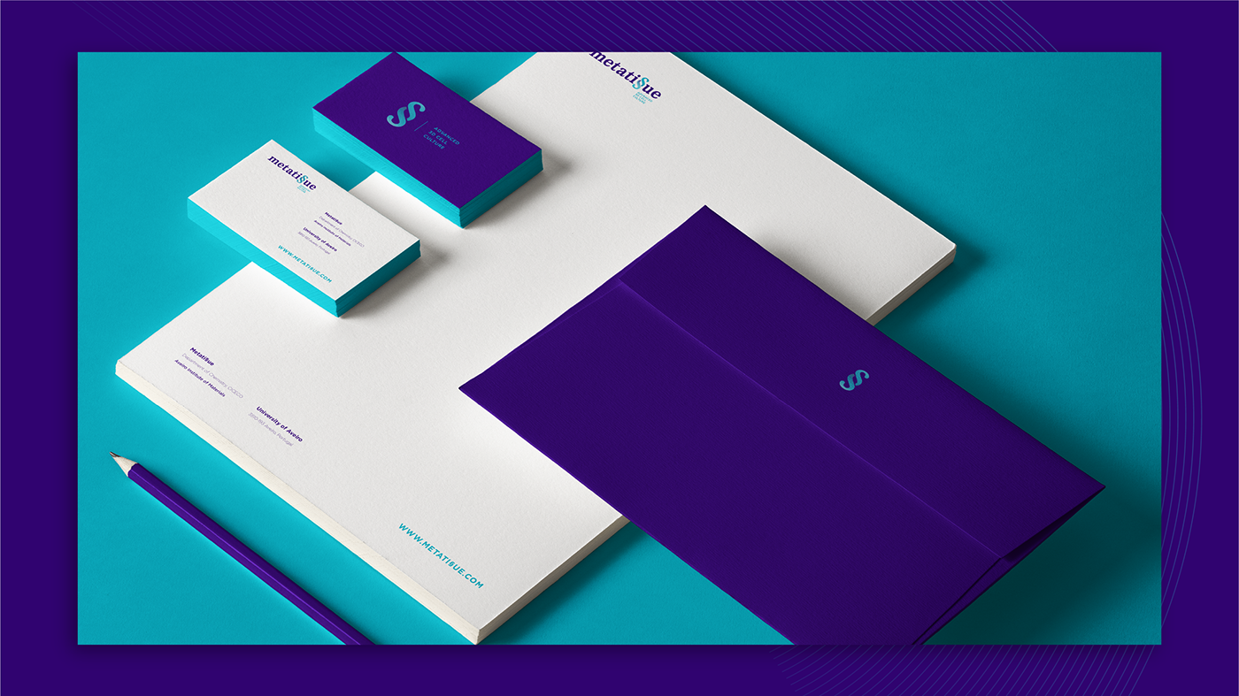
Branding | Basic Brand Guidelines
CHALLENGE:
METATI§UE is a project born in the COMPASS labs, a bio medical research division from CICECO - Aveiro Institute of Materials. The project consists in the creation of 3D Cell cultures and organic microtissues to be used in research and regenerative medicine. This technology isn't particularly new, yet METATI§UE meets completely new and higher standards regarding other similar products/brands on the market.
The team from COMPASS then gave us the challenge to NAME and to BRAND this project; and the previlege to work with them from the very beggining.
RESULT:
The team from COMPASS then gave us the challenge to NAME and to BRAND this project; and the previlege to work with them from the very beggining.
RESULT:
The essence of this bio technology is very metafisical, metaphoricaly speaking.
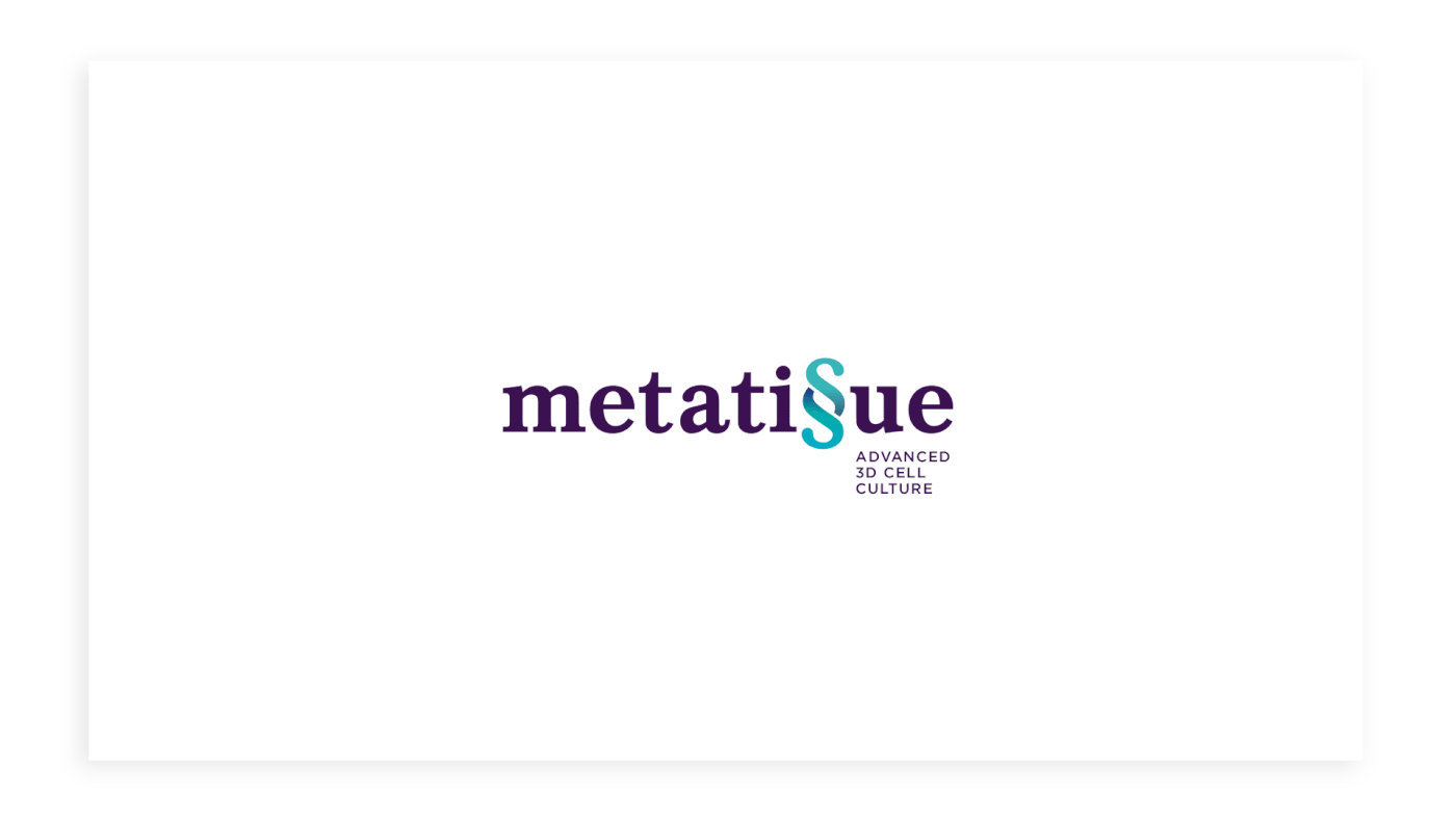
Though it has a very concrete and palpable origin, wich is science, the power to create something that is organic, living material, and the knowledge to harness that power is something oftenly associated to god(s) and their likes, therefore the metafisical field fits like a glove in this concept, giving birth to the name METATISSUE (metati§ue).
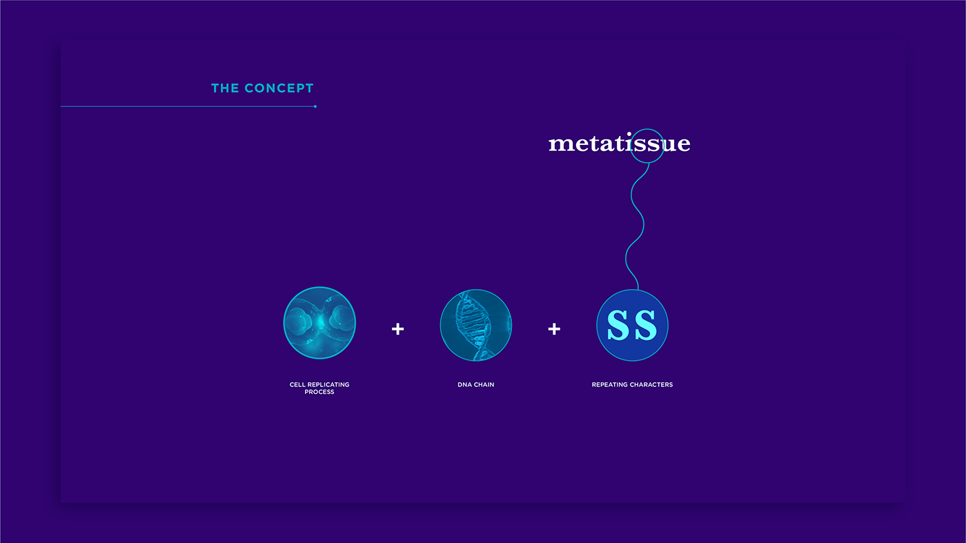
Having the mitosis and meiosis (division of cells) concepts in mind, we soon detected a simple repeating pattern in the name we created: the "S" symbol repeats itself in the word "tissue"...
So we aimed to demonstrate trought that simple visual nuance the essence of the brand, wich is the duplication of the cells, merging the two "S" symbols into one that seems to be dividing: the paragraf symbol "§" fitted perfectly.
Also only one symbol "§" in the word has the phonetical value of two "SS". The similarity of the symbol with the DNA chain also strenghtens the origin of this brand.
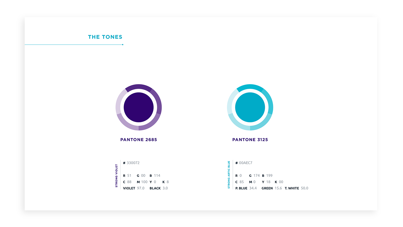
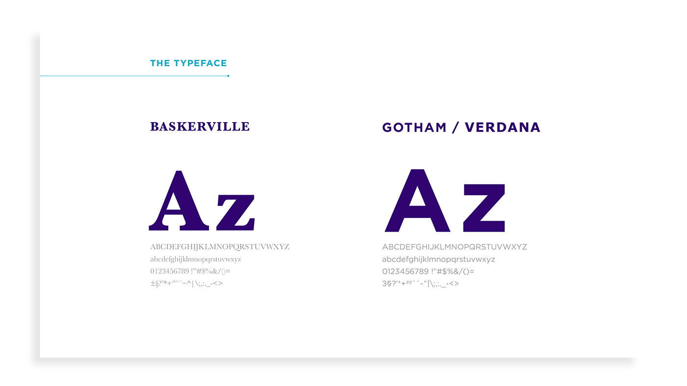
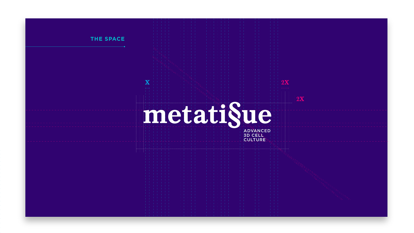
We chose a simple and sober serif font, Baskerville, to embody the logo and two strong and contrastant colors. Clinical with a somewhat futuristic touch to this brand.
Though it has a very concrete and palpable origin, wich is science, the power to create something that is organic, living material, and the knowledge to harness that power is something oftenly associated to god(s) and their likes, therefore the metafisical field fits like a glove in this concept, giving birth to the name METATISSUE (metati§ue).
Having the mitosis and meiosis (division of cells) concepts in mind, we soon detected a simple repeating pattern in the name we created: the "S" symbol repeats itself in the word "tissue"...
So we aimed to demonstrate trought that simple visual nuance the essence of the brand, wich is the duplication of the cells, merging the two "S" symbols into one that seems to be dividing: the paragraf symbol "§" fitted perfectly.
Also only one symbol "§" in the word has the phonetical value of two "SS". The similarity of the symbol with the DNA chain also strenghtens the origin of this brand.
We chose a simple and sober serif font, Baskerville, to embody the logo and two strong and contrastant colors. Clinical with a somewhat futuristic touch to this brand.