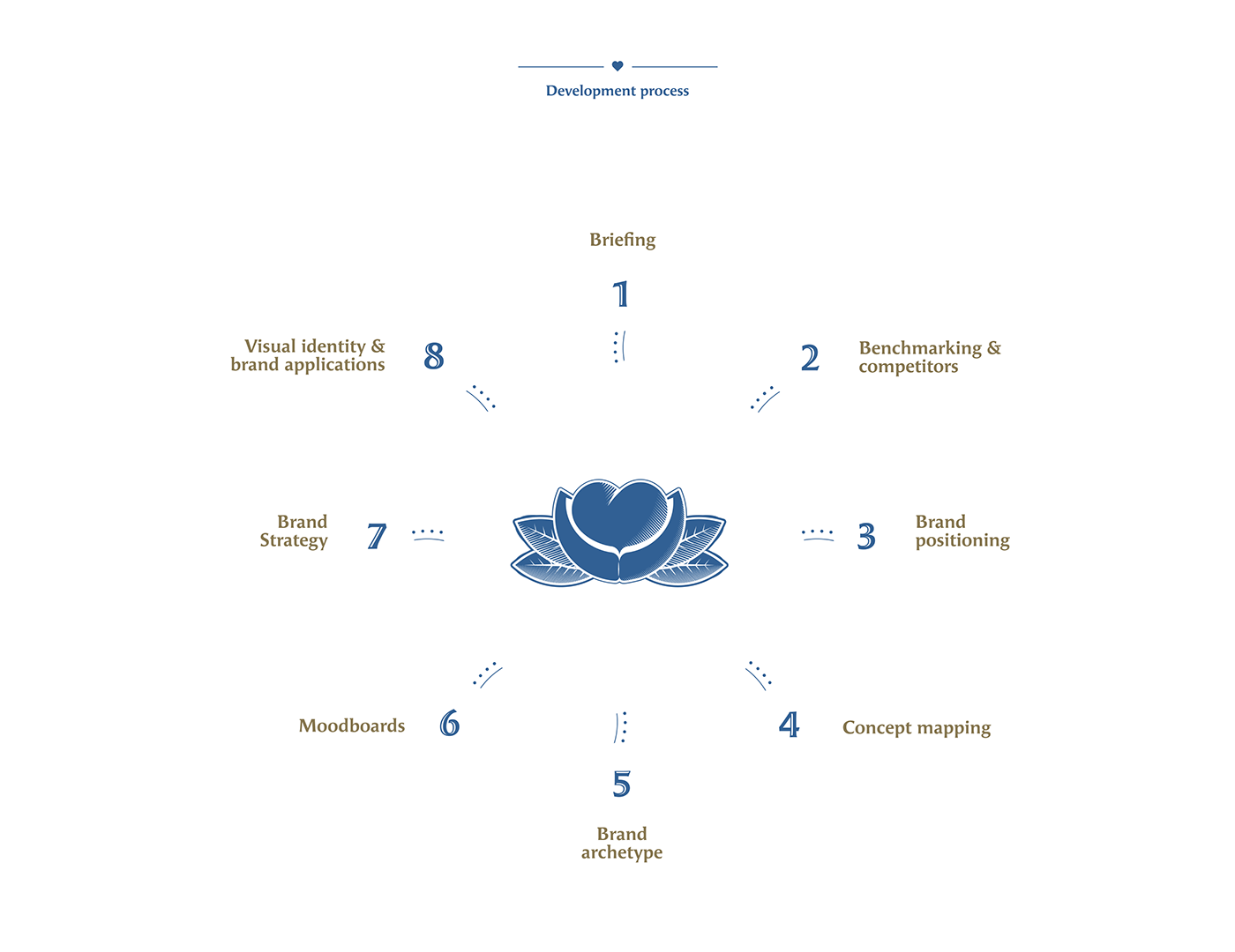
Brand strategy Art direction
Brand identity Brand identity guidelines
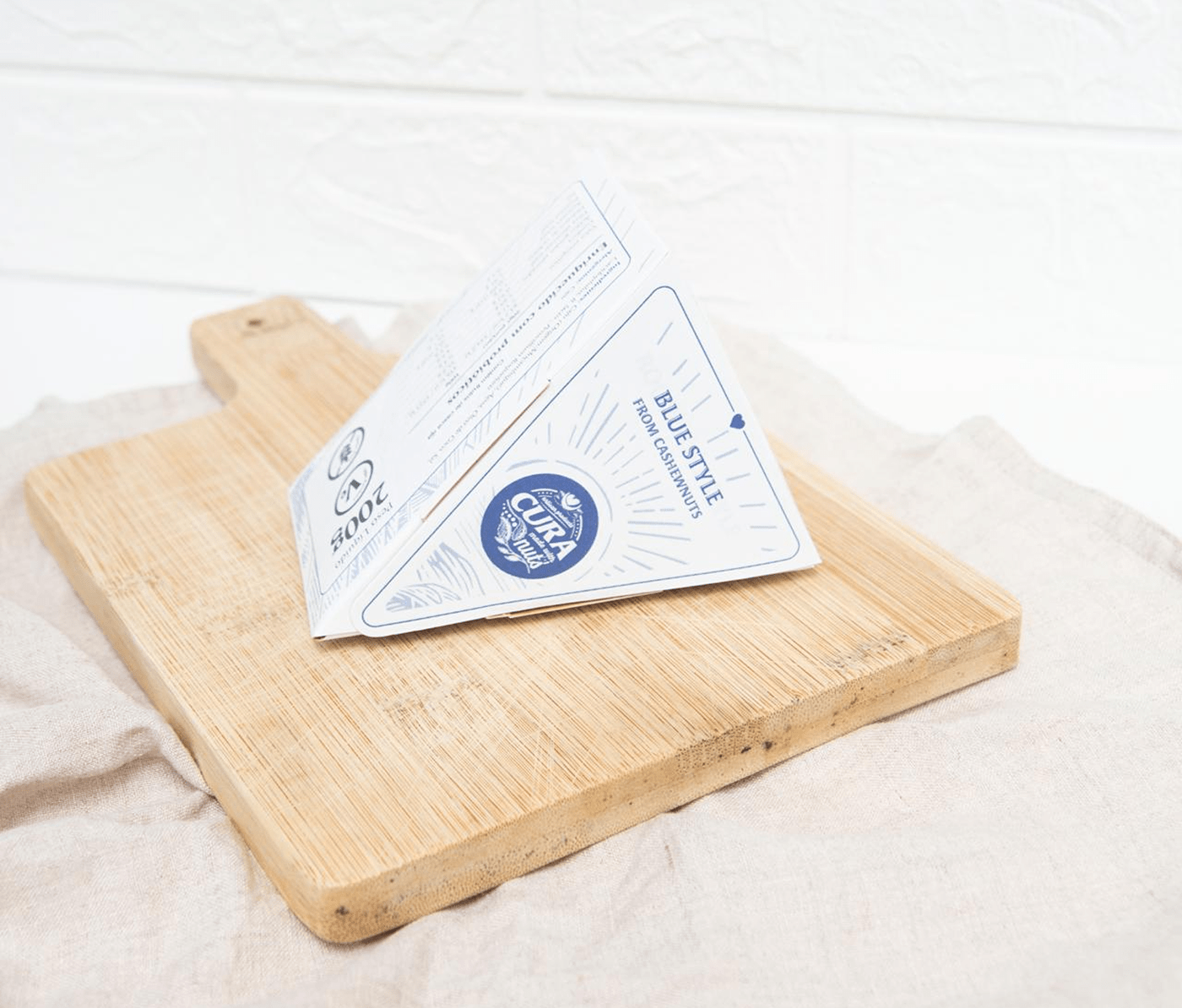
Packaging & label design Illustration
Print
Brand identity Brand identity guidelines
Packaging & label design Illustration
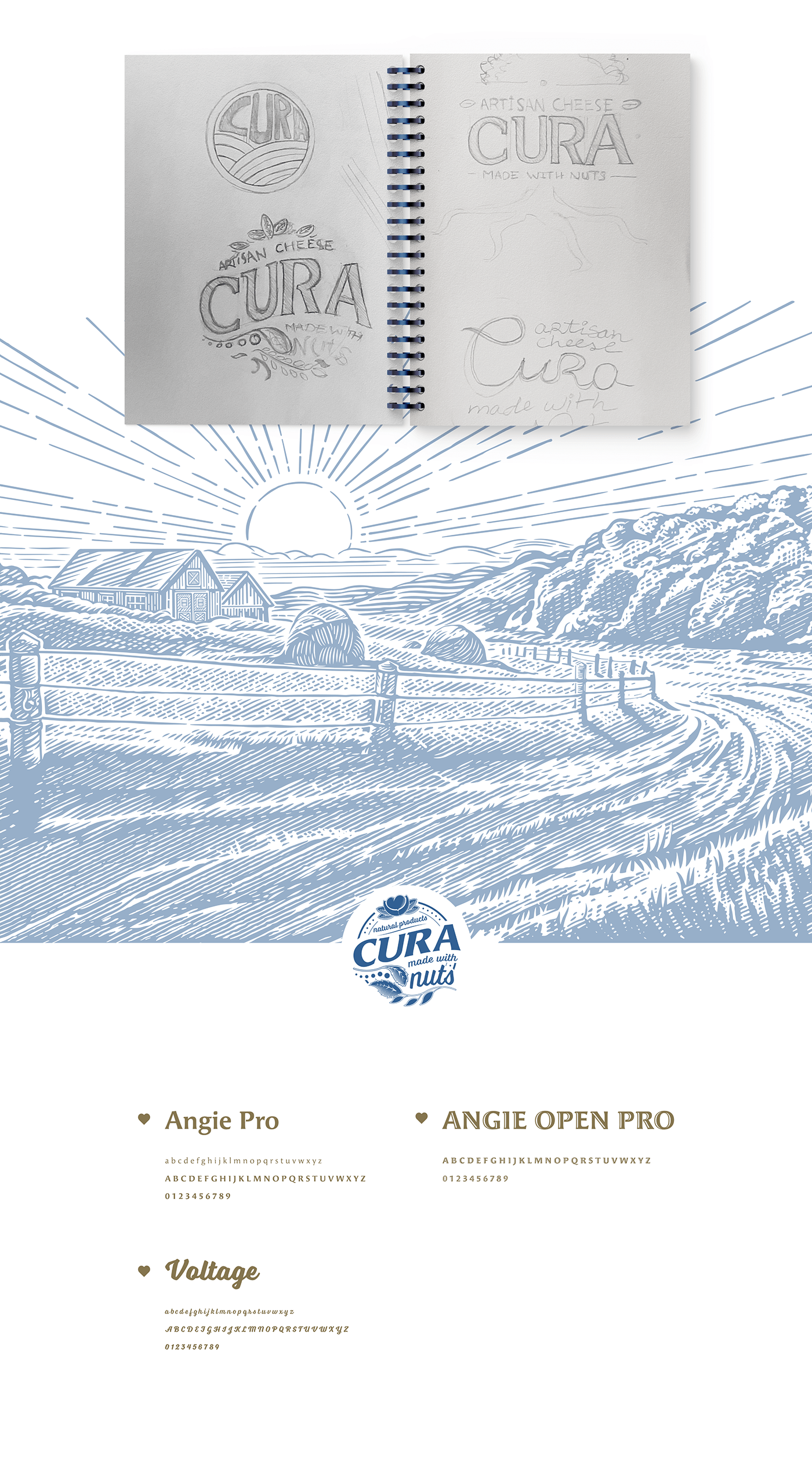
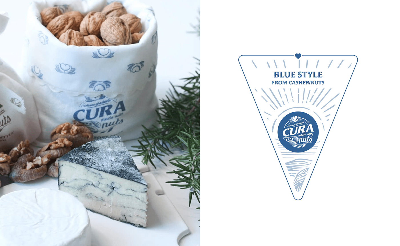
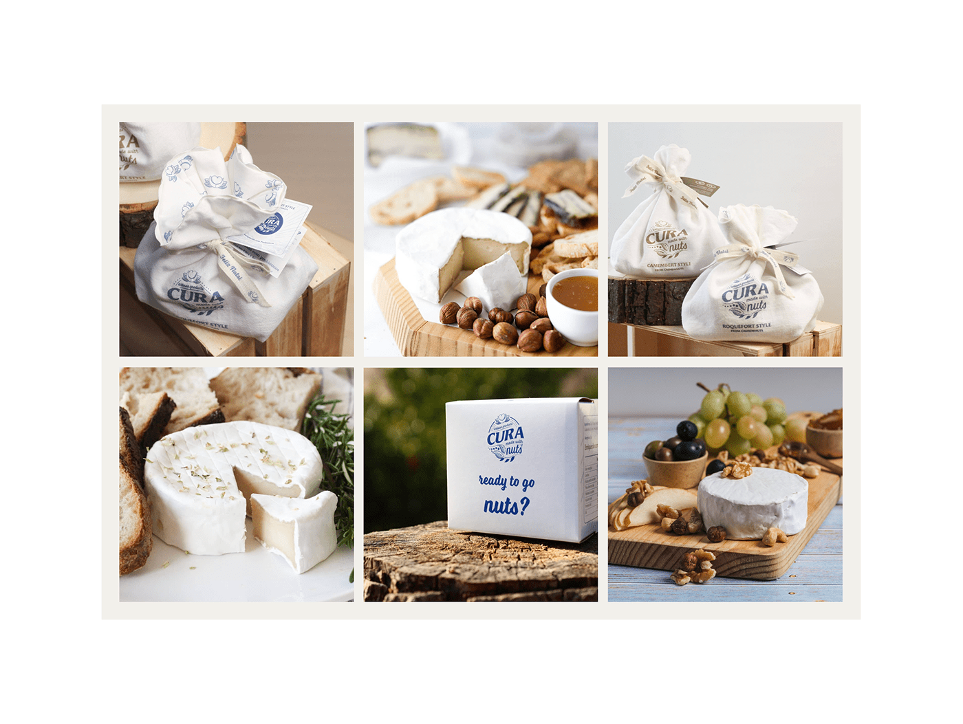
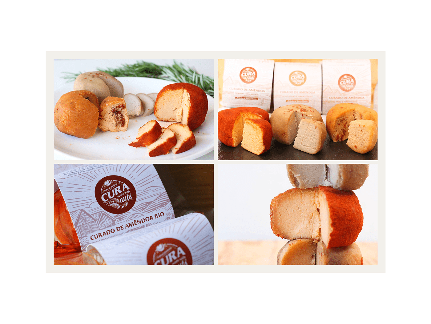
CURA is a traditional brand with a very modern touch. It produces natural and traditional cheeses, made from various kinds of fruit nuts (!) Every cheese is handmade using the traditional techniques of cheesemaking, because that’s what natural and traditional means. A lovely project that offers a tasty, healthy and conscious alternative to a worldwide appreciated culinary product.
The caring and ingenuity that the cheese maker, Daniela, had when she had this great idea, was our inspiration. Born from her preoccupation concerning the conditions involved in milk and dairy products production, mostly because of the animals and the impact of the industry on our planet. She also loves cheese and the cheesemaking process.
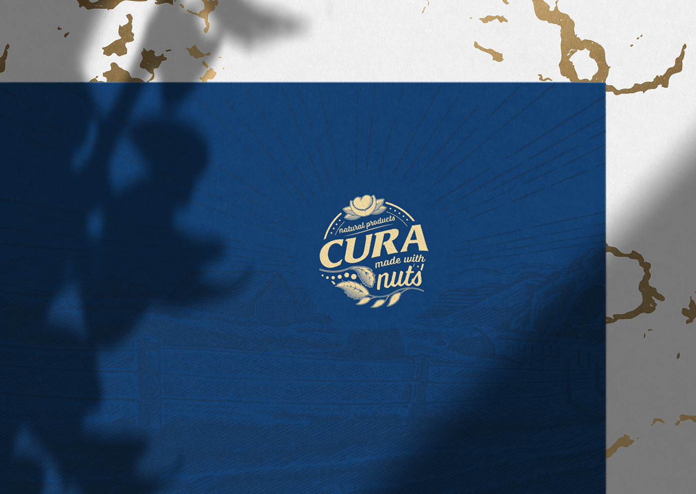
The brand positioned itself within the traditional cheeses, so that was the overall feeling for the visual identity. We drew natural objects, like the heart shaped seed, representing the love, caring, patience and time that Daniela takes to make the perfect cheese, adding a handmade touch to the brand. Also used illustrations through the brand’s visual id and simple mono or dual color compositions to easily combine with the various colours of the various cheeses and ambient photos for promotion and social media.
We went NUTS, then got cheesy!
The caring and ingenuity that the cheese maker, Daniela, had when she had this great idea, was our inspiration. Born from her preoccupation concerning the conditions involved in milk and dairy products production, mostly because of the animals and the impact of the industry on our planet. She also loves cheese and the cheesemaking process.
The brand positioned itself within the traditional cheeses, so that was the overall feeling for the visual identity. We drew natural objects, like the heart shaped seed, representing the love, caring, patience and time that Daniela takes to make the perfect cheese, adding a handmade touch to the brand. Also used illustrations through the brand’s visual id and simple mono or dual color compositions to easily combine with the various colours of the various cheeses and ambient photos for promotion and social media.
We went NUTS, then got cheesy!