Hawkes ‘London-to-the-core' attitude and challenger mindset towards mass market cider caught the attention and investment of craft leaders, Brewdog. With a new source of financial backing and the opportunity to scale up distribution and production, Hawkes needed to evolve their brand in congruence with their growth. Our brief was to tap into the mindset of the craft drinker and put cider back on the agenda.
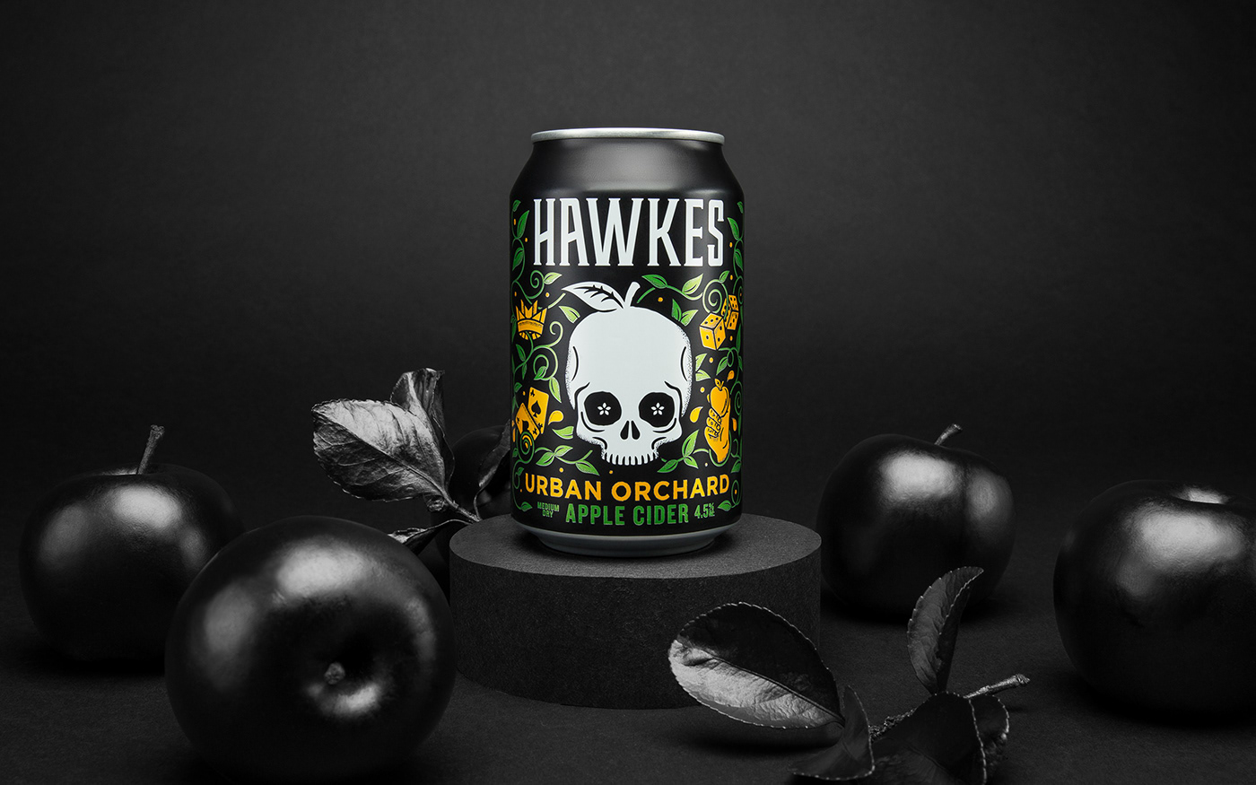
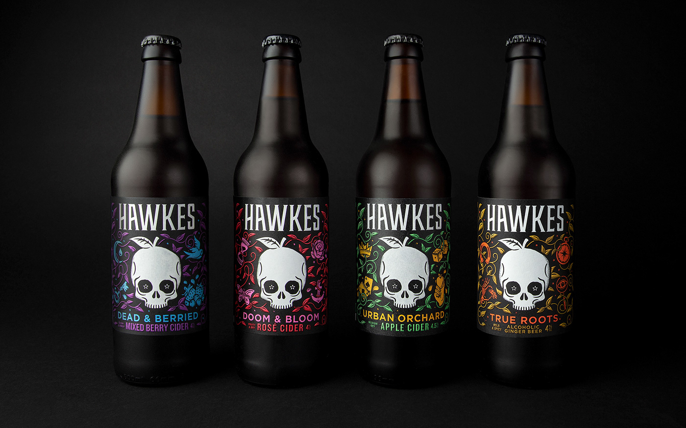
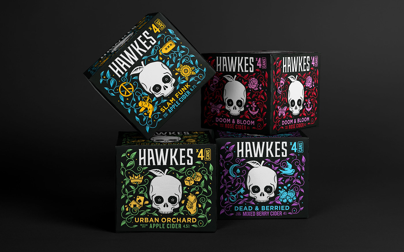
The cider category was overwhelmed with farm-grown cues, but Hawkes was born and raised in the city so we amplified their urban attitude and personality to stand out amongst the fields and trees of the competition. We built on existing assets, choosing to hero ‘Eddie' the skull as a strong, recognisable brand mark in a system that keeps the range consistent.
We also knew that Hawkes would have to feel at home in the craft environment, and so aimed to instil a feel for flavour and sense of quality throughout the design. A new illustration style sets a more contemporary tone, taking inspiration from tattoos and counter culture, and amplifies craft cues and tasting notes. Introducing colour added depth to each product, helping illustrations to pop against a black back drop, while embossed labels and spot UV give cans, bottles and multi-packs a more premium, tactile finish.