MAKING THE NATURAL CHOICE, AN EASIER ONE
The Brief:
''Help us keep our position as the UK’s best-selling dry dog food, while maximising the success of our range
for cats.''
The Opportunity:
Historically, Harringtons has mostly attracted a ‘traditional’ breed of dog owner (people with Labradors and the like). But now, as smaller, city-dwelling pooches become more popular, the brand needed to evolve if it wanted to resonate with a broader audience – including the proud parents of fussy felines.
We took the opportunity to modernise the look and feel without losing the essence of the brand and create a strong emotional hook that people would connect with.
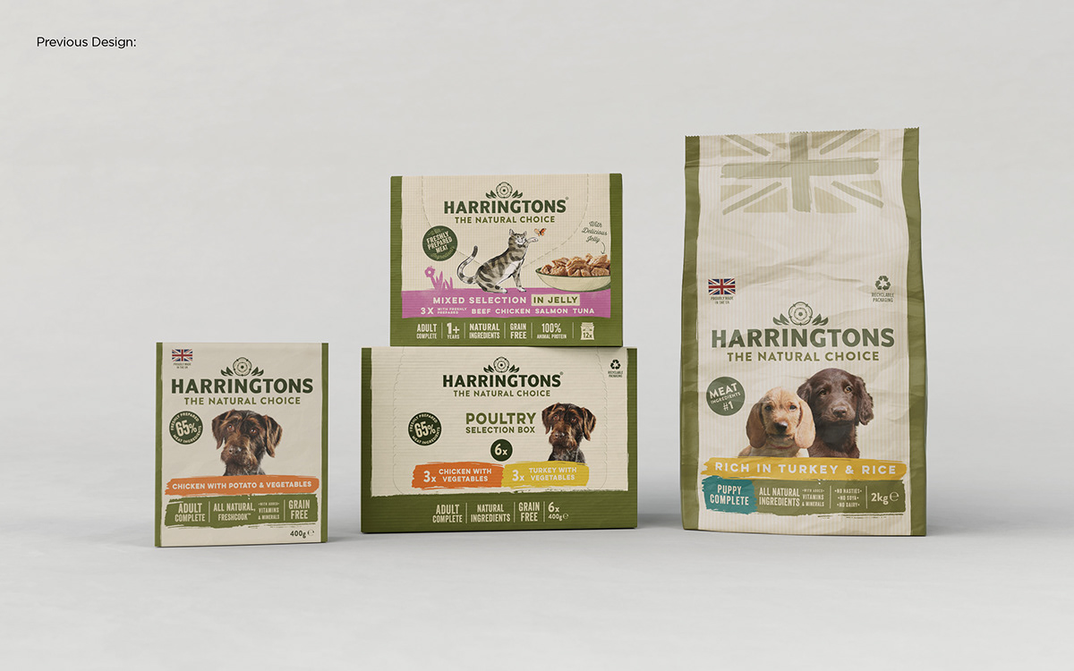
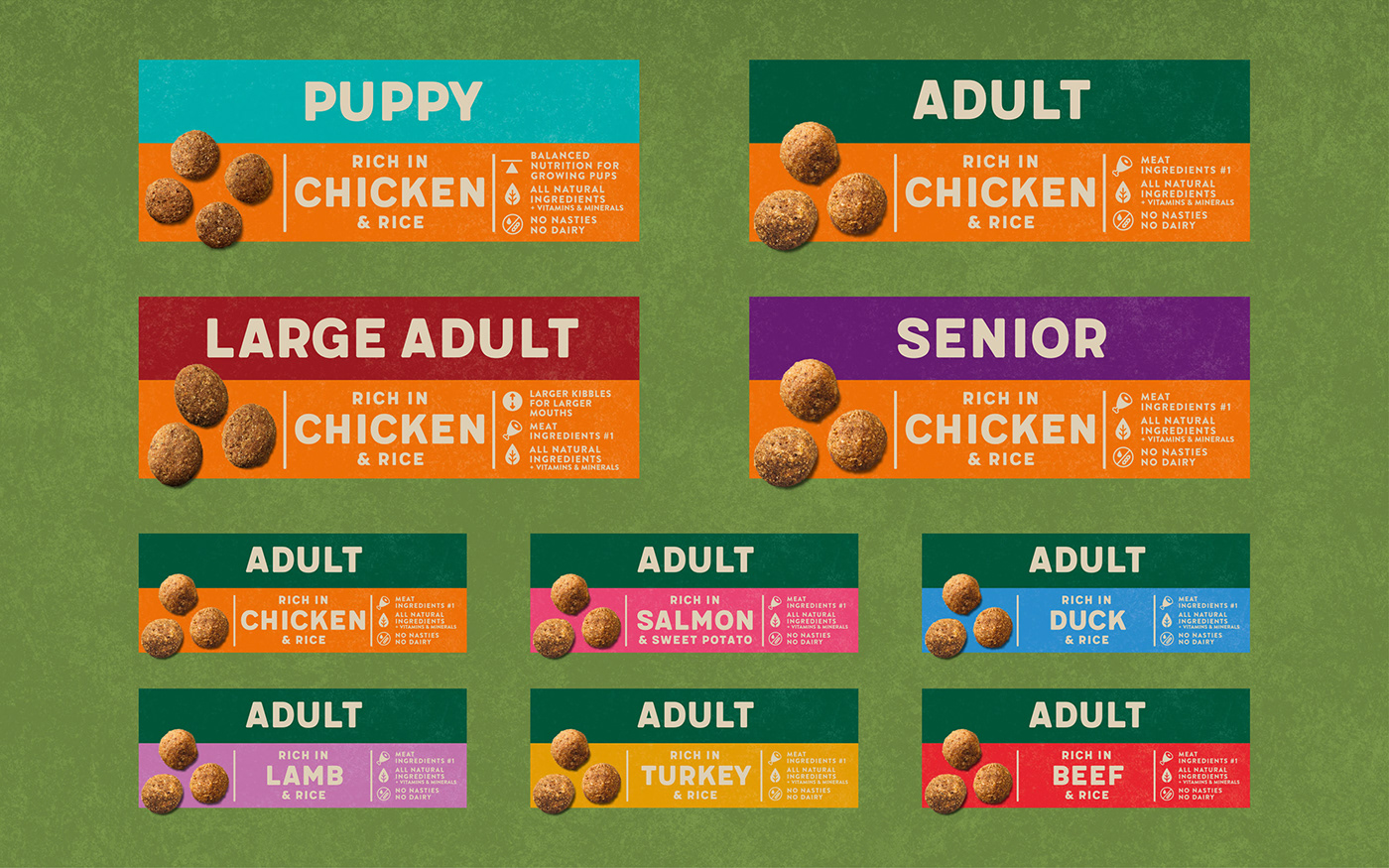
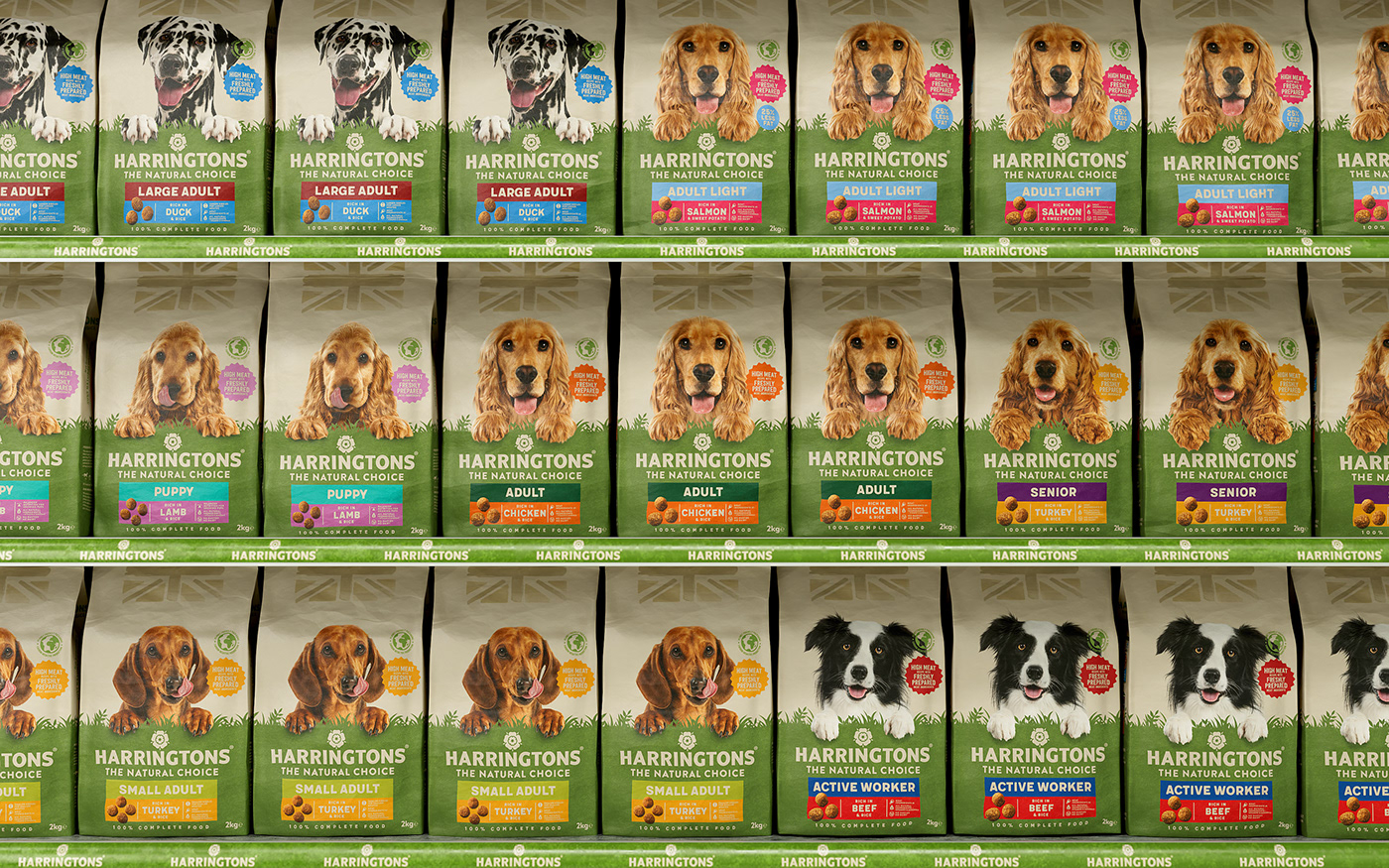
Despite their category leading status, Harringtons were seriously lacking in clarity and consistency. To solve this, we united every product under a simplified, more understandable design system, stripping the front of pack information down to what mattered most.
“We all want to do right by our pets, but it can be hard to know what ‘right’ is. As a new pet owner myself I know firsthand how confusing and overwhelming the pet category can be and design plays an important part in solving this.”
Steph, Design Director
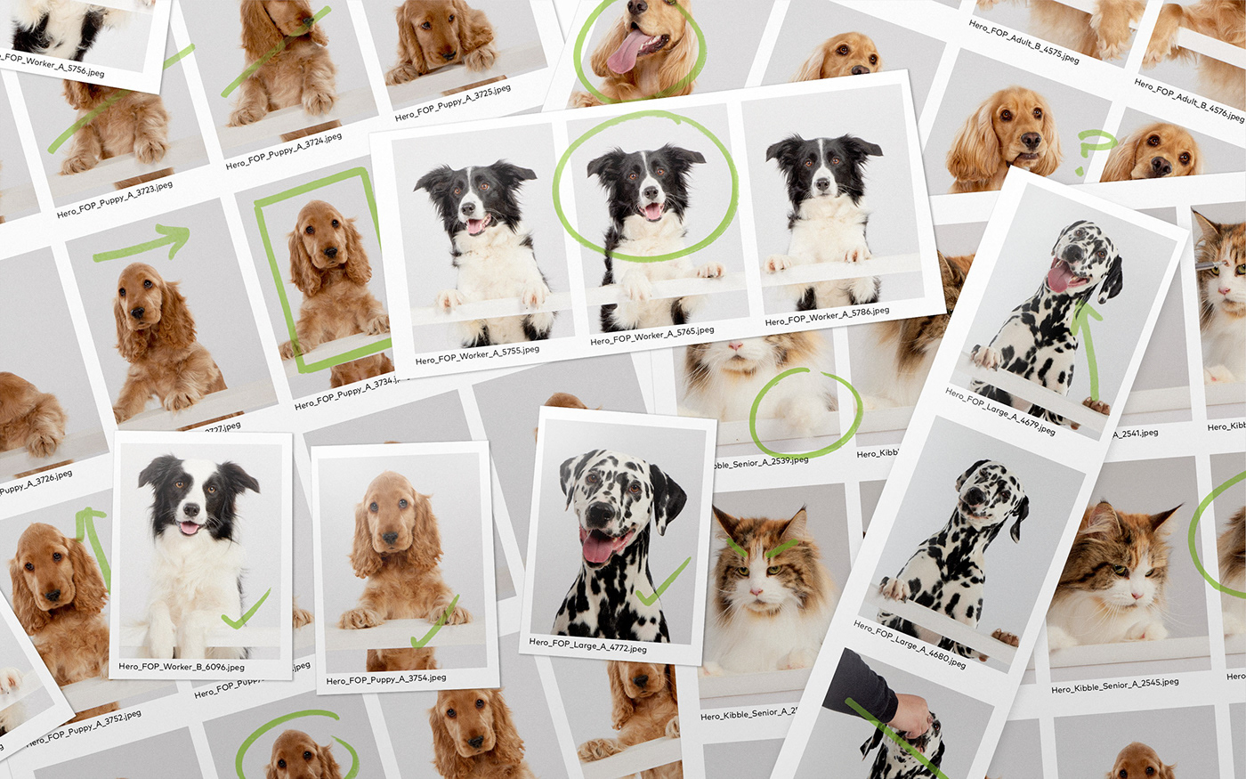
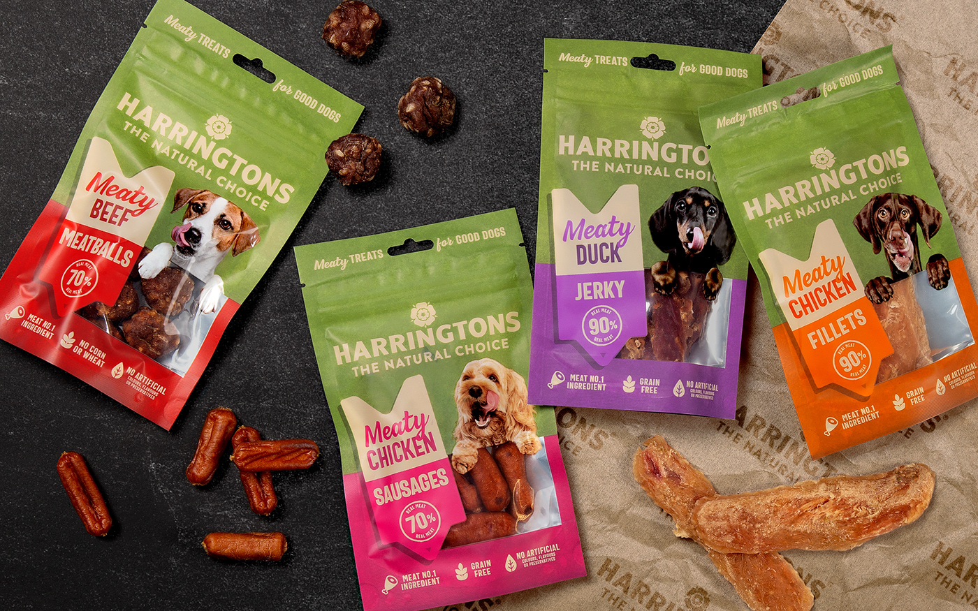
To attract a broader audience and cement the brand’s position as ‘the natural choice, ’we needed to amplify the emotional connection between owner and pet. And that called for some serious puppy eyes. So we commissioned, art directed and retouched a suite of fresh photography that now sits proudly on pack.


“The photoshoot was quite an undertaking – dog models don’t always play ball! But we knew we had to put the animals centre stage to grab the customers’ attention and pull on their heart strings.”
Jess, Client Director
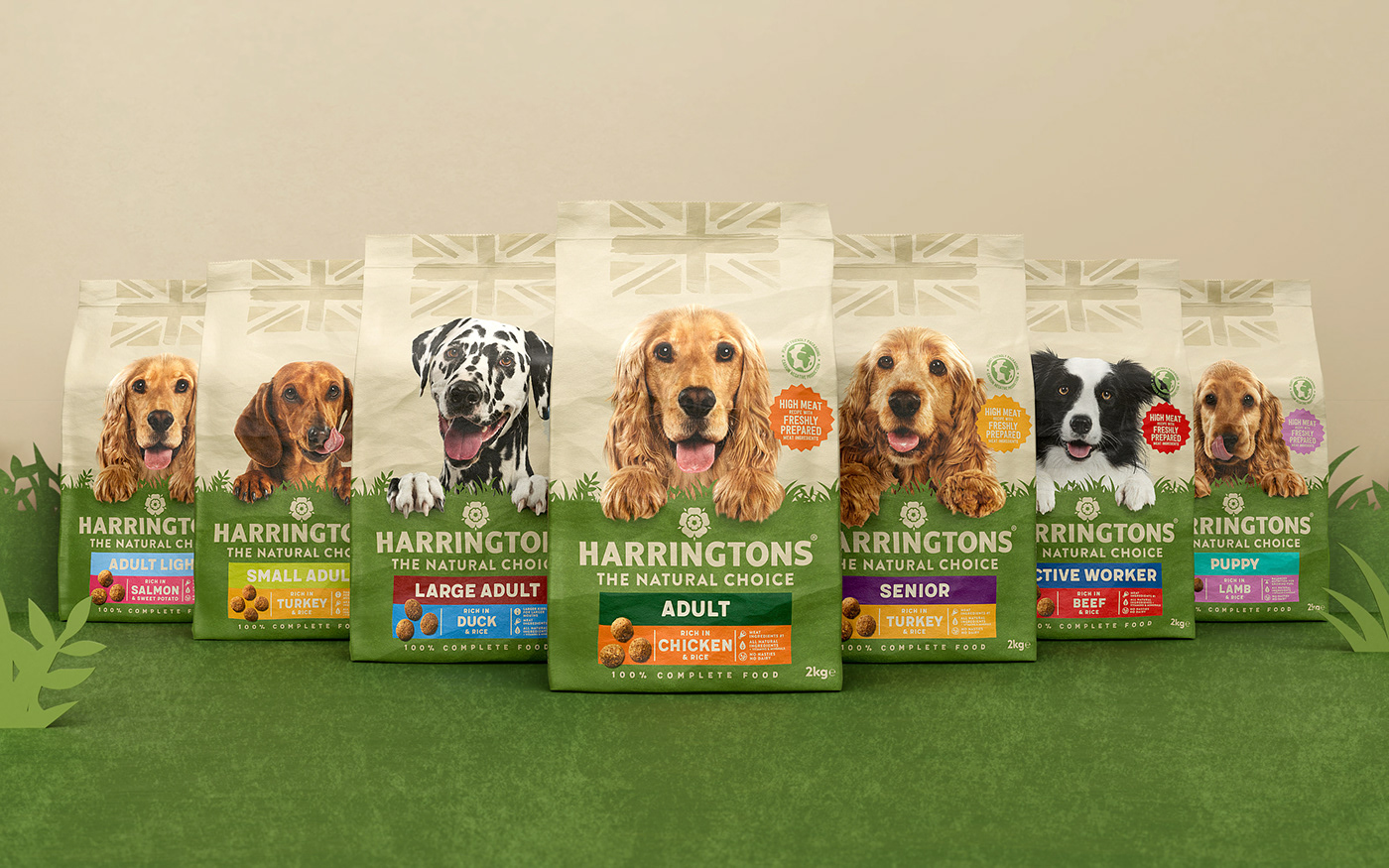
Real food. Real choice. Real pets. Building on Harringtons’ inclusive and friendly personality, we created a bolder, more cohesive identity with a recognisable imprint across both wet and dry food. One that better reflects the premium quality, expertise and history of the brand.


Previously, the height of the dry food bags meant they’d often be folded over on shelf, obscuring the brand name. So to improve standout, we re-imagined the pack architecture, lowered the brand mark and created a ‘natural horizon’ that features across all products.
We brought Harringtons’ cat food in line with the rest of the brand for the first time, with playful imagery that celebrates all their loveable idiosyncrasies – creating a bigger, more recognisable imprint across Harringtons’ whole pet portfolio.