Brewing goodness to go
The Brief:
“We want a compelling coffee brand that delivers on our core Co-op values.”
The Insight:
Too often, when it comes to coffee, convenience means compromise – leaving consumers choosing between quality or ease, good for the planet or good for their wallet.
The Idea:
Goodness to go. Wake people up to the coffee they deserve – one that looks good, tastes good and
doesn’t cost the earth.

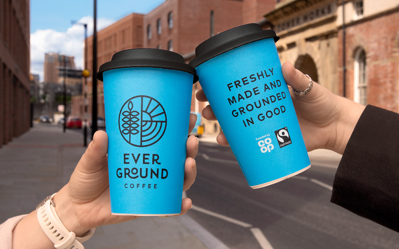
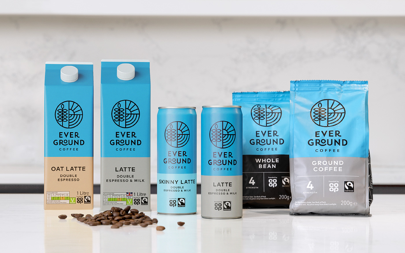
The first step was finding a name that felt right for Co-op. Positive, timeless and rooted in good, ‘Ever Ground’ reflects Co-op’s Fairtrade journey and their on-going pursuit to source and brew better coffee.

Warm, wholesome and full of energy, we gave Ever Ground a tone of voice to match their coffee. The messaging champions their delicious coffee first, supported by their Fairtrade credentials second.
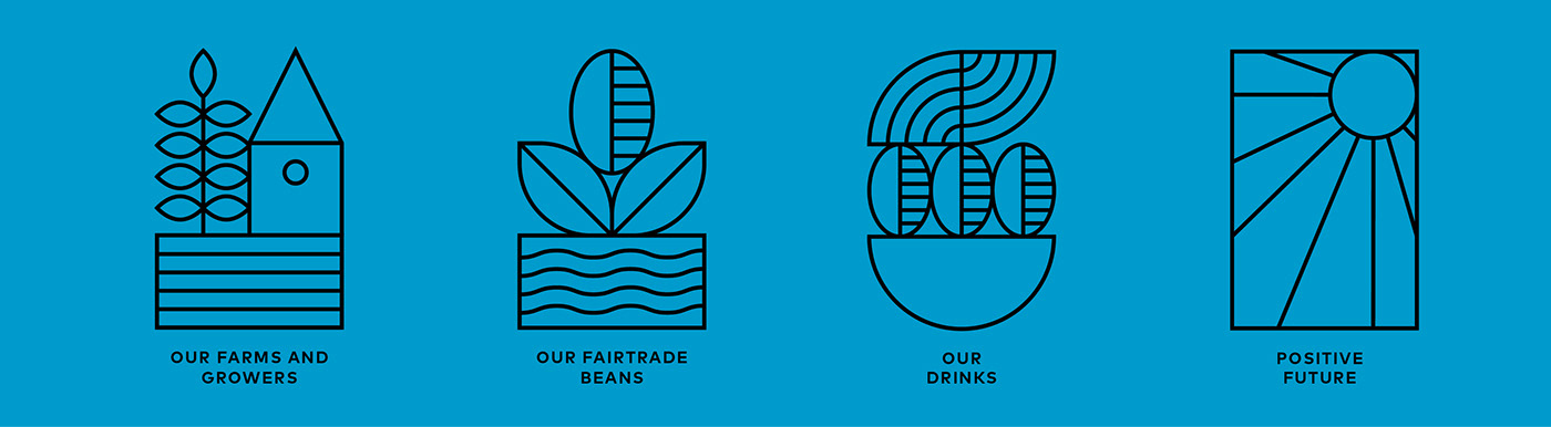
To visually represent Co-op’s values, we created a suite of simple line illustrations that feature across the whole brand world, either as stand alone icons or together to form patterns.


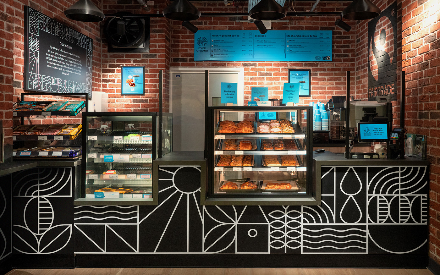
Blue sky drinking! For the colour palette, we chose to hero the master brand blue which pops against black and white for a contemporary feel that’s still proudly Co-op.
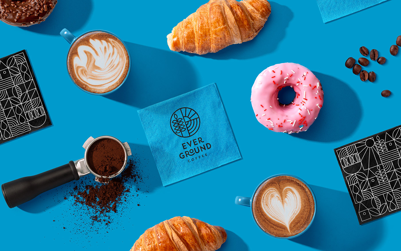

Their house blend, from the comfort of yours. After the success of Ever Ground’s in store offer, we then rolled out the look and feel across ready-to-drink iced lattes, along with bags of whole and freshly ground beans.

“Mass market coffee brands all look and sound the same, so instead we looked at what independents were doing and applied their mindset to a larger scale. It was more than just a logo, it was about creating a rich and distinct brand world that would tell the story of Co-op’s coffee journey.”
Martin, Creative Director


