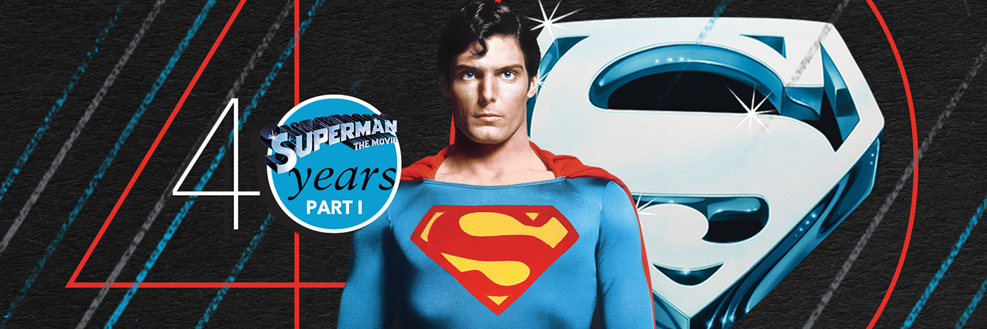
40 Years: The Music of Superman
Part I: Visual Assets and Design Reference
Client: La-La Land Records, 2018
2018 marked two significant anniversaries for Superman -- 80 years since his debut in 1938's Action Comics #1 and 40 years since the release of his first big-budget film, Superman: The Movie. La-La Land Records and soundtrack producer Mike Matessino had mapped out a year-long celebration for fans, beginning with the first individual album release of Superman IV: The Quest for Peace, followed a few months later by a combined release of Superman II and Superman III, and ending the year with an all-new audio mastering of John Williams’s original 1978 score, sourced for the first time from the original 2-inch, 24-track masters.
For a longtime fan, this was a dream gig and I was eager to start designing. The first step was to secure quality assets, meaning pre-approved poster art, logos, scene stills and character portraits from the four films—the condition and variety of which would inform and shape my design ideas for the series as a whole.

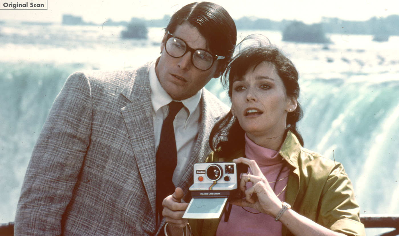
These first few examples demonstrate the specific issues with scans in the studio archives. Fixing faded colors is a fairly straightforward white balance adjustment, the effect of which can feel dramatic (see before/after animation of baby Kal-El above). Dust specks, grain, and color damage to the negative, as in the below shot of Clark and Lois and Niagara Falls, are more involved time-wise to correct, but the results are similarly satisfying.


Due to various legal issues, not every familiar photo from a film is available for or use. Sometimes, if we're to include key characters or scenes, we may be forced to use black and white stills. In order to use such photos without disrupting the booklet flow, they were treated with one of the three primary Superman colors -- red, yellow, or blue.

While black and white shots were sharper overall, some of the color photos had an overall softness (see Ms. Teschmacher below). This fuzziness could a result of the long exposure times required for shooting at night, or on a fairly dark soundstage. It could also be the image was scanned from a lower-quality source, such as a 35mm press kit slide, the kind which were included in the pre-digital era with publicity packs sent to for review purposes to newspapers and magazines. These press kit folders contained sheets with film summaries and technical details, as well as black and white 8 x 10 prints, and color slides. The slides were produced by photographing approved stills, then developing the negative to color positive -- a process very similar (and as error-prone) as photocopying a photocopy.
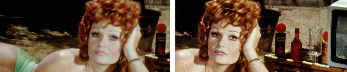
Sharpening the image in Photoshop helped -- to a point. In some instances, specific details were drawn by hand over the image (above right) using the Apple Pencil/iPad Pro and then softened and blended. See GIF below for a before/after.


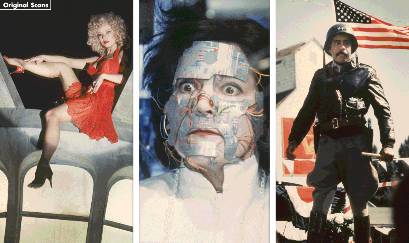


The blue fabric in the Superman costumes worn by Christopher Reeve had a distinctly "teal" hue--very different from the darker tights worn by actors in later Superman TV shows and films, but true to the brighter colors seen in printed comics of the 1970s and '80s. The costume material contained reflective fibers as well, which reacted differently to different lighting conditions. This was particularly visible in the high-res files sent by Warners Bros., where his costume color varied wildly from scan to scan.
When watching the movie, you may not even notice such subtle color shifts. But for printed materials, where multiple photos of Superman will appear throughout the package, sometimes side by side, the issue needs to be addressed. In the following split screen and animated GIFs , you can see the original scans and the corrected, now consistent suit colors.


Curiously, the "S" symbol was consistently soft in still photos, with the yellow backdrop of the shield often looking over-exposed and desaturated. In some cases (mainly close-up shots like the one above), I was able to restore the symbol in the photo to match freeze-frames from the corresponding scene from the film. But in most instances, the "S" had to be removed and then digitally replaced with chest emblems taken from photos of the surviving original costumes.


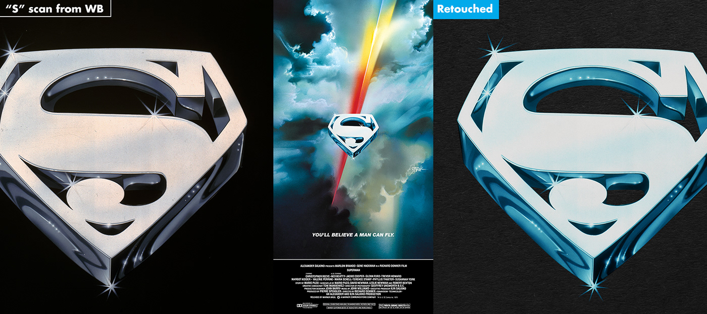
The original 1978 vinyl album (left in the above) was one of the better sources for showing the movie’s crystalized, dimensional logo. Set on a field of black, the logo's deep range of blues were emphasized clearly and some subtle streaks of violet could be seen within the letters. Unfortunately, home video packaging files provided by the studio (above right) had opted to remove such color variation in favor of a cleaner -- but also bland and generic -- silver-toned treatment.

As Superman IV: The Quest for Peace was to be the first soundtrack album released, a secondary issue with title logos arose. Posters and tie-in material for that film (shown above) made little attempt to follow the established style of the Roman numerals and subtitles of earlier films in the series. Some poster designs (right) even jettisoned the crystallized typeface entirely and used the same masthead from the comic books. Album producer Mike Matessino was hoping I’d be able to correct this inconsistency—and possibly restore a touch of class to the notoriously troubled and penny-pinched fourth production— by creating a title treatment that would line up with those previous films.
After some trial and error, it seemed the best way to solve both dilemmas was to start from scratch, redrawing the letters in Adobe Illustrator by hand, then adding shading and color variation in Adobe Photoshop. This allowed me more control in re-rendering those subtle details, and provided a consistent look that would carry through all four title treatments, including the new subtitle for Superman IV.


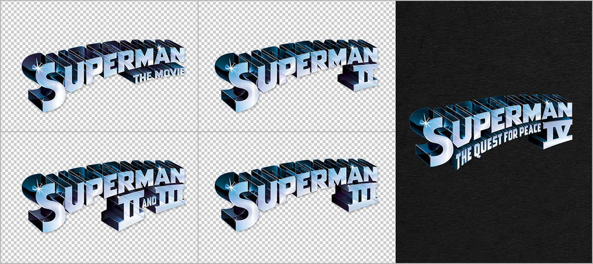
above: All final logo recreations. Note: the Superman II and III combination logo was not used in the final designs.
Finally, the scan of the crystallized "S" shield provided by Warner Bros. (below left) was sharp and clear, but the colors had lost their saturation and vibrancy. In addition to smoothing away the dust specks and debris, the retouched shield (below right) was color-corrected to match the better preserved original 1978 posters, which depicts (like the Superman costume) a deep teal-blue tone in the dimensional depth of the "S" shield.
This series continues in Part II, looking at the cover art, design and layout of the booklets and packaging for the three soundtrack releases from LaLaLandRecords.com