


Over the Moon
Celebrating the 35th anniversary
of E.T. The Extra-Terrestrial
Soundtrack CD and vinyl editions for La-La Land Records, 2017
Poster art for MondoCon 2017
Producer Mike Matessino had a specific direction for the cover of this newly expanded soundtrack album: Try something new, something we've never seen. Or, if not exactly new, then try to avoid the iconic touching hands or the bicycle and the moon. The two images had been well worn over 30-some years of various posters and home video covers and had lost some of their impact. If possible, Mike's preference was to not show the E.T. creature at all (not so much as a glowing finger), and instead switch our focus over to Elliott's emotional journey in the film, to convey something of the loneliness of a broken family and the unexpected, magical friendship he finds.
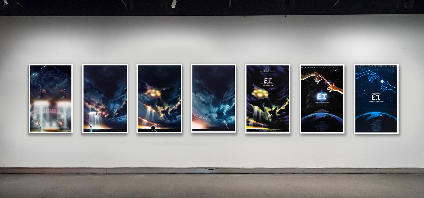
I was thrilled. It's not often you get the chance to create new art for a classic, so it was difficult not to dive straight after it. Knowing there was a chance we'd be limited to established imagery however, I felt I should include some variations on the familiar icons in my first round of concepts (see below), the quality of which varies wildly, as the level of ambition guided whether a comp was shown close to final art, or as a more suggestive rough.

At Mike's request, I started experimenting with a sequence of art painted by the late John Alvin, the artist behind the E.T.'s original ad campaign (as well as posters for other Spielberg-related films--Gremlins, The Goonies, The Color Purple, and the Hook teaser). Alvin's four-panel series depicted the silhouette of a boy watching as E.T.’s spacecraft emerged from the clouds to land in a clearing.
Film illustrator and commercial artist John Alvin (https://johnalvinart.com) produced several paintings for the marketing of E.T. The last three in the above showcase are the original advance "teaser" poster, the 1982 theatrical one sheet, and the 1985 theatrical re-release.
In comparison to his own teaser poster art, Alvin's painted landing sequence felt unpolished. Further, since Henry Thomas would not have been cast when these were illustrated, Alvin seems to have kept the boy's silhouette deliberately vague. Whether combined with the teaser poster or not, the boy looks slightly two-dimensional, as in the below examples.


Thankfully, everyone at La-La Land agreed the Alvin-inspired combos simply weren't working, and we moved on to discuss the other designs. I had a love/hate relationship with this next cover (see below). On the one hand, it's a very familiar (meaning easy to approve) image, but the wider angle, smaller moon, the foliage in the foreground, and the addition of a touch of glow along the horizon helped to portray it in a new light. Mike and I had some fun questioning where the sun sets in relation to the moon, but the argument was rendered pointless when we realized the glow probably looked more like a forest fire anyway, so...best to move on.

I felt this next cover had potential as well, but no one else was convinced. Perhaps it would've worked better on vinyl. The larger size of a vinyl cover would have made the trees seem taller, given more breathing room around the type/logo, and the additional space created would have allowed the figure of E.T. to be shown even smaller, making him harder to spot at first glance.

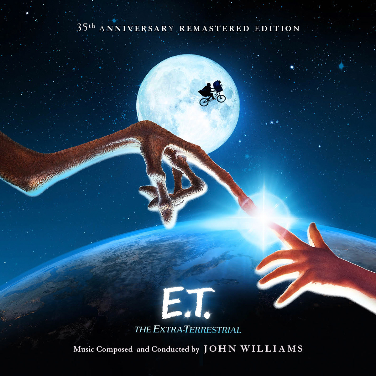
Eventually we zeroed in on two concepts. The first (see below) used the hands touching over the earth as well as the bicycle flying over the moon. It was hoped that using such established imagery would speed up approvals, and thankfully the unconventional pairing of the two iconic shots would help the cover stand out from previous albums. But it didn't excite anyone much, and so it was selected as our fallback option--a design that was safe and clean, but one we would push forward only if it proved necessary.
That left our final contender, an original mockup of Eliott looking up at the night sky (see below), that was based in part on an ILM FX composite merging E.T.'s model ship with a matte painting of Elliott's neighborhood.
The concept was so rough I nearly didn't show it. I felt the scan of the neighborhood was too grainy to print from, even on a small CD cover. And the lights of the ship were too strong, stealing the focus from Elliott. But everyone was drawn the cover's potential, despite knowing more time and additional visual elements would be required to take it through to finished art.
And yet, even if we discovered a crystal clear scan of the neighborhood matte painting... and even if the finished art turned out splendidly...there was still a chance it would cause a serious delay in production, since any original design on this level would require a sign-off directly from Mr. Spielberg, who was then in preparation to shoot 2017's The Post.


As Mike planned to visit ILM to look for a new neighborhood scan, I started assembling other assets and materials I'd need. While E.T.'s marketing and merchandise used the same initials for E.T. throughout, various treatments for "The Extra-Terrestrial" had been used over the years (see below). The one used on all the home video covers and re-releases was an Art Nouveau typeface named Souvenir.

To keep things fresh, I chose instead to use the earlier slab-serif typeface which was used memorably on the teaser poster, the novelization, and the Topps trading cards, which 7-year old me spent much of the summer of '82 collecting. The closest match, according to MyFonts.com's indispensable "WhatTheFont" tool, was a typeface known as Hillman. But there were differences--note the Es and the Ts in the comparison below, which have angled, rather than flat serifs.

As it turns out, my manic thirst for nostalgic accuracy wouldn't allow me to go with the close-enough Hillman. So, instead, I redrew the title in Adobe Illustrator, using a scan of the novelization's title page.

(top) hi-res scan from the novelization's title page for reference, and (bottom) redrawn in Adobe Illustrator
Some good news from ILM: Mike had retrieved a fresh scan of the neighborhood painting (below left), so I was able to then remove the model ship and replace the flat sky with something more dramatic, using a combination of various stock photos of clouds and stars. Foliage and mist was added to the foreground, creating an overlook for Elliott to stand on. I also swapped the large, Close Encounters-like ship for a more subtle, shining light in the sky, and then increased the color to make it feel more three dimensional and atmospheric.
We just needed an Elliott.

My plan was simple: photograph a boy of 10 or 12 in a red hoodie with a bike. My oldest son was only 8 at the time and looked it. I started casting a wider net -- his friends, teammates, other kids in the neighborhood. Seemingly every boy that summer was wearing their hair shaved up the sides and back. And with my deadline approaching, there now wasn't time to go to a local talent agency for a child model.
A day later I'm taking photos from the sidelines of my son's soccer game. At the half, I spot this kid circling through a nearby parking lot. It was like he pedaled over from the 1980s. He's the right age, right size, and the bike is close enough. The next time he circled over I yelled. “Hey, kid--okay if I take a picture?" He just shrugged. "Okay, let that bike dangle beside you. No, lower. Okay, now look up. Yep-that’s good. Thanks.” He quickly lost interest and pedaled away across a busy street and disappeared.


With very little time left, I had no choice but to build Elliott from stock photography (and my son's hands in a small tribute to John Alvin, who used his daughters hands as reference when painting the 1982 poster). Once I'd assembled a body, the figure was lit to match the environment. I also added a basket crate to the front of the bike.

(above left) I had second thoughts about sharing this, wondering if it' shows a little too much on "how the sausage was made."
Below is a look the new key art, without text or logos or other credits.


Each of the two discs in the CD set used poster art, from the original 1982 poster and the 1985 re-rerelease.


Shortly after the CD was announced, Mondo opted to release an 18x24 limited run poster of the CD cover, so I was asked to reformat the image for traditional movie poster proportions. It was nice to open things up a bit and see more of the grass at Elliott's feet, but emotionally, I think the art benefitted most by being able to increase the distance between him and the glowing light in the sky. The poster was announced at MondoCon 2017, and sold out not long after.

In addition to the 2-disc CD edition, La-La Land also planned a vinyl release. The design was in keeping with the spirit of the CD booklet, but the larger size allowed for some more exciting layouts. Here are some samples from that release, which is still available to order directly from La-La Land here.

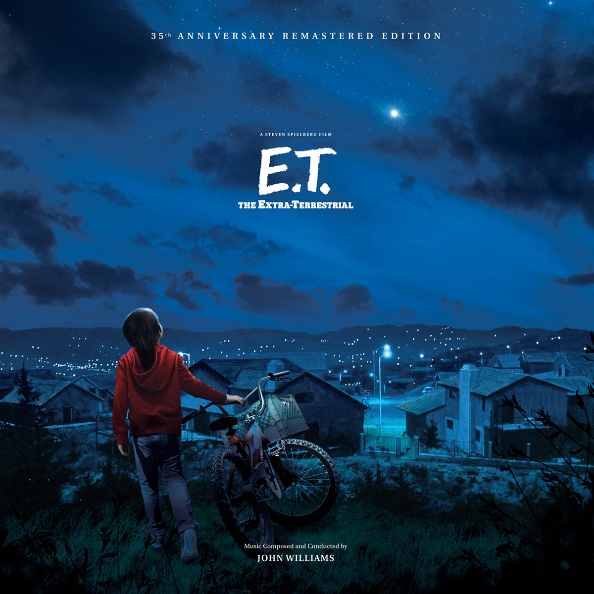
The additional space provided by the size of the vinyl cover allowed me to show Elliott's full body, and offset the light in the sky so the title fell more comfortably between the two.


The vinyl album also included a 12-page booklet, which used many of the same approved photos and layouts consistent with the CD booklet, but the larger size, but the larger size allowed a 3-column grid.


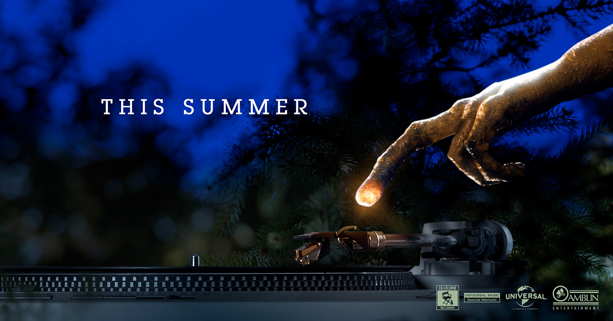
As with other high profile releases, I produced a series of environmental product photos and graphics to help tease and promote the releases through social media channels and message board postings.


The 2-platter limited edition vinyl album of John Williams's score to E.T. The Extra-Terrestrial is still available and can be purchased from directly from La-La Land Records here.


