


Star Wars: The Last Jedi
Logo Design Concepts
Logo Design Concepts
January 24-25, 2017
An explanation. Like so many kids of the 80s, I grew up with the Star Wars trilogy. The way my dad tells it, my first trip to that galaxy far, far away was at a drive-in theater back in '78 or '79 during a rerelease of the first film. I had to have been two, maybe three...? certainly too young to make any sense of it. Nevertheless he swears I was instantly hooked. The years after made a more lasting impression on me, and even now I can boast to having a near photo-graphic memory of the all the Star Wars action figures, posters, records, t-shirts, VHS tapes, bath towels, pillowcases, and lunch boxes that I carried with me from boy to fanboy.
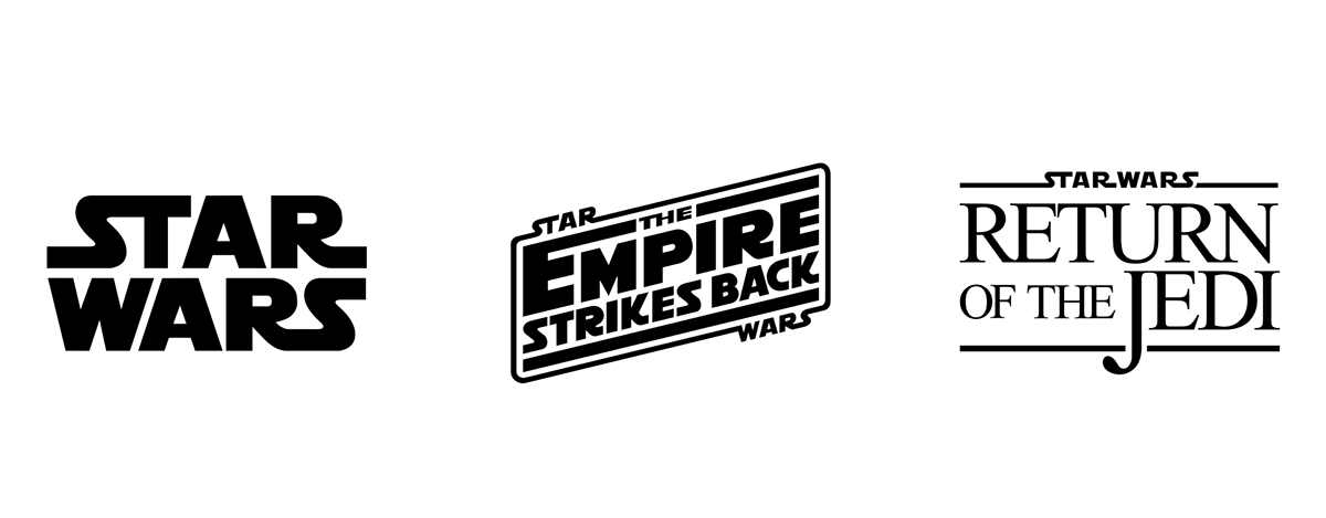
Today, it's par for the course when new film franchises come packaged with locked-in release dates for sequels, but each of those first three Star Wars films was written, shot, produced, edited, marketed and released under the assumption it could well be the last. Perhaps it was this sense of being in the moment, of not planning ahead, which shaped Lucasfilm's decisions regarding logo designs. But whatever the design rationale, the original trilogy was given three amazingly distinct title treatments (see below), which, to my mind, still stand as compelling evidence for allowing films in a series to possess their own individual design identities.
When Disney surprised the world by purchasing Lucasfilm in 2012, announcing their plans for a sequel reuniting the original trilogy cast, I was as excited as everyone else but also started wondering whether this new trilogy would follow the pattern established by the originals when it came to its title treatments. (Sidebar: So, um... 1) I'm a designer, so, c'mon, it's only a tiiiiny bit weird that I was thinking about this kind of detail and, 2) the movie seemed programmed to push our nostalgia buttons repeatedly, so thinking that approach might extend to the marketing of the films isn't an unreasonable suspicion. End sidebar.)
But, whatever, I was wrong. About a year out from the premiere, the title logo for Star Wars: The Force Awakens was finally revealed...

My first reaction? Fantastic. Simple. Classic. A wonderful, bold, and unexpected twist on the original logo. And yet... Hmmn...did it have...? Was that- ? Oh, yeah. Definitely got a whiff there. It was faint, but definitely a trace of that template-like feeling, which quickly had me thinking of the assembly line logos from these...

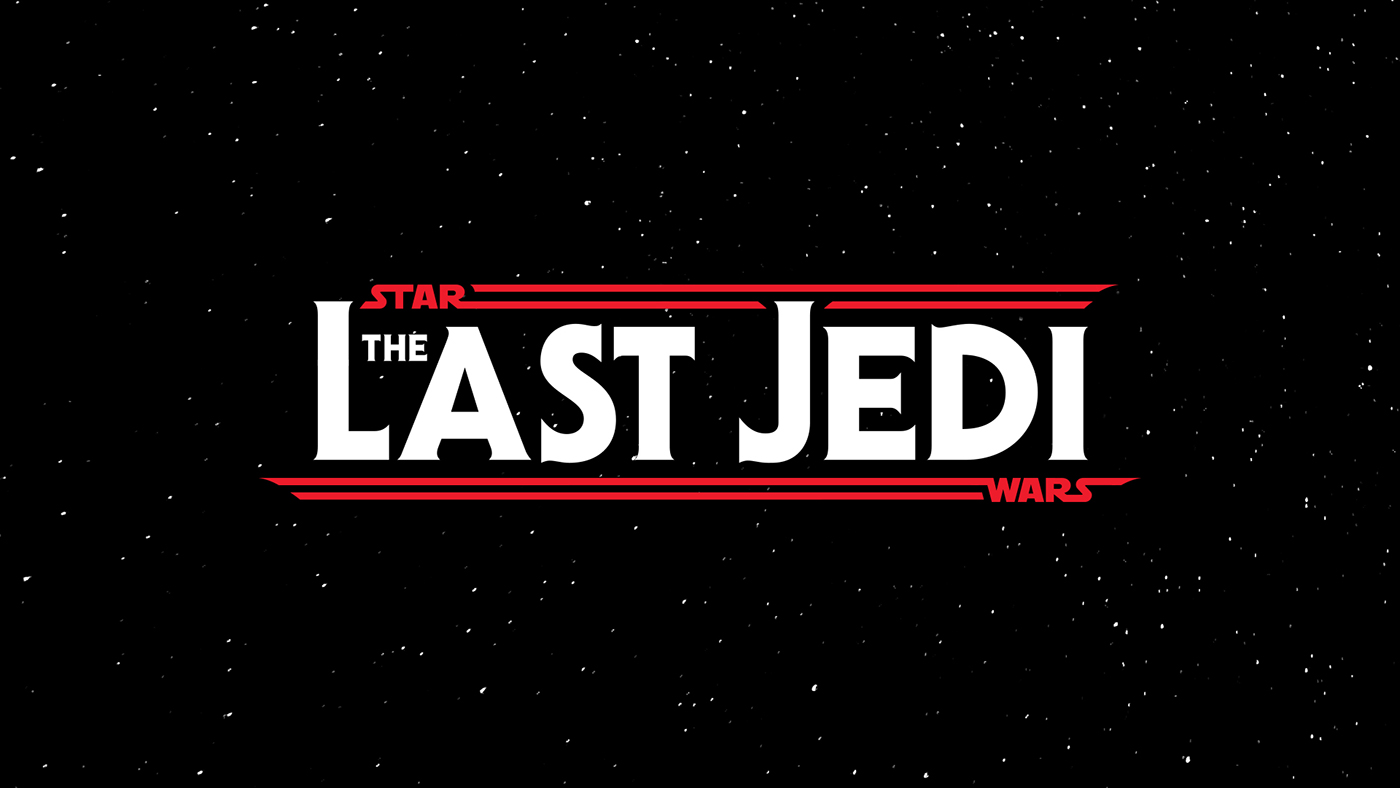
And then come Monday this week, that faint trace suddenly felt a lot more etched in stone as Disney announced the official title of the newest sequel in the saga would be The Last Jedi. With it came a teaser poster, based on a very familiar logo...

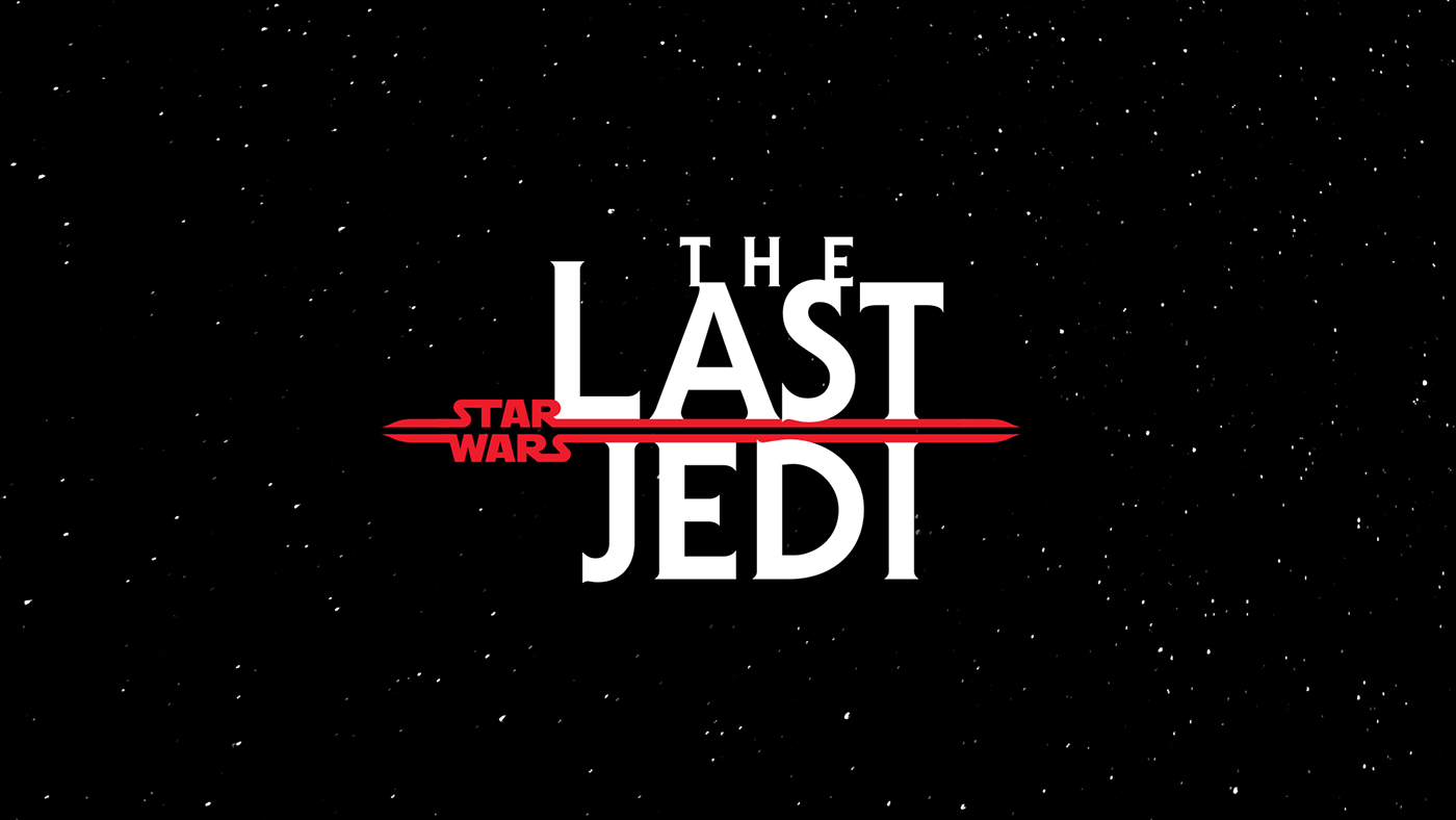
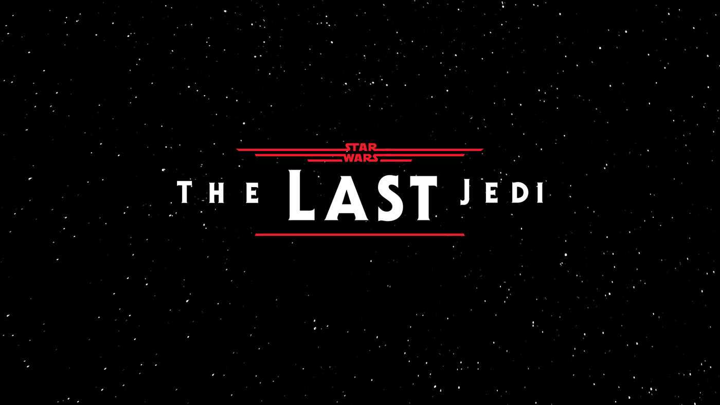
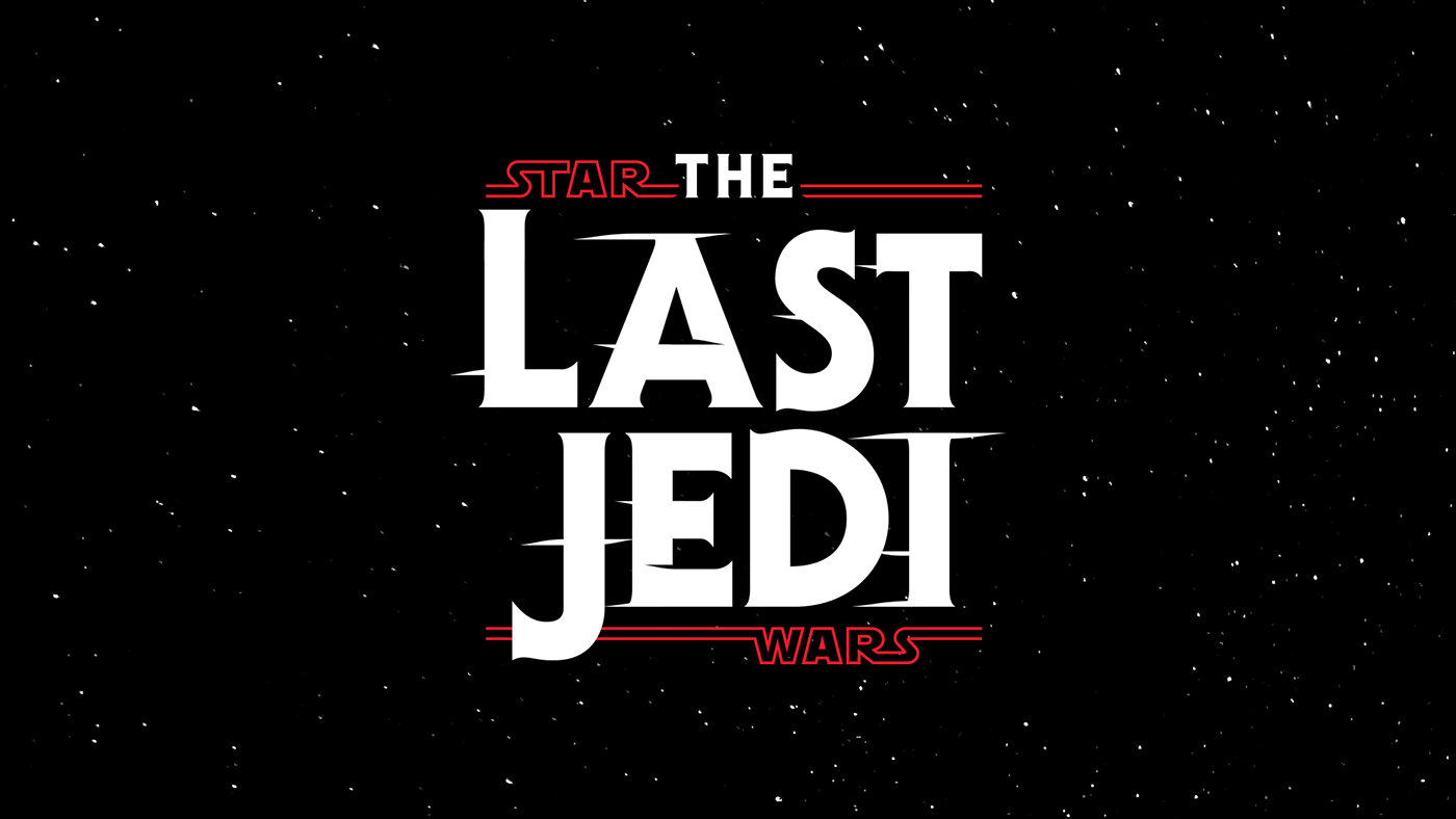
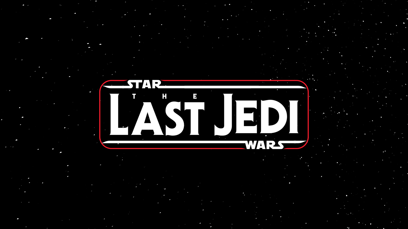
Thing is... I still like it. It's still a great logo. But when other Star Wars fans took to speculating over thematic meanings suggested by the logo’s red color scheme, I started itching to try out a few design ideas of my own that came to mind. So I set myself a quick design exercise with some simple, self-imposed parameters:
1) Don’t stray too far from previously established trends within the series. Keep the colors flat, the shapes simple, the overall design direct and bold but a personality that has grown since the first film.
2) Maintain continuity with the Force Awakens logo by using the same classic 70s typeface ITC Serif Gothic. For background on why that font was such a perfect choice, check this link, where The Verge designer Dylan Lathrop explores the issue fully.
3) Don't spend too long on this... you have a three kids and a mortgage after all.
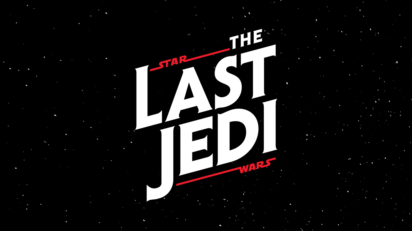
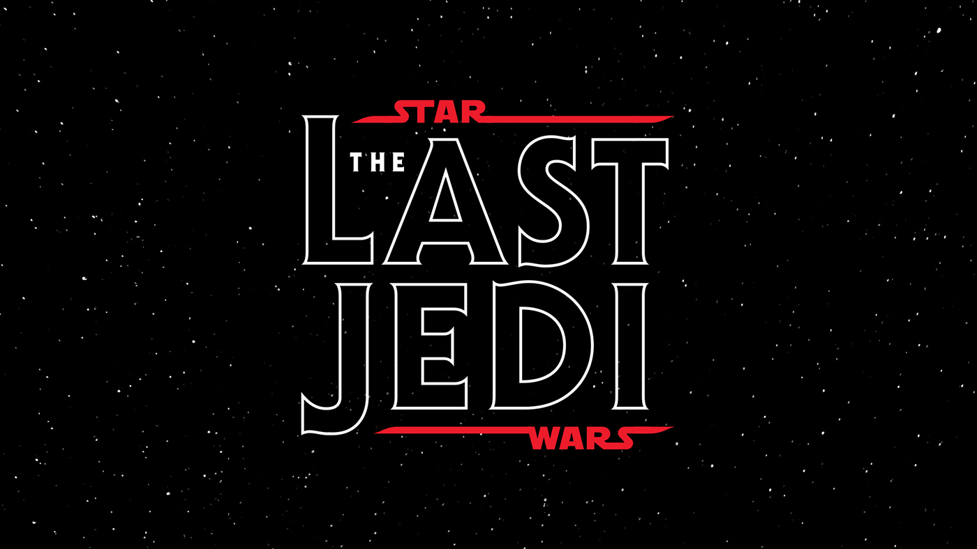
Okay, showtime... so how do my logos stack up beside The Force Awakens logo? Below is basically everything I came up with, side by side. Since this was an almost stream-of-consciousness design exercise (I limited myself to roughly 24 hours from start to finish so as not to dwell too long on any one idea) I realize that even the better ideas here need more polish. Still, I’d like to hear what other designers out there think, particularly since only other designers will be able to sift through so many similar-looking logos. Feel free to share your opinions in the comments section below.


