Po shchuchyemu veleniyu
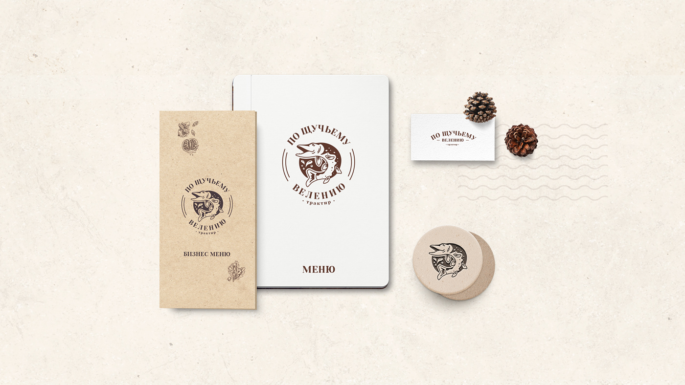
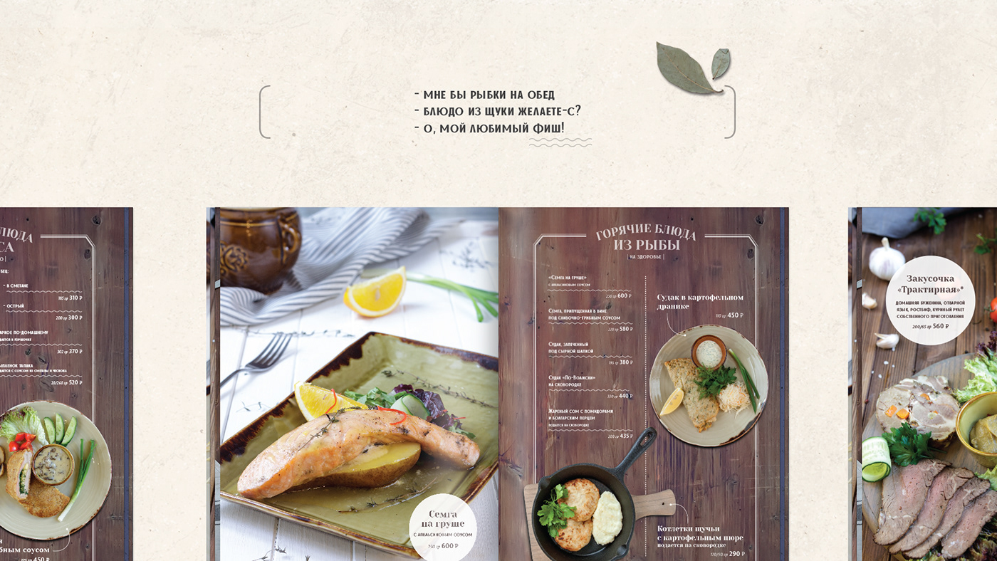
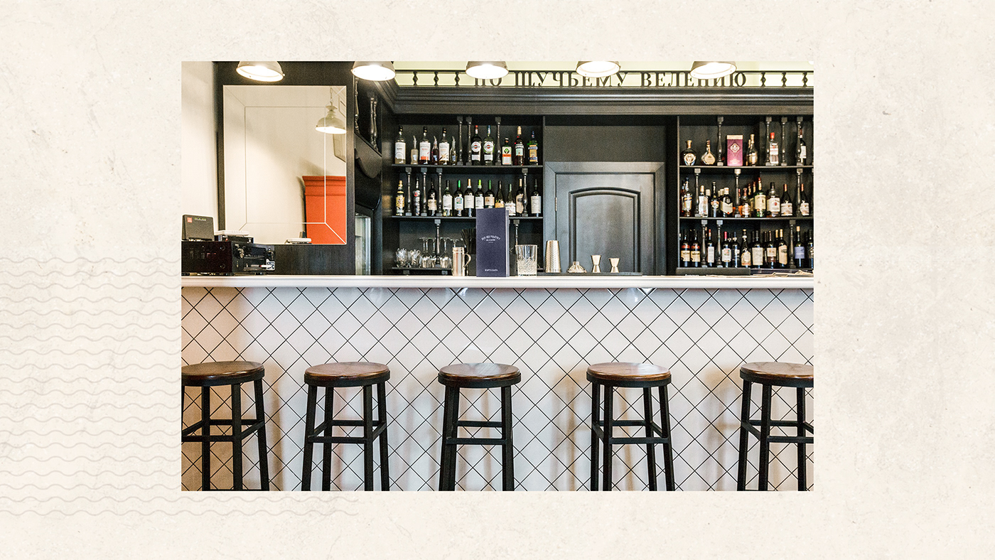
This is the tavern of traditional Russian cuisine with a 16-year history. It was necessary to refresh the visual image of the tavern for engaging a new audience. We have designed a logo that highlights the national identity and fits the new interior of the venue. The image of the pike at the heart of the logo reflects the name and a strong Russian character and tradition, which is respected in the tavern. The classic font completes the image. A simplified font version of the logo has been developed for different uses. It makes it possible to keep the recognition of the tavern on any media. As a part of the project, we have designed the main menu and bar card. Classical elements in the design keep the traditional character of the venue.
Client: Tavern Po shchuchyemu veleniyu
Task: Redesign of the logo and corporate elements and development of the menu and bar card
Task: Redesign of the logo and corporate elements and development of the menu and bar card