

REIMAGINING THE WHEELCHAIR SYMBOL
TO INCLUDE HIDDEN DISABILITIES

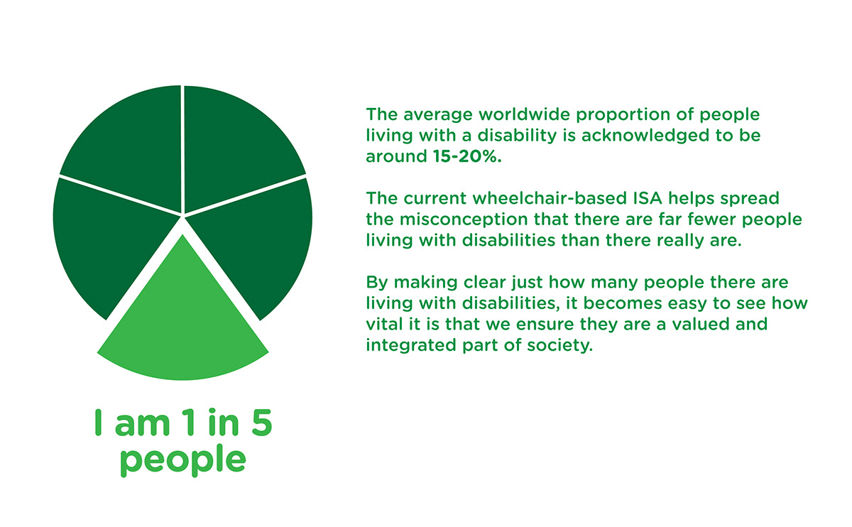
Visability 93 challenged designers to explore whether the International Symbol of Access ‘wheelchair symbol’ could be changed to better reflect the fact that 93% of people with disabilities are not wheelchair users.
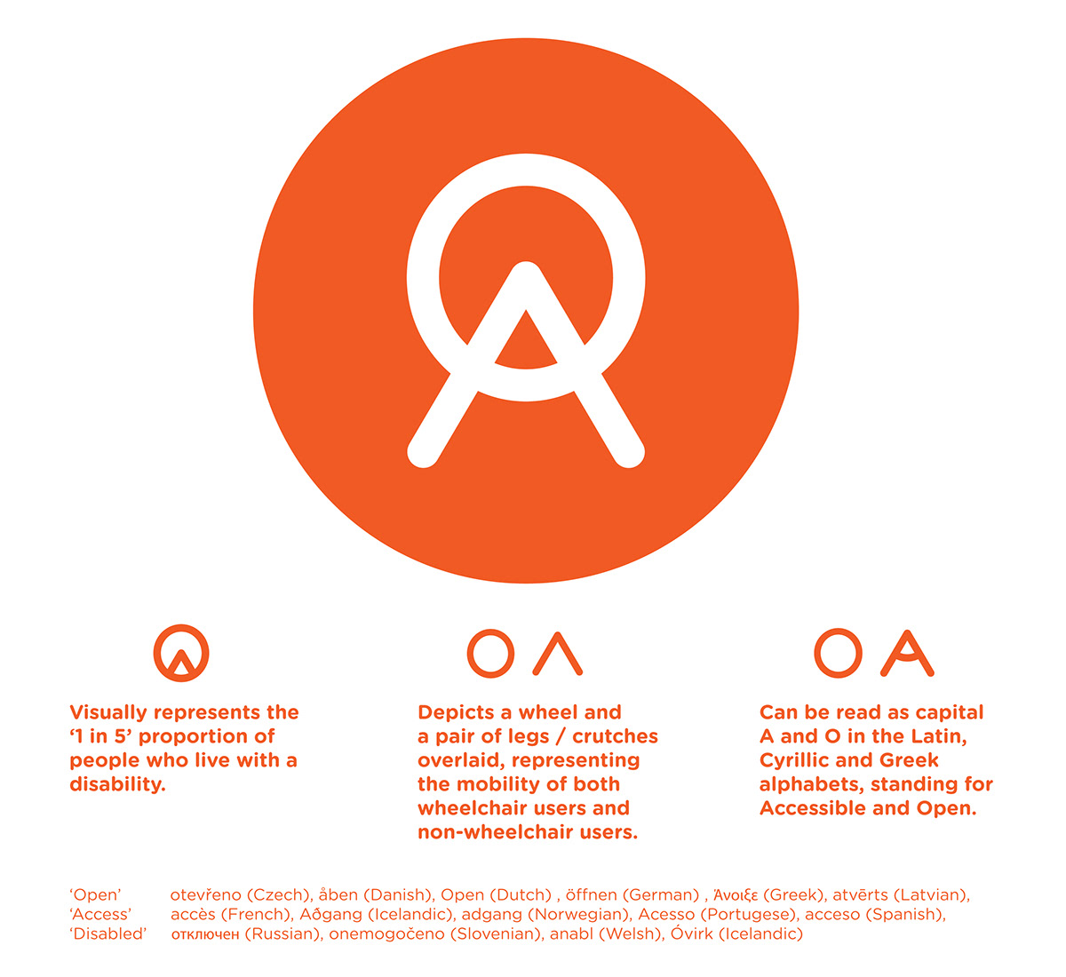
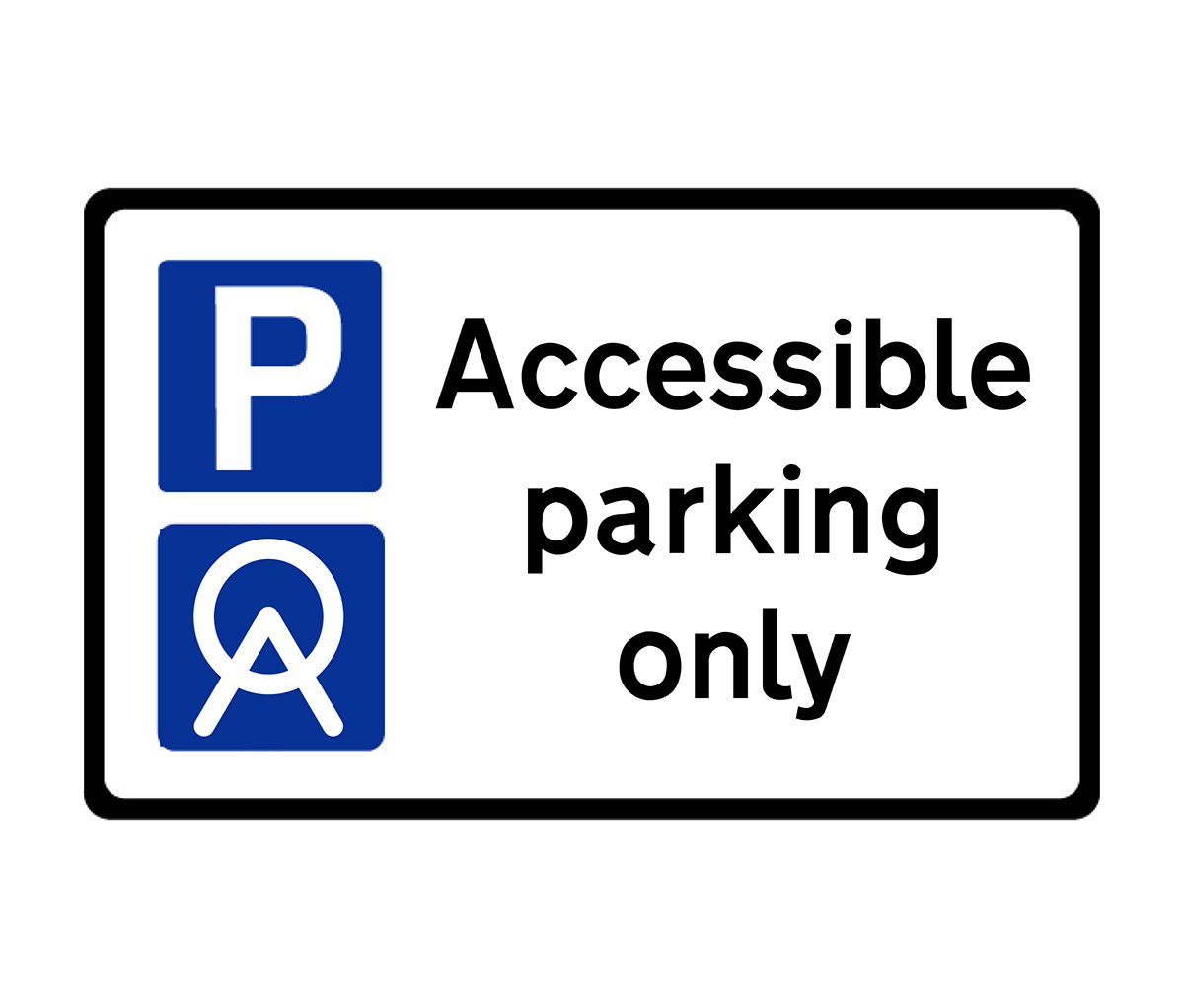
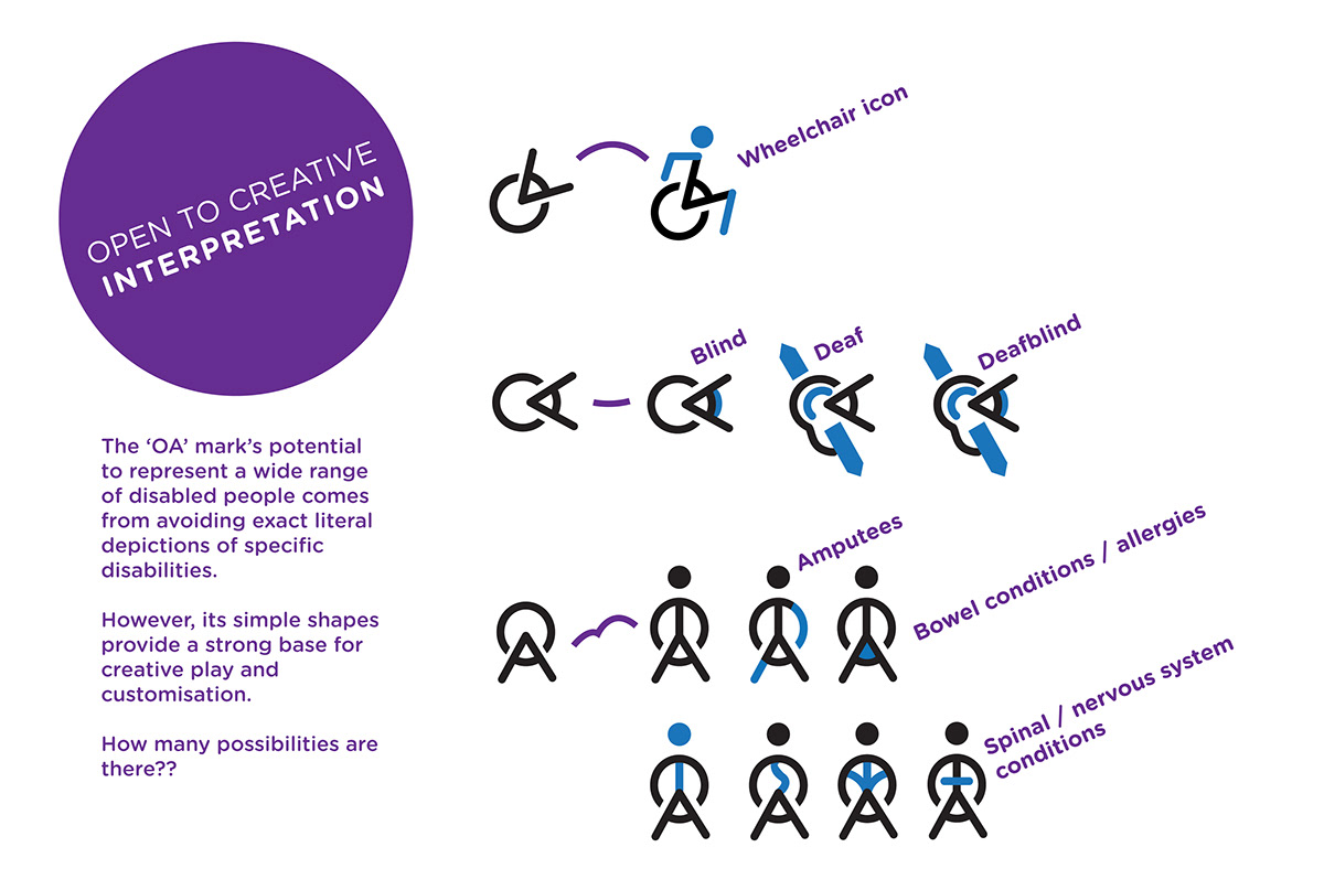
The figures on the left in the above image are icons created by Visability 93 that highlight particular invisible disabilities within this 93% (download as a font here). However, they themselves acknowledge that these icons are less suitable for practical applications where a single, standardised mark would be required. A new International Symbol of Access (ISA) would have to represent something more general - something that could unify the diverse range of people living with disabilities and still be simple enough to apply in the real world. The 'OA' symbol is an attempt to meet these requirements.
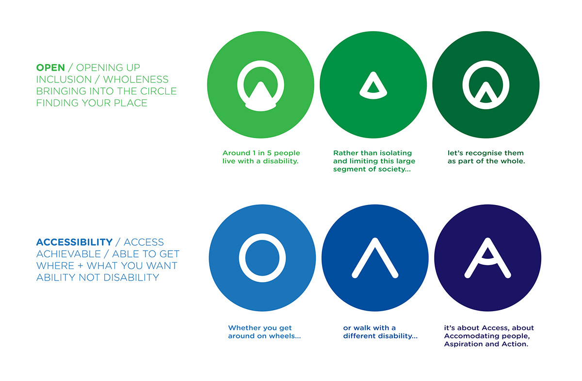
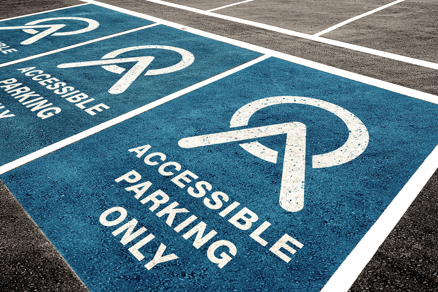
The 'Open Accessibility' symbol below combines the traditional sense of mobility and physical access with the idea of wider inclusivity and awareness of various disabilities.


What do you think?
Could a new International Symbol of Access help Open up Accessibility?
Could a new International Symbol of Access help Open up Accessibility?
If you think this symbol does its job well
and want to see it more widely used, then use it!
Share with friends, family, especially anyone who
doesn't feel like the current 'wheelchair symbol'
represents them.
Thank you for viewing this project and starting the conversation.
© Ciaran Saward 2019


