

This is my personal and unsolicited take on the Slack identity. Don't get me wrong, I obviously admire Pentagram and their rebranding, but I feel like something got lost along the way, especially if their goal was to simplify the brand identity, make it more flexible and cohesive (as Slack declared in the article presenting the new logo).
So, this is just my humble take on this: a case study based on the concept I posted on January on LinkedIn.
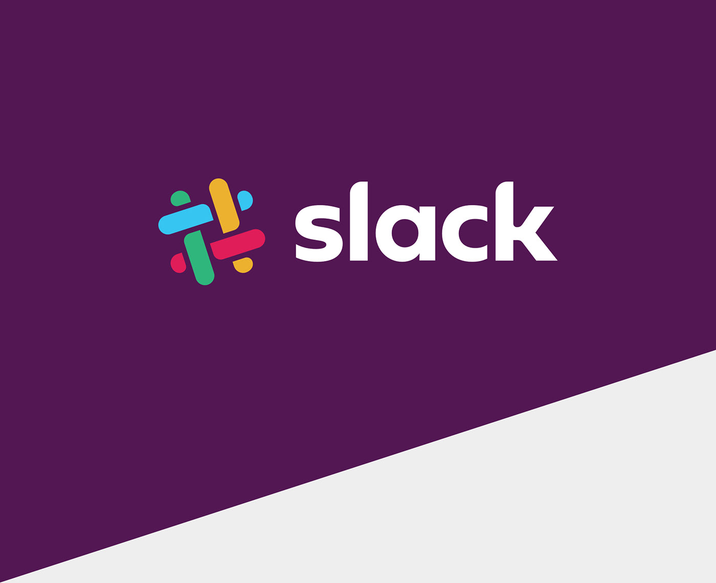
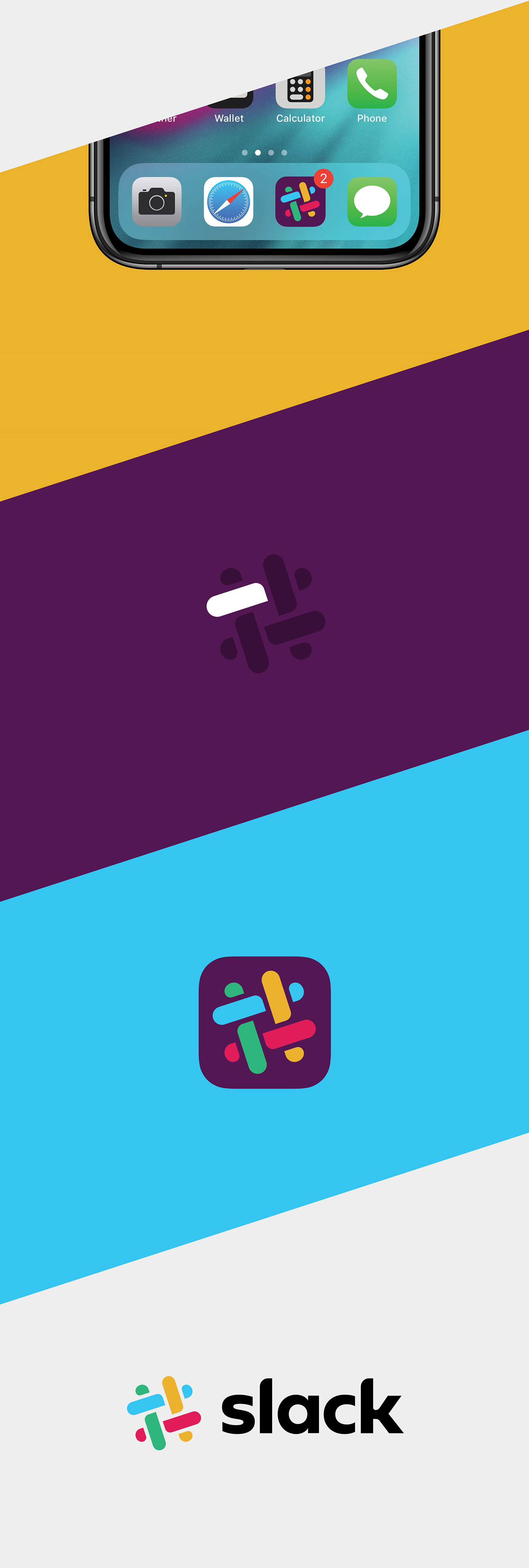
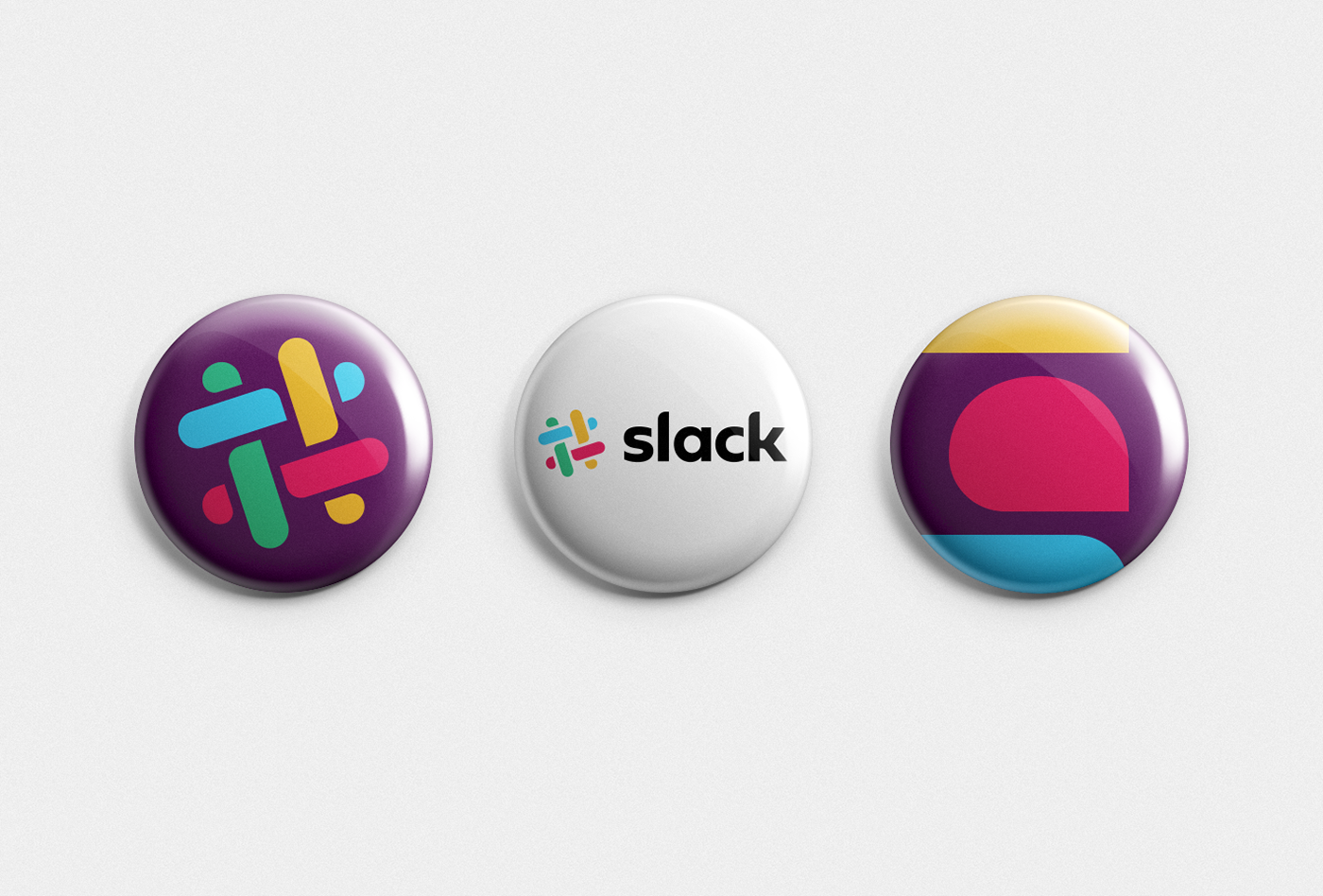
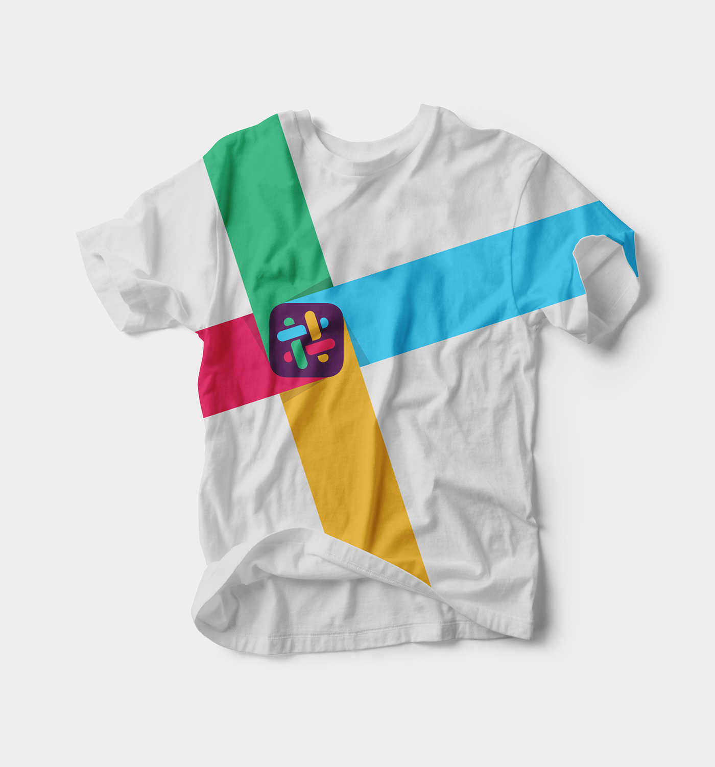
Just to play around, I came up with this concept: a simple solution, recognizable and deeply connected to the iconic hash mark that made Slack popular.
The customized logotype, based on the Geometrica typeface, reflects both the sharp and round edges of the brand new hash mark, convening both the app's approachable and performance-oriented values.


BRIEFING
According to what Slack says, the brand needed a more simple, cohesive and versatile logo: something that didn't use 11 different colors and an array of variations to be used in different contexts.
SOLUTION
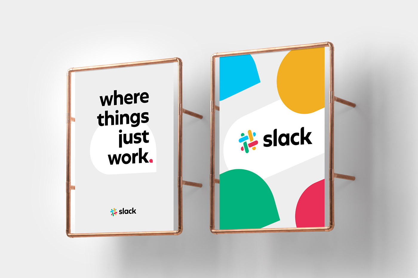
A brand new logo, yet immediately recognizable when compared to the previous version. A fresh solution hinged on 4 colors, the hash mark, the original 18° rotation, and with the addition of the balloon elements to express the app's conversational purpose.


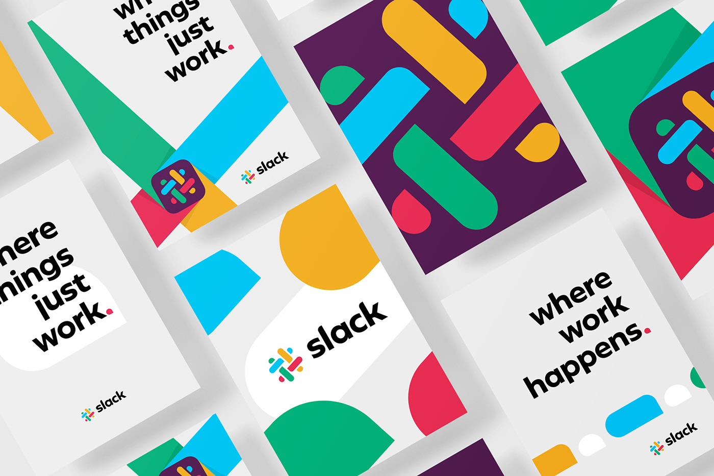
By emphasizing the iconic hash mark, the conversational icons and the historical symbol rotation, the identity expresses the brand playful spirit and fresh approach.


What do you think of this?
Thank you for watching!


