

BY CHOCOLATE
바이초콜릿
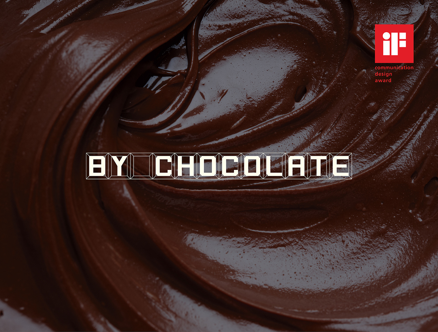
'BY CHOCOLATE CAFE'는 30여 가지의 수제 초콜릿과 초콜릿 음료, 그외 여러가지 디저트를 맛볼 수 있는 카페이다. 카페를 찾는 고객들은 달콤한 수제 초콜릿을 눈으로 보고 먹으며 기존 카페에서 느낄 수 없는 다양한 감성을 초콜릿으로부터 느낄 수 있다는 의미를 담고있다. 클라이언트의 요구사항은 100% 수제 초코렛을 만들어파는 '초콜릿 카페'라는 것을 평범한 일반인들도 쉽고 직관적으로 알아 볼 수 있는 디자인을 원했다. 그래서 우리는 전반적인 워드마크, 간판디자인, 인테리어디자인, 그래픽패턴까지 초코릿이 가지고 있는 특징을 최대한 살려 판매하고 있는 초콜릿 블럭의 형태를 모티브로 만들고 초콜릿의 재료인 카카오의 브라운 색상을 강조하여 브랜드 디자인을 만들었다. 워드마크는 초코릿 블럭이 가진 사각 형태안에 비율을 맞춰 디자인을 하였고, 간판디자인도 초콜릿 블럭의 형태를 살려 지나가는 사람이 밖에서 카페를 보았을 때 초콜릿 카페라는 것을 쉽게 알 수 있도록 디자인 하였다. 내부 인테리어는 입구 천장에 부터 초콜릿 블럭의 형태를 만들어 고객들에게 바이 초콜릿의 브랜드 컨셉 경험을 느낄 수 있도록 직관적으로 디자인 하고자 하였다. 명함, 패키지 디자인 등 각종 어플리케이션 디자인 또한 초콜릿 블럭의 패턴을 활용해 컨셉을 더욱 부각시키고자 하였다.
At BY CHOCOLATE CAFE, you can enjoy about thirty hand-made chocolates, chocolate beverages and various desserts. For the 'chocolate cafe' where makes and sells 100% hand-made chocolates, the client wanted the design that normal people can see easily and intuitively. Therefore, we developed the word mark, sign board design, interior design and graphic pattern with the motif of the chocolate block to express characteristics of chocolate as much as possible, and created the brand design that emphasizes the brown color of cacao used to make chocolate. The word mark was designed in consideration of the proportion of the square shape of the chocolate block, and the sign board was also designed to make people perceive the chocolate cafe easily, by stressing the shape of the chocolate block. The internal interior was intuitively designed so customers can feel the brand concept of BY CHOCOLATE, using the shape of the chocolate block in the ceiling of the entrance. In addition, designs of various applications including name card and package emphasizes the concept more using the patterns of the chocolate block.


IDEA DO IT


