Winotéka
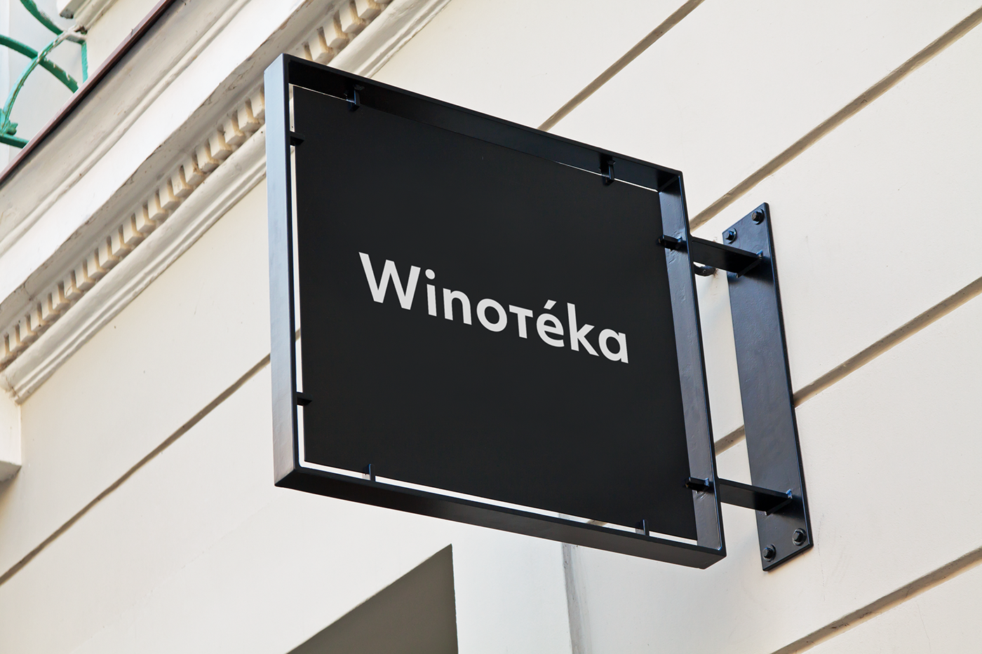
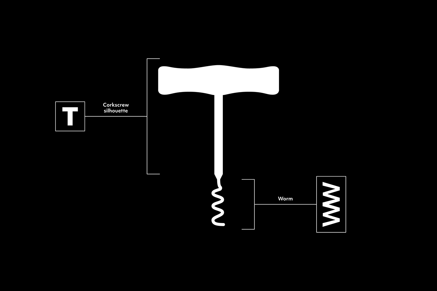
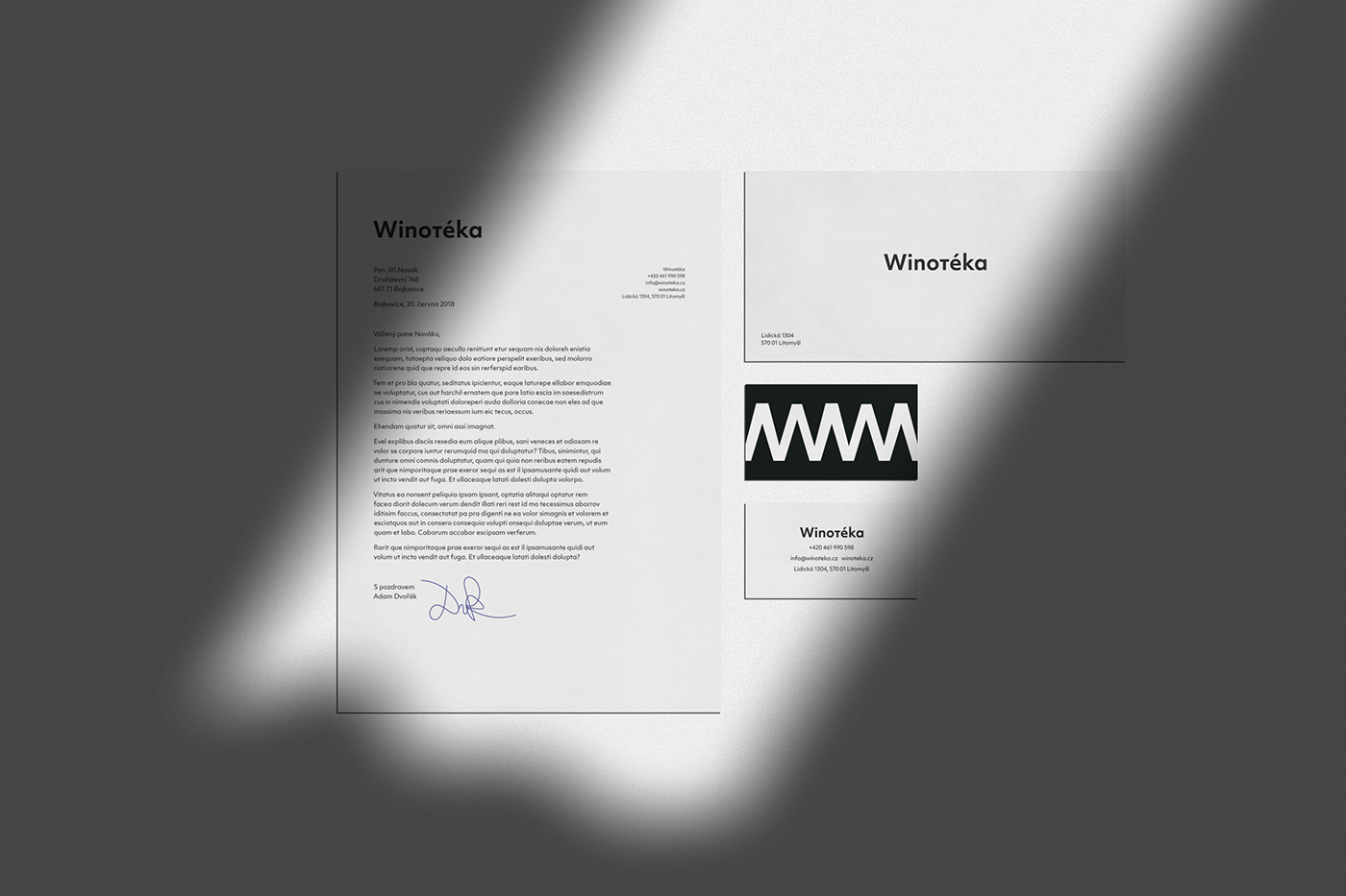
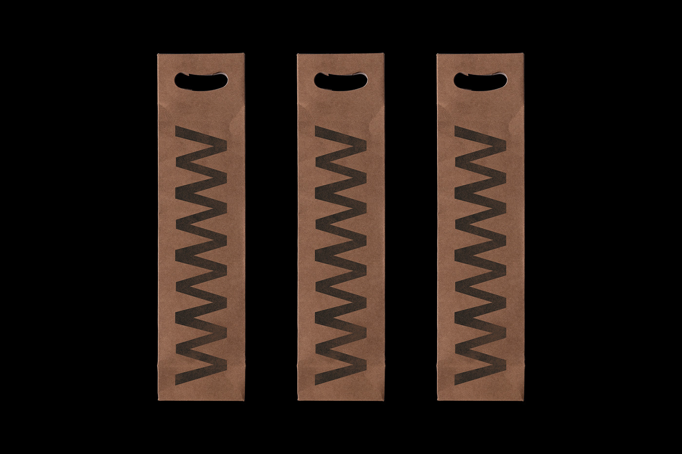
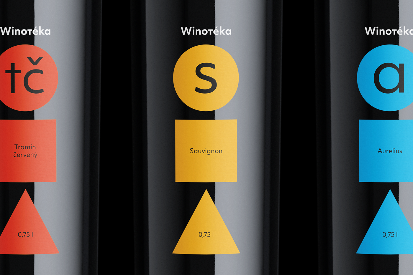
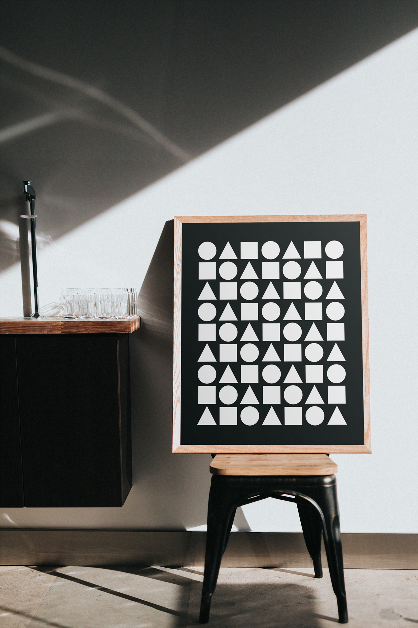
Winotéka je fiktivní vinotéka umístěná v České republice. Čistě typografické logo je ozvláštněno minuskou „t“ vycházející ze siluety vývrtky. Láhve disponují geometrickým designem oproštěným od typických „vínových“ klišé – renesanční antikvy, ozdobného písma a ilustrací vinné révy. Zbytek vizuální identity je pak vyveden velmi minimalisticky a doplňuje tak výrazné a barevné láhve. Vzorek využívaný v rámci nové vizuální identity vychází z verzálky „W“ a má opět kořeny ve vývrtce – symbolizuje totiž „červa“, klíčovou součást nástroje samotného.
Winotéka is a fictional wine shop located in the Czech Republic. The purely typographic logo highlights the silhouette of a corkscrew in its lowercase letter “t”. The bottles have a geometric design free from the typical “wine” clichés – renaissance serif typeface, decorative typeface and illustrations of grapevine. The rest of the visual identity is then done very minimalistic and complements the bold and colorful bottles. The pattern used in the new visual identity is based on the capital letter “W” and the pattern has also its roots in the corkscrew – symbolizing the “worm”, a key part of the tool itself.