Branding, art direction & website for Maz carpentry.
Maz was the second generation of a family business (premium- by its service and quality materials) with a poor and old logotype. Because of that the company had difficulties to contact with its real target: architects, interior designers and premium construction companies.
Our aim was to change its image into a quality and contemporary brand through:
– Its claim: changing "carpentry" for "contemporary carpentry" for corporate issues and "dresssing spaces" for commercial ones.
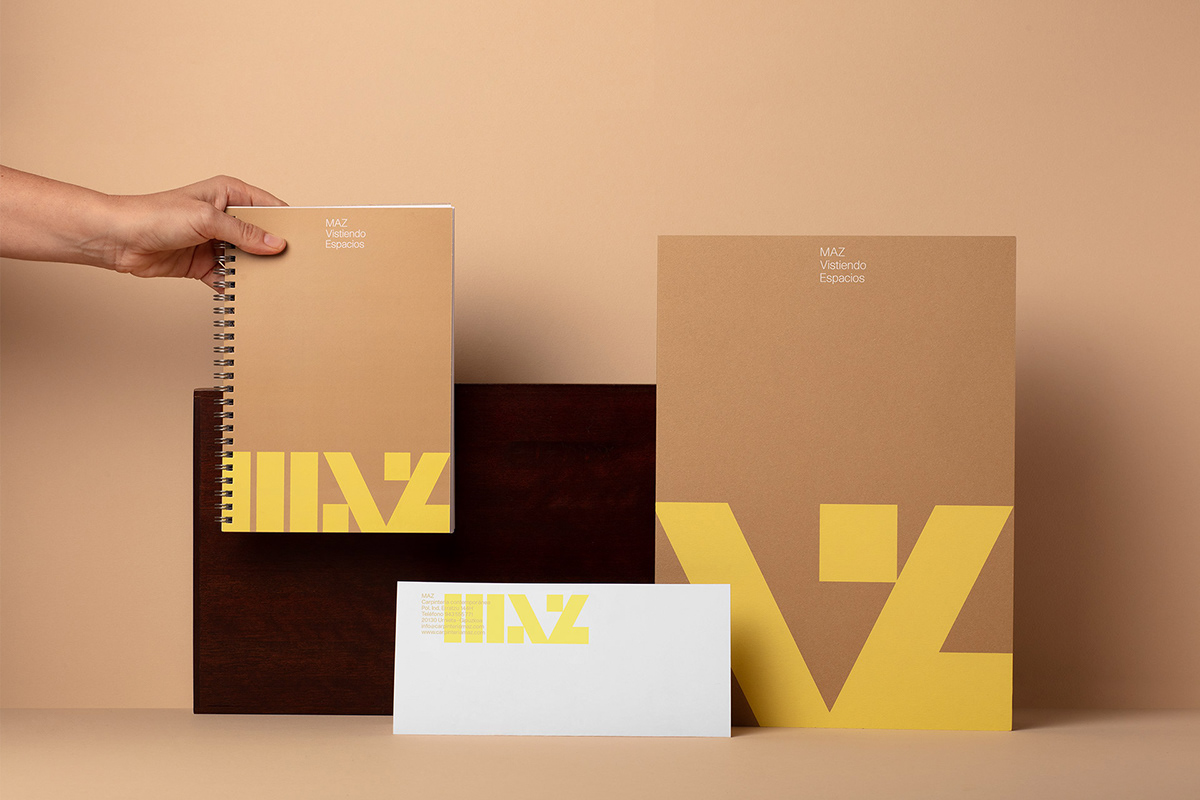
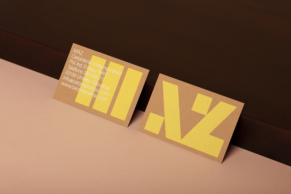
– A new graphic logotype based on two colours: a powerful one - yellow- plus a neutral one (related to traditional carpentry uniforms)
– Graphic business cards and folders etc
– High quality papers & printing process: screen printing for its folders and business cards...
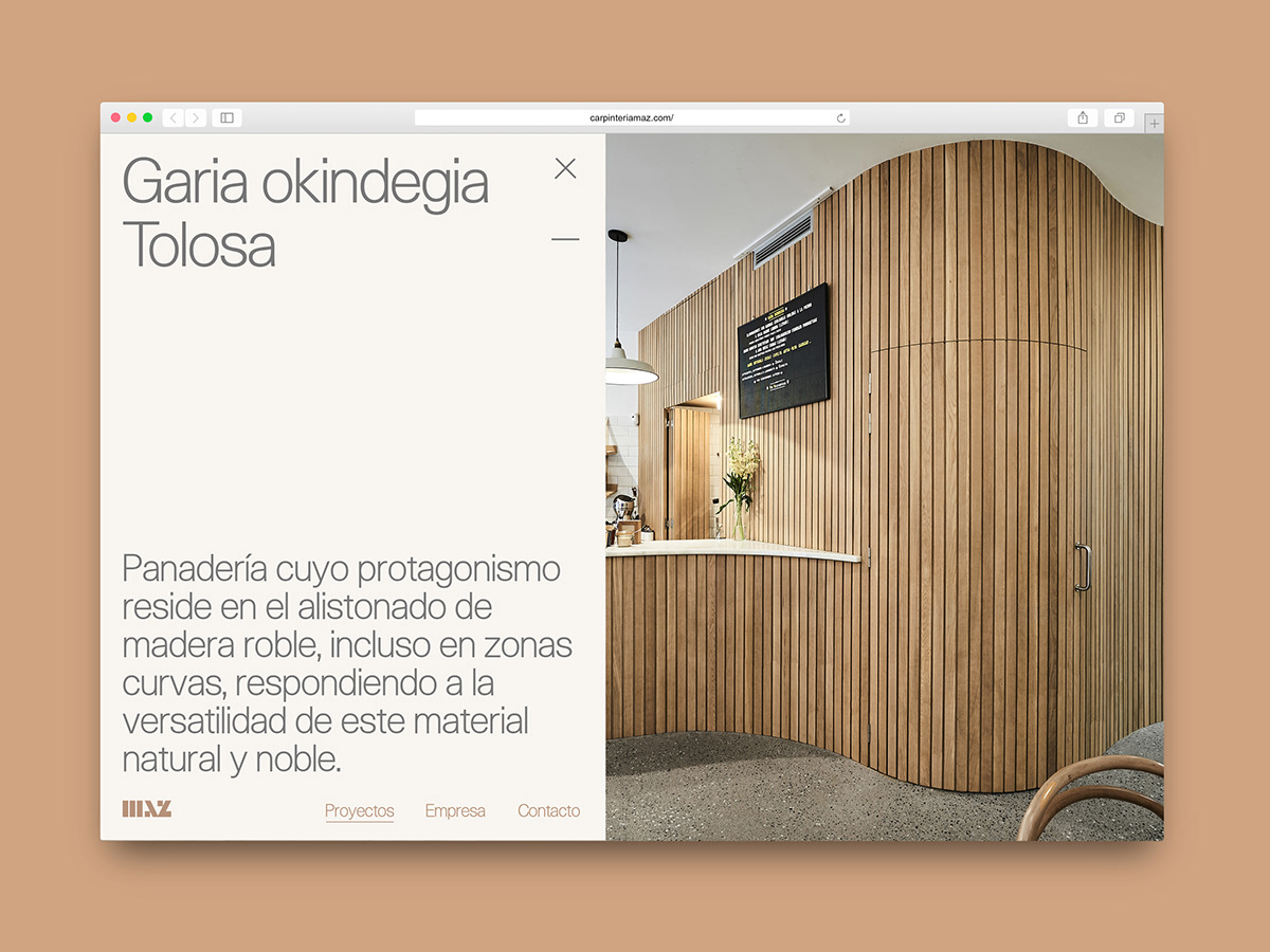
– Very visual website, with similar language to architects and interior designers websites
Client: Maz Carpentry
Art direction: Griselda Martí
Design: Pablo Ávila & Griselda Martí
Claim 1: Nom–Nam
Claim 2: Andrea Casas
Photography: Jorge Vidal


Thanks!
Follow us on Instagram


