
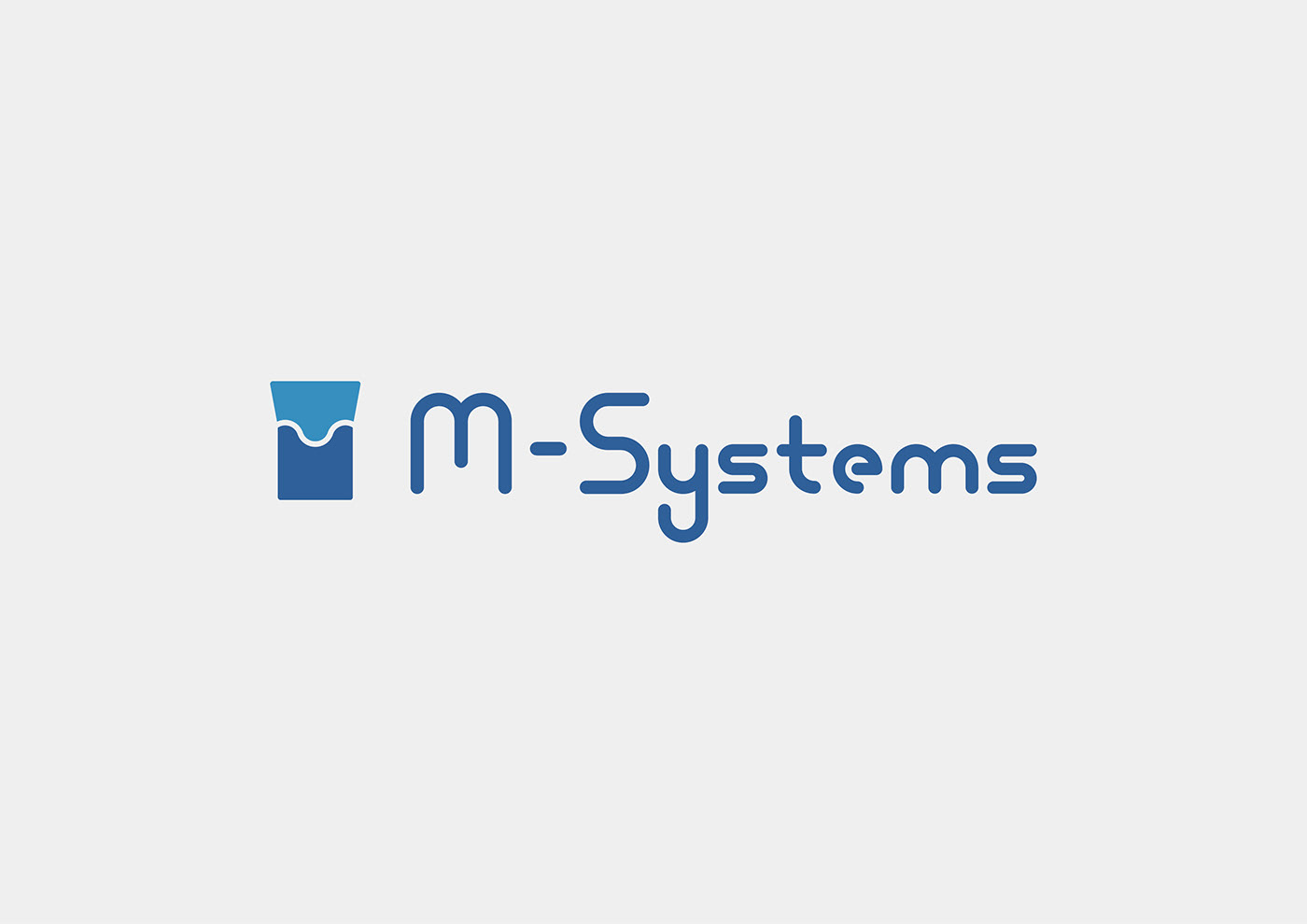
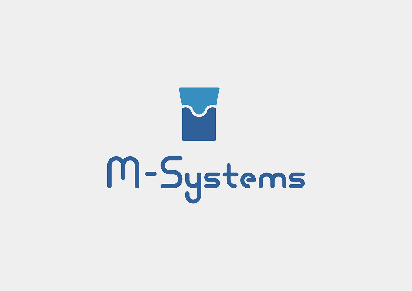
兵庫県加古川市にありますシステム業務をメインに事業を展開されている、M-Systems様のロゴデザインをお手伝いさせていただきました。
ロゴヒアリングシートにご記入いただき、打ち合わせで、方向性やイメージを擦り合わせ、ご確認いただきました。
ロゴヒアリングシートにご記入いただき、打ち合わせで、方向性やイメージを擦り合わせ、ご確認いただきました。
【コンセプト】
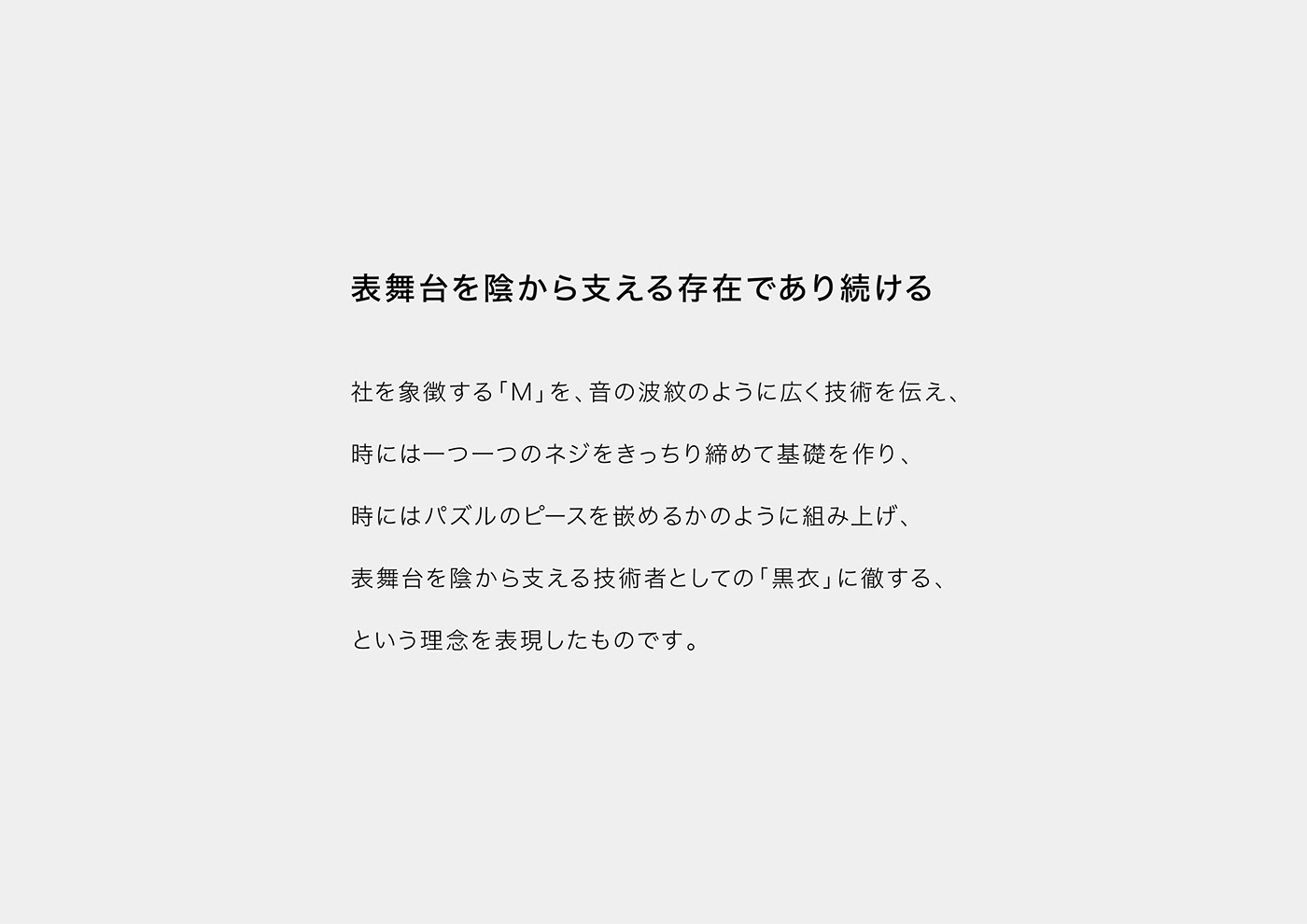
表舞台を陰から支える存在であり続ける
社を象徴する「M」を、音の波紋のように広く技術を伝え、
時には一つ一つのネジをきっちり締めて基礎を作り、
時にはパズルのピースを嵌めるかのように組み上げ、
表舞台を陰から支える技術者としての「黒衣」に徹する、
という理念を表現したものです。
時には一つ一つのネジをきっちり締めて基礎を作り、
時にはパズルのピースを嵌めるかのように組み上げ、
表舞台を陰から支える技術者としての「黒衣」に徹する、
という理念を表現したものです。
ㅤㅤㅤㅤㅤㅤㅤㅤㅤㅤㅤㅤㅤㅤ
We have helped M - Systems' logo design, which is in business in the system business in Hyogo prefecture Kakogawa city.
By filling in the logo hearing sheet, meeting, meeting the direction and image, we confirmed.
【concept】
Continue to be the presence supporting the front stage from behind the scenes
"M" symbolizing the company widely communicated technology like a ripple of sound,
Sometimes you tighten each screw tightly to make a foundation,
Sometimes it is assembled as if fitting a piece of a puzzle,
As a technician who supports the stage behind the scenes, he is committed to "black clothes"
It expresses the philosophy that.
Sometimes you tighten each screw tightly to make a foundation,
Sometimes it is assembled as if fitting a piece of a puzzle,
As a technician who supports the stage behind the scenes, he is committed to "black clothes"
It expresses the philosophy that.
※翻訳機能を使っています。
※ I am using the translation function.
※ I am using the translation function.


