POETIC CASES
Creating a brand led product language
Client: Poetic Inc Work: Product Strategy, Design studies, Industrial Design, 3D modelling, Visualisation Year: 2017-18
Decoding the DNA with a value driven approach
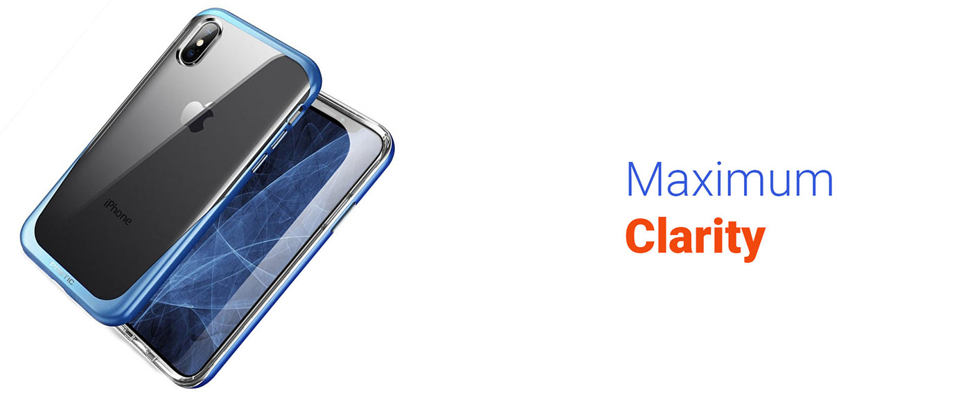
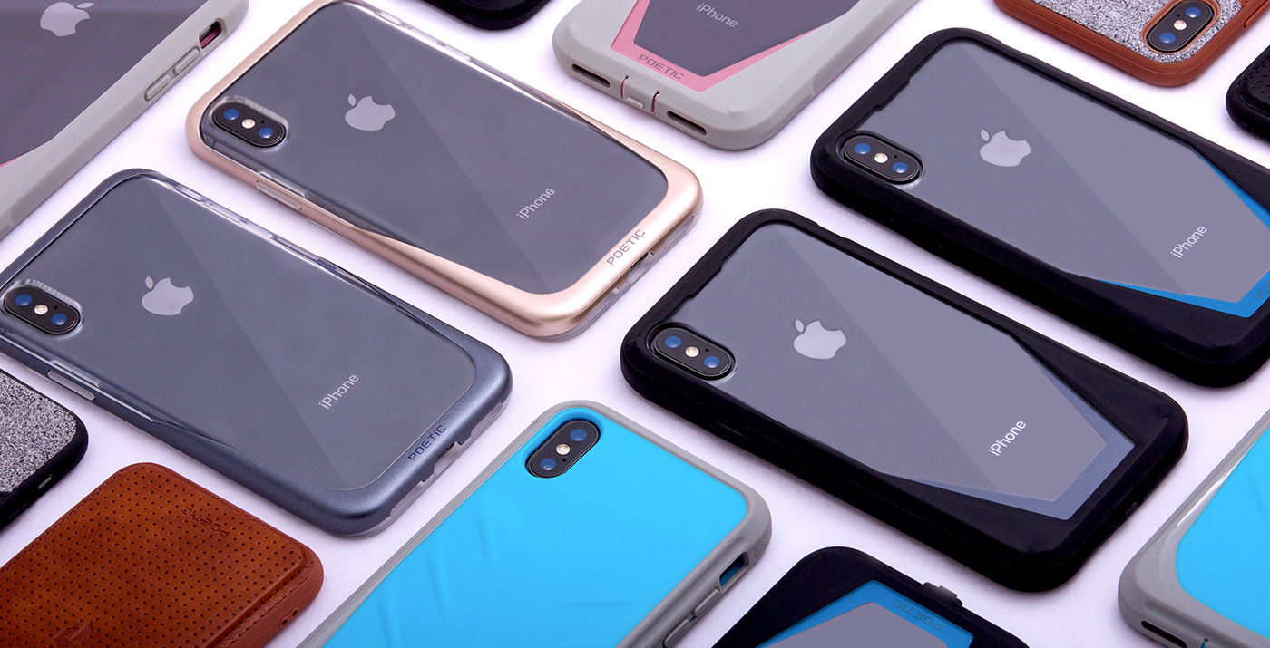
We had worked on plenty of cases for Poetic forming an aggressive, protective image for all of their offerings, but in early 2017 as we examined trends like protection, which had become more of a base requirement and the reduction of branding on the products were happening along with a need to highlight the device finishes. We identified that consumers liked to protect their devices but not necessarily showcase the brash perception of aggressive protection. This led to a new design philosophy of clear, tactile protection which was to show case as much of the device as possible without compromising on grip and protection, all done in a sophisticated essential manner. Similarly product features and the portfolio strategy were tweaked to create a new set of products which helped align to the next gen of consumers. The name Y-form was from the alignment of the three values that build up Poetic Case's new product language.


The Visual Identifiers


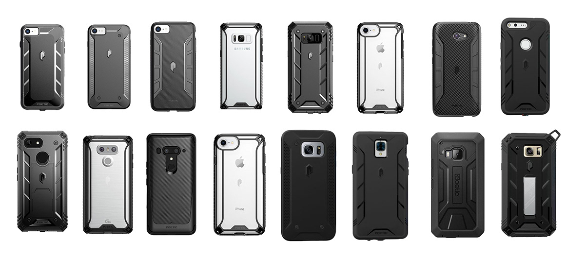
We were able to create a tool kit of physical identifiers using our unique understanding of Design systems and DNA and methodology where the consistency is maintained not only across product lines but across various device SKU's as well. Thus bringing about a 70% reduction in reliance on manufacturing engineers to create consistency. Successfully launching highly reviewed cases by Android Central and other online blogs and the attention to detail was evident.