Friendly Packaging For Seniors
A senior friendly brand/packaging intervention
Client: RPG Group Work: Brand Research, User insights, Brand DNA, Structural Packaging Design, Graphical packaging Design, Prototyping, Production Support | Year: 2019
The RPG Group approached Analogy with a challenge where one of its brands who were commercially doing well had hit a roadblock in terms of brand connection with its core demographics of senior citizens. We were tasked with uplifting the brand language in terms of packaging and communication design as well as to create a singular guideline and brand DNA that would hold them steadfast for the coming decade in terms of clarity, brand values and also user adherence.

The challenge was in terms of removing associations with trading and chinese goods vs a brand that believes in its values and ethos and stands proud in terms of its offerings. Also senior citizens were extremely distracted by various visual elements leading to confusion and drop in sales as well as retail mismatch.
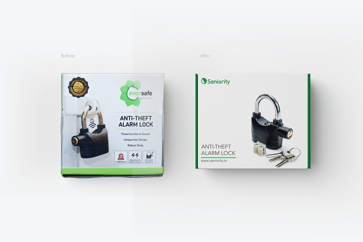

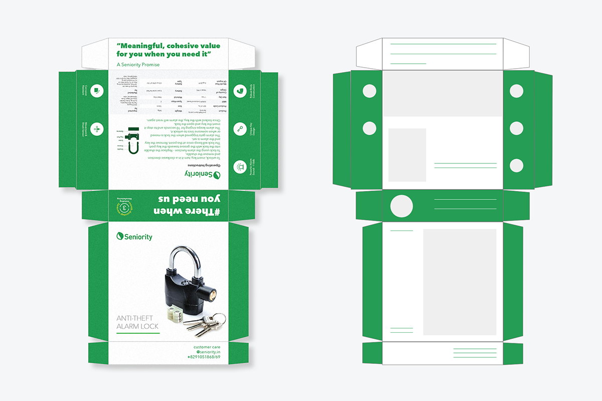

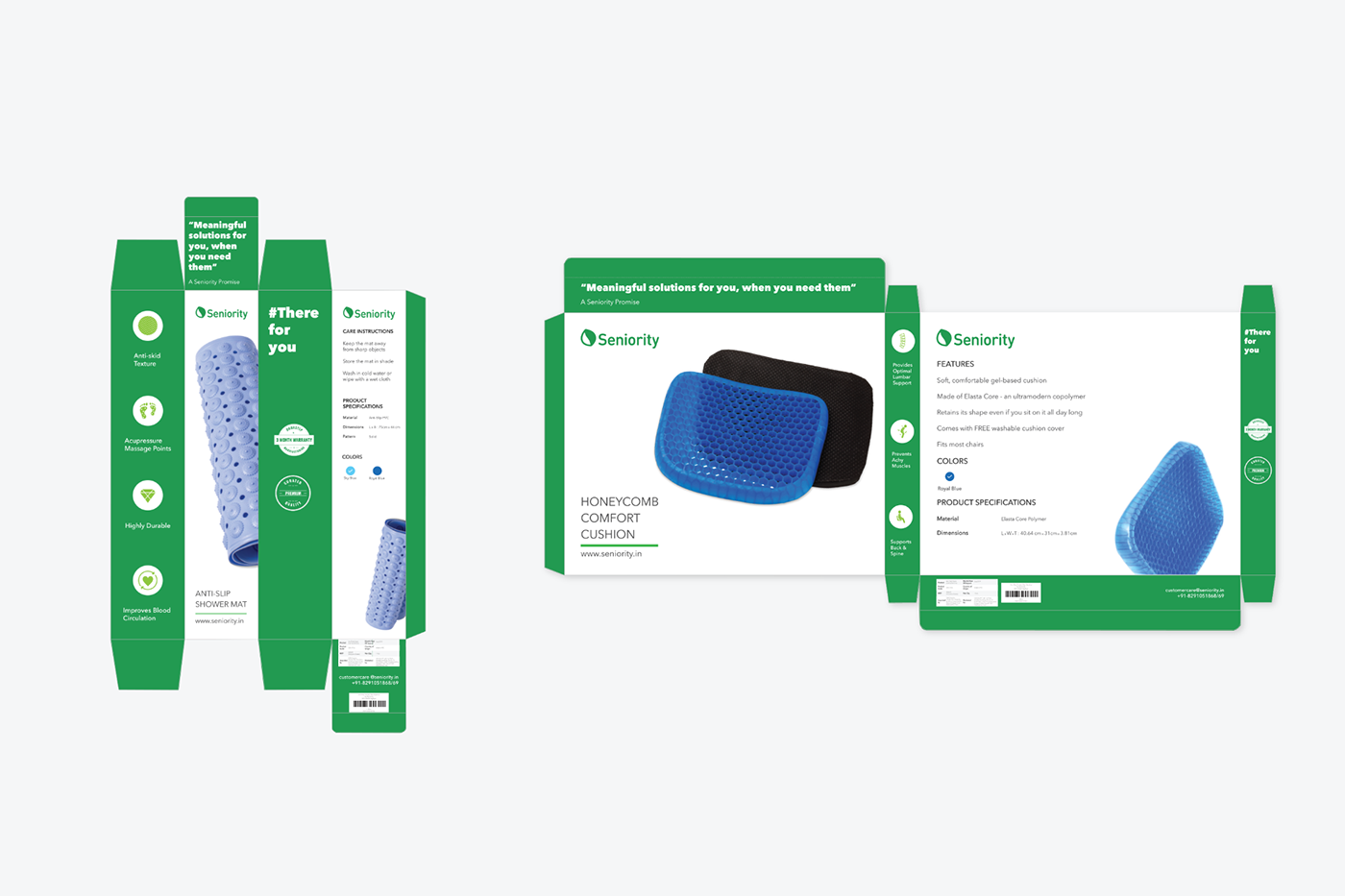
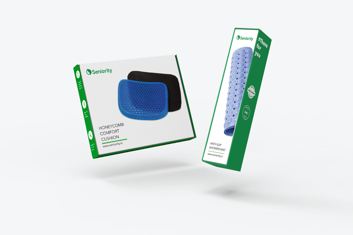
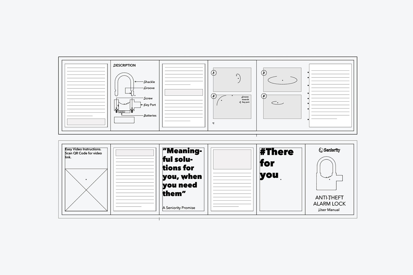
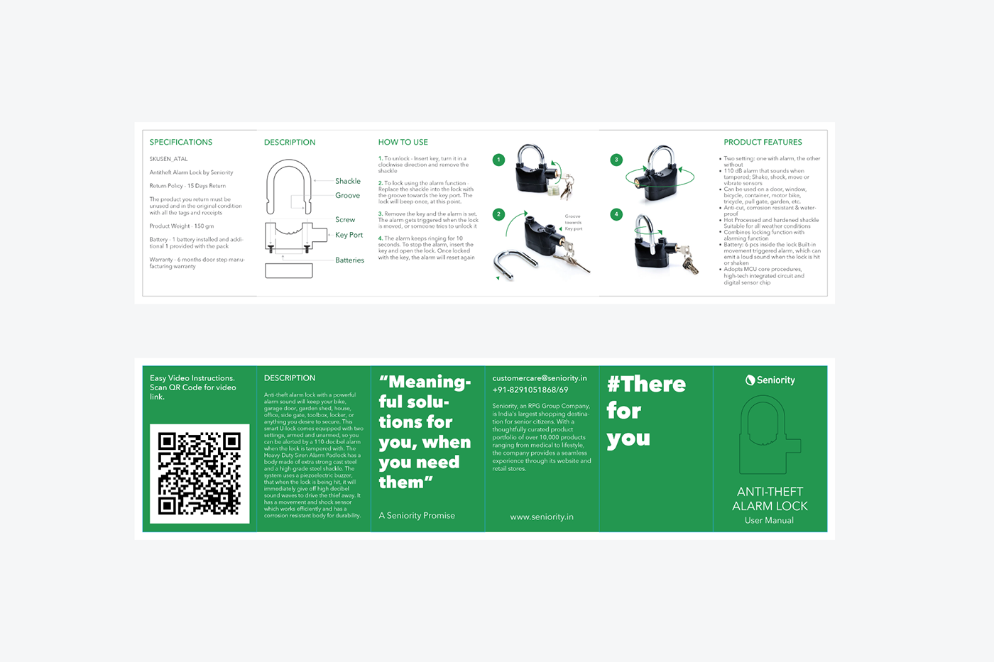
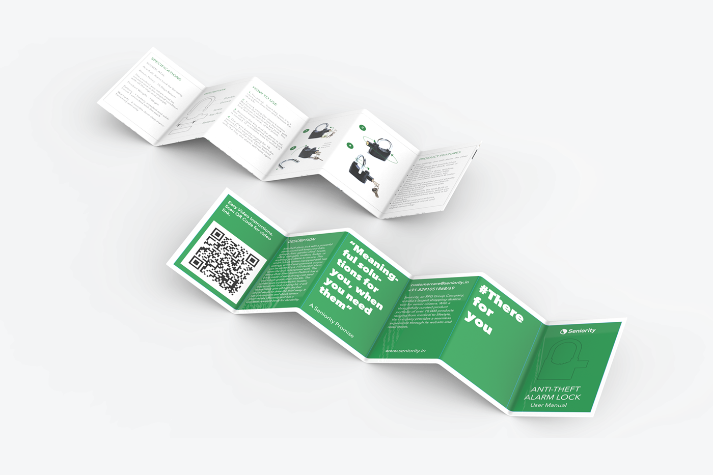
Creating repeatable and predictable wireframes to match the newly created Brand DNA was crucial and we had to ideate with type, imagery as well as small visual triggers, like badges and certification stickers for which a whole new visual language was designed including product photography.