


Not-a-Shop! (which forms part of the Düsseldorf-based Assembly Collective) is a concept store that connects the holy trinity of art, culture and fashion. This is not a shop for squares, it’s not a shop for genderphobes and it's definitely not a shop for boring people. The owners carefully curate their products to create a very niché collection of unique items that is not so easily-peasibly-available-to-anyone-and-everyone, as with your average shop.
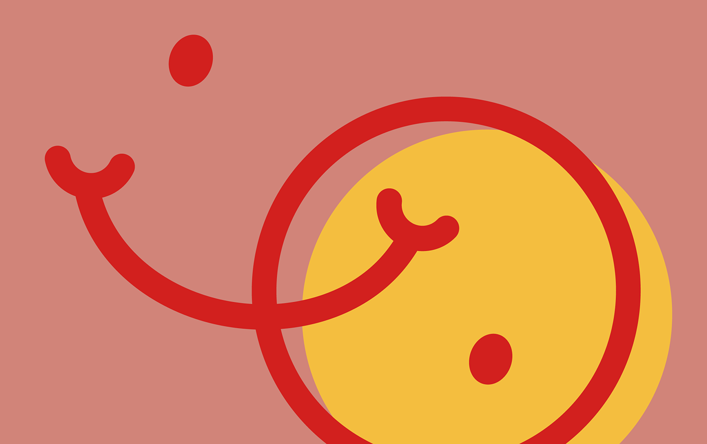
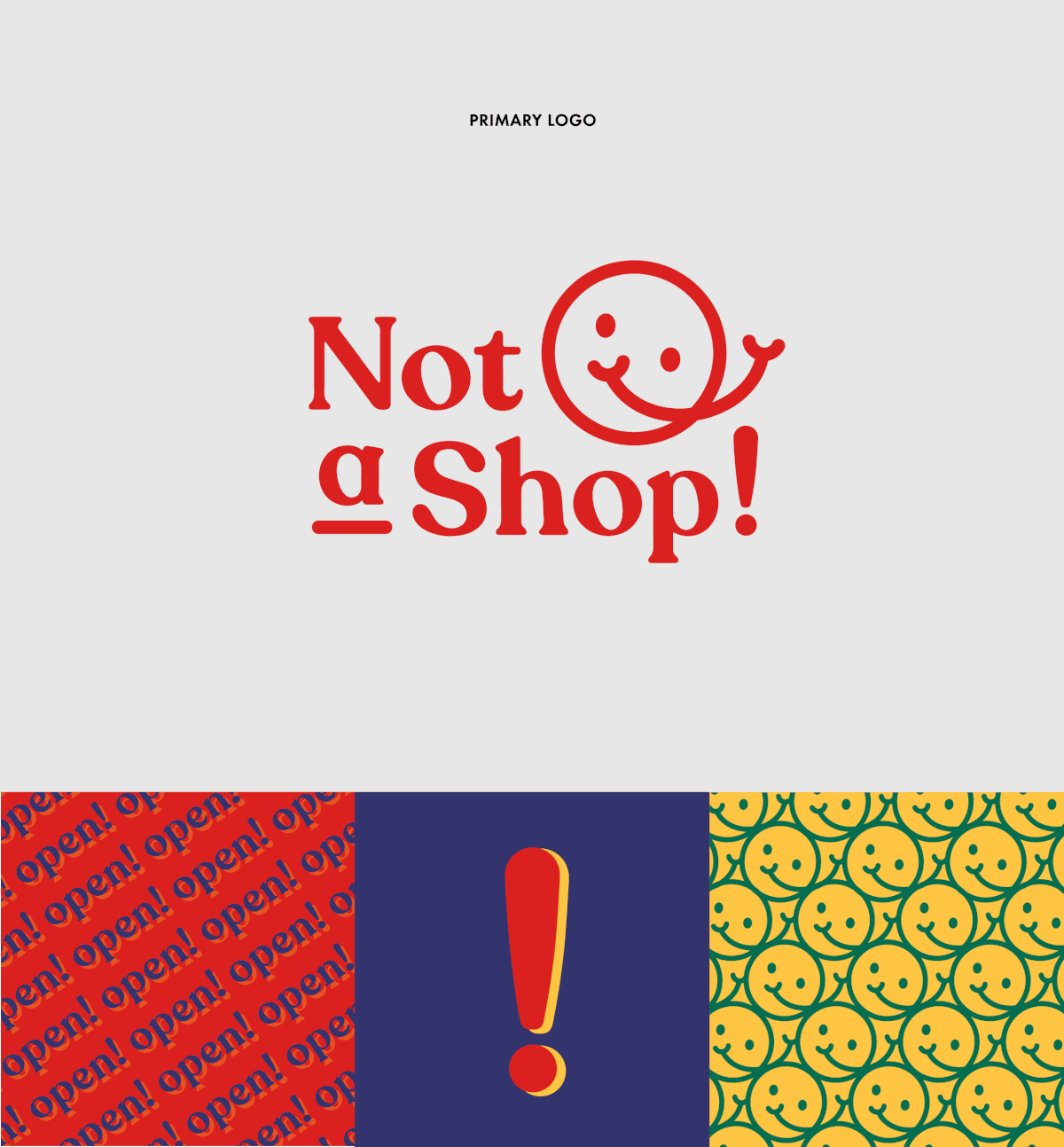
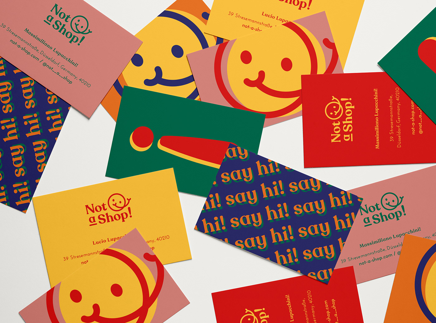
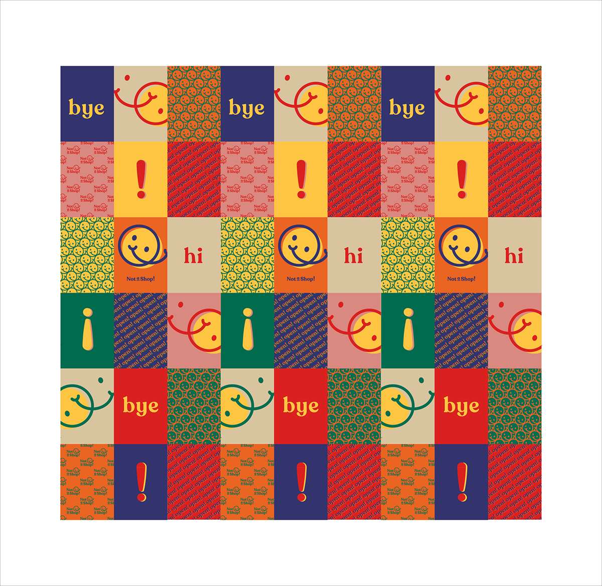
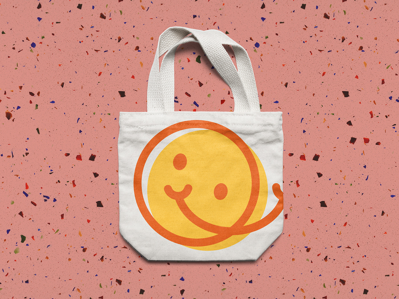
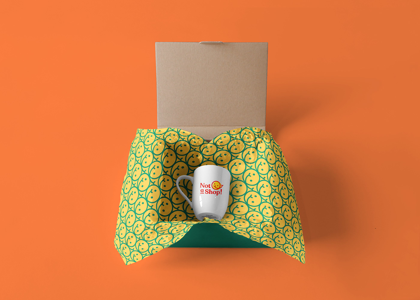
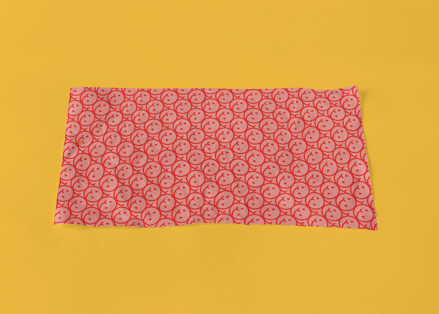
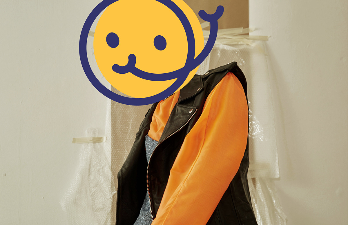
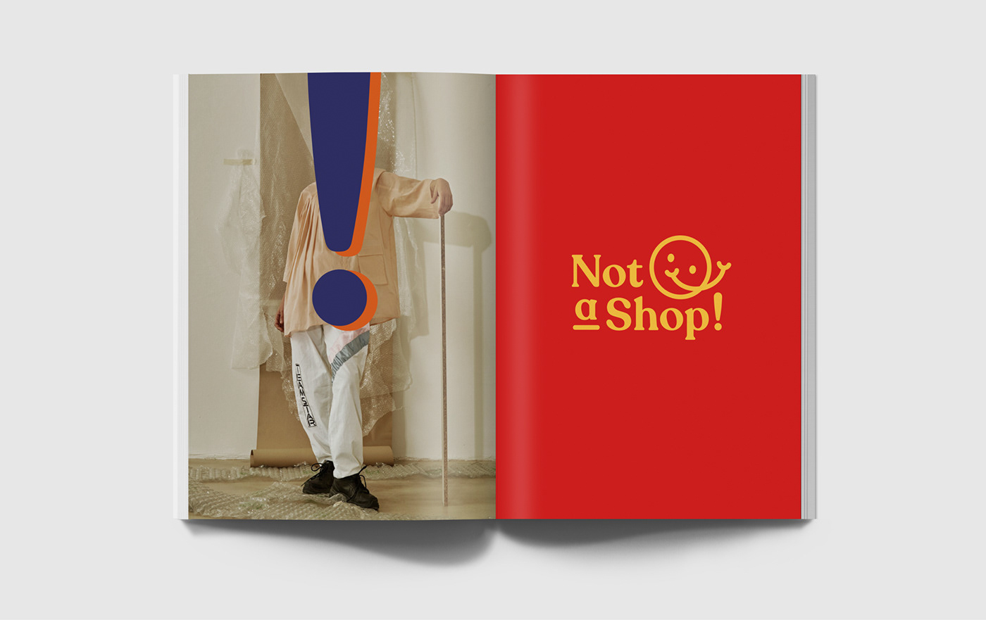
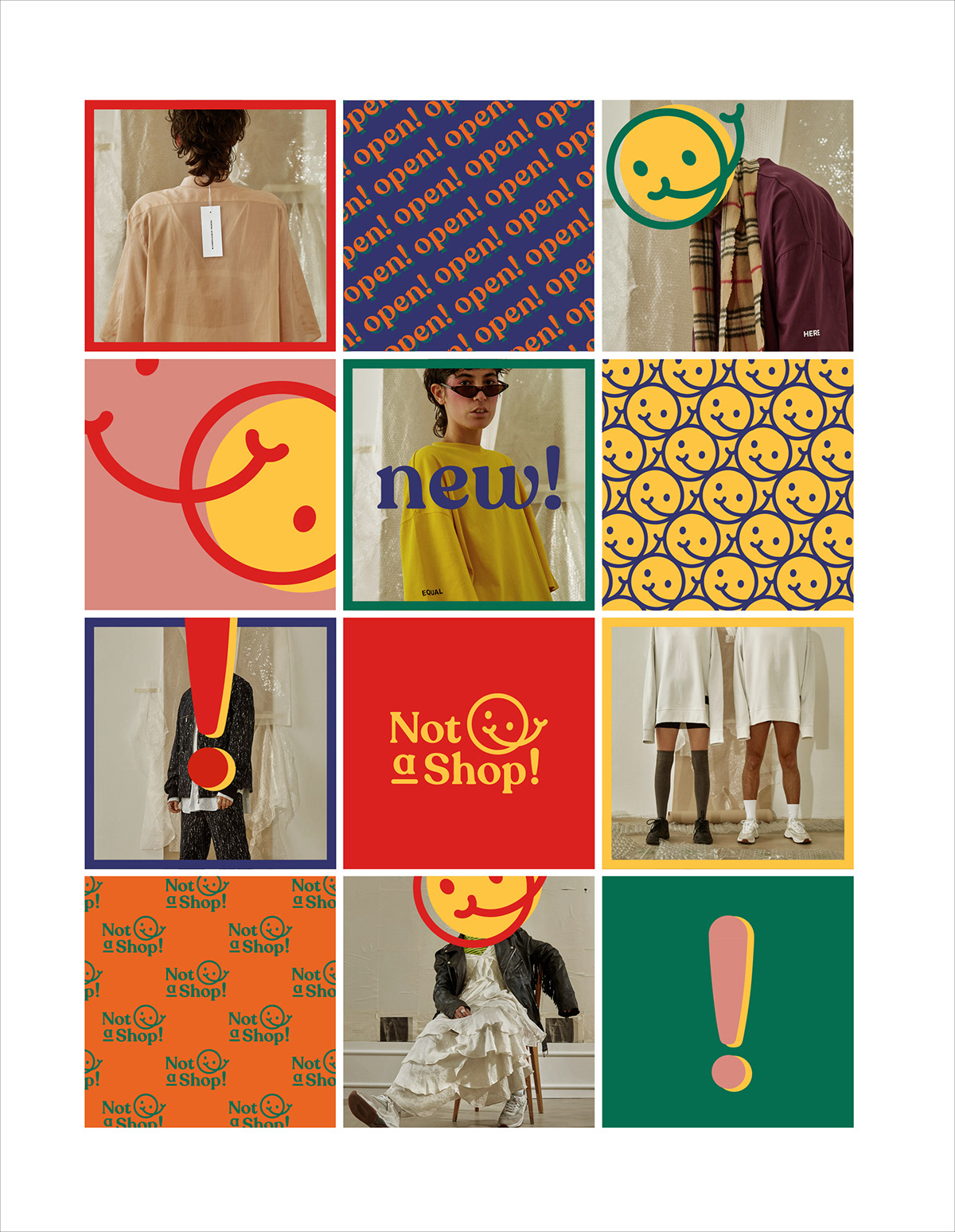
It’s-not-an-average-shop but essentially it’s a shop, right? The ambiguity of their name (and the fact that it’s kind of a blatant fib) resonates with the idea of early consumerism and advertising (which we all know was a blatant distortion of the truth). Never mind the 'little white lies', aesthetically it felt friendly, fun and personable (duh). Big, bold Typography, Vibrant Colours and a light sprinkling of uneasy smiles. We took this design essence as our inspiration and repackaged it in a modern and slightly off-beat manner. An identity that doesn’t take itself too seriously but has a definite sense of Confidence and Authority.
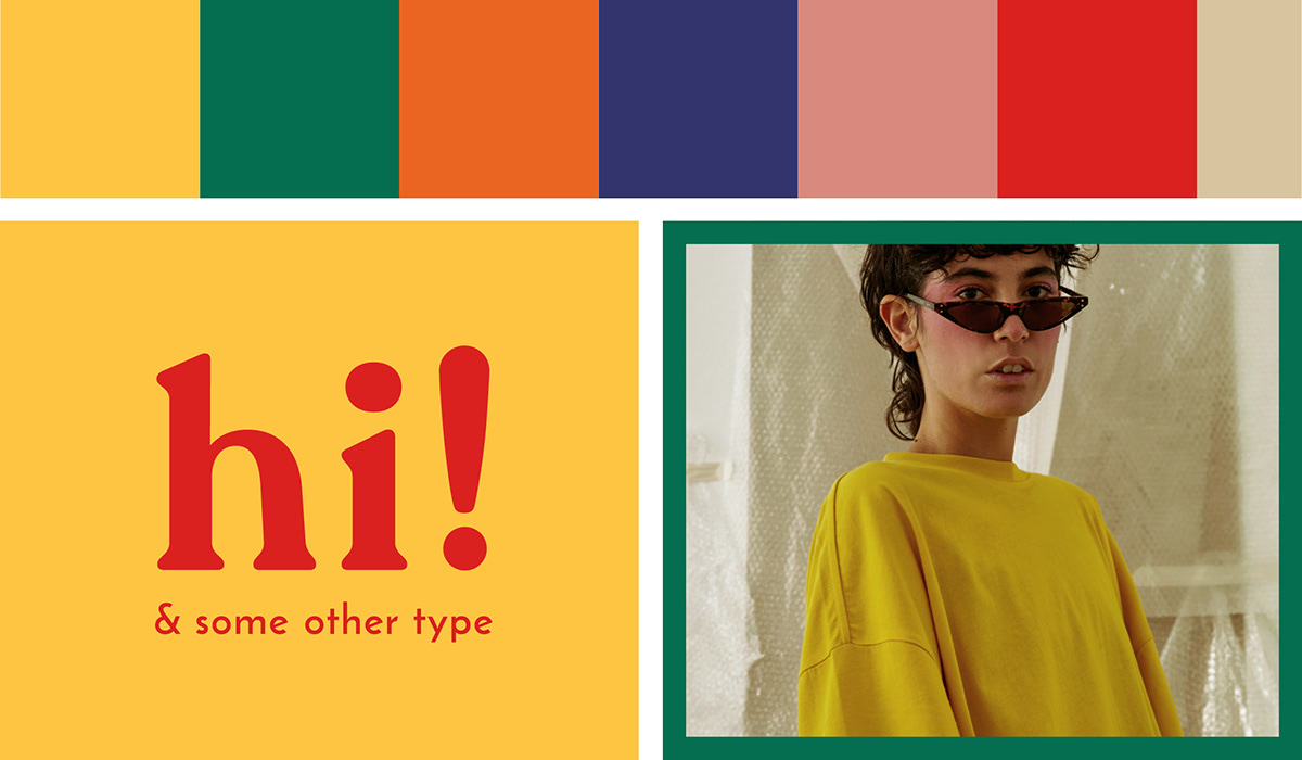
The Identity is made up of a contemporary, bright and contrasting Colour Palette which is combined with big, bold Typography and in-your-face, almost OTT, repetitive Graphic Elements. It's overpowering and definitely a bit too much - but that's exactly what we aimed for. And, the logo, well, hopefully it speaks for itself. (-;


Wallpapered Posters

Instagram Feed


Concept, Design & Execution: Blood, Sweat + Polony
Thank you for viewing, we appreciate it.


