
The goal of this project was to use typography/letter forms to create a series of compelling compositions that clearly illustrate each of the four gestalt grouping principles: similarity, proximity, continuance and closure. Gestalt (German for "whole" or "form") is a school of psychology that explains how humans respond to visual experiences. While being limited to a single typeface, Platelet, the challenge was to ensure that each composition clearly demonstrates asymmetrical balance while simultaneously illustrating each the grouping principles. To view my design process, click this link to be transferred to the project Dropmark page.

Similarity - Humans view figures with similar/same characteristics (shape, color, texture, etc) as belonging together in a group. This is illustrated here by use of color and size. The gray characters are different letters, but they are all the same color and size. The same is true for the black letters. The x's are the same character and are a different character and color than the rest of the letters.
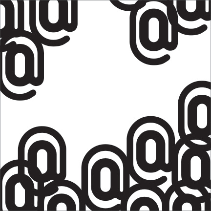
Proximity - similar/same figures, located close to each other are perceived as a group. The cluster of at symbols at the bottom is perceived as one group, while the single one at the top is its own group.
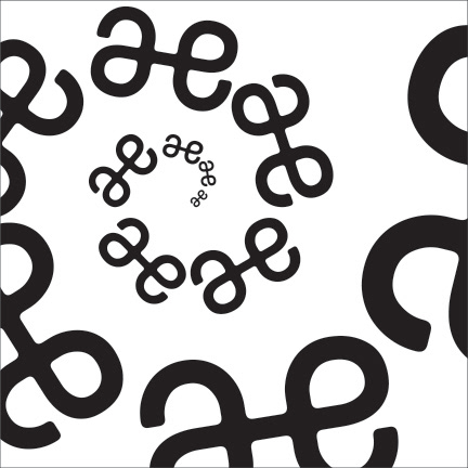
Continuity – figures arranged to imply a direction, leveraging our mind’s tendency to continue in a singular direction. The image above illustrates continuity in that the characters, while varying in size, are arranged in a way that causes them to be perceived as moving in a spiral pattern.

Closure - our mind’s tendency to close or complete incomplete figures or group. Here, I used the letter X to create closure.


