The objectives of our final project were to acquire an understanding of, and experience in, the process of thoroughly researching and exploring a visual concept prior to completion of the final image, to become aware of an underlying structure in all natural (and man-made) forms, to become familiar with the process of abstraction as a way of both analyzing form and expressing ideas, and to recognize and emphasize the design elements inherent in the subject matter through the processes of selective elimination and/or exaggeration.
The focus of this project abstracting and representing a plant or animal with contour lines and as developing textures that communicate the essence of our chosen form. The first task was to sketch line drawings of our chosen subject by hand, then expand and improve one of our sketches in Illustrator. Next, we found textures and color palettes that represent our animal and the essence we chose to convey. Last, we created mock-ups of a variety of products that feature our design.
Follow this link to see my design process and inspiration.

I chose a flamingo because I've always liked them. They're quirky and awkward, but at the same
time, they're beautiful and graceful. Here are my initial thumbnail sketches.
time, they're beautiful and graceful. Here are my initial thumbnail sketches.
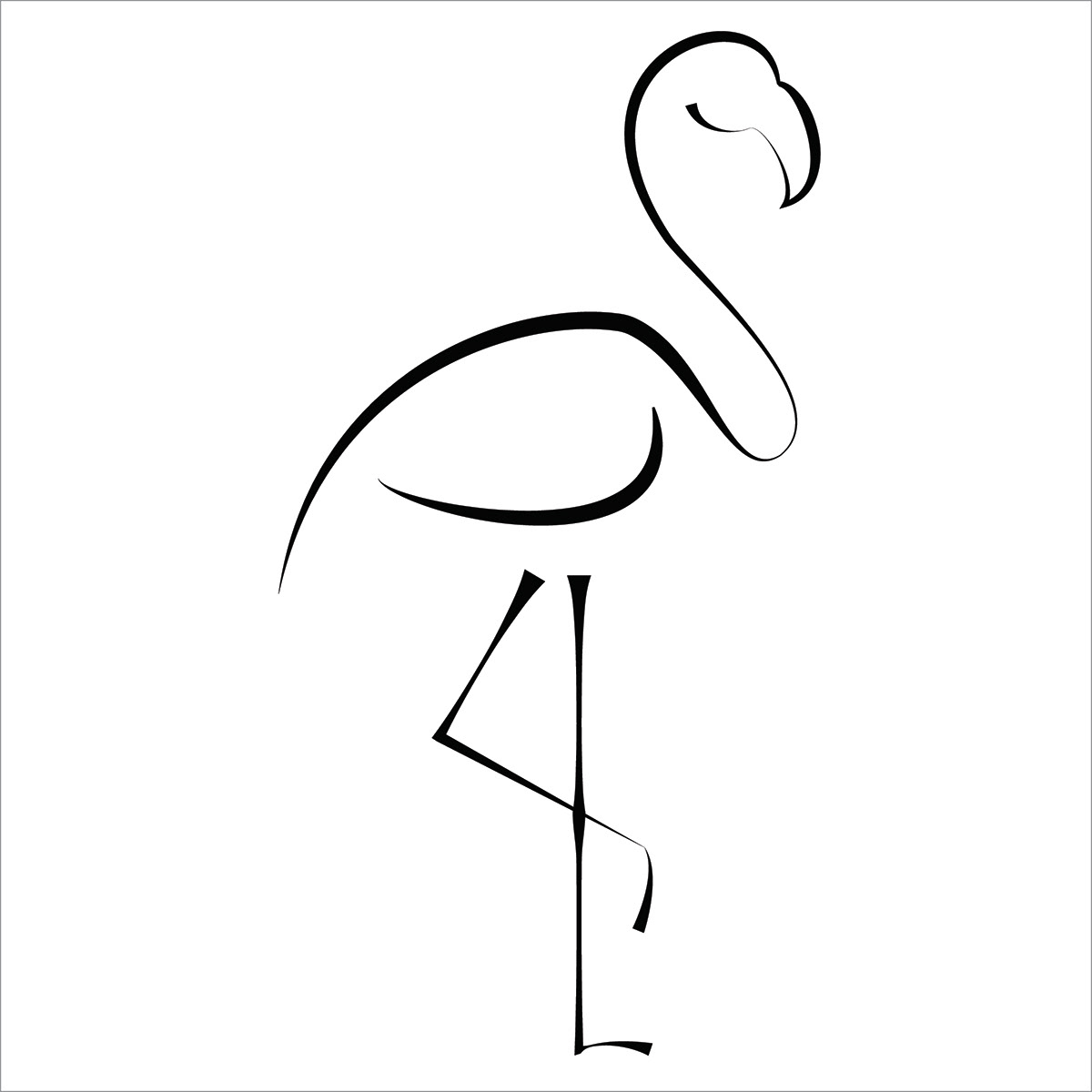
This is the contour line drawing I came up with in Illustrator. I used the pen tool to draw the flamingo, and then I used the width tool to adjust the width of each line. This helped me better communicate the elegance of the flamingo.
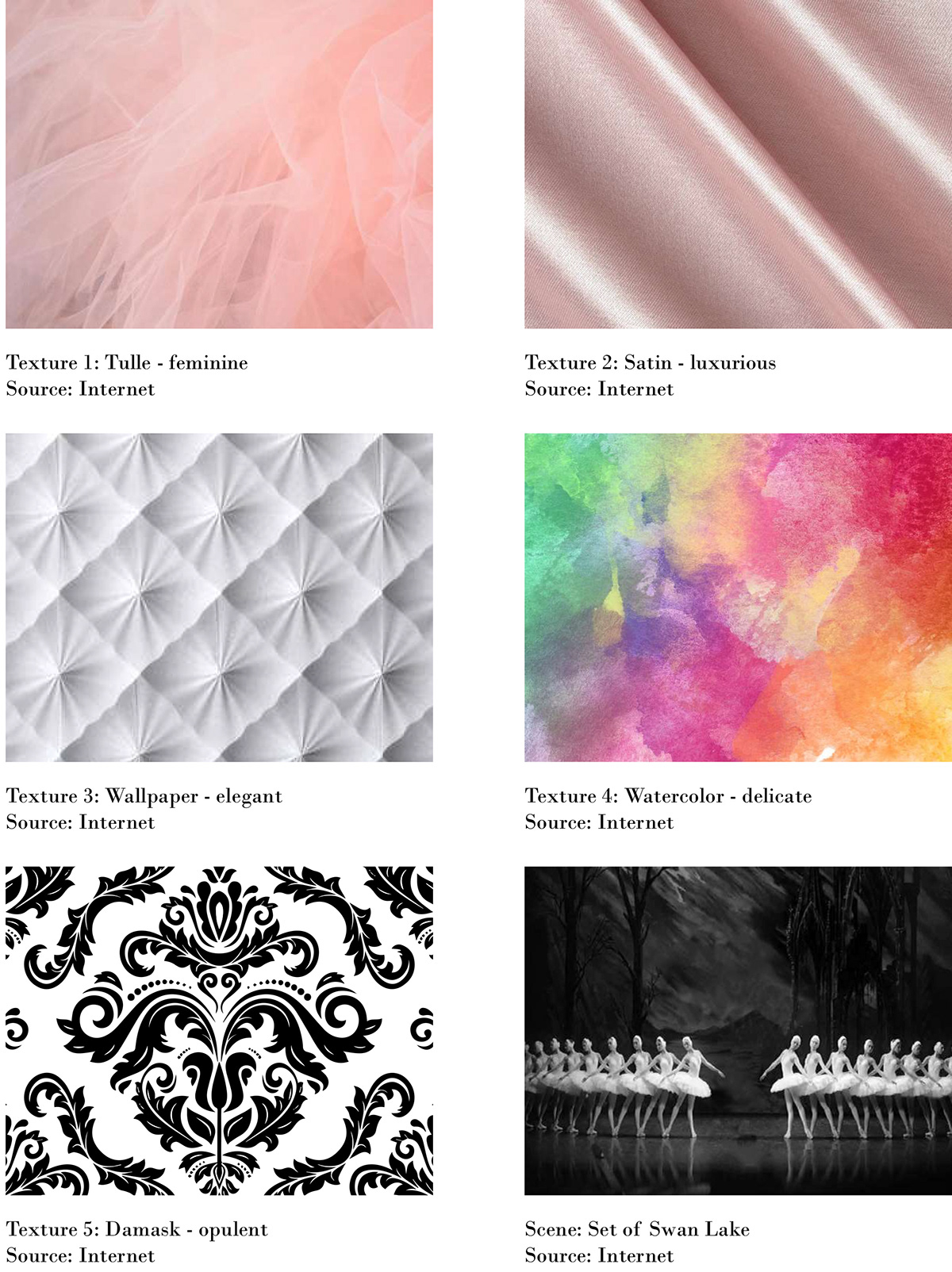
Above are the textures and the scene I gathered for my flamingo. While I was working on this project, I began to think of the flamingo as a ballerina because of its grace, beauty, and long legs. When I think of ballerinas and ballet, I think of beauty, grace, elegance, and opulence. Everything about ballet is opulent - the costumes, the moves, and the dancers themselves. As mentioned above, I used the width tool to adjust the thickness of my contour line drawing. I made the lines thinner on the ends and in more delicate areas (the neck and legs) and thicker around the wings and back, where the bird is stronger. These adjustments made the flamingo look like the ballerina I had envisioned.
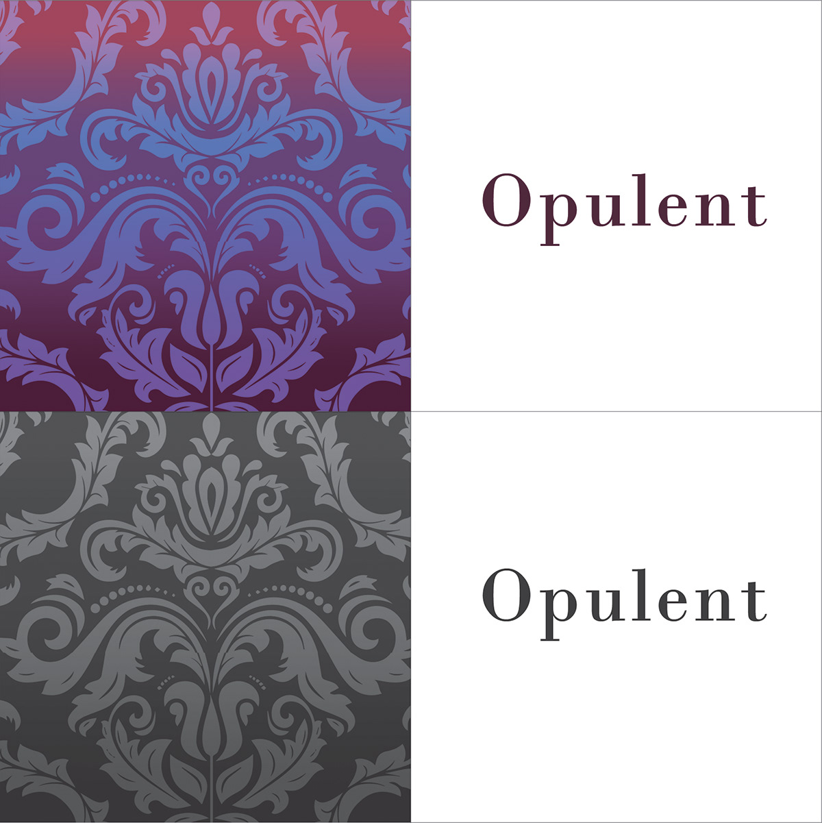
I chose the damask pattern because it best conveyed my chosen adjective - opulent. It's an old pattern that is often associated with wealth. Its complex pattern was popular during the Baroque era. The color palette I chose was inspired by a photo I found of ballerinas dancing on stage under the stage lights.
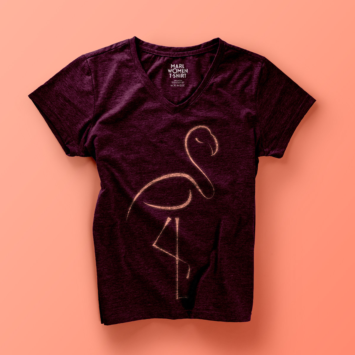
The following are the mock-ups I made of products featuring my design. I stuck with products on which I could envision this design being sold. I chose some clothing, book covers, and decorative objects rather than, for example, food packaging.