


Designing My Wedding
I want to showcase some of the collateral designs I've made for my wedding this past June 2018. I've designed the invitation, save the dates, magnet, mirror signage, website, menu and programs.
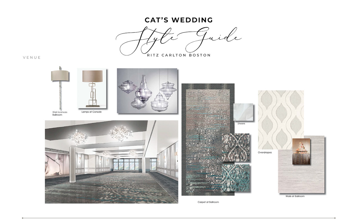
I've made a style guide to better communicate my vision to vendors and ask specific details for the details that I wanted to have. Before I started putting together the style guide and the elements, I needed to make sure they are conveying the right story.
THE STORY
_
_
I met James in 2006, and we were friends for about ten years. I am living in New York City, and James was born and raised in Boston. One day, I asked him to check out The Museum of Modern Art in New York. After discovering that the wait would be over four hours, we made a spur-of-the-moment decision to go to Morimoto for dinner instead, followed by a sunset walk on The High Line.
Over that dinner—and many more meals after—we bonded over a shared love for food, travel, and art. After four years of globe-trotting, museum-touring, and adventure-seeking, it was clear we were on to something great. Together, we've explored over 20 states and 5 countries, side by side, one step at a time.
We were a long distance couple for about four years. Our travels together was an important aspect of our relationship and it was something we looked forward to when we got together. I wanted to make a story through my invitations to showcase our travel imagery, and the idea that we are two cities coming together.
I've decided to take a more of a imaginary approach to the illustration, where it's a mix of cute and conceptual backgrounds. Heavily inspired by the Disney's Short Film: Paperman.
STYLE GUIDANCE
_
_
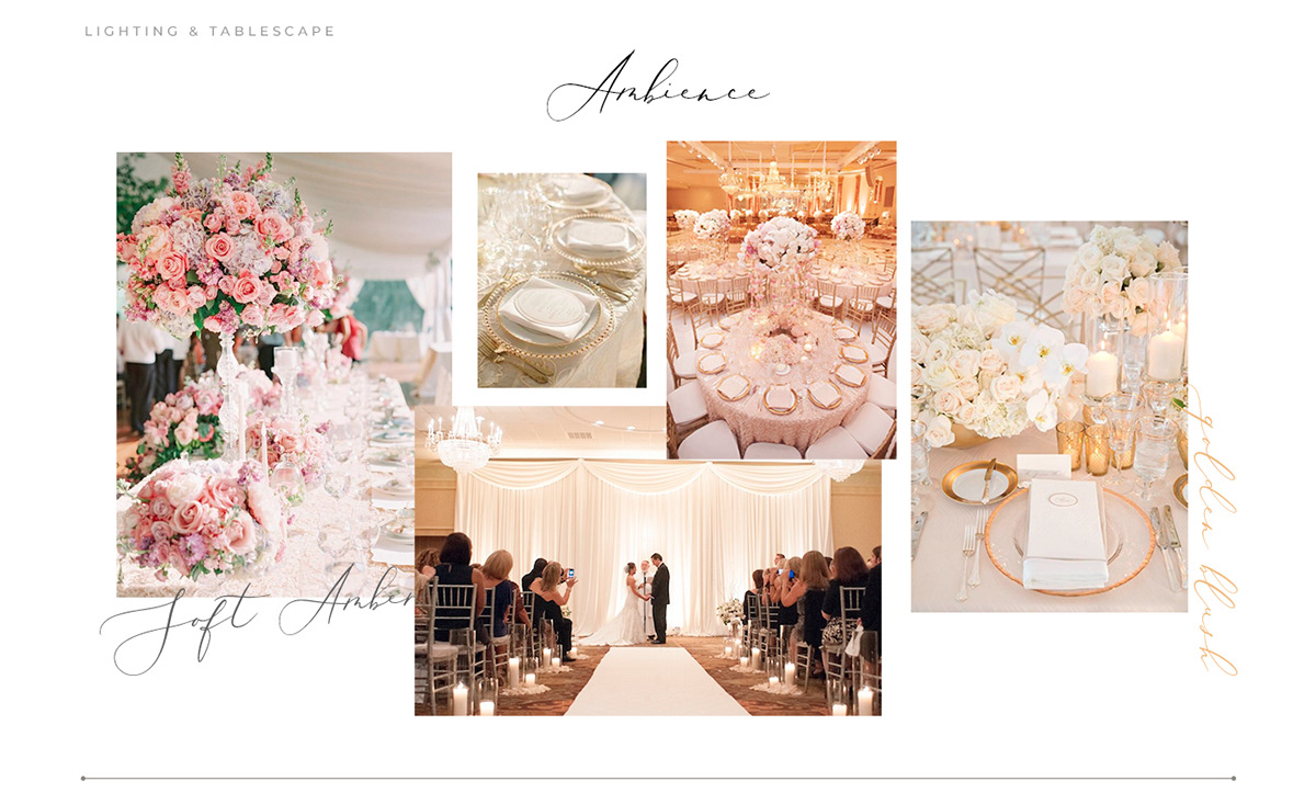
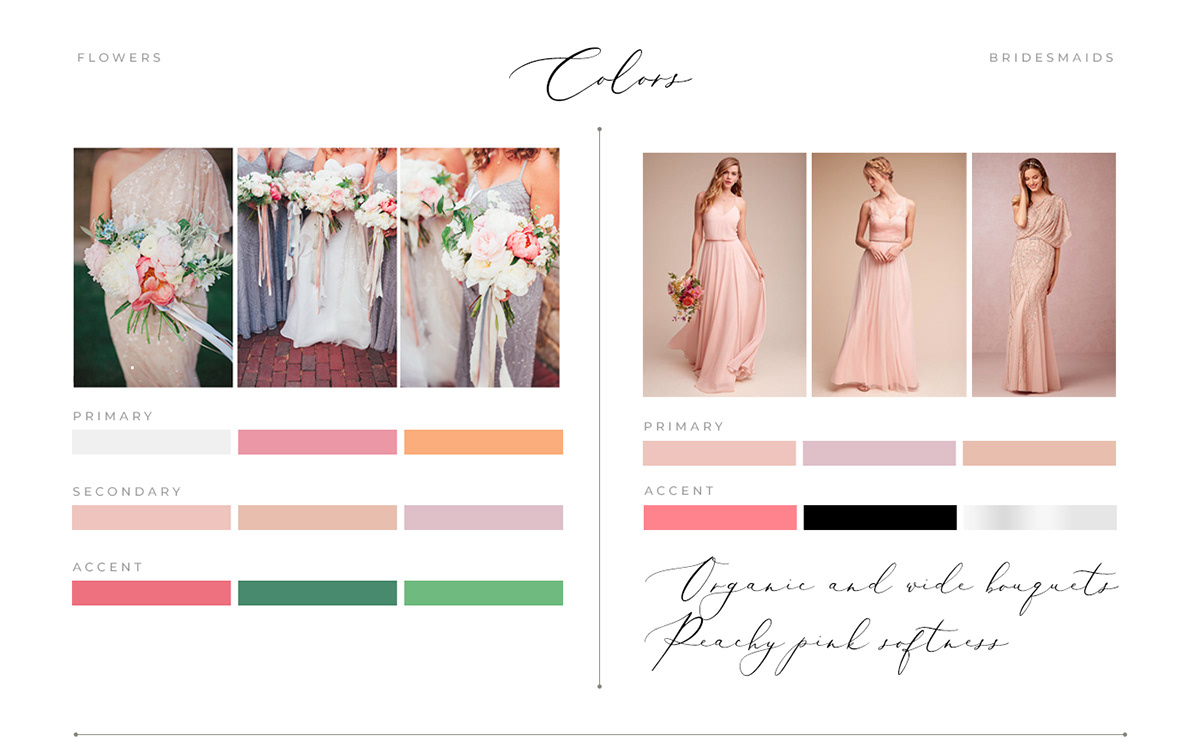
The venue was indoors, and the materials had a lot of cool tones. I wanted to skew the color of the event towards the warm tones. I intermixed the metals, from gold to silver with added muted blush and accent pinks to brighten up the room. I mixed garden colors with metallics to create a sense of beautiful springtime. Since the bridesmaids are wearing more of a muted peach/pink tone, I wanted their bouquets to be center of attention and stand out.
_
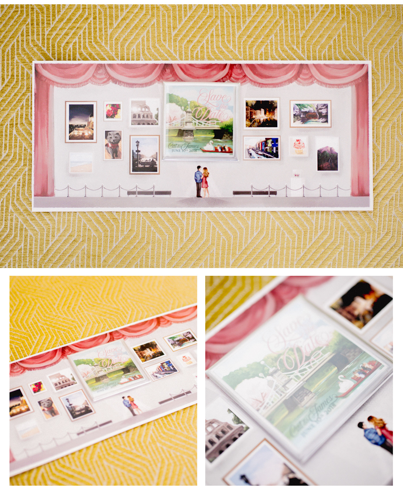
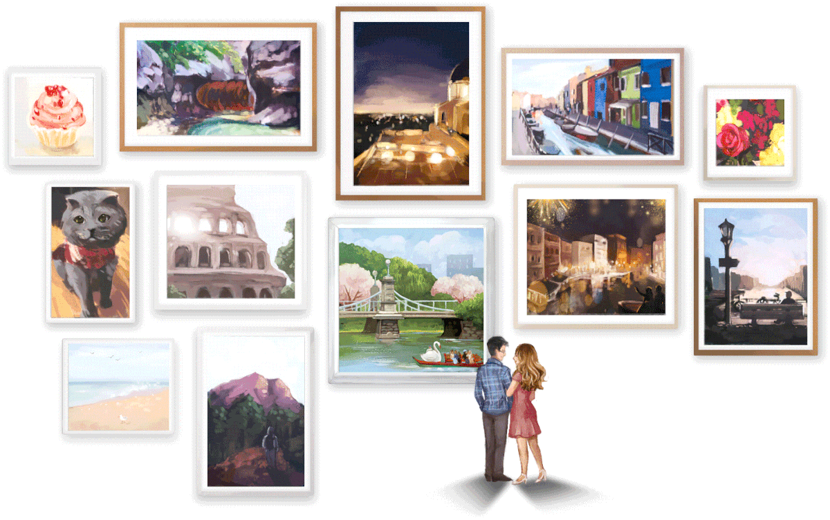
I've selected a few of our favorite travel photos and had them illustrated in a museum setting. Museums are one of my most visited places, and I wanted to represent that. By making the curtains of the museum into the muted pink, I wanted to inject hints of what the styling of my wedding will ultimately be.
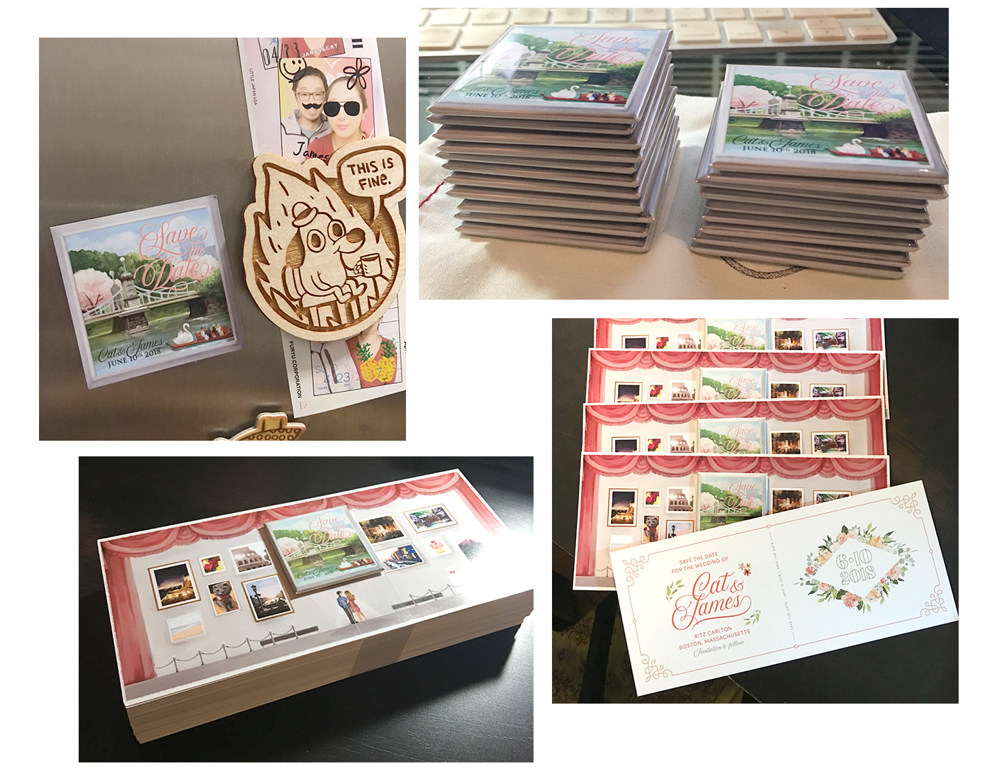
In addition to the graphic framed elements of the illustration, I wanted something to stand out. The center of the save the date is a raised magnet, where the user can remove and place on their refrigerator.
The imagery of the magnet is from a photo that I took of the Boston Commons Gardens. It's the middle of the park, with swan boats floating through spring. I felt this was an iconic location that would be the vital location of our wedding photos, so I wanted to depict that in this magnet.

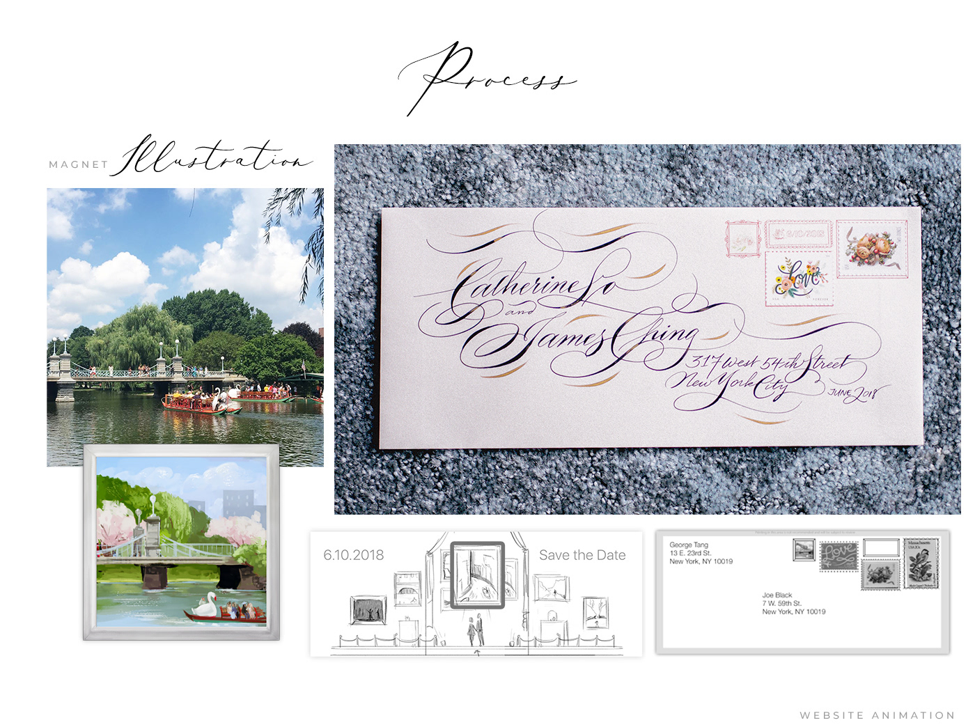
In this above animation, I'm depicting the drawing vs the real photo that it was modeled after. I felt that this was a great way to get users interested in what these photos are.


INVITATION
_
_
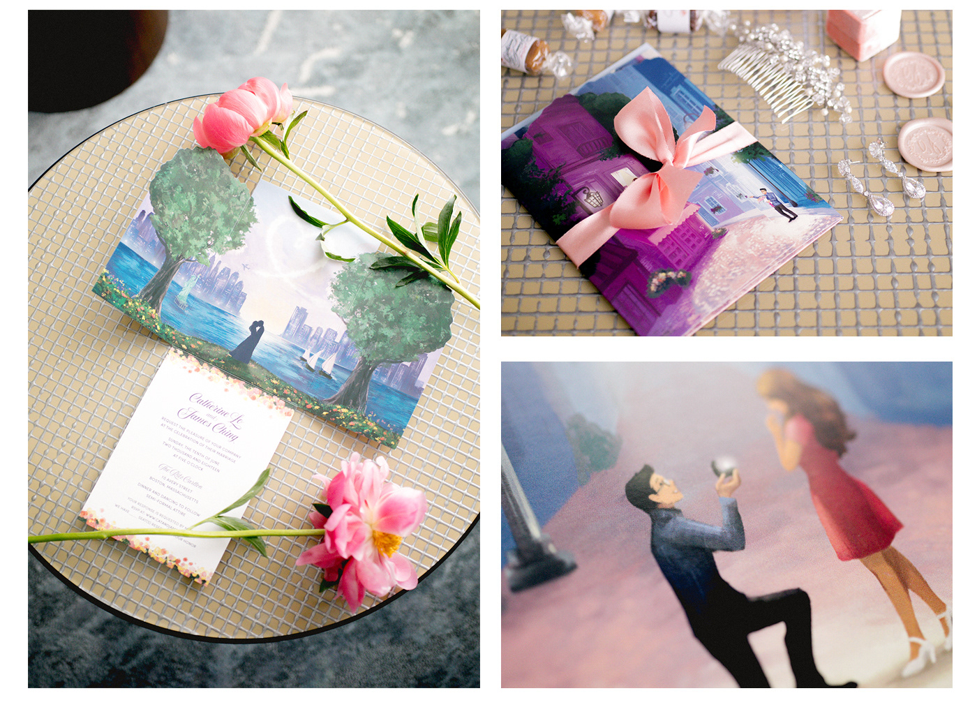
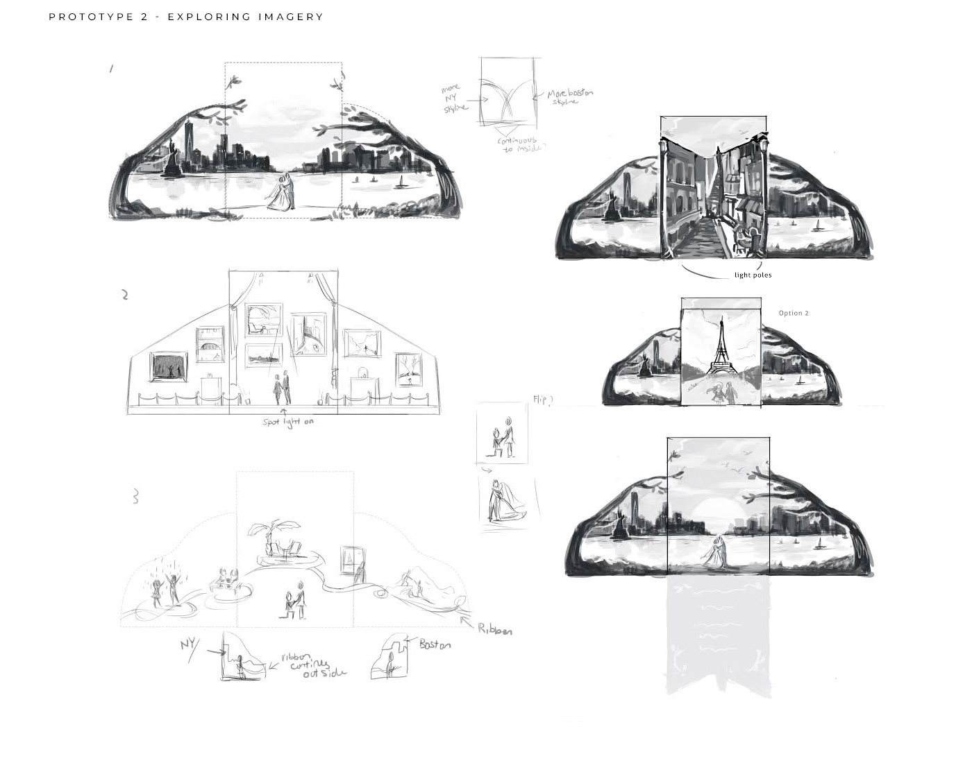
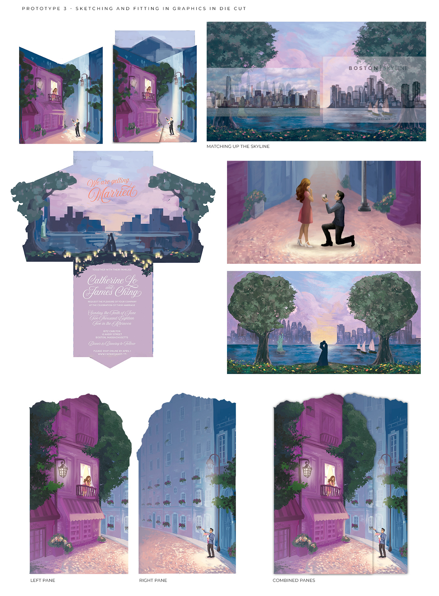
The concept for the invitation was that I wanted to tell the story from our relationship, to proposal, to marriage. The imagery on the flaps is showing James holding flowers on the sidewalk, while I am peering out of the balcony. The background and the concept is two stories in one. I wanted to depict the efforts taken during our four-year long distance travel, and the time I've spent waiting for him to show up.
The imagery of the building is actually the image of the location in Paris where James proposed. We got an airbnb at Montreuil, Seine-Saint-Denis Arr in Paris during New Years eve in 2017 where we rang in the New Year at the apartment over some wine and cheese.
Depicting in the middle pane, as you were told the story that this was a long distance relationship, there is an image of the proposal. When you fold the flaps down, the image of the people is aligned with the background where it now shows two figures together over a skyline.
This skyline is symbolizing the meeting of two cities. Left is New York with the Statue of Liberty, and right side is Boston with sailboats. Meeting in the middle, and the wedding location is in Boston.
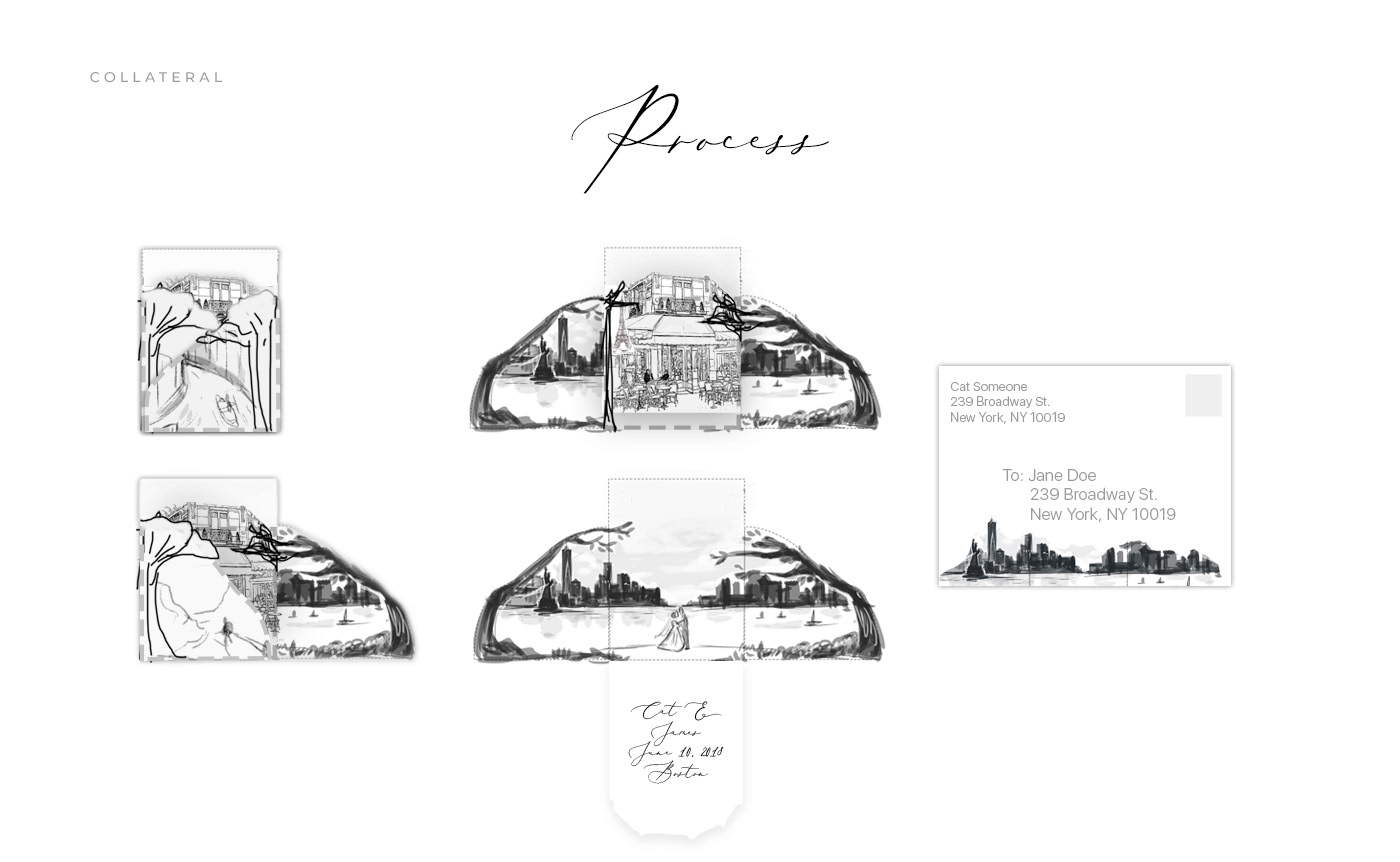
The die line is something I drew to make the cutouts more organic and interesting. The scoring of the print was also done lightly to prevent the paper from cracking when folded.


THE PROCESS
_
_
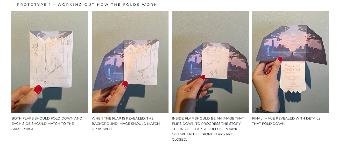
The process of this was interesting. I made a ton of paper prototypes and variations and ended up settling with the 3 flap design. This was probably the hardest variation out of all my options because of the folding, scoring, die cutting and aligning the imagery to the paper.
Once I have this idea down, I made numerous calls to different printers in the country and got a quote and estimate on my crazy idea. I explored many different paper types, printing styles from offset to digital, to flooding the paper with a solid ink so the scoring wouldn't show white.. that process was long.
I ended up settling with printing on digital, with die cut, scoring on a ~120gsm paper. The upside was that it was light enough that when the paper is folded, it wouldn't crack. The downside is that it was too light to stay closed. In order to solve that, I hand tied a ribbon on each and every one of the invitations before placing it all in an envelope.
The challenge of making the graphics tell a story and work out also involved a ton of brainstorming on what graphics would make sense on each pane. Not only the pane has to match up, but also the extension as well.
This was months in the making. 😓


Hope you've enjoyed this writeup. Some more photos below showing the rest of the elements of the flower colors, palette, and styling all coming together. Special thanks to Michelle Yang with the Illustration, and Ethan Yang Photography.


