


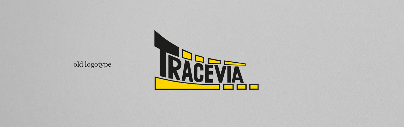
Tracevia
Brazil & Portugal
2010
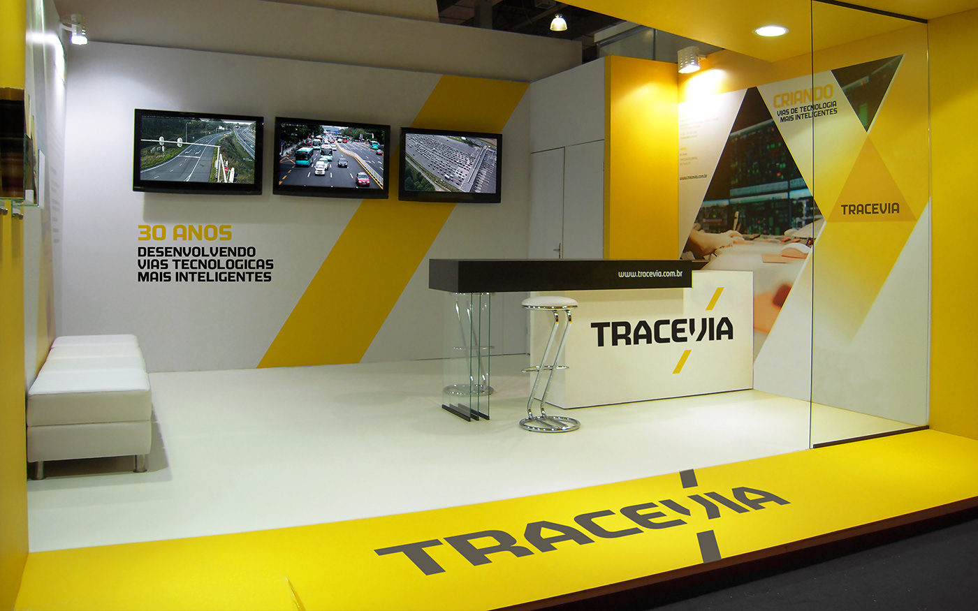
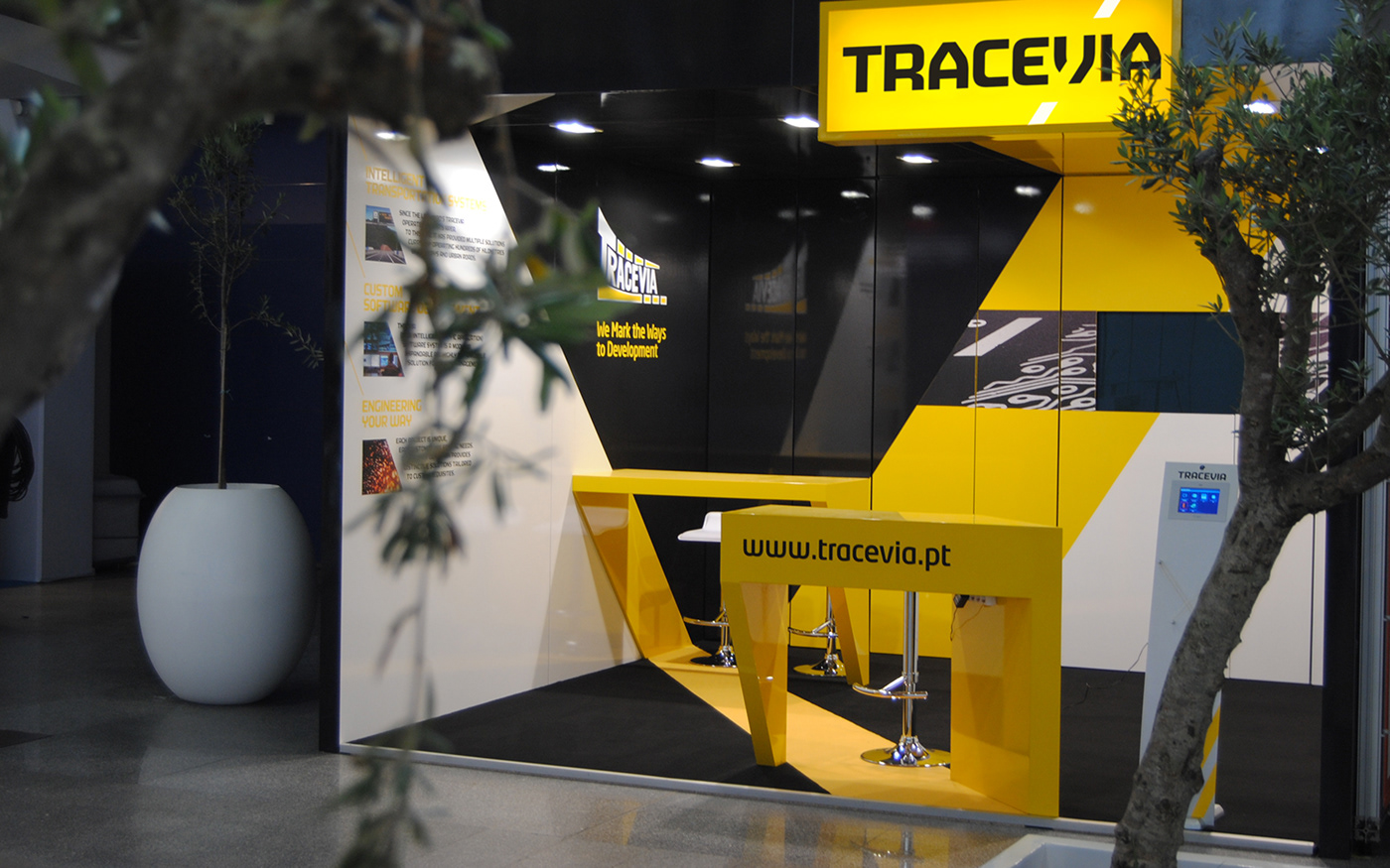
Late 2010 we were asked to create 2 small exhibitions stand for Tracevia (which means something like "lines in the road"). Tracevia was expanding into international markets and shifting its business from traditional road markings into high-tech traffic management. They wanted small striking booths that could capture new business and position them at the forefront of technology... but their identity did not embody their technologic jump.
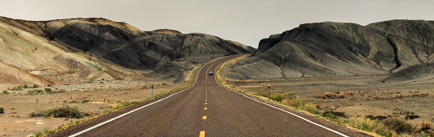
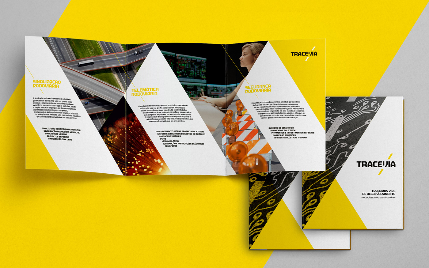
Keeping the contrasting construction colours, we brought to life the "lines in the road" together with a crafted typography that merged the solidity of a construction company with the technological flair. The project naturally expanded into a full rebranding.


The Brazilian stand already incorporated much of the new look & feel, while the earlier smaller booth for Portugal was implemented at the same time that the identity was being developed. Typical :D


Designed while at White
All rights White & Tracevia


