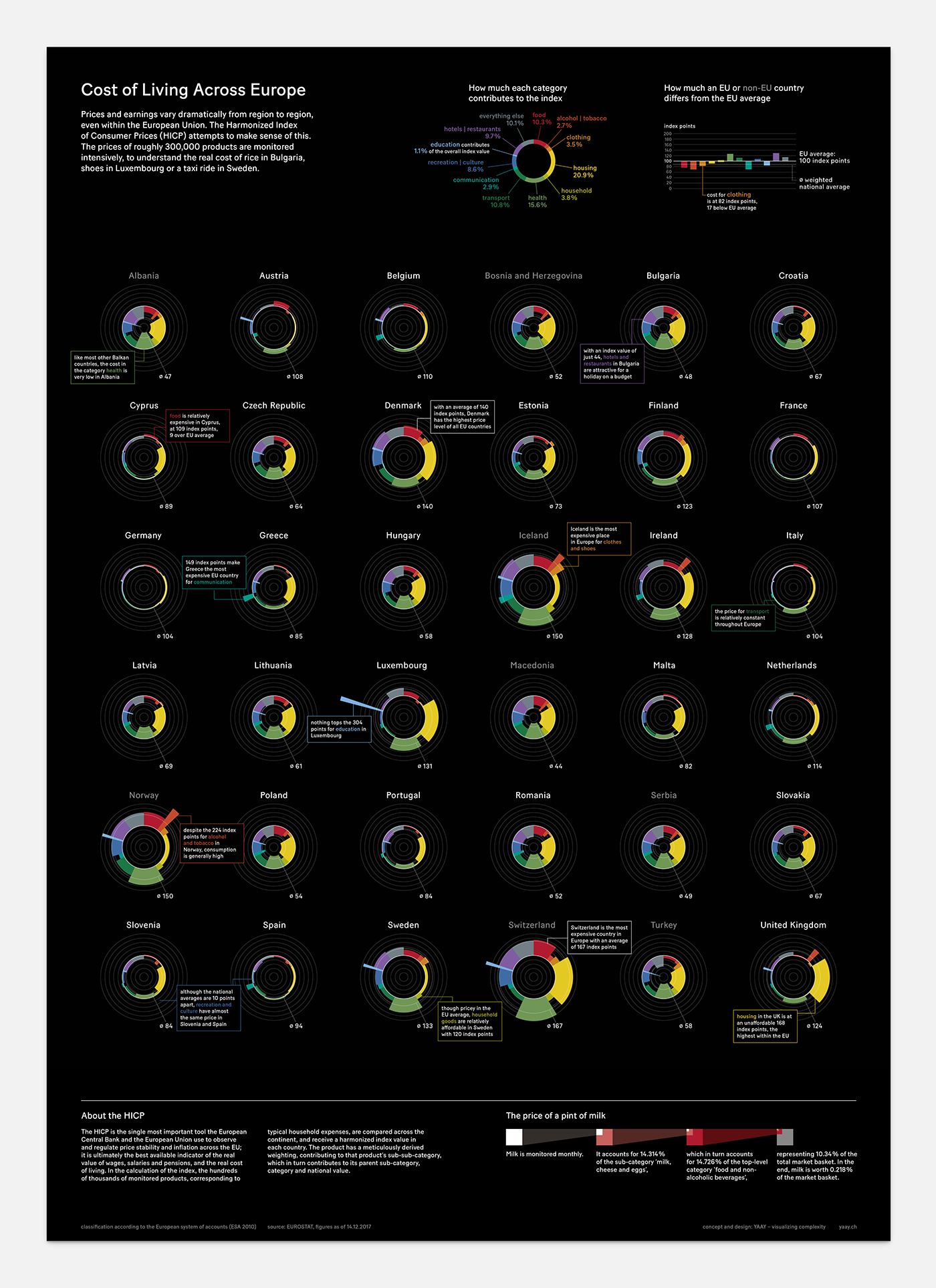
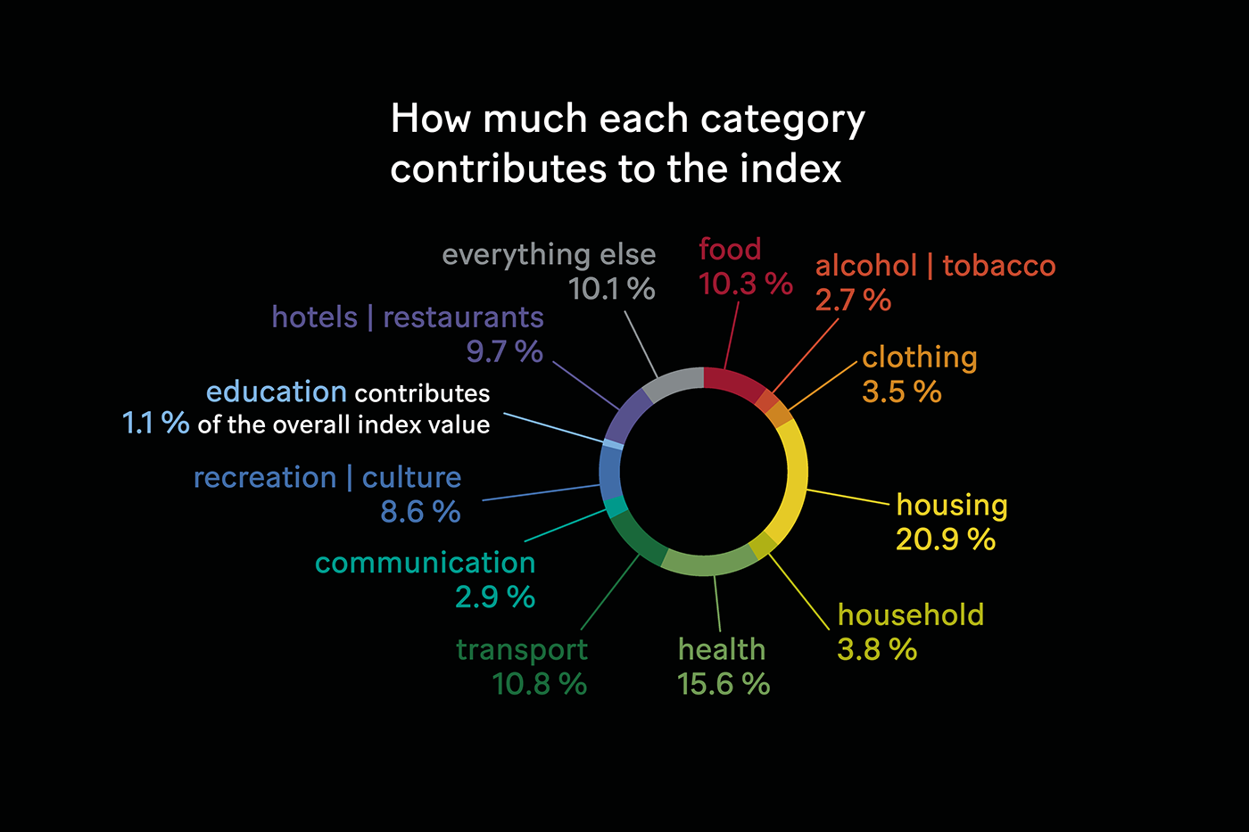
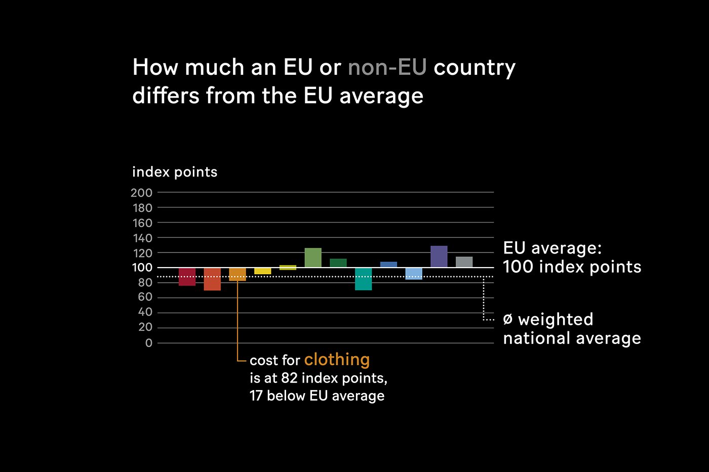
Cost of Living Across Europe
Self initiated, 2018
Always digging through interesting datasets, we came across a dauntingly detailed table based on the Harmonized Index of Consumer Prices (HICP). The HICP attempts to make sense of the variation of prices and earnings within the European Union. The prices of roughly 300,000 products are monitored intensively, to understand the real cost of rice in Bulgaria, shoes in Luxembourg or a taxi ride in Sweden.
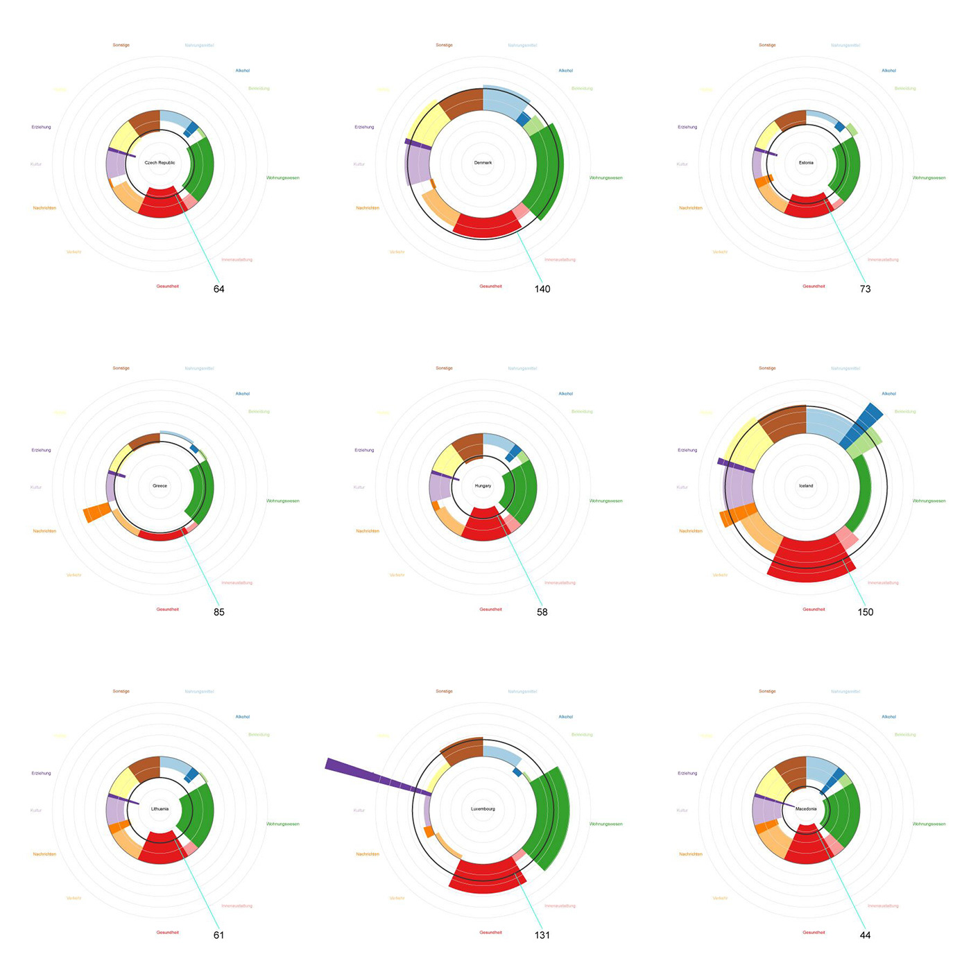
We set out with pen and paper, and sketched until a new diagram type emerged. In a way, it is a hybrid of a polar area chart and a pie chart, focusing on deviation from a group mean. We call it a radial mean deviation diagram. With this diagram type, we can show the price for each category with the radial distance from the mean, as well as the weighting of that category with the central angle. Slices pointing inward correspond to a below-average index value, and those pointing outward represent an above-average, or ‘expensive’, index value.
We used an unusual but fruitful workflow, generating the SVG structure of the diagrams in JavaScript with D3, before exporting to Adobe Illustrator. Where code is better, we let D3 do the work, where the human touch is necessary, we took the job back.
Read the article on Medium!

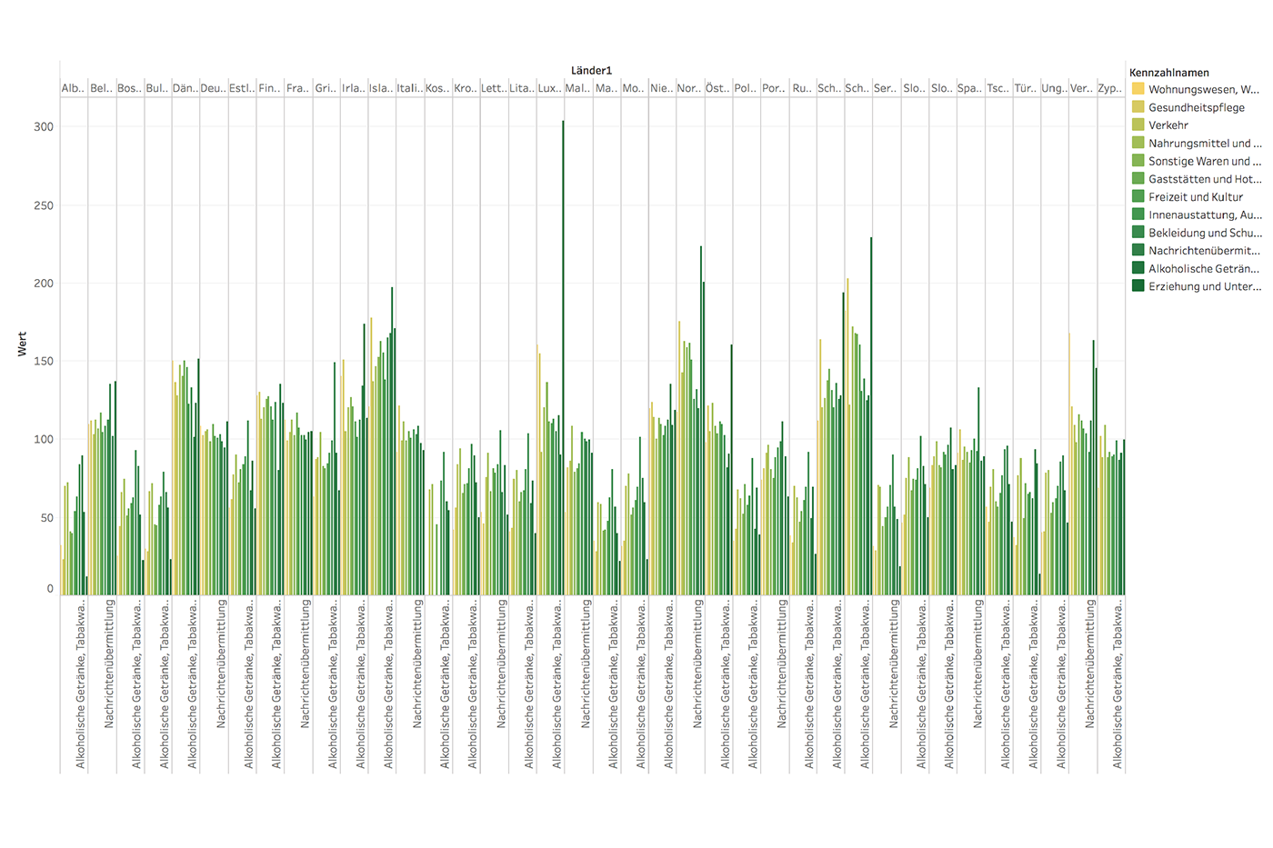
In Tableau, tendencies like a wider variation in the category ‘health’ than in ‘transport’, become visible.
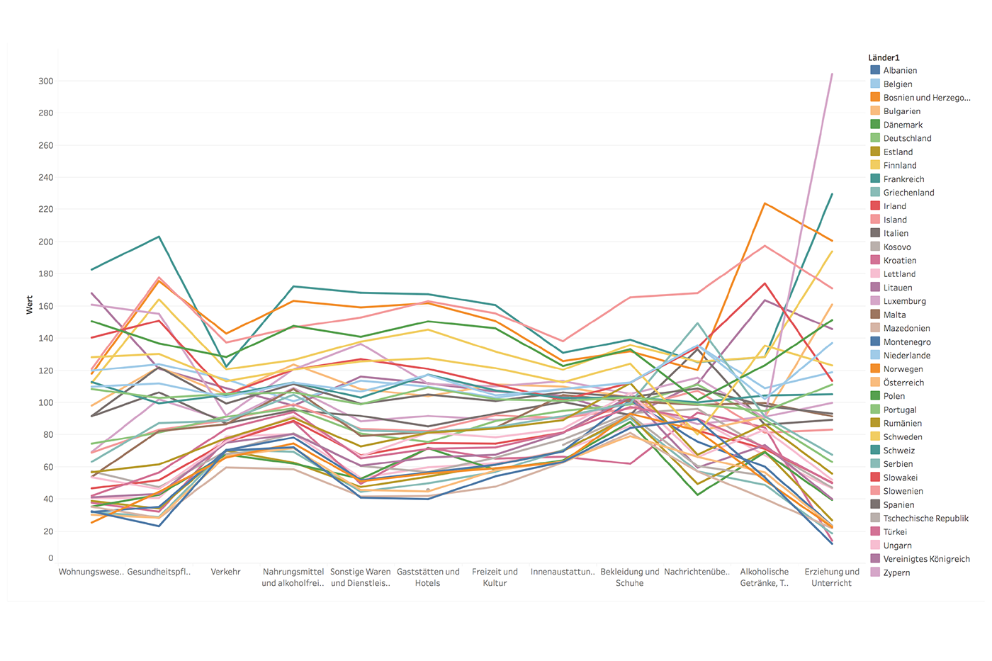
Outliers, such as the price for ‘education’ in Luxembourg, are revealed.
The split between north and south, east and west becomes obvious on a map (left), as well as the change over time (right).

The output of the D3 script: