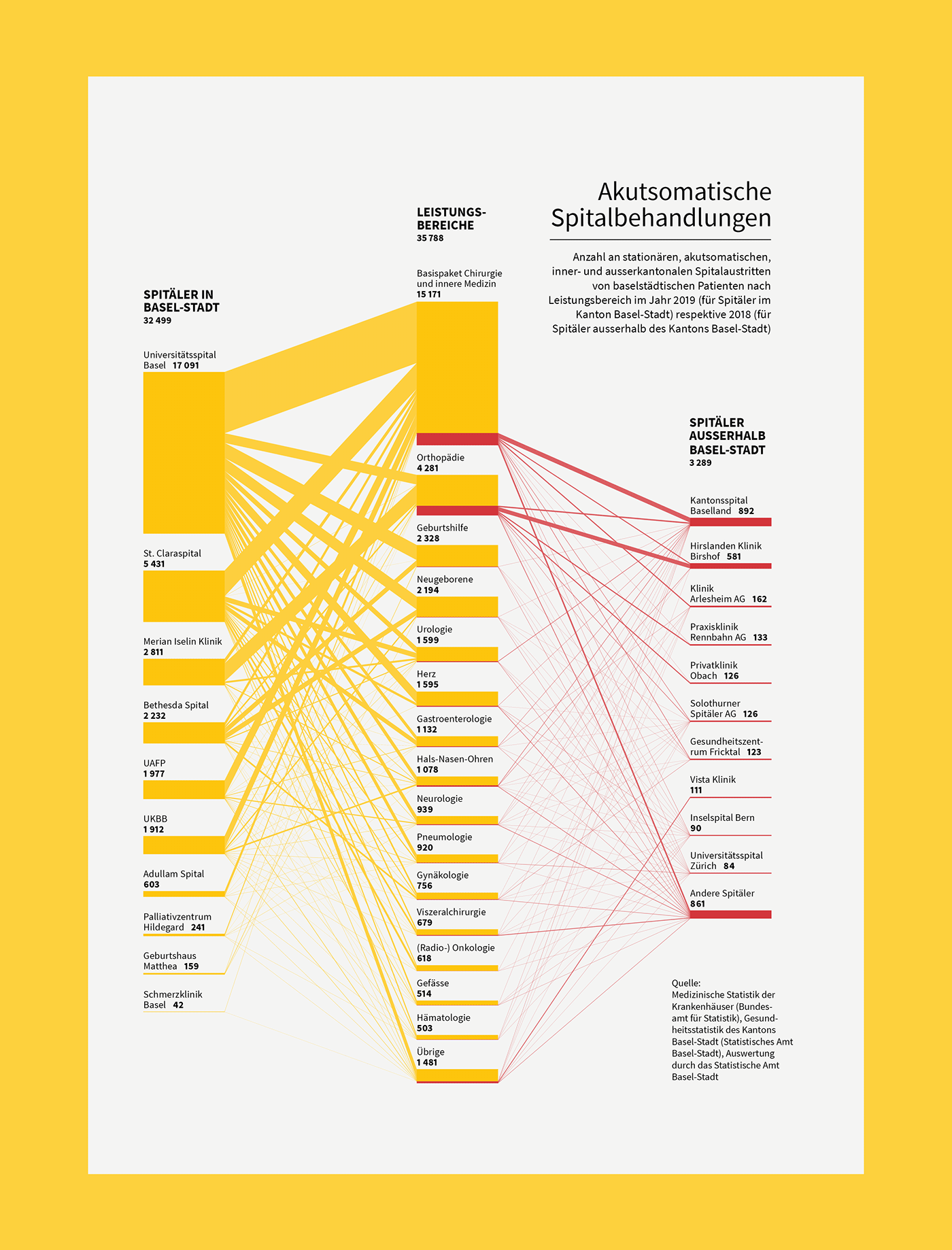
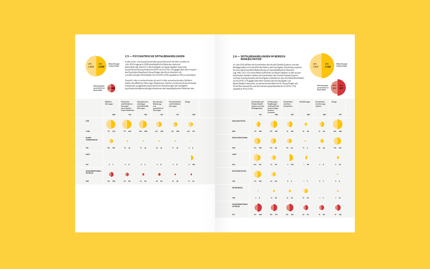
The Challenge
Communicate healthcare trends with data visualization in an annual report. What treatments are most needed by the population? Which hospitals are there and how many treatments do they do per year? What about the specialization of the different hospitals and how are they developing?
The Outcome
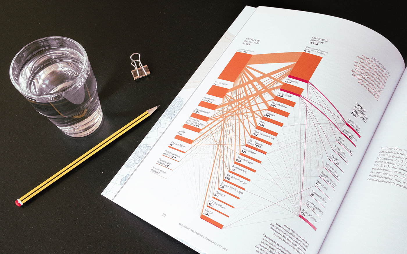
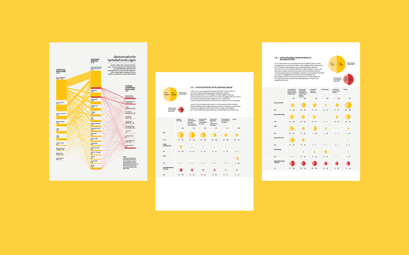
The complex topic is illuminated from two perspectives. The size ratios of hospitals and their share in the various treatments are visible in a networked alluvial diagram. The change in the areas of activity of hospitals over time is made clear by two-divided circles. The two different visual approaches are held together by a common color code.
The Impact
Grössenverhältnisse und Zusammenhänge in komplexen Zahlen werden durch Visualisierung bereits auf den ersten Blick erfassbar. Auf den zweiten Blick können weitere Informationsebenen erschlossen und die Daten im Detail untersucht werden. Die innovativen Visualisierungen aus dem Jahresbericht können auch als Social Media Content und für Präsentationen weiter verwendet werden.