Fixture.
We are very proud to announce the release of our new grotesk familiy at Sudtipos. Available
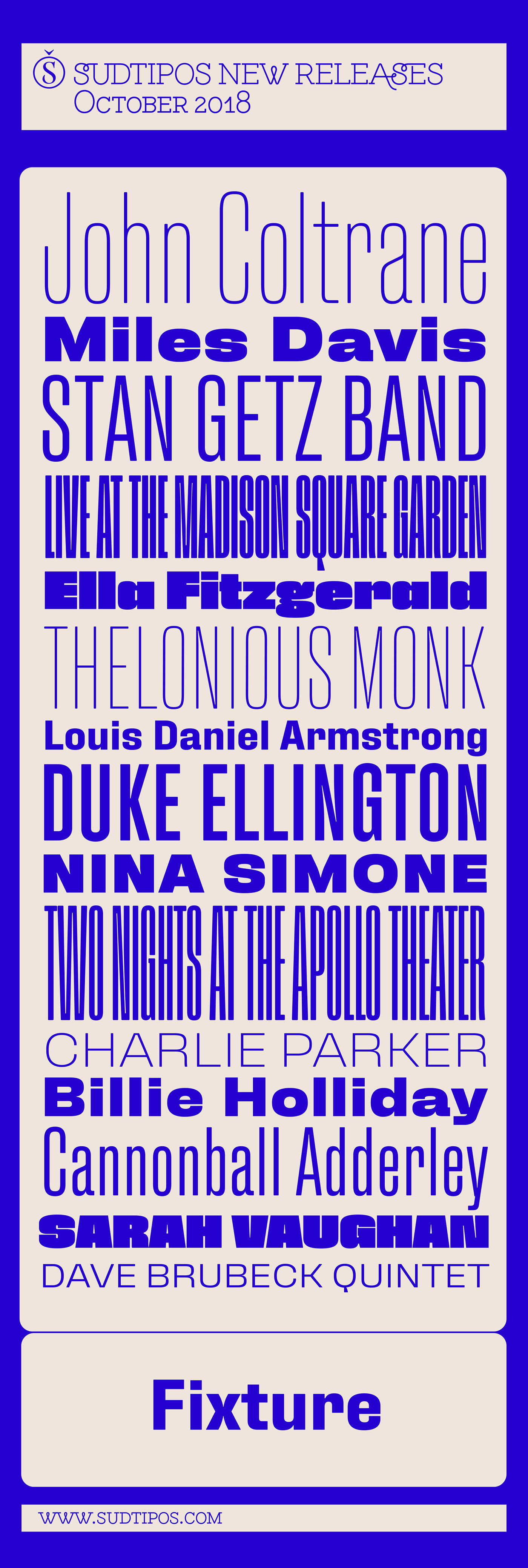
Fixture is our massive 72-font take on plentiful offerings of the late 19th century’s typefaces, posters and wood letterpress sundry done in the Grotesk genre. Four widths ranging from Ultra Compressed to Expanded each come in nine weights and accompanying italics. Some common sans-serif alternates, such as the a and g, are included in all the fonts.
The idea with this design was to put together a workhorse font family with enough functional flexibility to work in multiple environments, from the subtlety of magazine layout or film credits to the visual drama of billboards or packaging.
Aesthetically speaking, it is quite interesting — though in retrospect quite unintentional — that each different width and/or weight of this face ended up pulling a different dominant trait from the melting-pot origins of the entire family. It’s almost like a tribute album to some famous band’s covers of older songs. It may also be a good conversation piece on our tools shaping the very things for which they’re used. Can’t really get any more post-Grotesk than this. In the 21st century, this is the one genre to rule them all.
here.About the font.
—
Fixture is our massive 72-font take on plentiful offerings of the late 19th century’s typefaces, posters and wood letterpress sundry done in the Grotesk genre. Four widths ranging from Ultra Compressed to Expanded each come in nine weights and accompanying italics. Some common sans-serif alternates, such as the a and g, are included in all the fonts.
The idea with this design was to put together a workhorse font family with enough functional flexibility to work in multiple environments, from the subtlety of magazine layout or film credits to the visual drama of billboards or packaging.
Aesthetically speaking, it is quite interesting — though in retrospect quite unintentional — that each different width and/or weight of this face ended up pulling a different dominant trait from the melting-pot origins of the entire family. It’s almost like a tribute album to some famous band’s covers of older songs. It may also be a good conversation piece on our tools shaping the very things for which they’re used. Can’t really get any more post-Grotesk than this. In the 21st century, this is the one genre to rule them all.
The font and the movies.
—
While we designed this typeface, we imagined many uses and applications, fromo posters to movie titles. By chance we discovered Vanessa Zuñiga, a talented Ecuadorian artist and her work, whom we invited to participate in this idea. We combined our imagination and her interest in learning and experimenting with kinetic type. The project grew and we could not stop trying ideas, like playful experiments that are part of an imagery that we think can be useful enough to inspire those who want to make use of this type family.
The variables.
—
From Ultra Compressed Thin version to Expanded Black, Fixture comes in 36 weights plus italics. A total of 72 fonts to play with extremes.
The alternates.
—
Some classic alternatative glyphs like "a" or "g" were added.
.
The poster reference.
—
Moving posters. Exercise with animation.
The experimentation.
—
We have tried many kinetic type effects that we want to share.
Credits
Font: Fixture
Foundry: Sudtipos
Type Design: Ale Paul
Type Design Assistant: Ale Freitez
Animations: Vanessa Zuñiga
—


