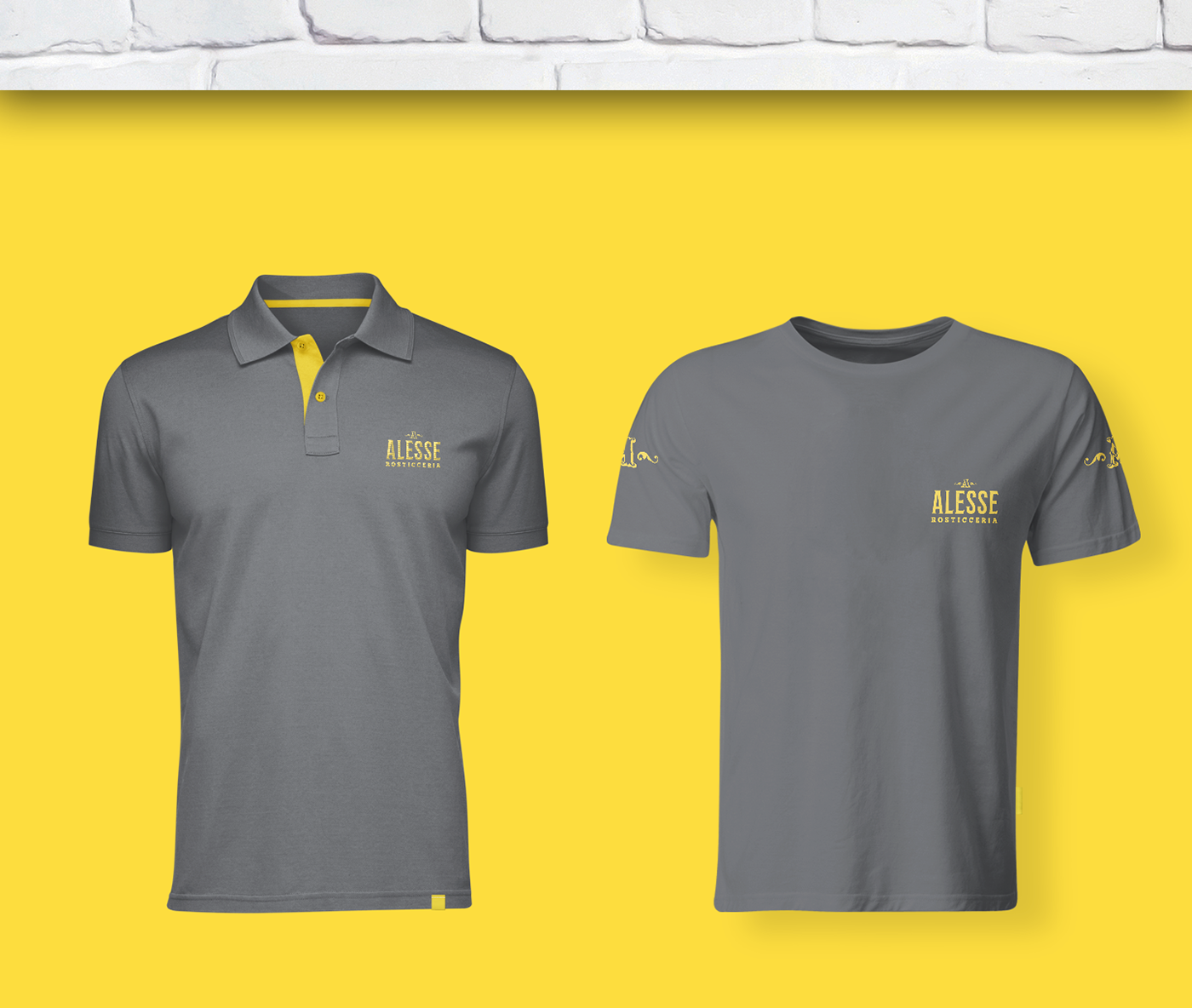

Alesse is a typical rotisserie in the heart of Rome, the scent of its dishes has inspired our work, giving a rustic but contemporary look to the project.
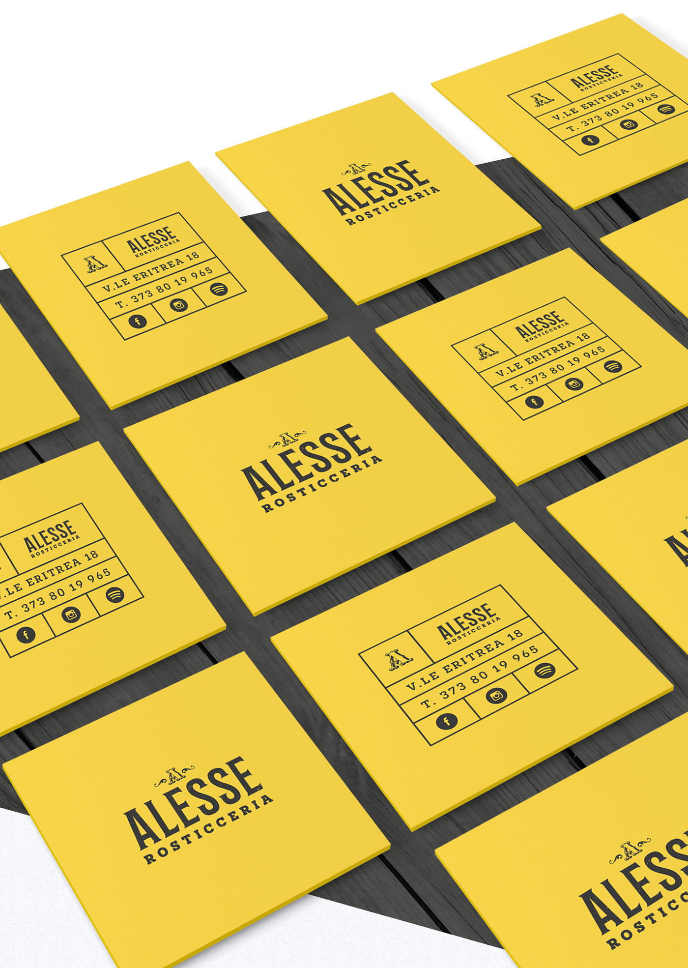
The appearance of the brand originated primarily from the use of a typography that had similarities with the typical hooks used to hang the sausages, in particular the letter S of the font reproduces that type of instrument, typical in any rotisserie.
Secondarily trying to give the communication a contemporary cut through the use of cages both in business cards and in the cards used in the prices, this aspect of "frame" was then repeated in various communication areas as in social media and in the same preparation of the shop windows.
Lastly, a light material pattern was added on the surfaces of the communication and on the typography of the logotype to make everything more rustic and lived, without however exaggerating and legibility of the logotype.