


We're already more than half past 2018, and it seems like the perfect time and opportunity to rewind, and review the design trends we were looking forward to seeing all around this year. We've browsed through numerous portfolios and works from the latter half of this year, gathering as many designs and creative output as possible that have already been executed or have been applied in one way or another.
Our midyear review list will take you on a sort of analysis on how trends have either continued or evolved as we progressed through 2018. Without further ado, let's dive into design!
Duotones & Dual Exposure
Duotone has certainly stuck around past the first half of this year. Photos sporting the said effect can be seen on various forms of media: websites, posters, streamers, magazines and possibly plenty more we’ve yet to see. Applying duotone (especially together with double exposure) gives the material an edgier, more vibrant look as it creates a striking contrast between light and dark hues but effectively making each individually pop beautifully. We've also seen the "glitch effect" in design on the rise, utilising duotone and double exposure to create the broken, imperfect yet captivatingly bold picture.
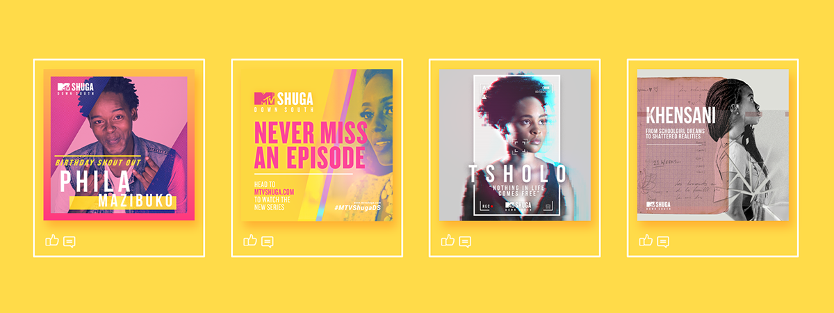

Project: MTV Shuga Down South Brand Identity
Author: The Kinetic


Project: Loftus Park Precinct Brochure
Author: Wynand Botha


Project: What Now? App Advertisements
Author: Nikoli Shaver


Author: Nathan Albrecht
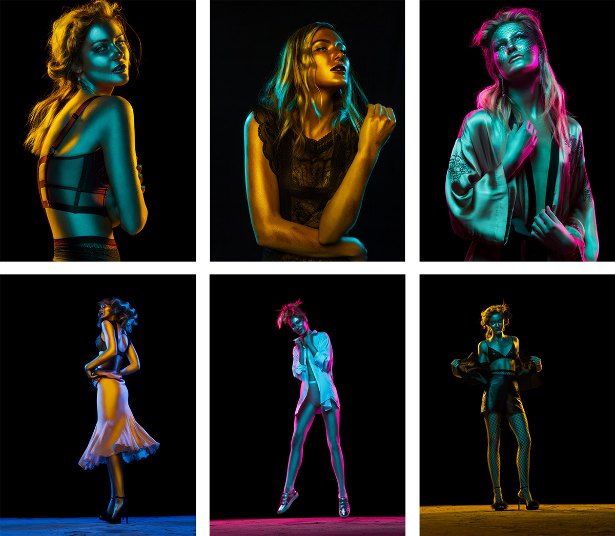
Color Gel Photography
With its creative link to the duotone effect, one particular trend has made a noticeable presence in the area of photography: color gel and the use of filters. This style of photography contributes to the burst of engaging colours all around the design world, and although its most common form is in fashion-centric visual design, some have made it possible to mimic color-gel photography on 3D figures and create a similar outcome.

Project: La Vie en Rose for Domestika
Author: The nobody photography, Alonso Murillo
Project: Editorial for Elements Magazine
Author: Andre Schneider
Bold Colours
Colours continue to rule, maintaining its bold presence in the world of design. While some continue to use members of the dominant colour family, plenty of brands and designers have gone on to play with and pursue different tints and shades for a more unique mix of colours. A number also apply these bold tints and shades against a light gray or charcoal black backdrop, highlighting the colours’ presence even further.

Project: Portia Dark Chocolate Packaging
Author: Kolya Gevorgian


Project: Cafe Buho Brand Identity
Author: Futura .


Project: Lucy TV Brand Identity
Author: Mariana Pires
Vibrant Gradients
Now appearing with sometimes three or more hues combined, gradients have stood their ground through their recent rise and comeback. Even riskier combinations of tints and shades have come into light to create a blast of colours that make heads turn and take a second look. Gradients continue to provide depth and moods that convey emotion and evoke inspiration.


Project: The Awakening Brand Identity
Author: Gabriel Lam


Project: Kosmos der Ideen Brand Identity0
Author: Lena Cramer, Johanna Dahmer


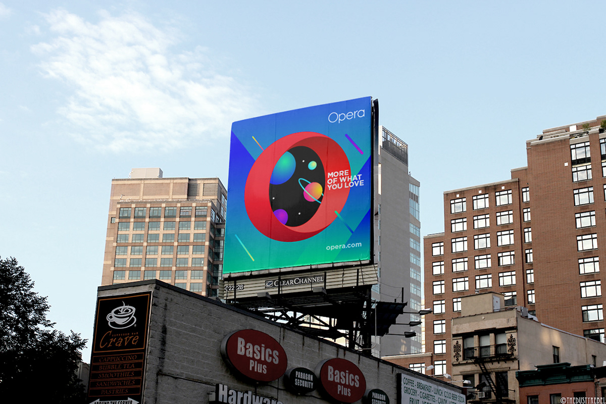
Project: Opera Brand Identity
Author: PUPILA .CO
Geometric Patterns
Seemingly looking like a random assortment of lines, curves and squiggles, geometric elements contribute to making a vibrant and energetic visual. Abstract geometry still finds its way through 2018, being utilised by brands and individuals alike to give designs fresh, bold looks. Shapes may appear simple but given the right arrangement and combination of colours, it can project elegance and sophistication, or fun and excitement (or however you make of it).


Project: Maltesa Identity
Author: Studio Auro


Project: Windrose Paper&Co.
Author: Estudio Selva


Animation
Our initial inclusion of “animation” to our trends list may have been a bit too broad, when our scope was actually focused on web design and mobile interfaces.
Animation continues to assist in making relevant information come forth in a manner that delicately balances orderliness and entertainment. Through animation, information not only appears in a smooth flow of progress, but visually expresses the process or transaction at hand while also delighting the user.
“Animations are no longer the delightful surprises they once were — now, they’re expected,” writes Jerry Cao of UX Pin. Users will look to animations as their guides especially through unfamiliar interfaces. They will look for hints on what actions are available, which elements are connected with one another, and what outcomes one might expect when deciding to interact with either of these elements. Animations may not tell the user the way, but they definitely will show them.
Project: Jafen Art Studio Website
Author: Bahaa Samir, Hesham Mohamed
Parallax Effect
In 2018, the Parallax Effect is much more pronounced whereas before it only gave subtle hints of motion. Website designs are given much more depth with new refreshing execution styles of the effect as animations and video have been thrown into the mix.
Project: Mowellens Website
Author: Phoenix Tthe Creative Studio
Project: Humbert & Poyet Website
Author: Oui Will
Project: Verity Studios
Author: Outpost

Project: Birds of Ukraine
Author: Sergiy Tereschenko
3D
Whether they're aiming for realism or an edgier, more modern aesthetic, more and more graphical elements are popping out in 3D form. Looking quite refined, 3D elements continue to be utilised to spatially illustrate an idea or a message, and do so delightfully by splashing a range of colours and textures on them.
In the realm of web design, 3D is not just an element even but an experience. A good number of websites have imbued their designs with an interactive aspect in 3D for purposes that range from pure entertainment and novelty, to shopping and information discovery.

Project: Sobieski Vodka Website
Author: Sidlee Paris

Project: Dot Lung Website
Author: Vool Studio


Author: Rutger Paulusse
Project: Jade Dalloul VR Portfolio
Author: Jade Dalloul
Project: Flow Studio Website
Author: Ondrej Kostolňák

Author: Peter Tarka


Isometric Design
Similarly with 3D, isometric projections offer a unique way of expressing ideas and messages as it continues to catch attention wherever it maybe used. Isometric illustrations are most commonly executed as accompanying illustrations to written copy in websites and apps. They also work well on their own to create eye-catching visuals perfect for posters and magazine covers, or even on digital screens when it is animated.
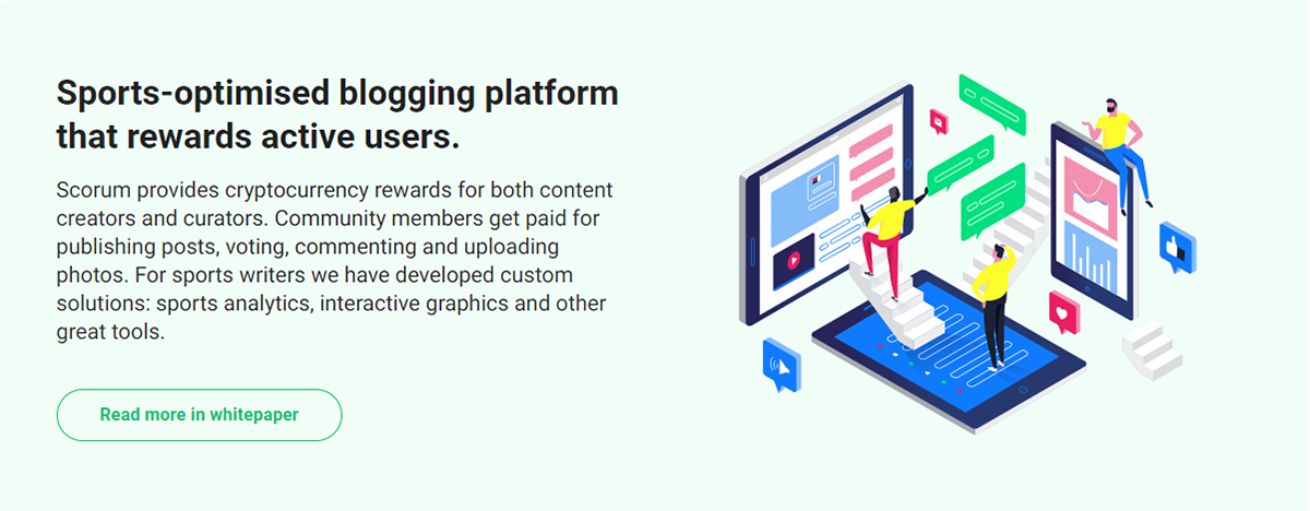


Project: Scorum Beta Website Illustrations


Project: Argyle Coin Website Design

Project: Google Mobile Day Illustrations
Author: Bittar Design

Project: Timekit Website Design
Author: Dmitrii Kharchenko
Project: RTE - Le voyage électrique Website Design
Author: Merci Michel
Refined Metallic Finish
We may have heavily focused on metallics looking so refined in 3D, but we will have to expand the idea to simply the overall impeccable execution of metallics.
Gold continues to shine as the most prevalent metal, whether used as an accent in a piece of art or the main element of a brand identity. Even if it may not be gold however, metals – whether gold, silver, copper – continue to be used because their presence signals either a gleam or a total shower of luxury.


Author: Carlos Bernal


Author: Patrice Dufresne
More White Space
The trend and style of minimalism continues to permeate the design world, and there are no signs of it stopping. Blank spaces make for intentional information breaks in a design – decluttering the user's view and often guiding them towards that which they ought to see and focus on instead. This trend carries on because with white space, designs are appear elegant and refined. Thanks to intentional white space as well, users are provided with a comfortable, no-fuss viewing experience that doesn't bother their minds too much and gets them to where they need (or want) to be.

Project: Cocoladas Creative Blog
Author: Sochnik. Zhenya Rynzhuk
Project: Rootslive Website Design
Author: Andstudio, Karolina Pečiukonytė


Project: Pictury Archviz Brand Identity
Author: Sonia Castillo


Author: Phoenix The Creative Studio

Project: Daoust Lestage Website Design
Author: Phoenix The Creative Studio
Breaking the Grid
Lately we’ve seen designs that “break the grid” indeed, ones that stand out for not conforming to the standard organization of elements either on screen or on paper. Just as intentional blank space aims to declutter so much information, so do these bold designs aim to break through the clutter and command your undivided attention.
These hail inspiration from the brutalist design style, especially in the sphere of digital design where some websites break expectations by appearing bare, yet somehow boldly so.
Project: Lawrence Website Design
Author: Max Kaplun

Project: Rare Syd Website Design
Author: Maud


Project: Carrots Rebranding
Author: Magdalena Reyman
Author: Magic People Voodoo People, Joey Maese
Project: Dada Data Website Design
Author: Akufen

Project: Patrick David Website Design
Author: Patrick David Creative Agency
Custom Illustrations
Illustrations aren’t entirely new, as they have always been an ever-present aspect in the world of design. However, custom branded illustrations add a whole new dimension to drawing attention from or sending messages to relevant audiences. Illustrations help convey a mood or express emotions you intend your audience to feel about a message, a piece of design or the entire brand itself through the illustrations, and its subsequent style, that you present to them. They could be flat, semi-flat, isometric, or even animated – either way, illustrations can definitely boost brands or ideas to become easily recognized, understood and remembered.


Project: Epicurrence No. 8 Website
Author: Aristide Benoist

Author: DEUS


Project: Tubik Blog Articles Illustrations
Author: Tubik Studio, Sergey Valiukh
Generative Design
As Mackenzie Brown writes, "In generative design, designers set up a process — they write the rules for a system — but the end result is produced by the process itself." Using generative-design tools, designers work together with artificial intelligence, and using much-needed computing power, to input and process data to create designs beyond the imaginative capabilities of the human mind.
Thousands of iterations can be conjured in a short amount of time, presenting opportunities for out-of-this world solutions while also giving designers more time for more the arduous tasks at hand. However, designers need not worry that computers will be the ones to create designs anytime soon. Human input is still a necessary component to generative design – artificial intelligence just makes it possible to make a many, many ways to go about the problem within the parameters initially set by designers, and designers themselves have to evaluate solutions to refine them and create a viable, executable final solution.


Project: MOTIF Magazine
Author: Kapilan Naidu


Author: Murmure •
Project: Envision Energy Brand Development
Ultra Violet's Reign
As a year slowly inches to its close, plenty start to wonder what the annually much-awaited “Color of the Year” will be, which is ultimately decided by a team of designers, forecasters and colorists of the Pantone Color Institute. And although Pantone Color Institute VP Laurie Pressman insists that the selected colour(s) is “a novel suggestion rather than a do-or-die style edict,” there is no denying that their choice continues to make an impact on upcoming designs and materials.
With Ultra Violet announced last year, we have seen a handful of designs using the enigmatic yet inspiring shade. “The Pantone Color of the Year has come to mean so much more than ‘what’s trending’ in the world of design; it’s truly a reflection of what’s needed in our world today,” added Pressman during its unveiling late last year. The colour communicates a bit of complexity but with a sense of wander, as it may pose a challenge of sorts to look beyond the box, beyond our skies – beyond the boundaries of what we only currently know and perceive. Ultra Violet is a call that limitless possibilities lie ahead, and we ought not to tremble in fear to pursue them.


Project: Minimosso Art Series
Author: Ryan Ovsienko


All these developments in consideration, there is one thing that seems to stick about for 2018 as a year of design – and that it is how it's going to be a much bolder, more daring year. Colours will pop even more vibrantly. Concepts of uniformity in design will be shattered in favor of standing out from the crowd, or just wanting to be purely itself; raw and unapologetic. Designs will take on whole new forms that provide depth and interesting perspectives in communicating deeper meaning. Interaction with design will be more impactful, giving us immersive experiences that may stimulate our senses and our minds.
And so we shall see, there are still a few more months before 2018 comes to its close.
Thank you for taking your time to read our review, and we hope you enjoyed it. If you can, do share this article! We'd appreciate it.


