


Concept
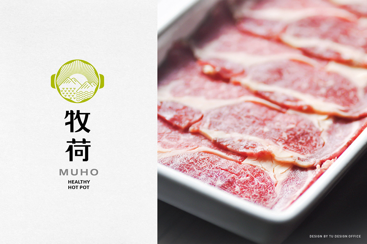
MUHO, located in Taipei, is a Japanese hot pot restaurant providing consumers with natural fine food ingredients as a main feature.
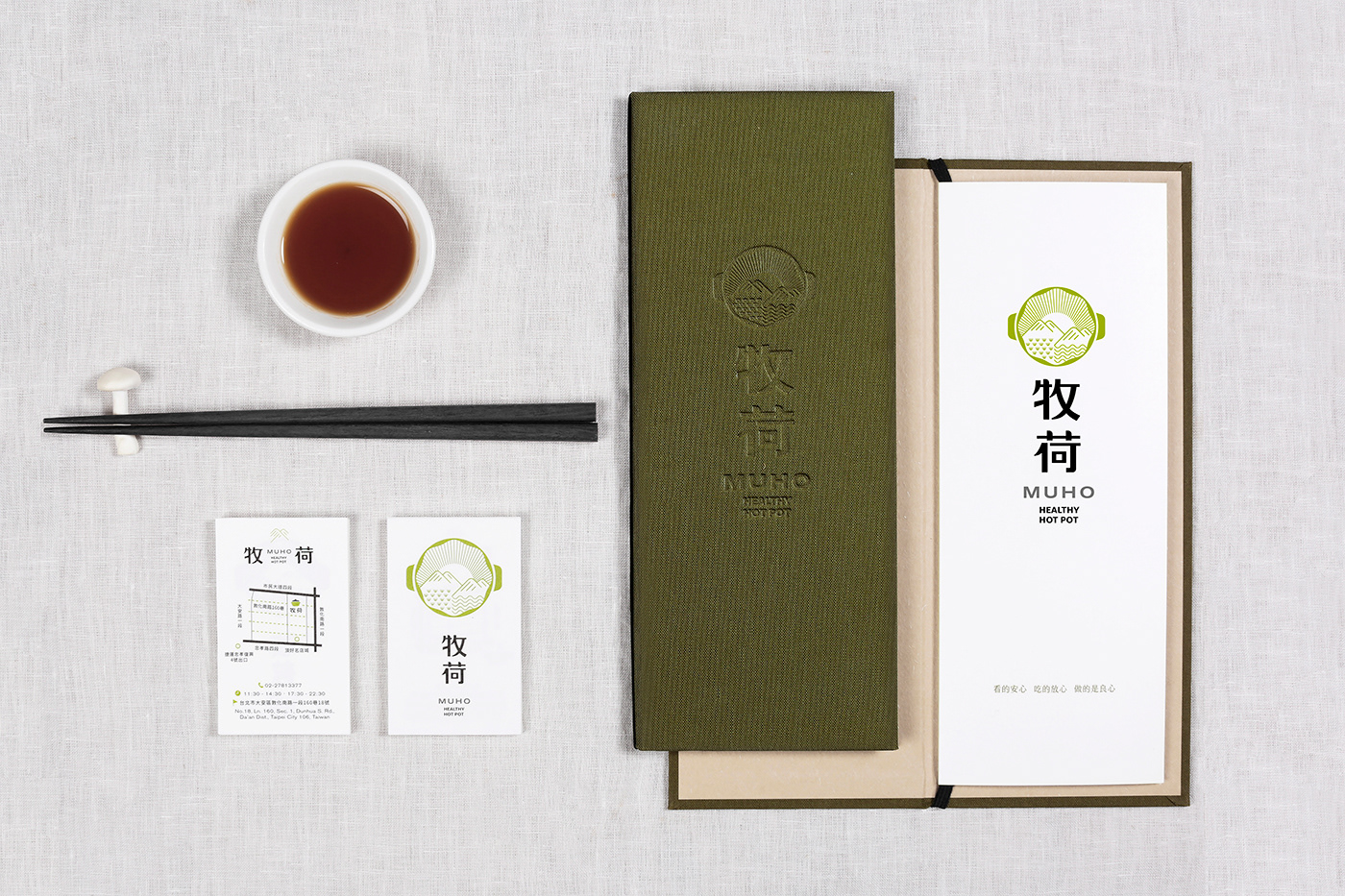
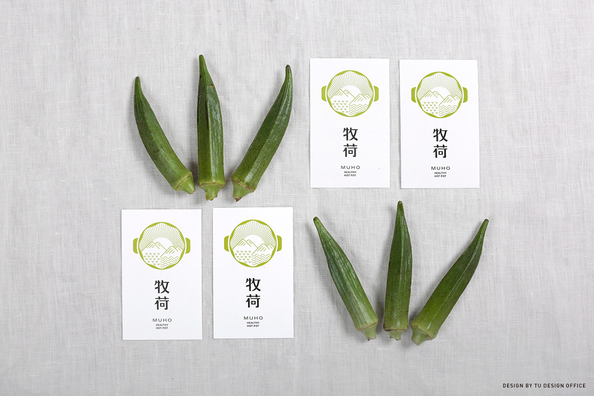
Its logo idea we designed, is based on natural food ingredients imparted by the nature. We use a hot pot with ingredients as a main design and present the nature as a scenario. The silhouette of the hot pot is inspired by most-frequently-used lettuce and cabbage. We hope, by this design, to convey a message of brand image of amiability, nature, and security. MUHO’s hot pots are a kind of cuisine that people can eat immediately with the natural ingredients cooked well quickly, which allows consumers to enjoy freshness and beauty of nature.
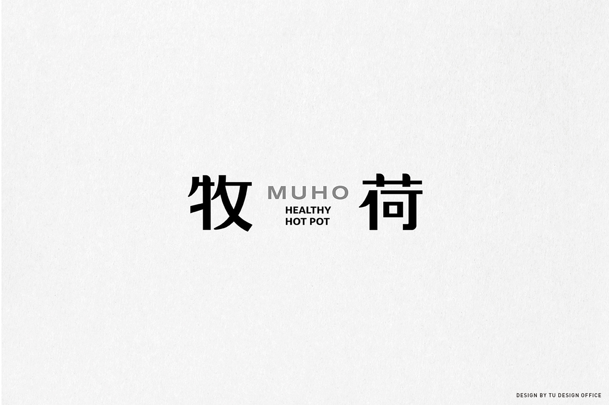
「牧荷」是一家位於台北市的日式火鍋店,以提供給消費者「令人可以吃的安心的天然良好食材」為主要特色。
在品牌Logo上,我們以「來自大自然所賦予的天然食材」為主要概念,設計上以火鍋為主要造型,並將火鍋中的食材,以大自然的情境作為表現,而火鍋中湯的外輪廓造型,則是源自於火鍋最長運用的萵苣及高麗菜造型。希望藉此傳達出「親切的、自然的、令人可以吃的安心」的品牌形象,同時火鍋是隨煮隨吃的食用方式,立即把天然食材煮熟而食,讓消費者享用到大自然的鮮美。


Design by TU DESIGN OFFICE


