Korus Connect
Connecting communities through a brand made for them.
Brand Strategy, Web Design & Development, Ui/UX Design, Messaging

Overview
Korus Connect is a non-profit organisation that fosters collaboration between various organisations for communities in Victoria, Australia who seek growth, facilitation and support. They serve local communities by facilitating partnerships between organisations, relationship building, community engagement efforts, resource management, and training.
Gridhaus’ mission was to help Korus Connect become the brand it deserves, increase communication efficiency and brand recognition, build new networks and open new streams of revenue—without alienating their existing user base.
The Challenge
How do we build a brand identity for an organisation that interacts with so many different stakeholders and users simultaneously through multiple channels and efforts?
The Outcome
Through our partnership, Gridhaus helped Korus Connect develop a focused brand strategy and identity that helped them communicate their brand better.
Developing the Strategy
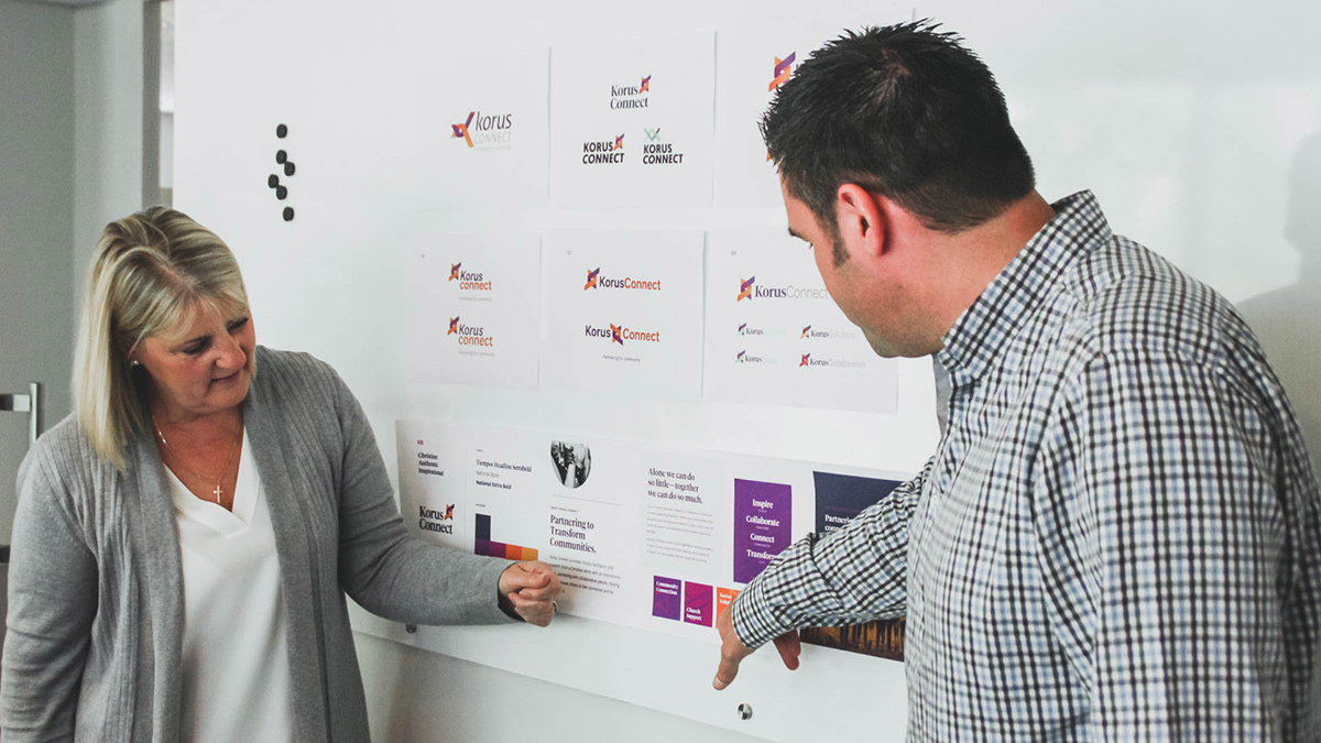
Through consistent exchanges and conversations between Gridhaus and Korus Connect, we learned about their needs, finding out what worked and what didn’t with their old brand. Together we agreed that the best approach was to first craft a thorough brand strategy.
Over a two-day facilitated session via Zoom and utilising its robust whiteboard features, Gridhaus surfaced the challenges Korus Connect faced. In the process, we prioritised the needs and goals of the organisation and its users. This became the foundation for the branding and applications for their 2018 growth and beyond.


Understanding the users
Korus Connect is a community first organisation. It’s a champion for community building and fostering relationships where people help each other grow. To understand the needs of these users, we built unique user profiles to represent the range of people Korus Connect aims to create impact with. This painted a clear picture of their demographics, psychographics, needs and wants.

Brand definition
Through a series of exercises in the strategy session, we were able to extract and refine the key pillars of the brand. This defined the brand’s personality: how it should look, sound, and act.

Positioning
Understanding what the Korus Connect brand is and who they are a champion for helped define their internal brand positioning statement, which served to reinforce their positioning tagline “Partnering for community”. This set the tone for everything designed and developed for the brand identity.

Identity design
Gridhaus developed an entire identity system to make sure every user touch-point reflected the brand. The rebrand included updating the logo, introducing a new colour palette, a new typographic system, and vibrant community-inspired design elements. This created a more cohesive experience and atmosphere for the brand with its physical and digital extensions.
All these brand elements were compiled into a comprehensive brand identity guideline to assist the organisation in successfully implementing their brand and new visual identity.

“Gridhaus’ process has helped us design a coherent brand experience and journey for our users. Likewise, they’ve taken us on a journey of discovering who we are and what we can be.”
Chris Dickons, Programs Director of Korus Connect
The new logo
As Korus Connect grew since its establishment two years ago upon what is known as ACCESS Ministries, it needed a logo that represented an organisation built on a history of over 70 years of ministry in Victoria.
It was crucial that the logo evolved from uncertainty to maturity, embodying Korus Connect's rich history and newly discovered brand attributes. We took what was working with the previous logo and refined its form and typography to work on a broader scale of applications and sizes.


Finding the right type
We updated the typeface of the brand to be contemporary and clean, with just enough warm character. The typeface combination flexibly works well across large printed displays down to small digital screens.

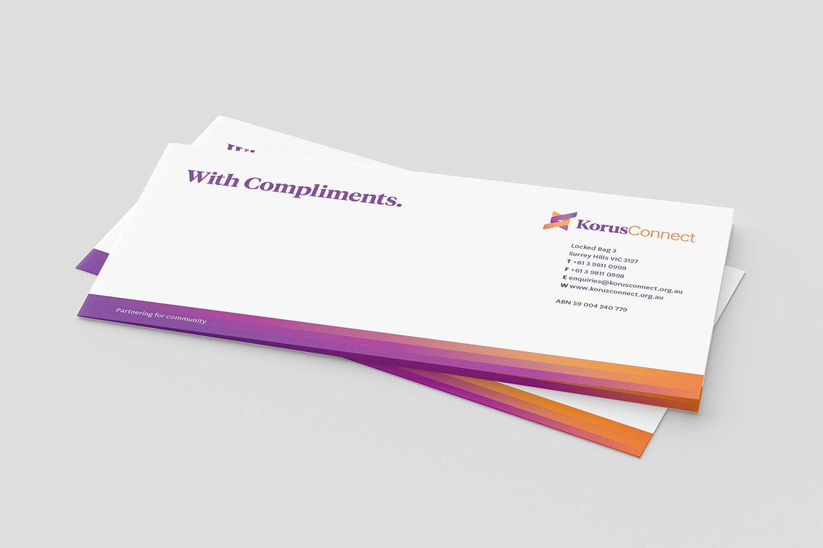
Brand colours
Bold, vibrant and warm. The Korus Connect brand colours are a reflection of its goal of building community. They are also used to colour code and organise various design systems across the brand.

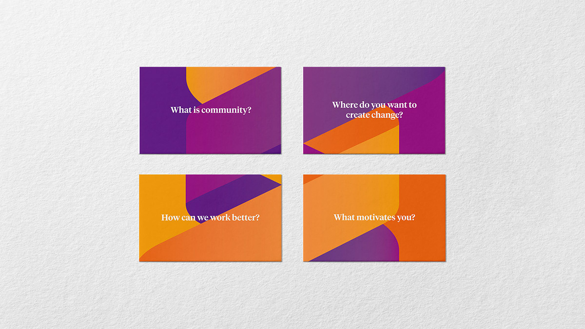
Visuals inspired by people
The aesthetic of the brand was inspired by human connection, warmth of relationships and the movement of meaningful causes. Fluid gradients, colour overlays, and dynamic compositions became the visual system we implemented across the brand.
Beginning with items they receive in the mail or through meeting the Korus Connect team, we helped design a coherent experience for users. This included business cards, stationery, email newsletters, keynote decks, document templates, and signages.