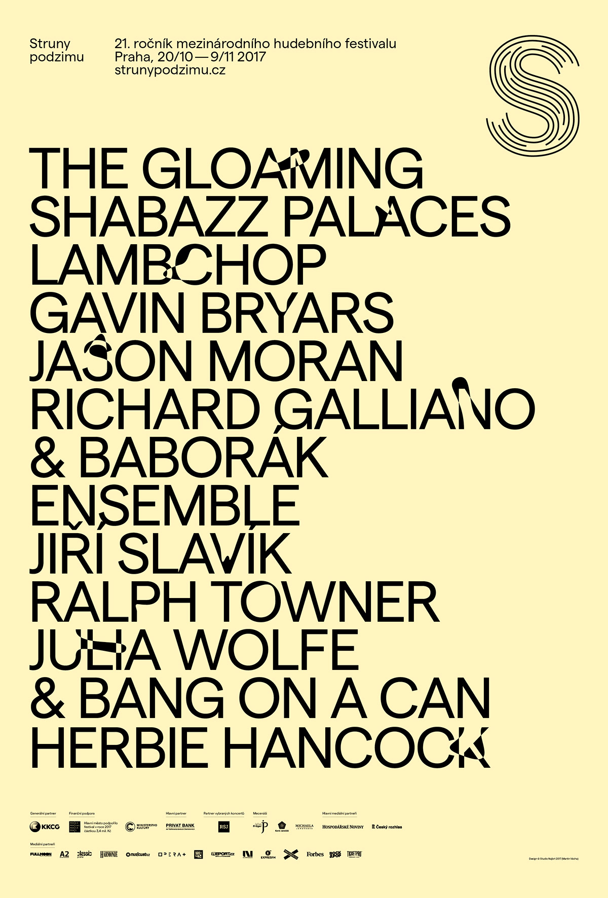
Strings of Autumn
2017
2017
Client: Struny podzimu
Author: Martin Vácha
Cooperation: Petra Hajská (photo — Struny podzimu)
Font: Matter
Type: Brand, Poster, Festival
–
–
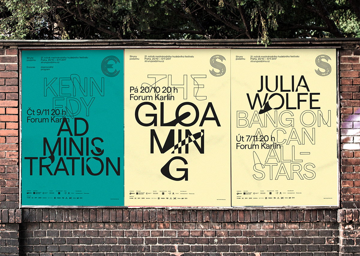
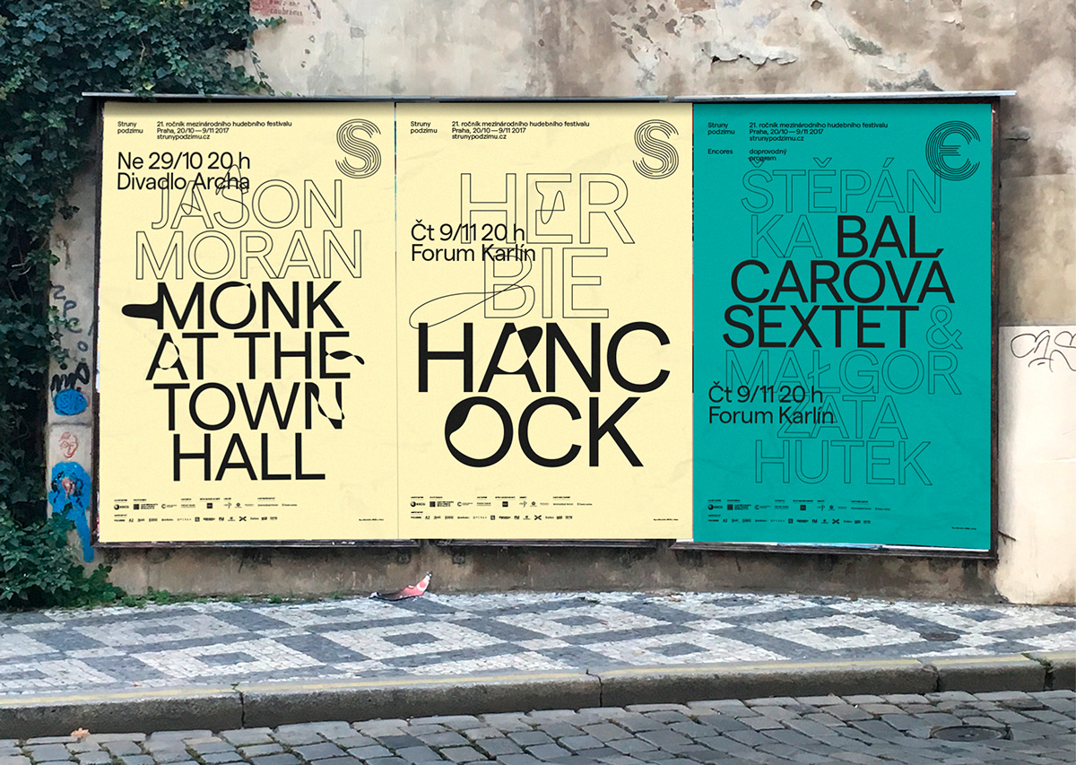
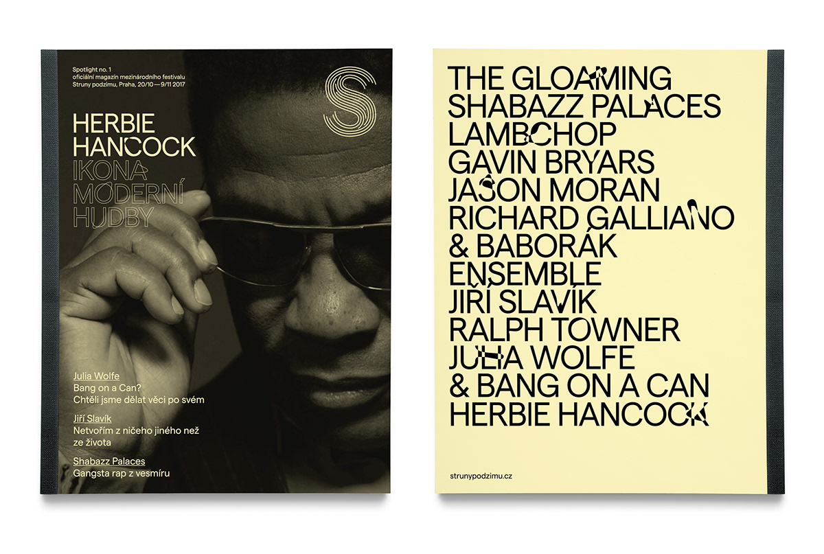
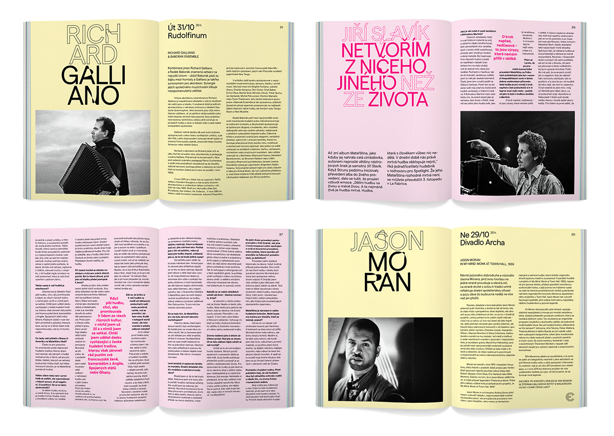
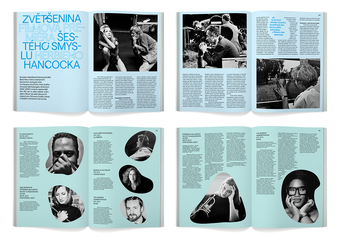
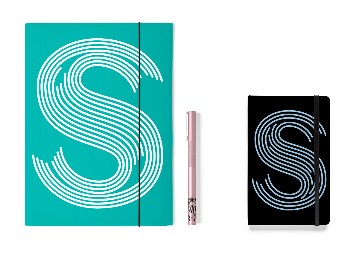
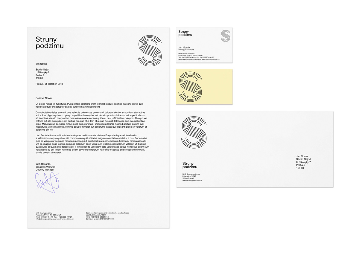
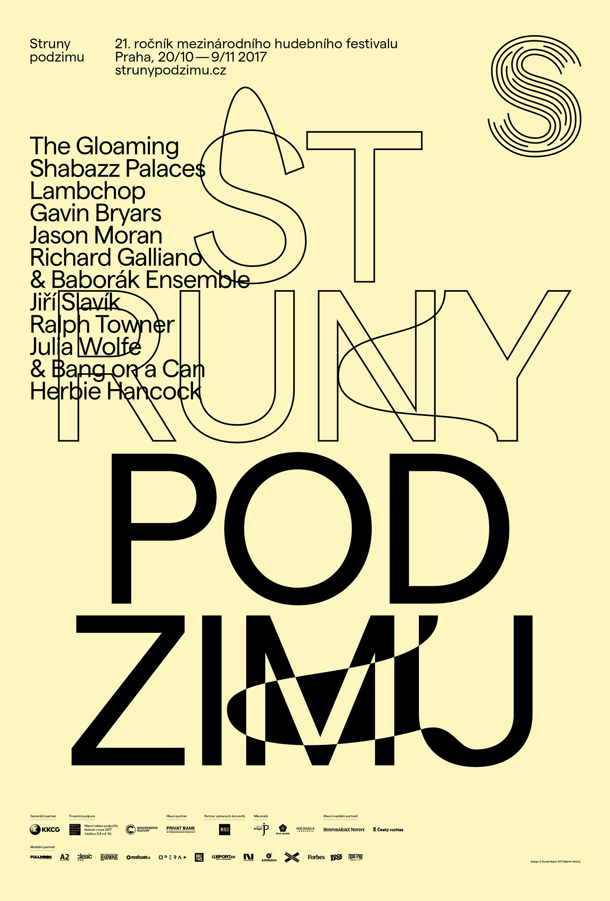
Back after a yearlong pause, the Prague’s twenty-one-year-old multi-genre festival returns with a renewed team and a new visual identity. Martin Vácha twisted and turned the strings into the S-shaped logo and built on the idea with the contours of the letters, which from time to time “skip a beat” as a small glitch, dissonance or line-up experiment.