East Bay United
East Bay United is one of the premier soccer clubs in Northern California. With more than 2,500 players, the club offers world-class soccer experiences at all levels – from the neighborhood recreation team to competitive teams competing at the highest levels in the nation. Based in Oakland, California, the club represents a thriving and diverse soccer community. East Bay United Soccer Club exists to develop youth players and coaches to reach their full potential as leaders on and off the field. Our club is dedicated to offering world-class soccer experiences for all players, regardless of their soccer level, or social or financial background.
About The Project
East Bay United and Bay Oaks finally merged together and became East Bay United Bay Oaks. Thus they would like to redesign their logo to capture their new name and reflecting their brand identity as the leader in urban youth soccer player development.
Solution
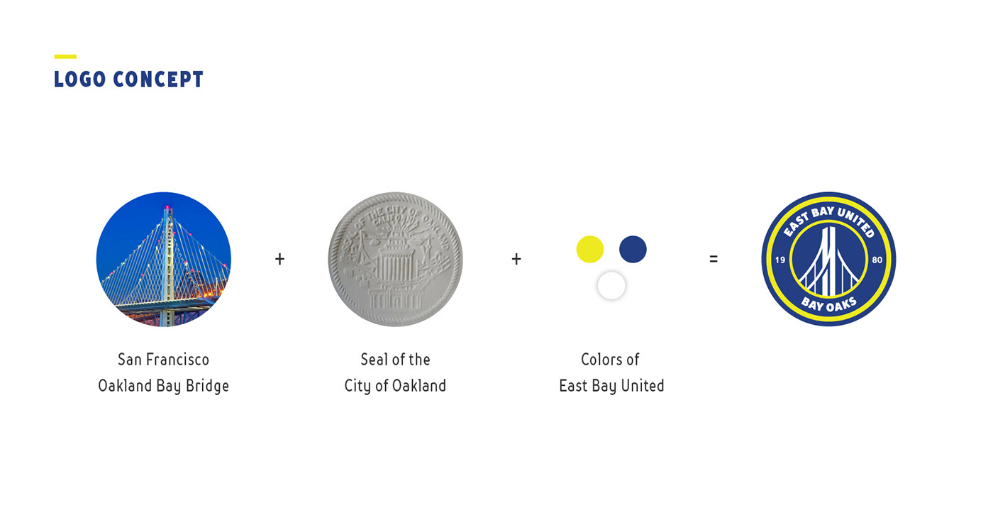
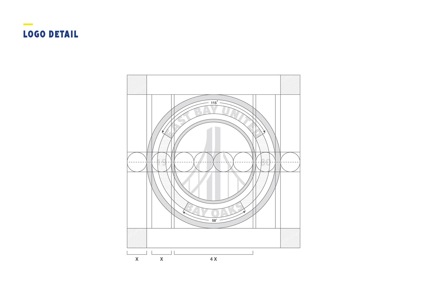
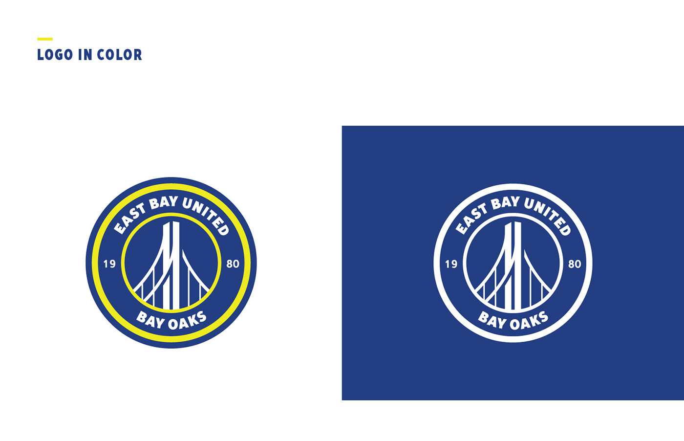
The new Oakland Bay bridge illustration was added to localized the logo and reflecting upon the club's unique qualities: East Bay location, Oakland roots, urban and diversity. Two circles of seals were used in the logo to represent the unity of East Bay United and Bay Oaks. The Bold font was used to emphasize the names of the two clubs. Continue the use of the old color yellow, blue, black and white as a way to carry the old tradition to the new era.