VYB
BRANDING ● PACKAGING
VYB
BRANDING ● PACKAGING
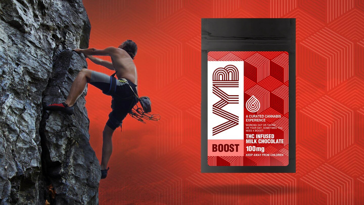
Sprout worked with the VYB team to not only generate a brand, but also develop the packaging graphics for their newly released line of cannabis products. This included extensive brainstorms into the naming of the four effects, and the descriptions which follow. Each effect name needed to accurately describe its application and experience, so consumers are aware of which outcome most appropriately complimented their needs.
The VYB products specifically focus on a patient or consumer’s medial or recreational desire, hence the four different designs. These four effects (Boost, Peak, Float, and Fade), each target a different physical and psychoactive benefit that can be derived through cannabis extractions. Whether a lozenge, chocolate bar, or the raw extracted material itself, the products are individually infused with one of the four effects, and delivered to their patients in appropriate dosages and consumption methods.
When creating the VYB brand, Sprout wanted the design to be as un-intimidating as possible, while easily conveying the difference between the four effects in the visual appearance. This was grown into a black and white brand which then became saturated with color when associated with any of the specific products.