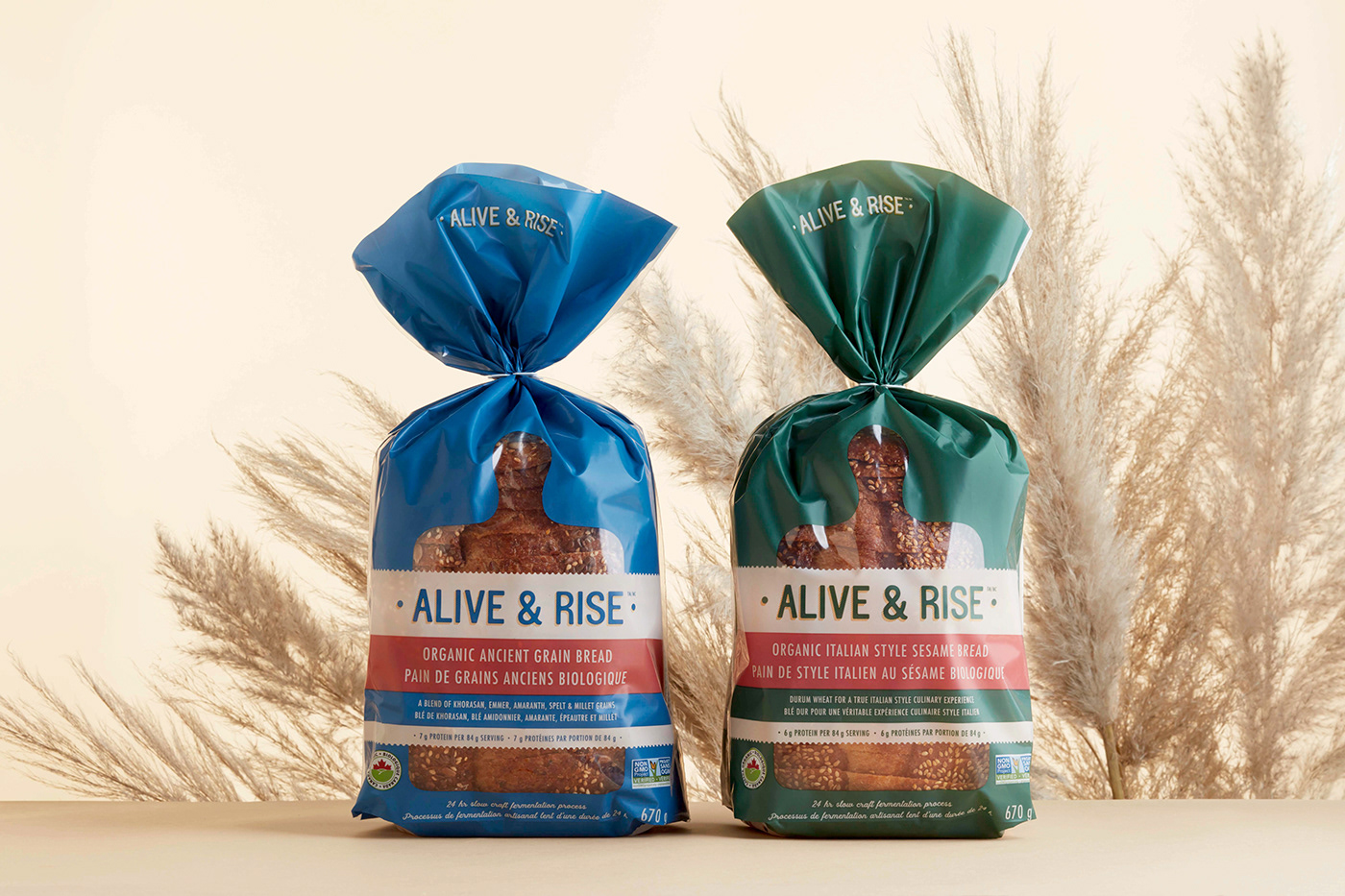
Naming, branding, packaging design and copywriting for a collection of fermented, wholesome bread products.
Our naming strategy and solution tells the story of the breads' main characteristic as well as the aspirational qualities of the consumer.
"We’re baking bread the way it used to be and the way it was meant to be. Somewhere along the way bread lost its nutritious qualities –
we are committed to changing that. Our bread is a revival of the fermentation process — rich nutritious qualities that preserve the germ and support digestive health, inspire lower sugar levels and create a delicious taste. Fermentation is a natural, metabolic process that converts sugar to acids and gases. In short, this means our bread is more alive, closer to the freshness of the earth and simply better for you."
Our approach to this design was inspired by the true Canadian Maker. Pure and honest integrity. In the spirit of the greatness of Canada’s super natural, pristine landscape and the farmers that cultivate and harvest the finest quality ingredients on our land, we know that quality over quantity is important to you. Carefully sourcing only the best, nutritious and safe ingredients and pairing them with nutrient preservation methods is at the forefront of our methods.
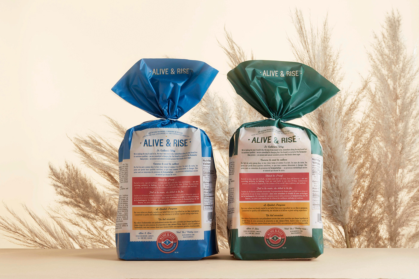
Branding, naming, logo design, typography design, graphic design, packaging design, art direction and photography styling for Alive & Rise.
Designed in Vancouver, Canada by arithmetic.


