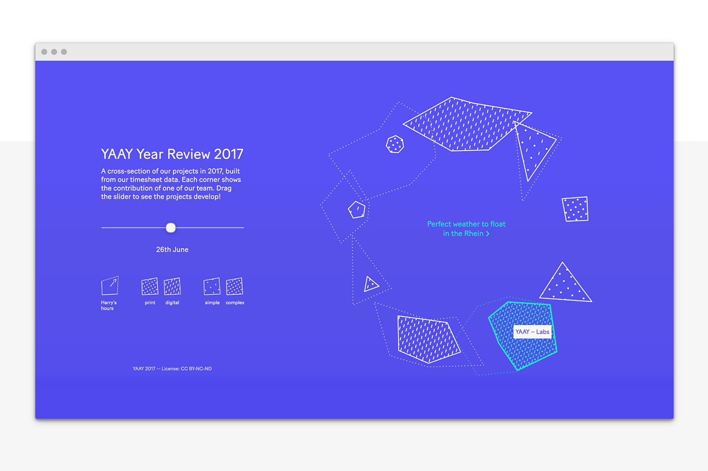
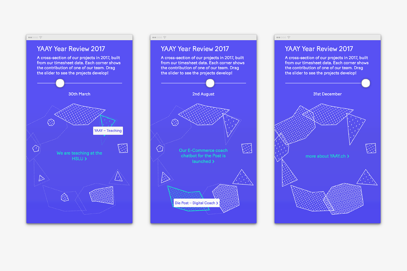
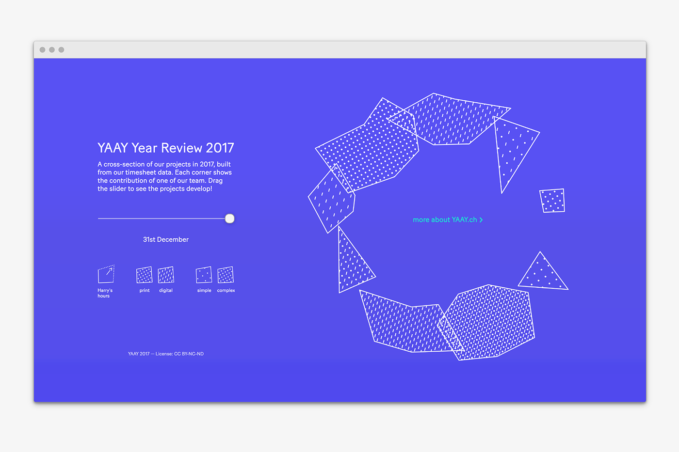
Interactive, Data-Driven Year Review
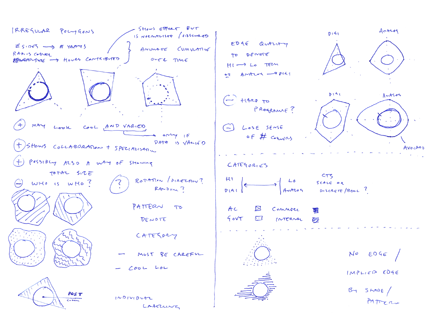
Superdot — Visualizing Complexity
Inspired by the approach of our design studio to visualize large datasets and complex relationships, we created an interactive annual review for 2017 based on the hours we worked. Through a navigable timeline, you can see projects that we've worked on develop as uniquely determined polygons. The size of the polygons is derived from the hours spent, the shape from the number of collaborators who have worked on a given project. Analog and digital projects have different patterns where pattern density denotes the project’s overall complexity. For additional information each project is linked and a running commentary stands in the centre of the diagram.