When designing the logo, I used the stroke behavior of the letterforms to create a looped path and an arrow to show playful momentum. This looped path made for great design elements in marketing materials, as I was able to wind it into a knotted maze which twisted and turned all over the art board.
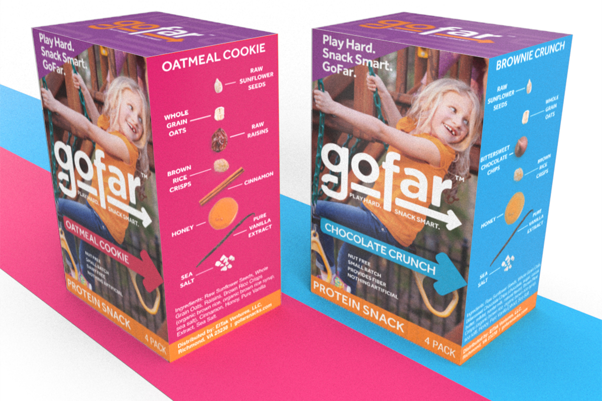
One of the main selling points for GoFar’s products was the limited ingredient deck. In the four pack boxes, I used the arrow in the logo to reinforce the flavor callout, which then provided two arrows (plus the child’s eye line) encouraging you to turn the box to read the visual ingredient list.
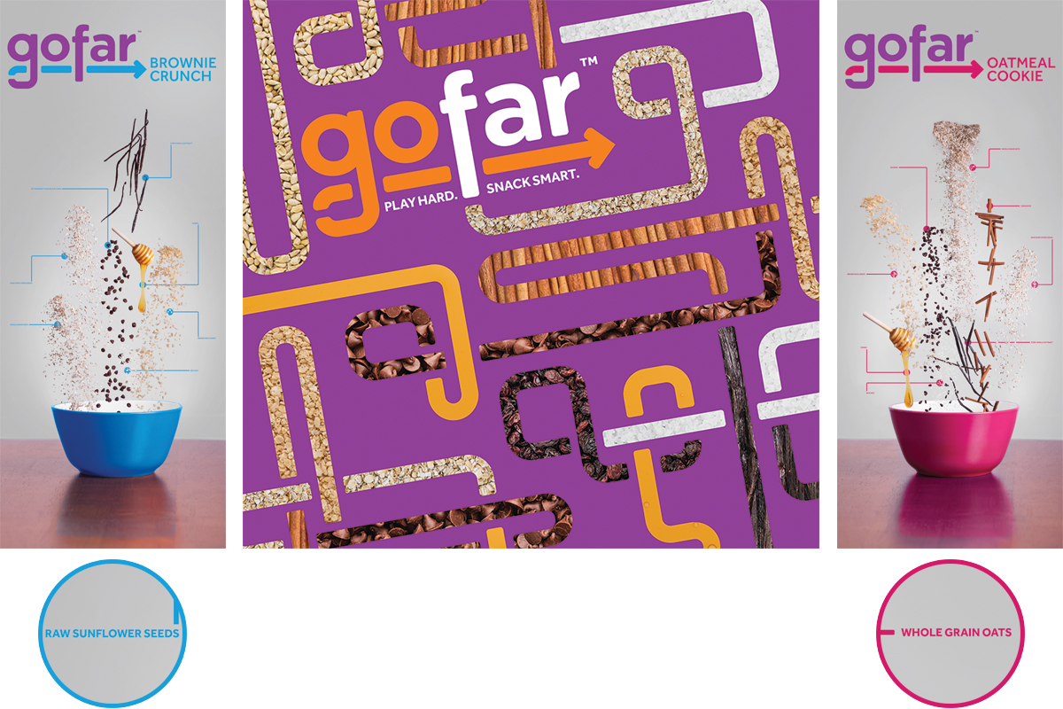
The tradeshow banners and backdrops also highlighted the ingredients in different ways. The side banners used labeled imagery of the various ingredients falling into bowls. The backdrop used the textures of the ingredients to page the loops and turns of GoFar’s path.

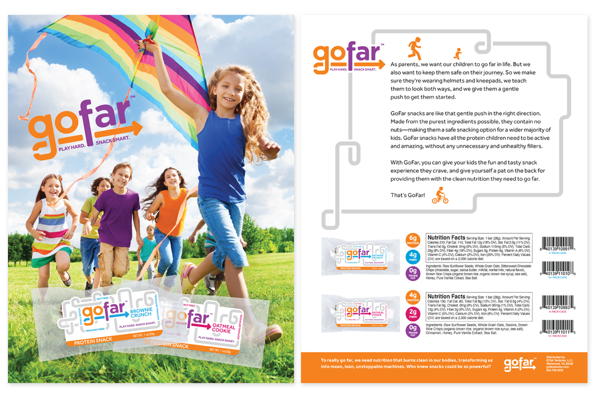
In point-of-purchase advertising such as this rack header card, I used the logo, large and bold against imagery of an energetic child being active.

On the sell sheets, I wanted to use notions of play with packaging imagery at the bottom. On the top sheet, I used the looping path to list ingredients, benefits, and play activities. On the bottom sheet, I used traditional images of children playing with brightly colored clothing and toys to illustrate the energy to be obtained by the protein bar.