


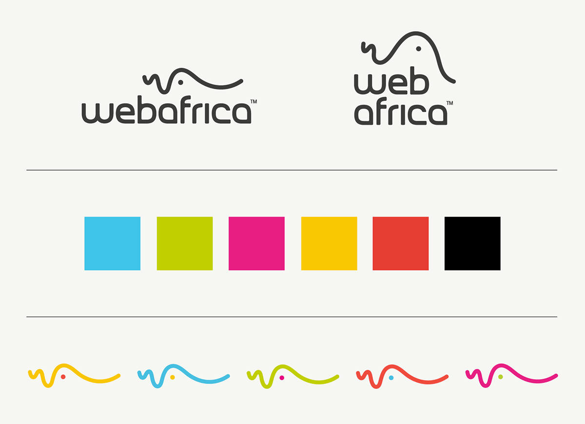
Webafrica is a Cape Town based (now also in Joburg) internet solutions company that have been getting South Africans online for more than 20 years. Having an identity that matches their age of existence, Webafrica was getting lost in a pool of similar-offering brands and needed a logo/identity refresh to evolve with the times and make them stand out of the crowd. They’re known for their distinctive brand tonality and it felt fitting that they have an identity that captures this personality. So that’s exactly what we did.
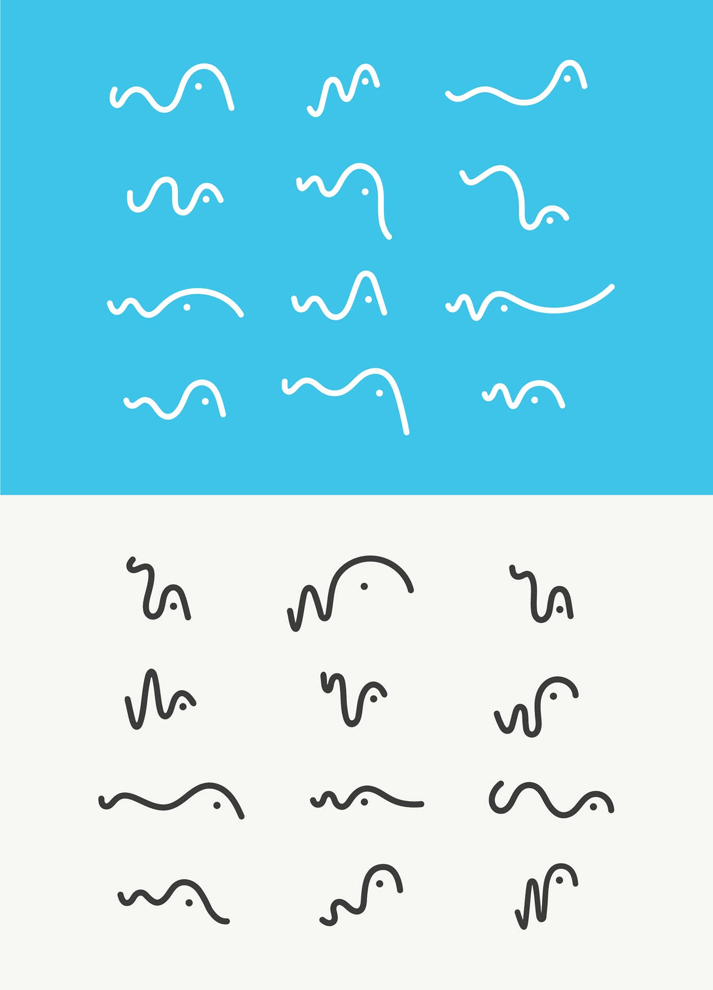
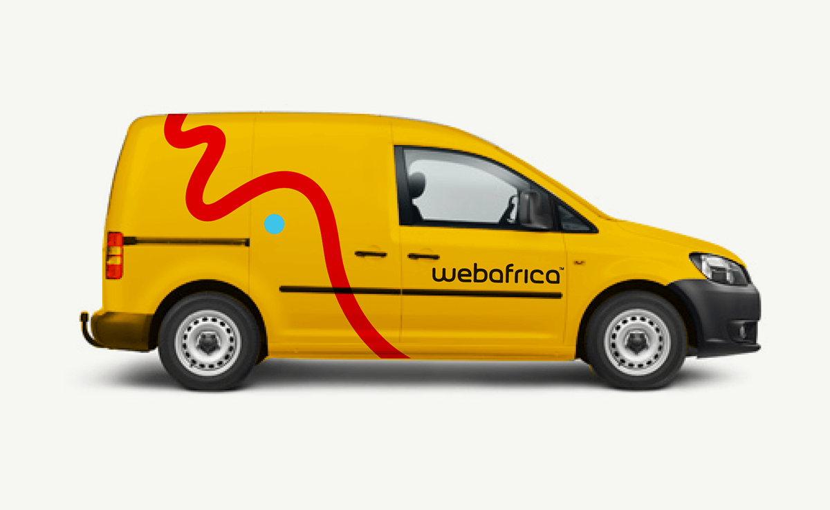
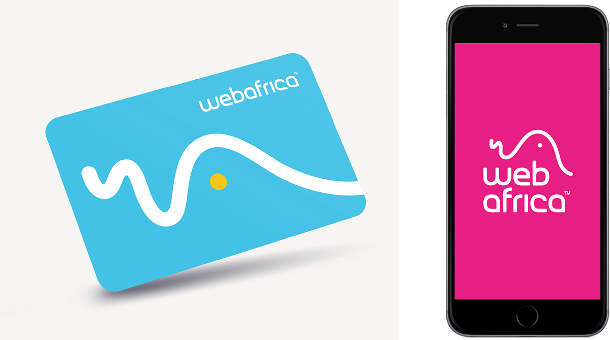
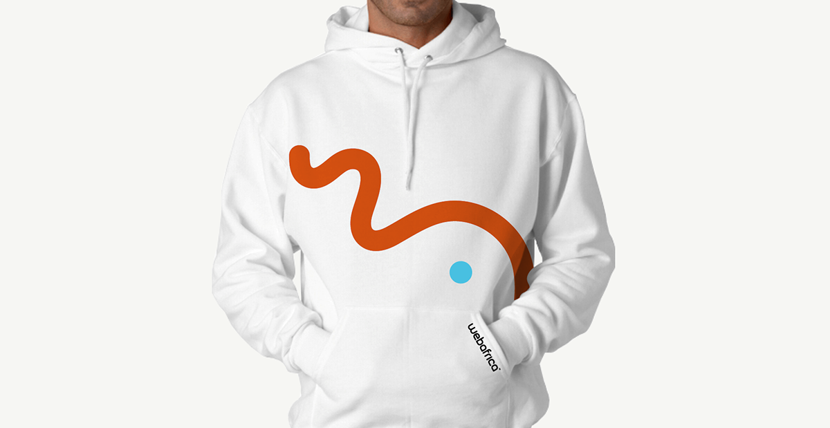
The ‘stuff’ carrying your internet signal (connection) from one point to another are known as ‘waves’. We took this thought and created a simple, ‘wavy’ logo icon which is based on the ‘w’ and the ‘a’ of Webafrica. This icon evolved into a cheeky, faster-than-fast little character, known as ‘Will’, who represents all the values of the brand. His ever-changing form (based on his mood) lent itself to a versatile bank of Graphic elements creating a simple and solid visual language. By adding a vibrant, colorful brand palette and basic, quirky animation we managed to make Webafrica’s brand tonality come to life through their logo and their wider identity.


Talk about the one-of-a-kind online manual we created with easily downloadable assets and animation.

Concept, Design & Execution: Blood, Sweat + Polony
Client Service, Creative Direction & Project
Management: The Jupiter Drawing Room
Client Service, Creative Direction & Project
Management: The Jupiter Drawing Room
Thank you for viewing, we appreciate it.


