Client
Steinheide is a unique sales consulting firm. Unlike other consulting agencies and advertising firms out in the market, they scientifically predict and guide client behavior. Steinheide employs data collected using brain studies for this process. The study of how the brain reacts to different stimuli, colors, shapes and other information is evaluated, based on which they help companies influence potential clients and establish better visibility to their products. The data they provide is highly reliable since it isn’t dependent on random experiences.
Client’s Perspective
The client’s clarity about the mood and message of the logo as well as their target demographic was refreshing. They insisted on using a natural or organic form like a human or a lion to take center stage on the logo. They also wanted it to be active but not aggressive. Steinheide’s take on their logo was to send a message of certainty, prestige, authority and reliability.
The Idea
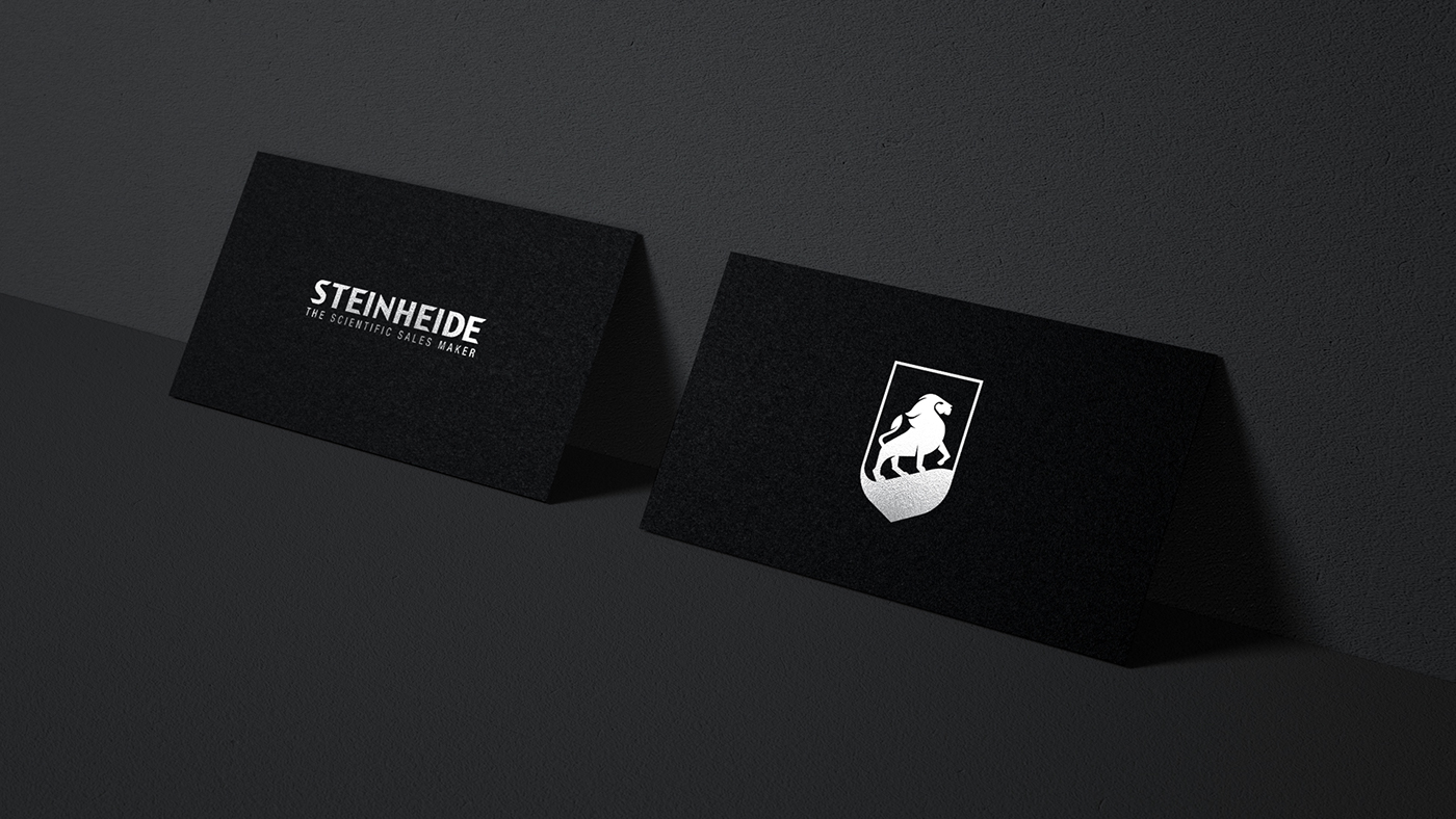
The core idea was to use a lion as the principal object of the logo. This was a deliberate decision as the lion commands prestige and authority just like the client wanted it to. Though in theory, androgynous logos perform better than the contrary, Steinheide required a masculine logo for it to be congruent with the business idea. We chose to keep the divine proportion in mind while designing.
The Development
The pose of the lion on the Steinheide logo was inspired by the iconic movie of Lion King. We tried to recreate a scene from the movie not just because it instilled a sense of pride and trust rather than fear, but also because it depicted agility. We enclosed the lion within a shield which is slightly angular to evoke a sense of certainty that the Steinheide brand intends to project.
The Execution
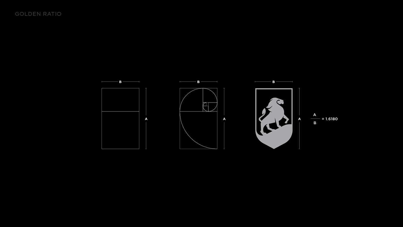
The Steinheide logo was designed based on the theory of golden ratio and divine proportion which is a rule embraced by designers, architects and painters all over the world. A proportion satisfies the golden ratio when its dimensions give a value of 1.6180 when the bigger number is divided by the smaller. This is said to be a “perfect shape”. Appearing throughout the human form as well as in nature, it has extensive influence on the perception of beauty. The shield in the Steinheide logo follows the divine proportion where its length to breadth ratio is 1.6180. Further, the lion is designed using the application of the ratio in geometry, or the golden spiral. The design, following the client’s requirement, depicted a masculine lion and hence we opted for a font that is androgynous to maintain the balance.
The Final Logo
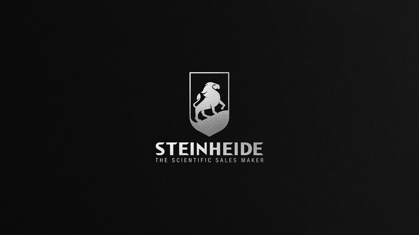
The final product of our design is a powerful and assertive figure in the form of a lion, yet we ensured that it doesn’t venture into the realm of aggression. We maintained its dynamic nature by opting for a particular pose that captures its swiftness. The shield that encloses the object perfectly complemented the overall mood of security and trust that we set out to establish. Finally with the perfect choice of typography we were able to deliver a product that the client loved. The Steinheide logo was a true collaboration of our design team with the client. They had a clear vision of the emotion that they wanted to invoke and we knew exactly how to capture it in design. Together the final logo was brought to life that more than satisfied all the parameters.