


La Glace Premium French Ice Cream
The art of living makes little distinction between work and play, labour and leisure, mind and body, love and creation — there is rarely division. The pursuit of fully immersed artisanal creativity is the vision and the adventure.
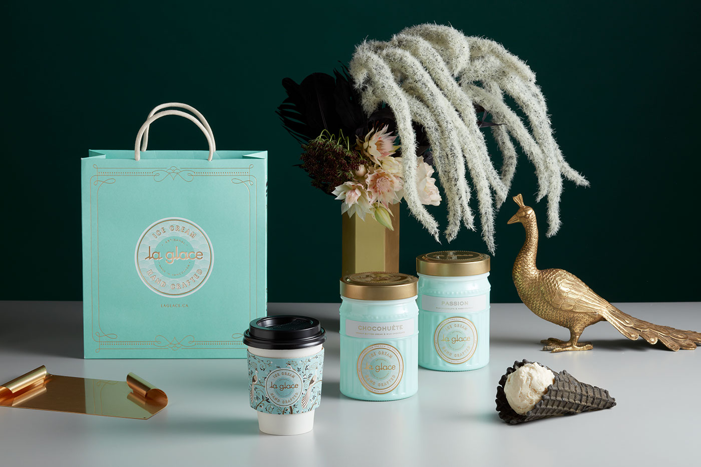
When we set out to create the La Glace brand, the most important emotional value was for the brand and all touch points to embody love and invite connection. The notion that life’s best moments are bettered when cherished together became the core sentiment that we set out to express through the design details. We focused on harnessing sentimentality for the past - we leveraged the idea of nostalgia to create a space that would send people somewhere romantic and trigger positive memories. Elements such as brass, marble, the rounded bar and most of all, the colour mint evoke this notion.
The overarching art direction was born from a fascination of the mid-war transitional period between Art Nouveau
and Art Deco. Wherein flowing curvatures migrated to geometric poetry. As two distinct styles that sit side by side in
art history’s time-line, we asked the question, what was the bridge between the two styles — how do you go from
Art Nouveau’s infamous Alphonse Mucha-esque overly styled, curved and decadent line work towards a more
geometric bursting style? What would the style in-between those two periods look like? This was our inspiration
for the details found throughout the space, not geometric and not overly ornate — a middle ground, a marriage
of the two distinct periods.

Double thick custom dieline shopping bags with extra thick corded handles,
fully lined with a multi-colour plus gold foil print of our peacock pattern.

Custom typography wordmark for the gourmet ice cream cafe La Glace.
Influenced by pre-war era vintage type samples collected from France & Italy.
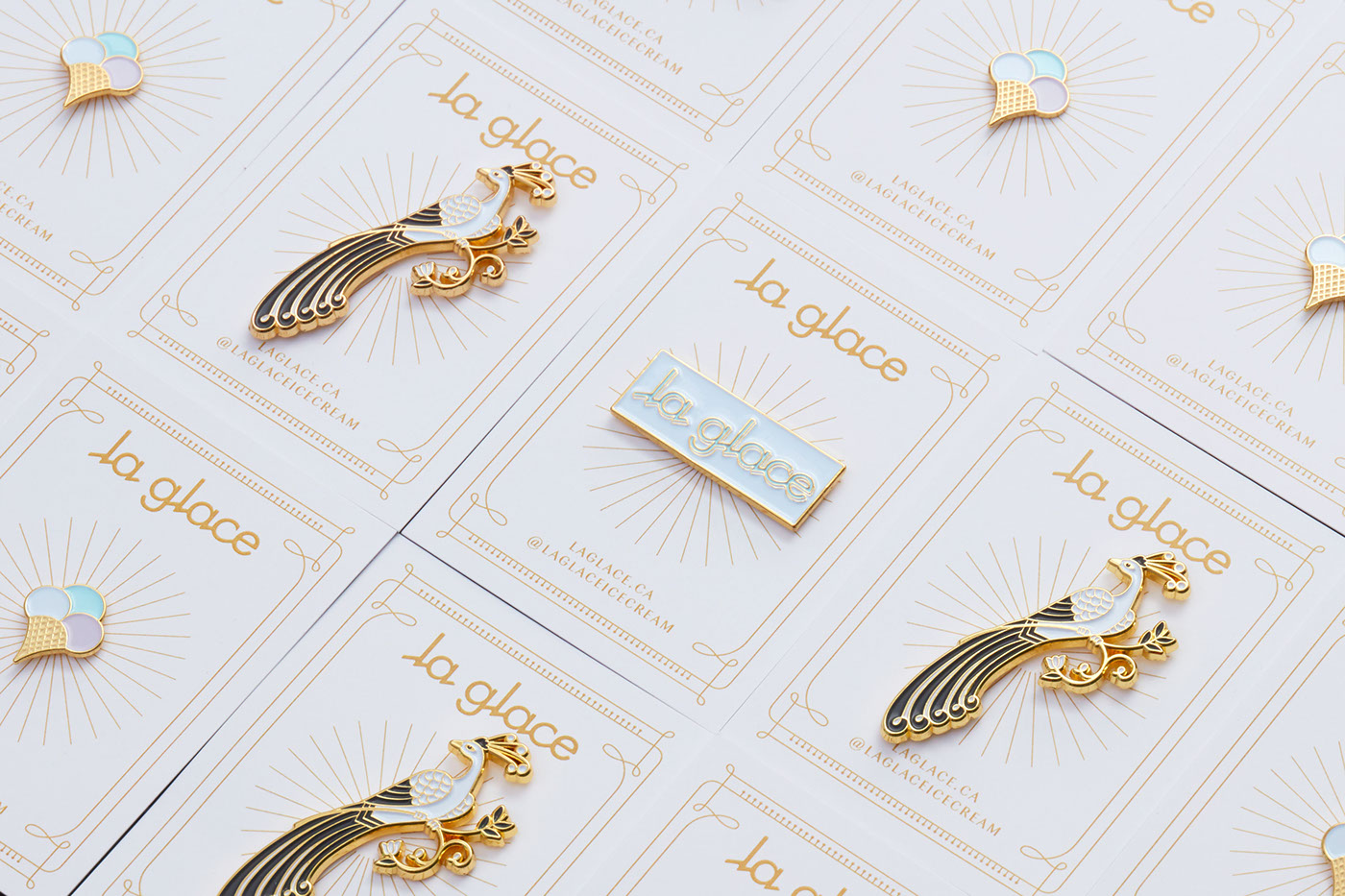
We designed the La Glace team uniforms to be playful and emotive of the brand story.
Belgium linen aprons were custom made with inset eyelet trim and adorned with a set of three pins;
our peacock mascot, a Deco ice-cream cone and the logotype.


When creating the brand experience for the La Glace ice cream cafe, we established early on that each and every
touchpoint should express the brands sentiment of love and connection. At the centre of this expression is the hand-painted brand pattern that integrated elements of Chinoiserie and the brand's mascots — pairs of peacocks. Distinctive use of Art Nouveau's curving line work in an understated means intertwined into Chinoiserie floral and bird scene motifs create an unexpected story of community and the intimate bonds we form.

Branding, logo design, graphic design, packaging design, industrial design, art direction, copywriting,
custom apron and uniform design, custom shopping bag design, custom coffee cups design, custom stationary and business card design, custom ice cream vessel design, colour system, and photography art direction and styling for
La Glace.
Designed in Vancouver, Canada, by arithmetic.


