A balance between
the East and West.
Based in multi-cultural Singapore, our identity was
created to reflect our Chinese lineage. The word
'民' (min), translated to mean 'people', was carefully
chosen to represent our studio and what we feel it
stands for.
We believe that when we create forms that are
We believe that when we create forms that are
modular or fluid, we allow for the opportunity for
little discoveries. Our identity hopes to bring that
thought across.
Full Logo

Monogram Application
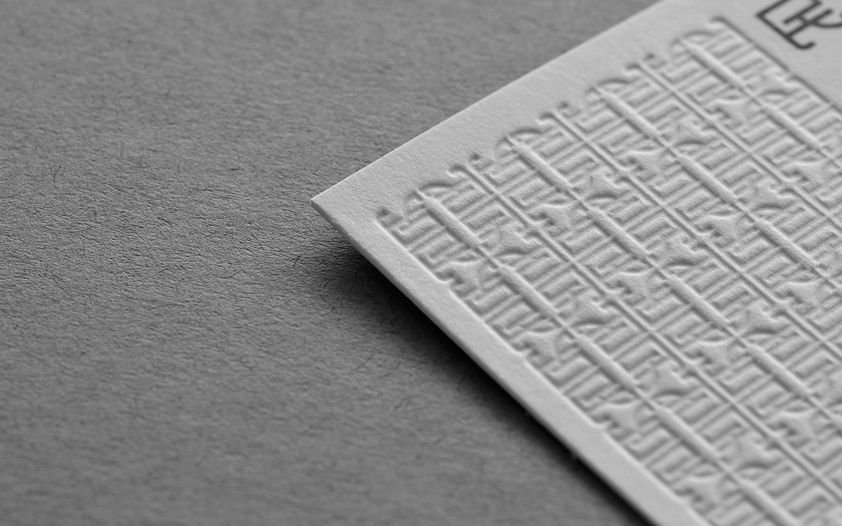
A graphic element that brings to mind traditional
Chinese windows or wooden screens is also
created when the character is repeated four times.
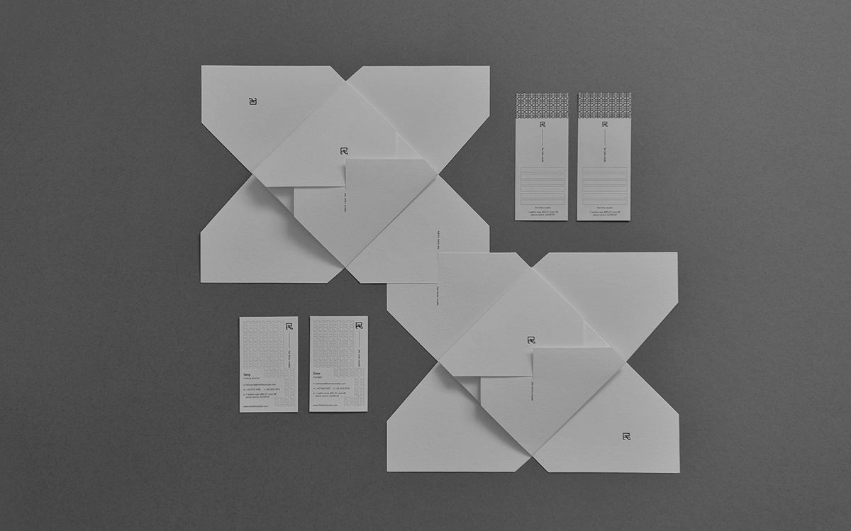
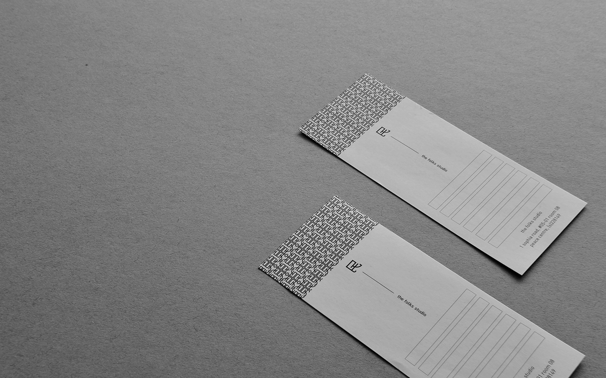
Name Cards
A name card is a receiver's window into our world.
We experimented with different materials and found
one that would allow light through – just as a window
would, when illuminated from behind.
Lotus CD Sleeve
A customized CD sleeve, inspired by
a lotus in bloom.


Project completed:
2012


