

Creating Clarity.
Selleys is a premium brand in the DIY category,
with its products sold in most home fix stores
and supermarkets island wide. We were tasked
with designing the packaging for its cleaning range.
As new products that will be introduced in complex
and busy retail environments, creating clarity was
our design objective.
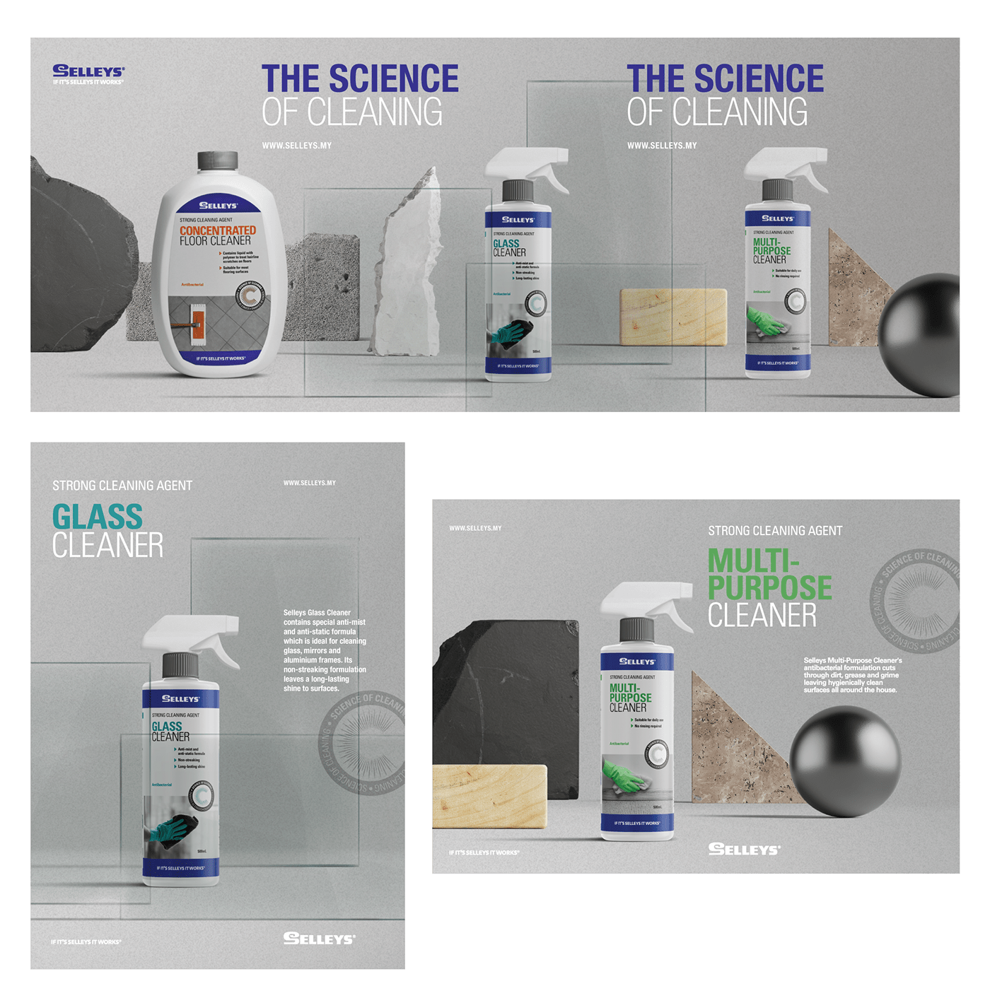
The label design was minimal, yet not entirely
abstract. White was chosen as the primary colour
to help the products stand out amongst its colourful
counterparts in the same category and accent
colours were introduced to help differentiate
between variants. Simple bottle forms were also
selected for a clean look and to enhance
packing efficiency.
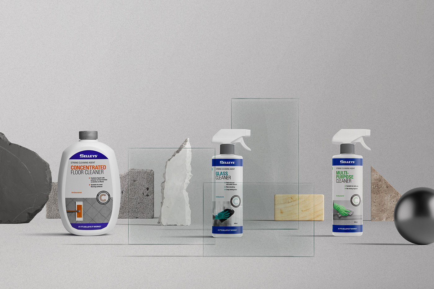
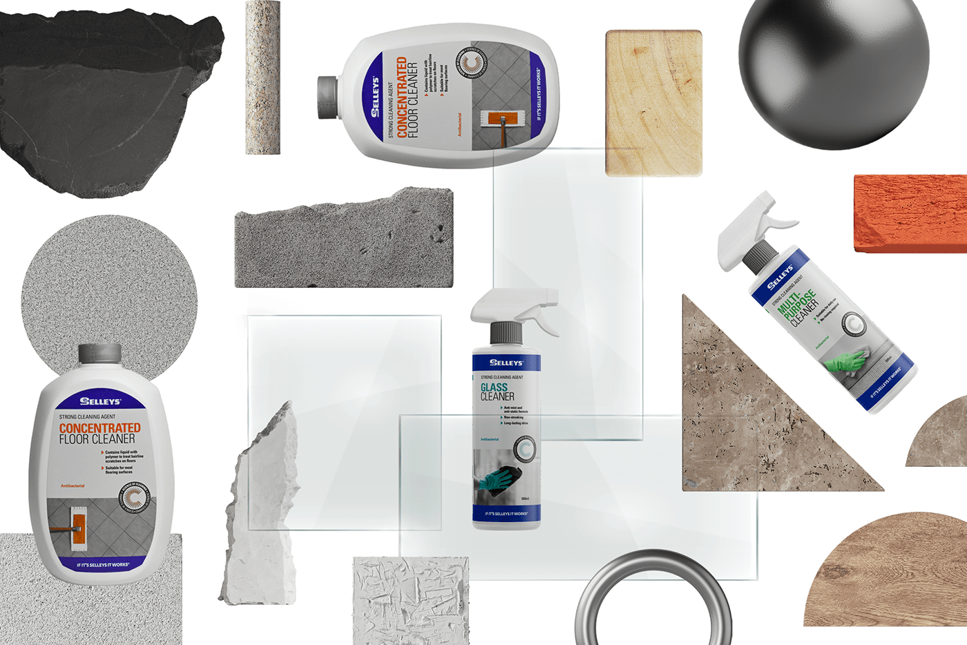
In line with the brand tagline ‘The Science of
In line with the brand tagline ‘The Science of
Cleaning’, the art direction for the key visuals
adopted a laboratory-like feel. Materials were
treated as specimens and used as composition
elements.
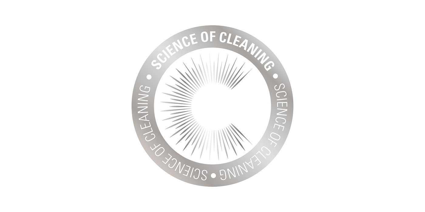
A ‘Science of Cleaning’ mark, also termed The
A ‘Science of Cleaning’ mark, also termed The
Scientific Sparkle, was developed to represent
the result of cleaning with Selleys. Sparkle spikes
form the letter ‘C’ that represents ‘Clean’, and is
used as a quality mark across the range.


Project completed: 2018


