


Rancho is a small winery based in Forqueta, Caxias do Sul district known for its historical features reminiscent of the immigration - the old houses, the centennial churches, the cuisine and the traditions.

The Challenge was to create graphic pieces for a small local product that differed in an environment where the wine culture is intrinsic. The identity should translate the quality and care in preparation that the brand's wines have without fall in the ordinary of the segment.
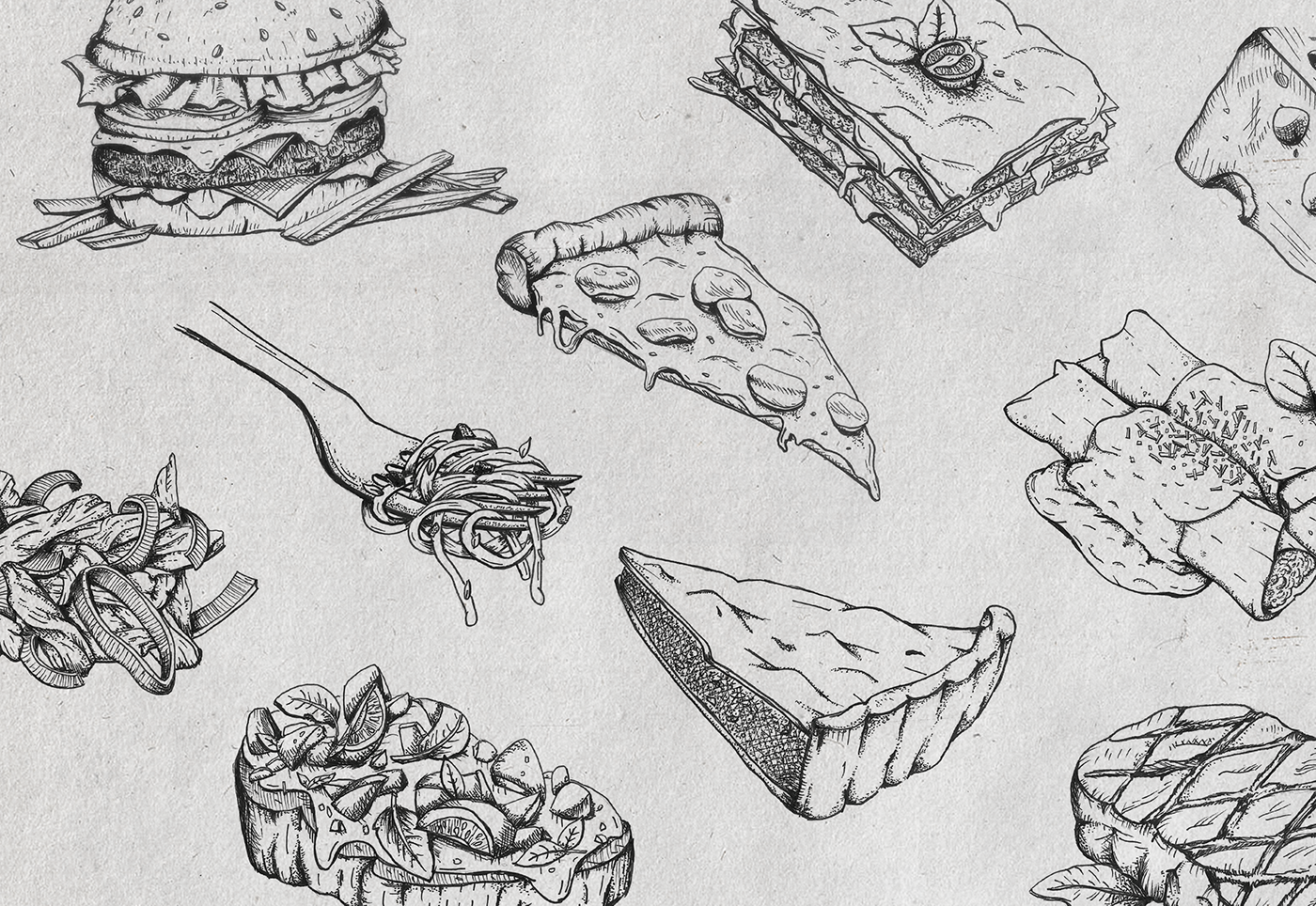
The solution came in choice of techniques, mainly. We developed illustrations that rely on the humorous tonic, at the same time that we bring a huge depth of details. The earthy and golden tones that the label carries create a sophisticated and intimate universe for the product. The signature of the brand brings organic flourishes of the traditional calligraphy, and in its format of seal it helps the work to fulfill with its objective to begin an experience already at the point of sale.


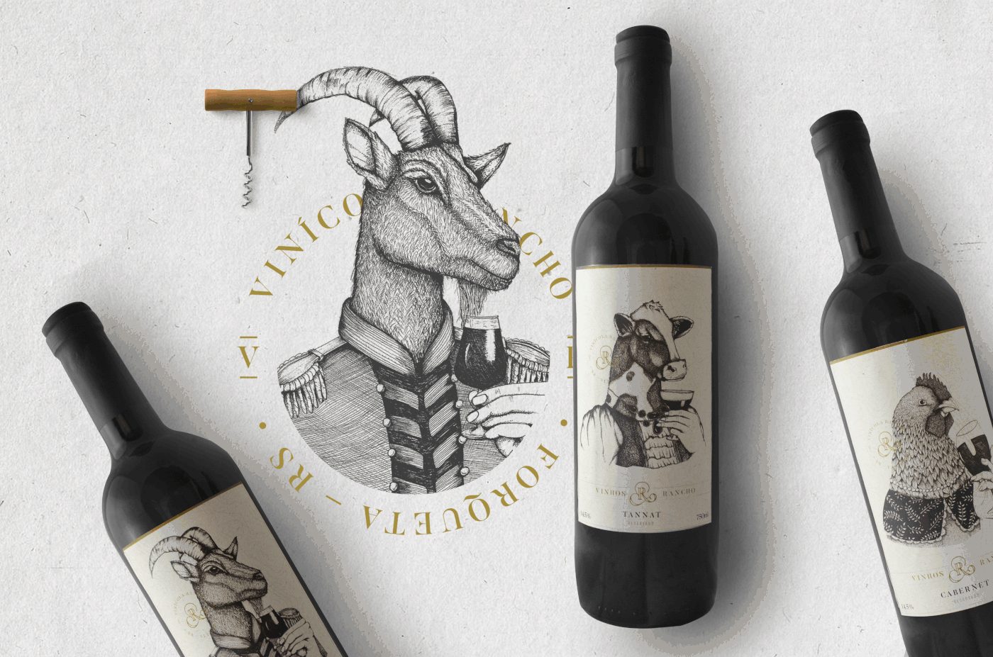
"O Vinho Rancho nasceu na fazenda de uma tradicional família da região da Forqueta e era exclusivo para celebrações especiais. Aos poucos, ganhou reconhecimento e chegou aos pequenos comércios da Região Uva e Vinho. As características frutadas, dando maior destaque para o sabor da uva, agradam os mais diversos paladares. Inspire-se e viva os sabores do Rancho."
LIBRE. Branding & Design – Porto Alegre, RS
HELLO@ESTUDIOLIBRE.COM.BR / +55 51 3072 3001
Design team: Gianlucca Segato, Glaiton Tatsch, Mariana Sartori
Illustration: Mariana Sartori • Copywriter and Planner: Letícia Dallegrave
Follow us on social networks to stay tuned!
AS


