

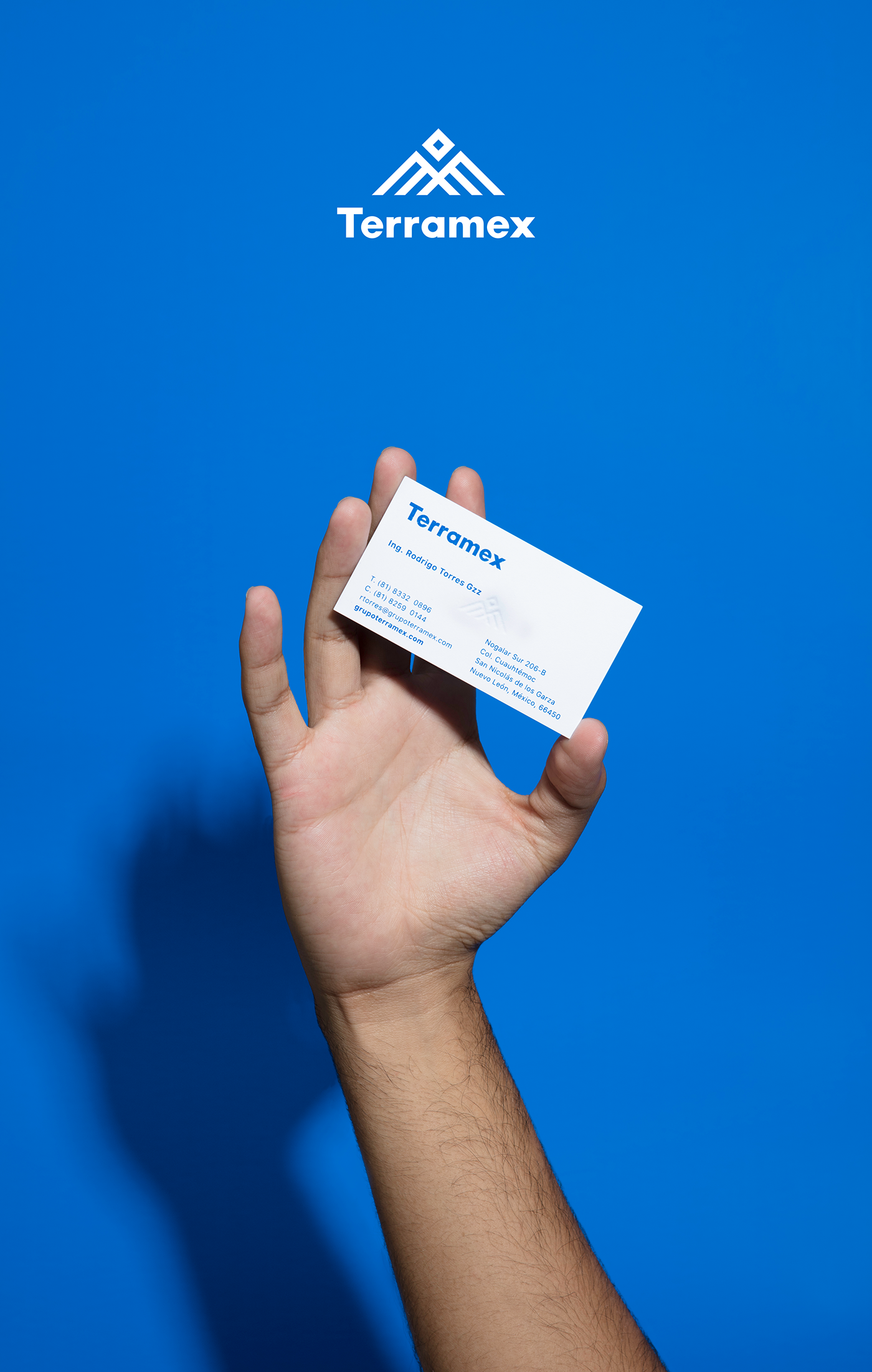
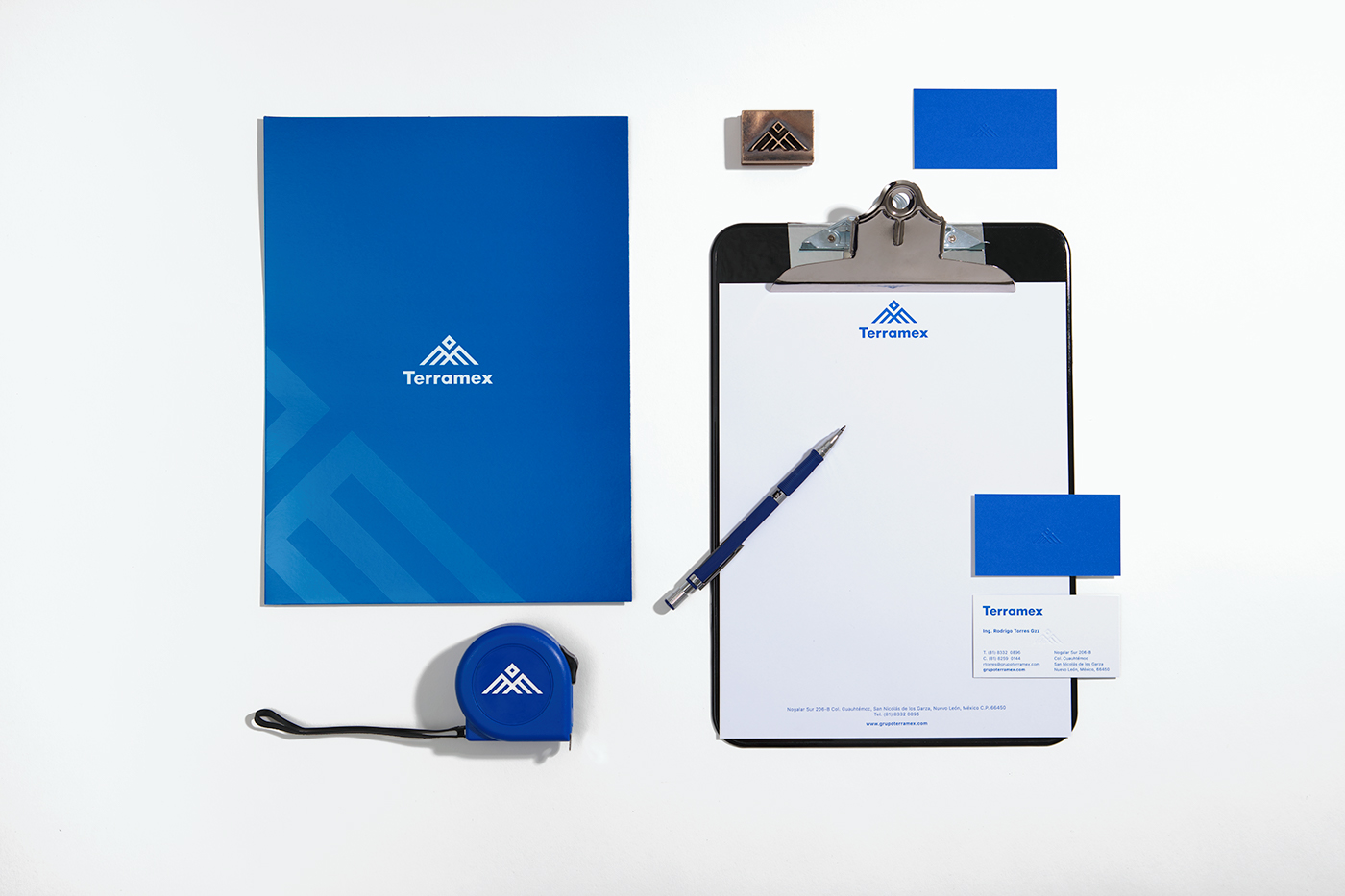
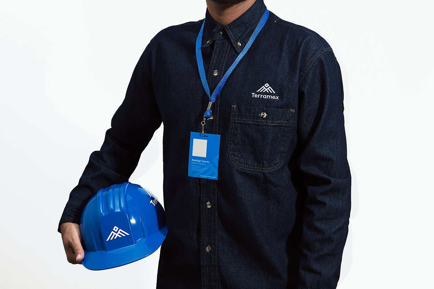
Terramex is a company founded in Monterrey, Nuevo León, dedicated to transportation and logistic services for various industrial sectors.
For the concept, the objective was to strive for a strong corporate image and timeless branding.
For the concept, the objective was to strive for a strong corporate image and timeless branding.
Another main goal was to present an image that complied with the abstraction of the following representations:
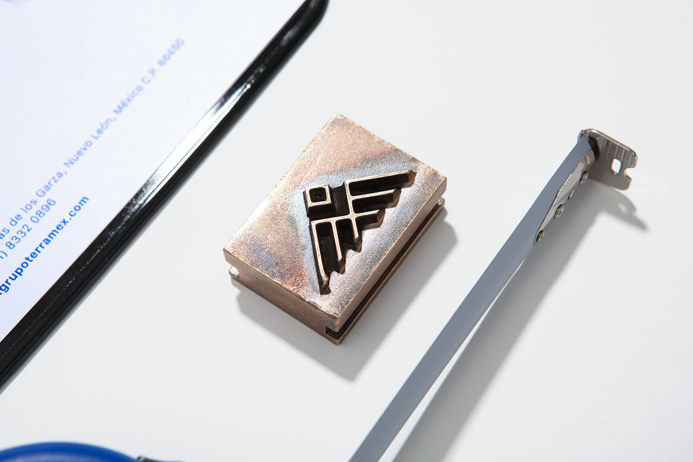
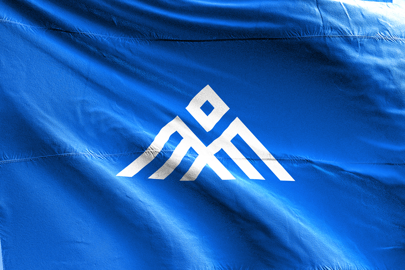
1 – The Eagle: symbolizing rapidness, precision and strenght.
2 - Mountains: representing growth and the company’s origins and ties to the city where it was founded. (Monterey a city surrounded by mountains).
3 – Abstraccion of ‘TMX’ which stands for Terramex, as the pillars of the emblem.
2 - Mountains: representing growth and the company’s origins and ties to the city where it was founded. (Monterey a city surrounded by mountains).
3 – Abstraccion of ‘TMX’ which stands for Terramex, as the pillars of the emblem.
Once the branding had been defined, special atention was given to Terramex’s blue color to distinguish from the competitors, and a scale of grays and sepcial finishing touches such as raising and UV barnishes were added. The typography reflects modernity and formality at the same time.
The branding reflects a very complete, strong and timeless image.
Terramex es una empresa fundada en Monterrey, Nuevo León dedicada al servicio de logística y transporte de carga para diversos sectores industriales. Para representar la identidad de la empresa, se creó una imagen corporativa fuerte y una marca atemporal con un gran significado.
El objetivo era desarrollar una imagen que cumpliera y representara lo siguiente:
1 - El águila: símbolo de la rapidez, precisión y fuerza.
2 - Montañas: La empresa es fundada en Monterrey, Nuevo León donde abundan las montañas. Representa el crecimiento de la empresa y su origen.
3 - Se hizo una abstracción con las iniciales ‘TMX’ que representan Terramex, como pilares del emblema.
Una vez definida la marca, se dio especial atención en el azul Terramex para diferenciar entre la competencia, y se acompañó con escalas de grises y acabados especiales como los realzados y barnices UV. La tipografía refleja modernidad y formalidad al mismo tiempo.
Es una imagen completa, fuerte y atemporal.


Art Direction: Art Labore ®
Photography by: Rodrigo Chapa
Copywriting by: Maria Riojas


