


Yee Kwan Ice Cream
Yee is on a mission, a mission to excite taste buds with her amazing ice cream. What started as a small family business to bring new flavours to the market has grown to supplying ice cream to national retailers such as Ocado and Wagamama.
Our first experience of her ice cream was Black Sesame Seed which knocked our socks off, so we couldn't wait to work with her.
Our first experience of her ice cream was Black Sesame Seed which knocked our socks off, so we couldn't wait to work with her.
— The Identity
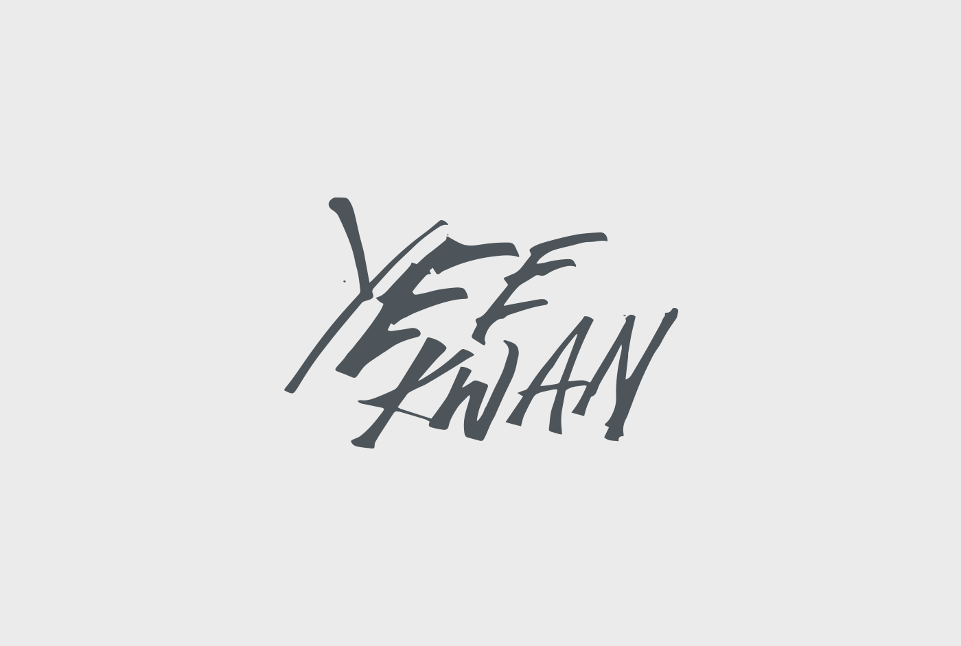
After researching the subject and competition, we knew we wanted the brand to have a hand-drawn quality in the typography.
We experimented with many different types of pen, brush and ink, before landing on the free-flowing 'gloopy' style below, which is used for the logo, flavours and display copy.


— The Story
When we first began this project, Yee told us about her Eastern travels as a child, and in later years with her husband and children. This is where the inspiration for her exciting flavours comes from.
This idea of travelling the globe to discover new flavours became the core concept of the brand and the focus for a short story we created for the side of Yee's tubs. 'Armed with just a notebook and a spoon...'

— The Website
For the website, we wanted to push the boat out and try something we'd never done before. The home page focuses around how Yee creates her flavours (travelling the world to find exciting ingredients to use in her ice creams) and utilises some web trickery to make the journey much more interesting.
— Advertising
When it came to the advertising style we wanted to keep the imagery playful. We created a fun protest against all that is vanilla. DOWN WITH CHOC CHIP! STAND UP TO SCREWBALLS! JUSTICE FOR TASTEBUDS!
We painted our arms and created strong protest images using Yee's more interesting ingredients.


