

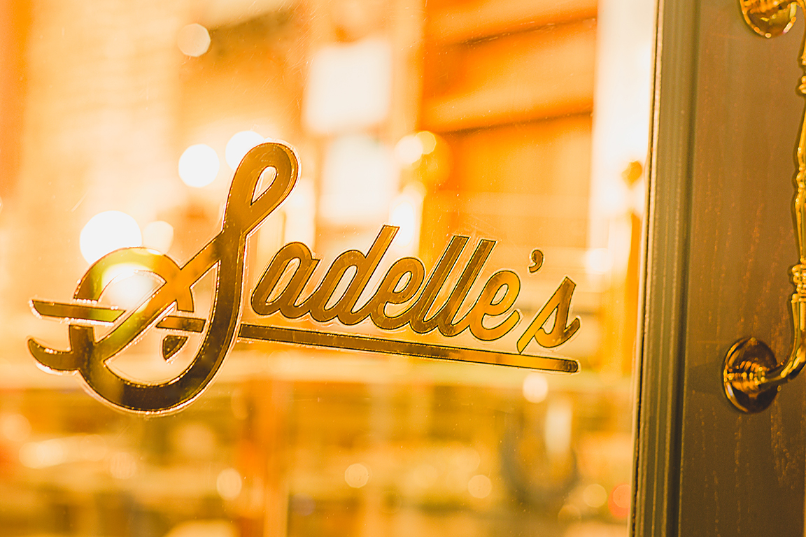
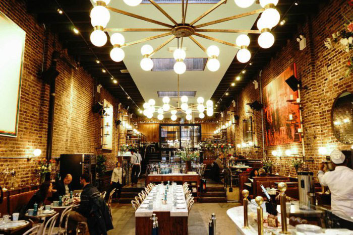
Sadelle's
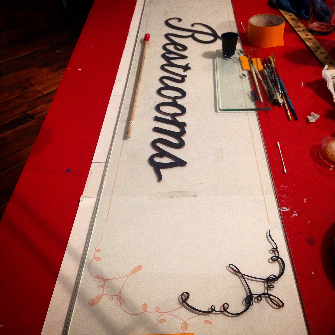
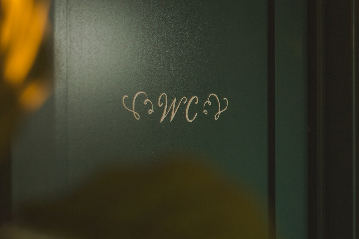
Last year, while working as the artist for the well-known NYC restaurant group, Major Food Group, I worked in creating the signage for their (then) new restaurant and bakery in SoHo, Sadelle's. I worked with the creative direction of Ken Fulk Inc and the owners of MFG in designing and creating enamel painted menu and directional signage, 24k gold leaf window pieces, and two floor designs.


Photo credit: whatweadore.com
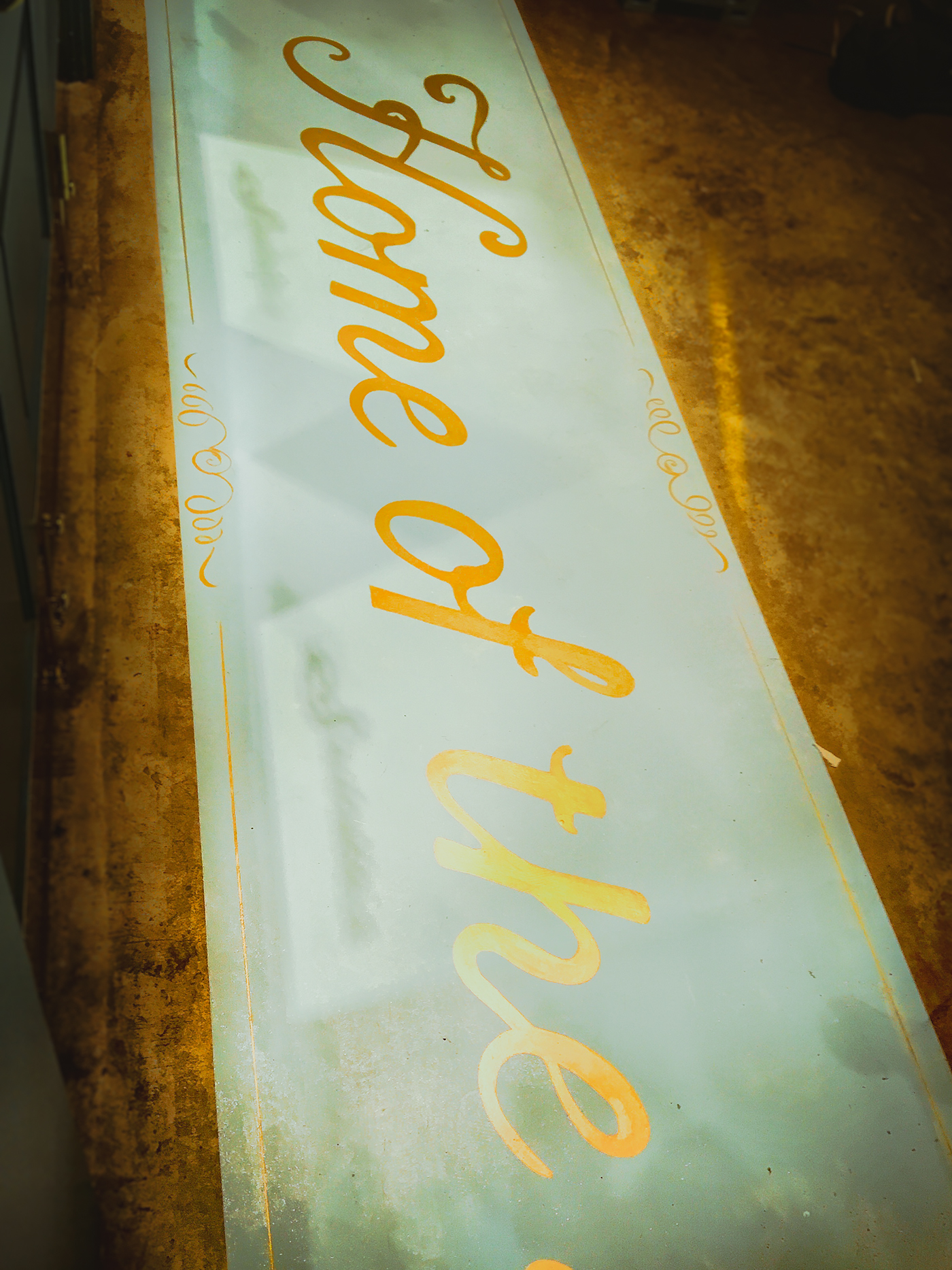
Instead of the more traditional reverse glass painting, I painted the front of the 1/4" glass, saving the back of the glass to lay the 24k gold, so as to appear like a gold inlay. The inspiration was old world European bakery. This was the chosen design of about 10.


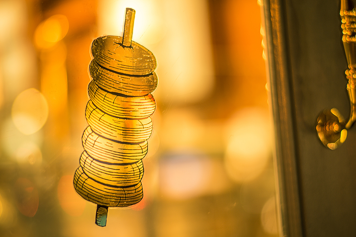
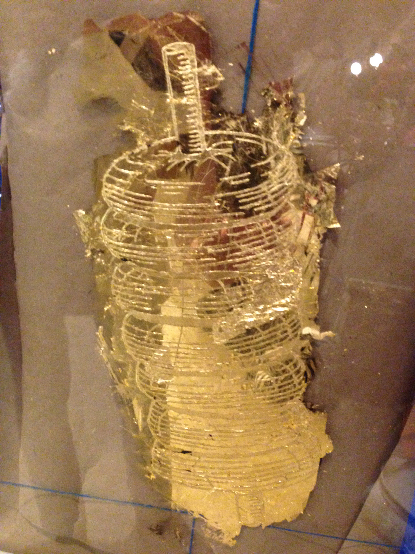
A traditional water gild, carefully laying the gold over the VERY thin outline. Design for these was provided by Ken Fulk Inc.


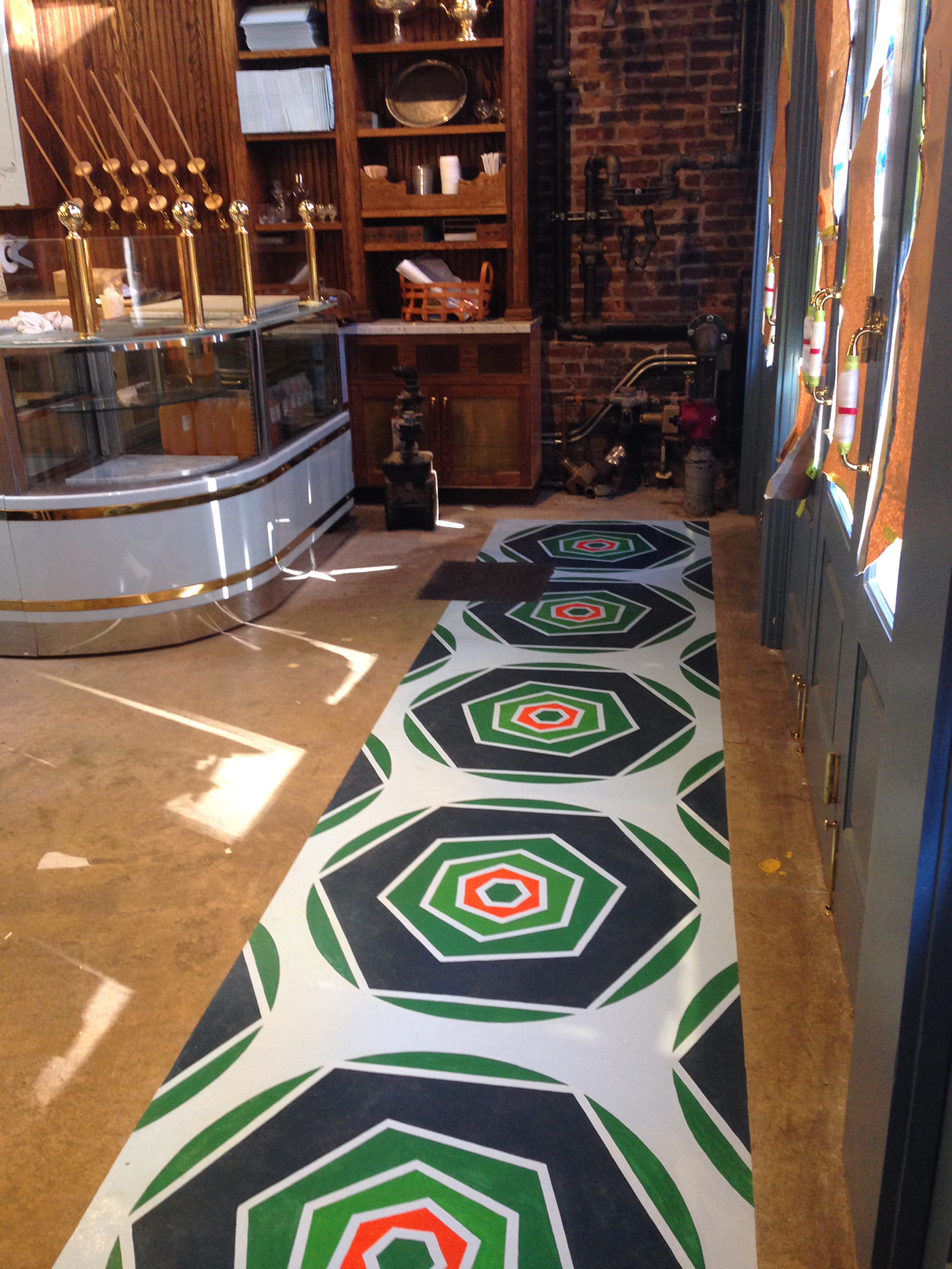
The first of two floors. This first floor took 40 hours of design and execution, and then they decided they wanted a more calligraphic look. Who knew? A part of me died inside, but I took it in stride. The bakery part of Sadelle's is bagel-centric, and the creative direction was honey-comb pattern, so I took the brand colors and created a series of salmon/lettuce/poppyseed bagels. I became very intimate with the structure of the honeycomb, and came to think of it as the structure of the unverse. So why not bagels be the structure of the universe?


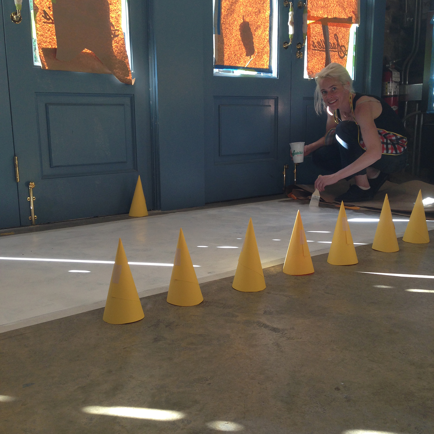
The second floor. Part of me did die with this one. From the fumes and backbreaking work, I actually loss partial use of my right hand and arm for about two months. Fortunately, I use my left hand for most precision work. Work continued!


Photos: sadelles.com


