Dispomedis Madrid
Brand strategy Art direction
Brand identity Brand identity guidelines
Packaging & label design Illustration
Print Editorial
Brand identity Brand identity guidelines
Packaging & label design Illustration
Print Editorial
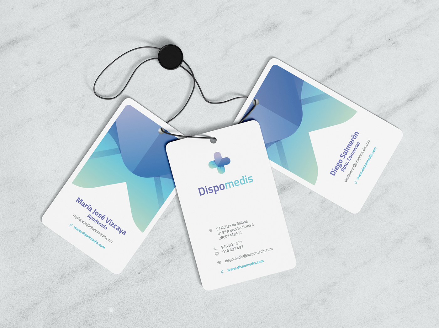
Branding for a Spanish company that manufactures and sells medical care materials, such as gauze, bandages, etc.
This brand, for some time in the market with development, felt the need for a more professional, more oriented and cohesive communication that effectively transmitted the core values of the brand. Being a brand of the medical universe required a serious and very corporate approach, but also a friendly touch and close to the consumer since the products would also be marketed on some specific commercial surfaces.
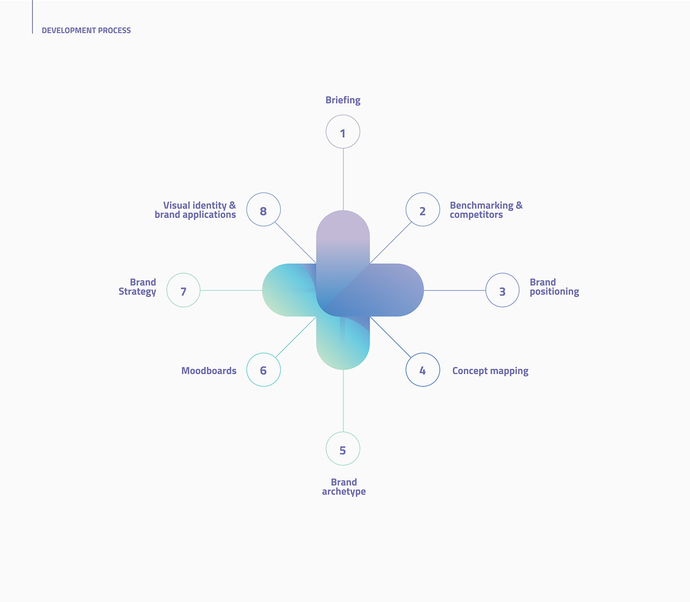
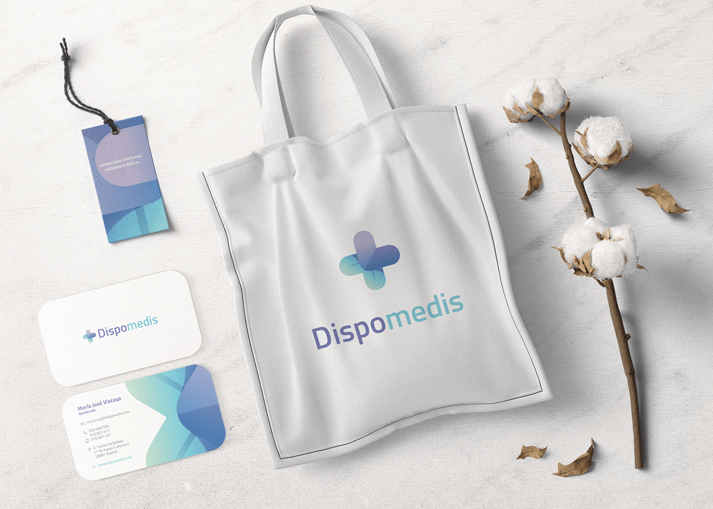
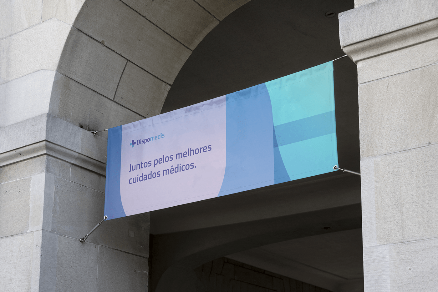
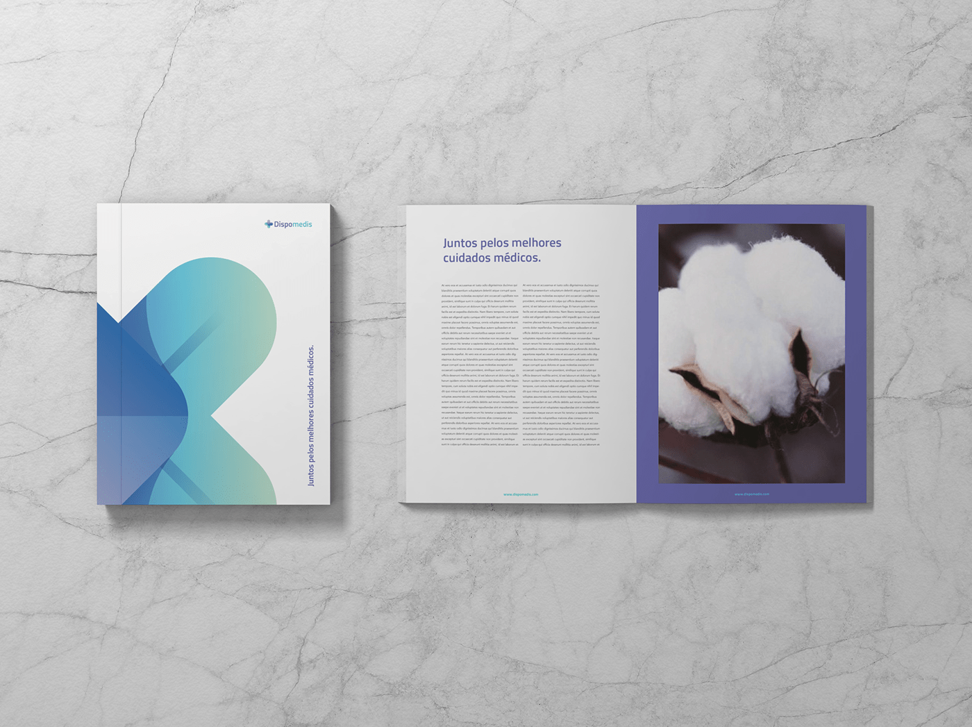
What we built was a logo that refers directly to the medical universe built within a pattern that merges shapes and colors. The chromatic fits perfectly, placing the mark inside your universe adding a touch of lightness and modernity through the gradients used. The brand unfolds naturally by the various items of its communication, using the symbol and the pattern that characterizes it.