CASA DO DESIGN
DE MATOSINHOS
— IDENTITY
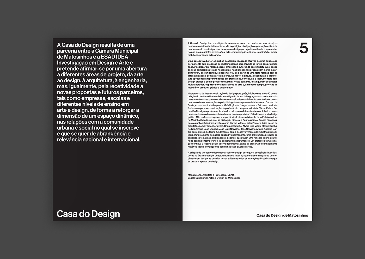
Casa do Design de Matosinhos is a design museum for exhibitions on the history and current state of portuguese design, as well as a curatorial platform to promote discussion on its future. It is also a core piece of the city's strategy to develop itself through the promotion of contemporary practices in the creative fields.
We were invited by esad—idea to design the museum's identity and to develop a visual language for its communication and physical presence.
We were invited by esad—idea to design the museum's identity and to develop a visual language for its communication and physical presence.
Our initial premises were clear yet quite open. We believed the look and feel of this institution's communication should be fresh and provide opportunities for experimentation – a design museum's communication should be able to reflect the creativeness of its field's practitioners –, while having a strong and identitary language.
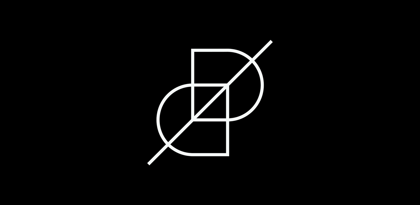
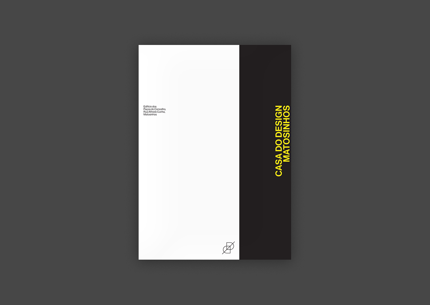
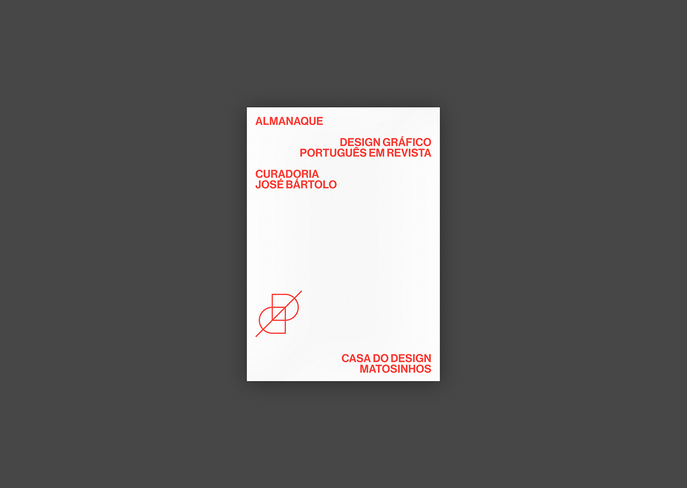
From the beginning we felt there was a need for an iconic mark that could act as a logo in its most traditional sense. We wanted it to have a timeless feel and to represent design as an exercise of projection. Using basic geometric shapes, we've intercepted two planes (the letters “C” & “D”) with a line, an axis that keeps it together and creates a feeling of depth.


Having stabilised the institutional identity, we went on to develop the principles that compose Casa do Design's visual language. We didn't believe there was a need to have a heavily defined matrix, but rather a set of orientations that other designers could interpret and use in future iterations of its communication.
Therefore we've defined two basic guiding principles:
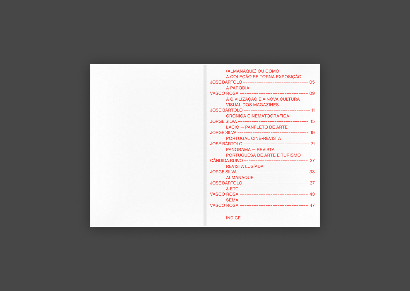
1. Every piece used in the communication should be designed as an open canvas where space is going to be occupied with different elements – typography, imagery, solid blocks of color, white space – either by actions of construction, occupation, interruption or deconstruction.
2. Information is contained on different stripes set across each piece, creating differentiated hierarchies and reading moments. These stripes should be able to make the structures visible or invisible, change direction, overlap and even change styles.
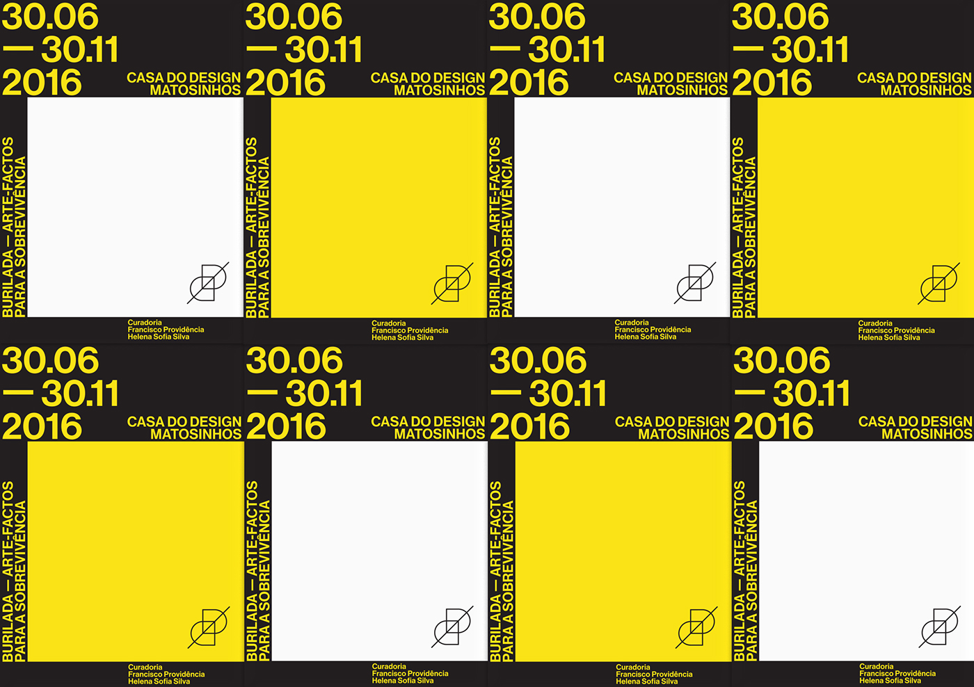
Grid system for posters
(fictional/study examples)
(fictional/study examples)
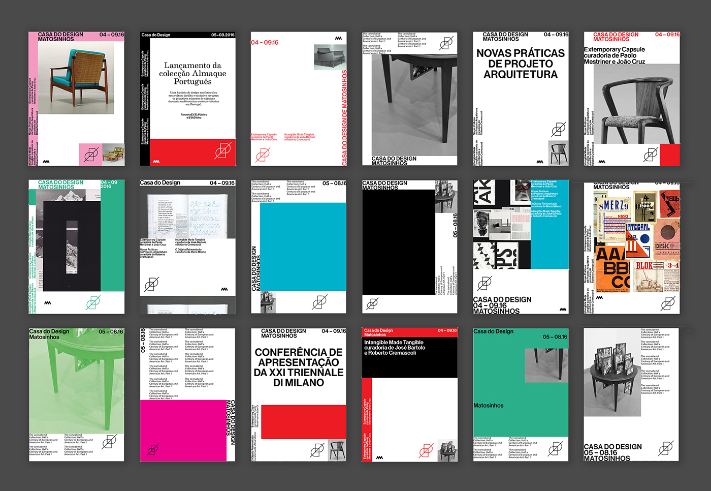
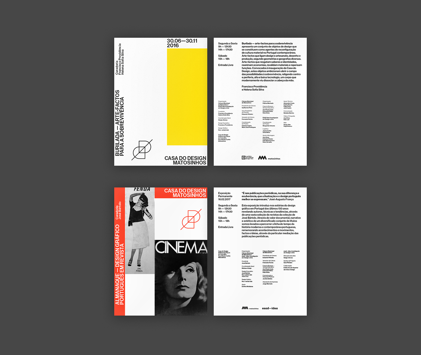
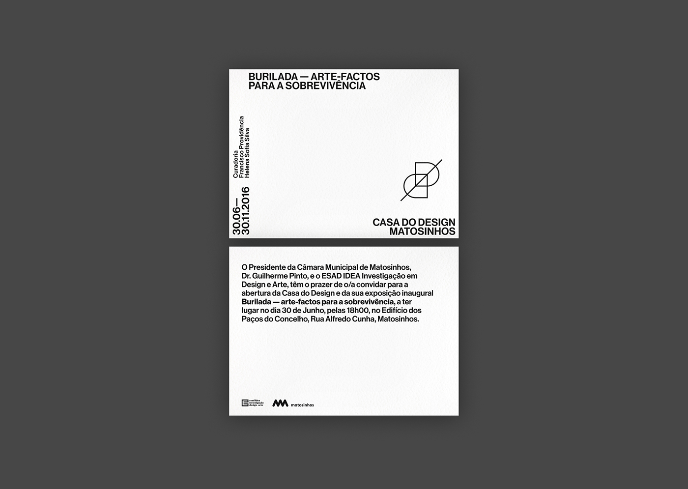
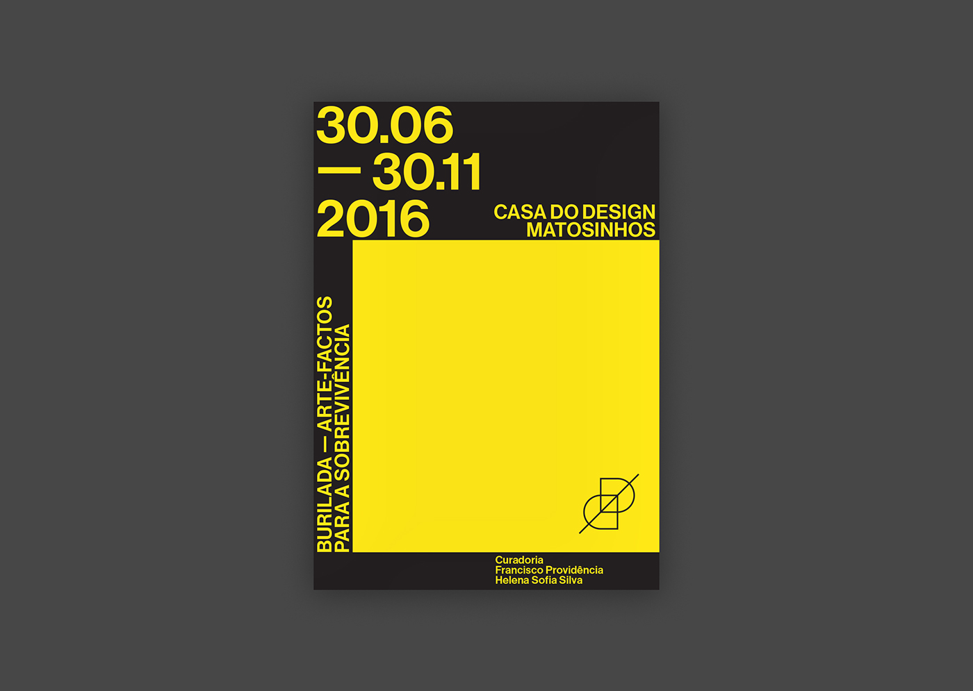
To test its implementation we were commissioned to design the communication materials for the first two exhibitions at Casa do Design.
Below you can see some examples of the work we've developed, plus a very cool neon sign with the logo that's placed at the museum's entrance!
We'll keep updating this project as we keep being involved in new projects and future exhibitions.
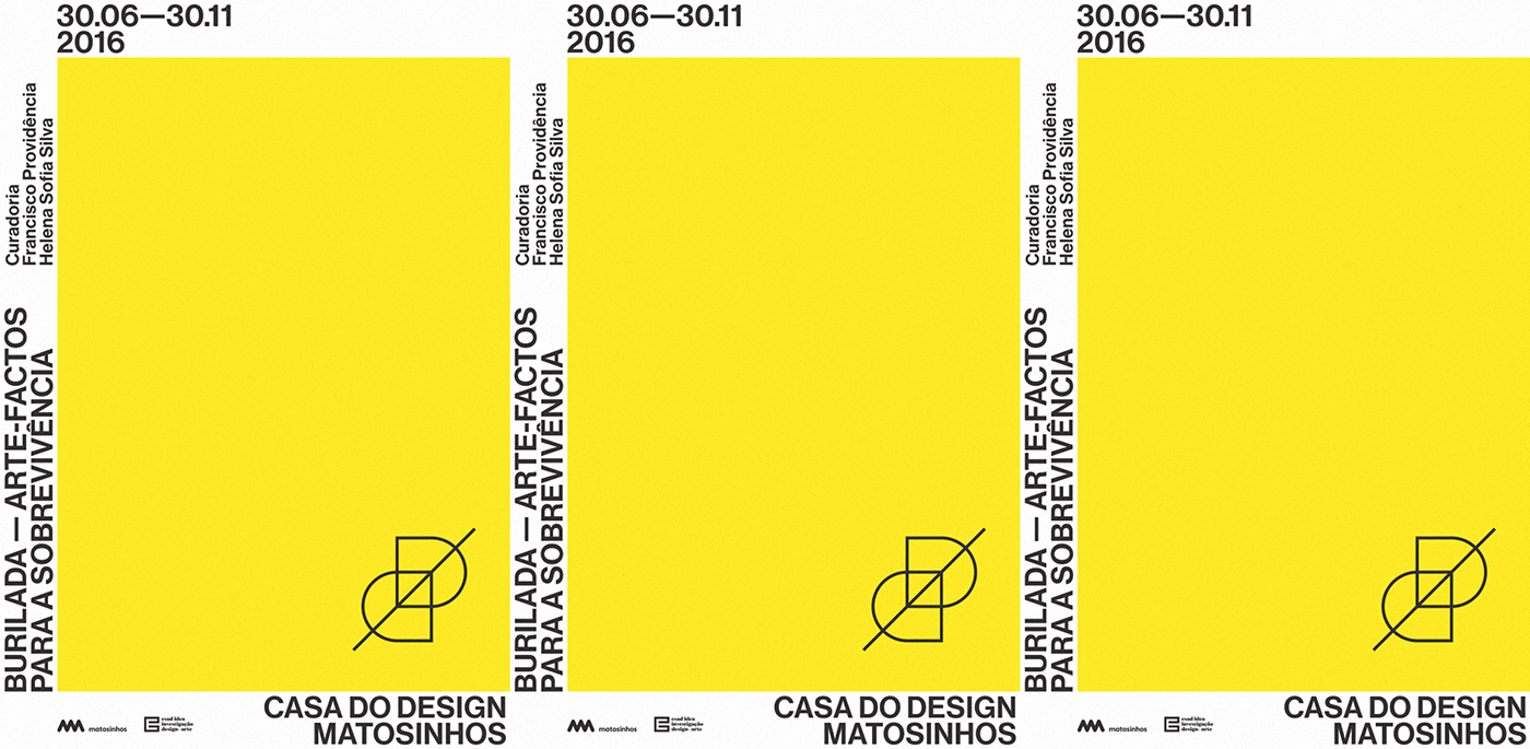
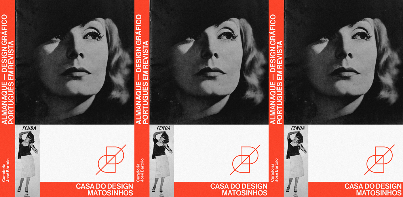
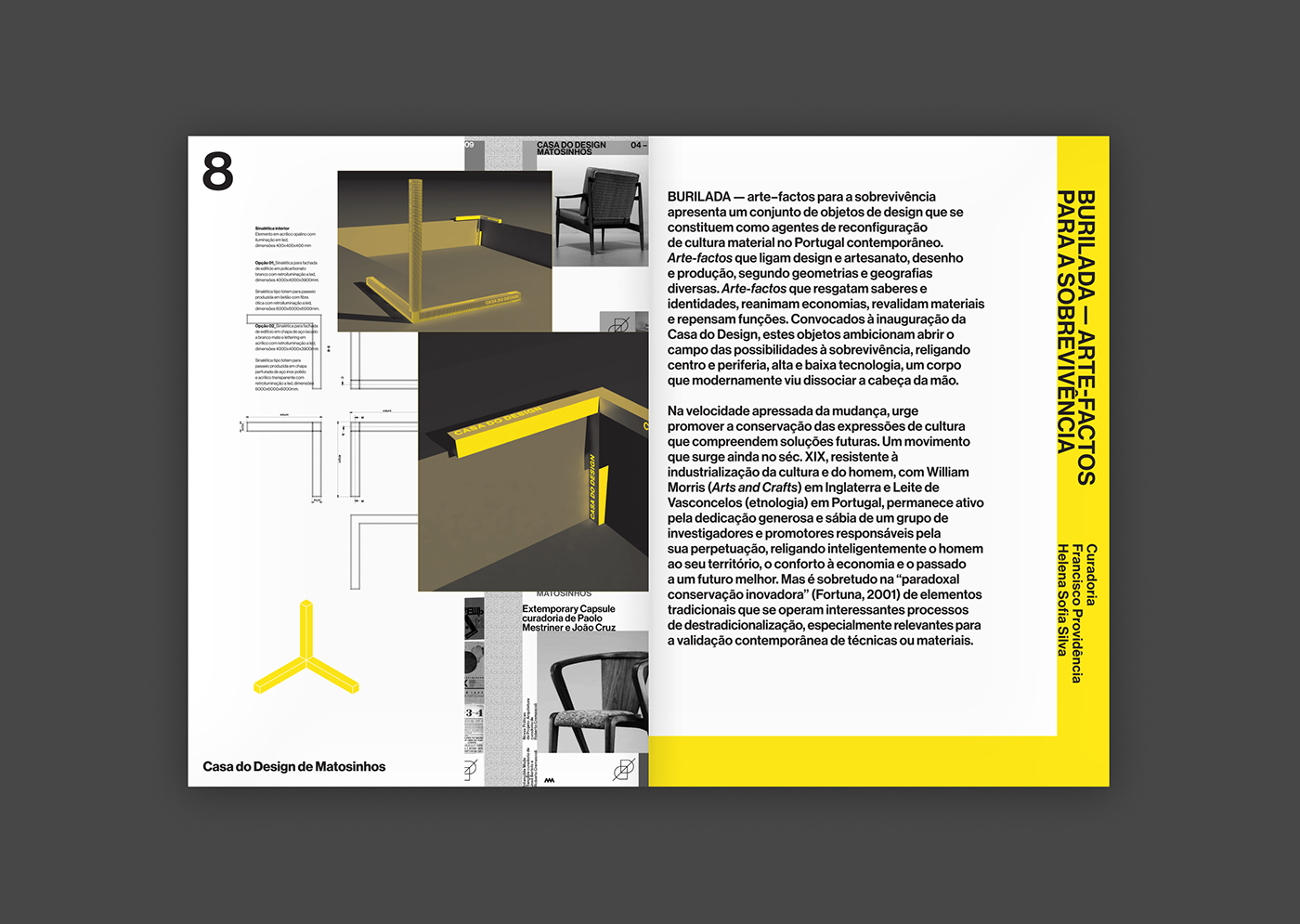
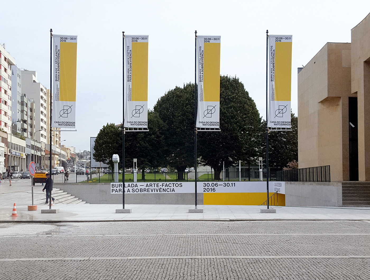
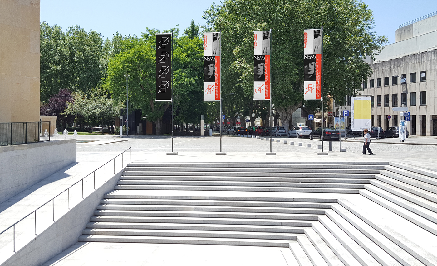
Graphic details for the “Burilada”
and “Almanaque” exhibitions


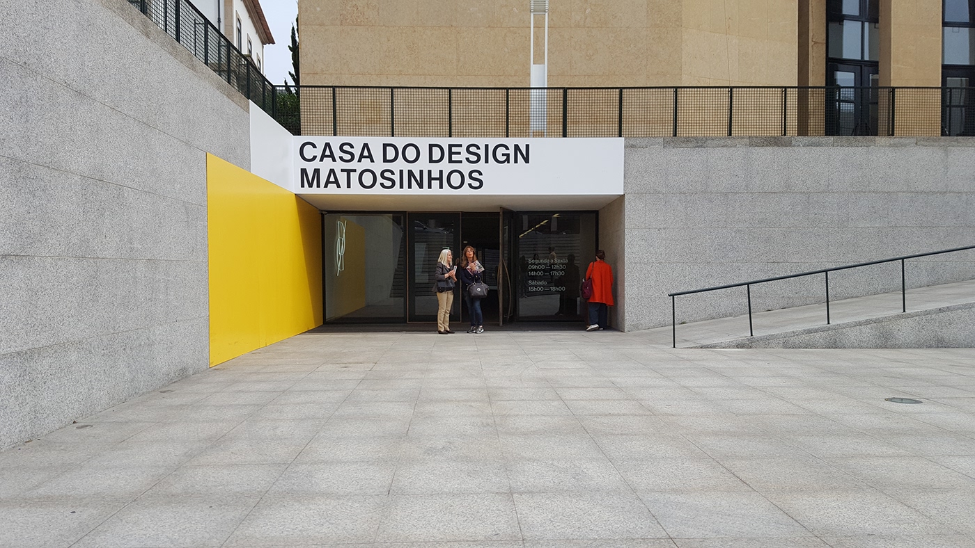
Entrance and outdoor
communication examples

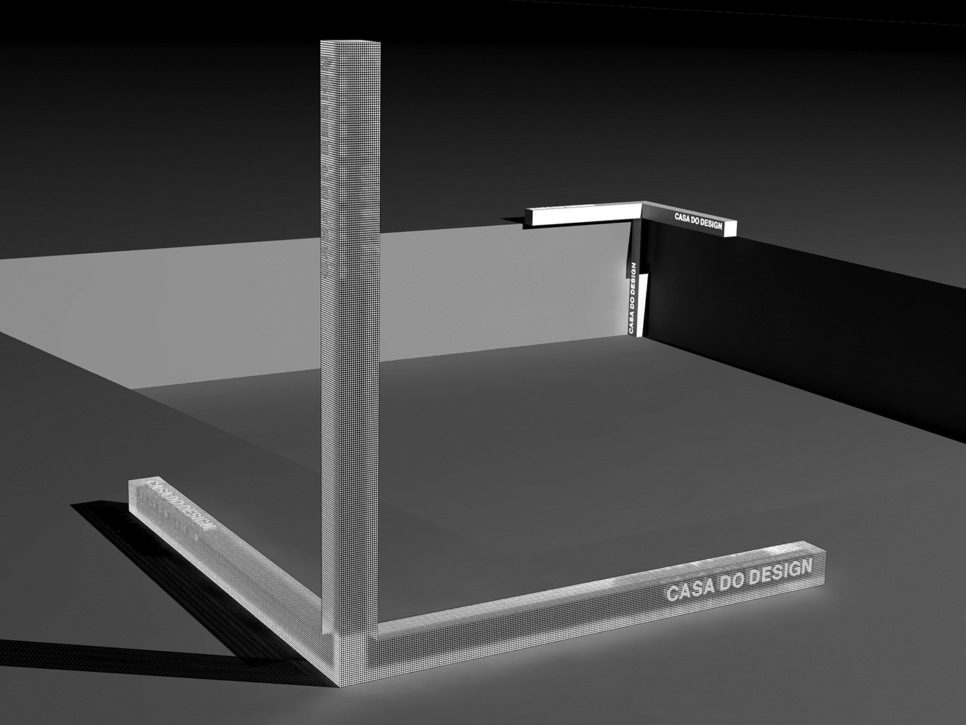
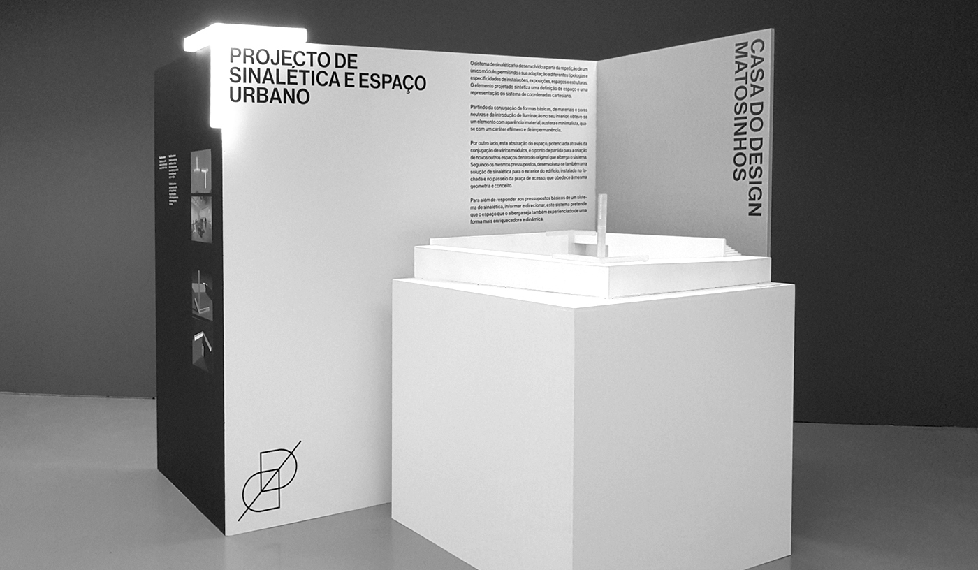
Outdoor structures and interior signage project that we've developed in collaboration with product designer Carlos Pereira. (in development)
Non–verbal Club 2016
Art direction, Identity, Communication
and Editorial Design.
Interior signage and outdoor structures design
in collaboration with Carlos Pereira.
Casa do Design de Matosinhos
is curated by esad—idea.


