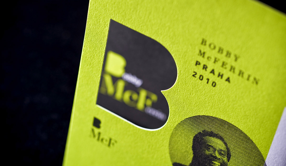
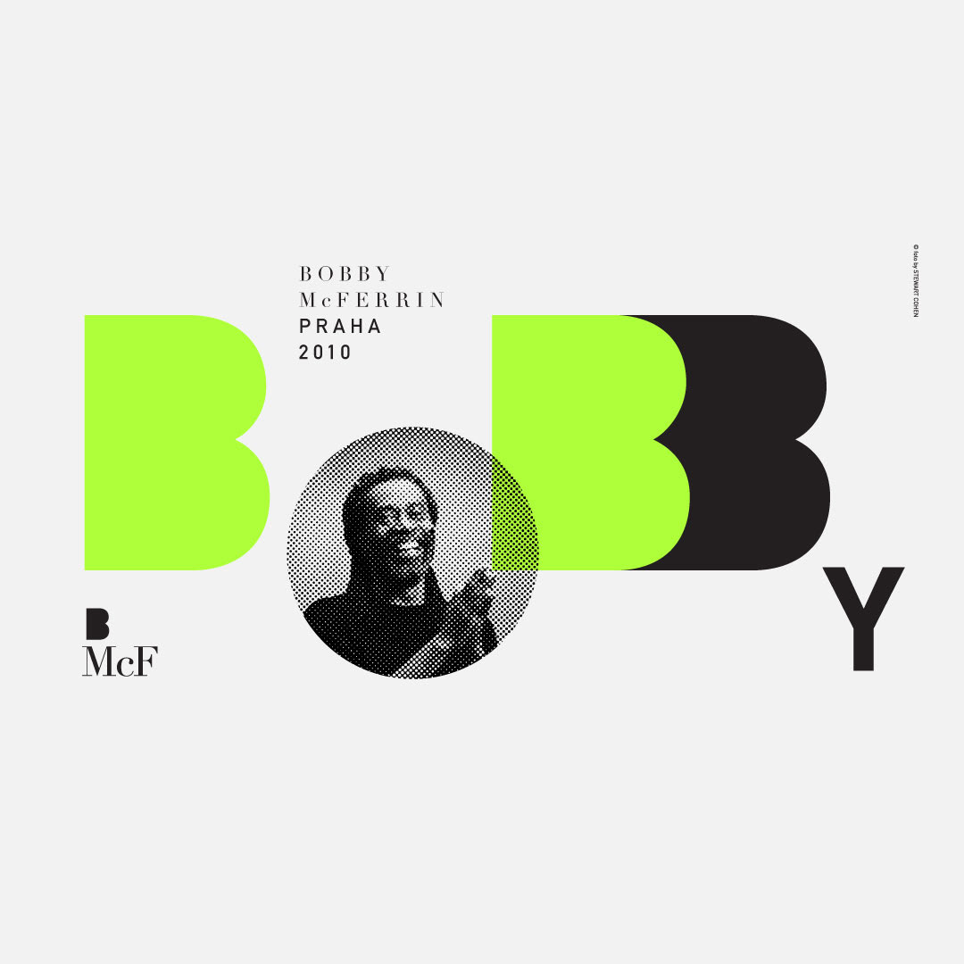
The visual identity of Bobby McFerrin tour in the Czech republic is based on the enigmatic photograph of Stewart Cohen and playful typography which highlights letters BMcF and evokes the eclectic style of the artist.


The identity was applied accoss all tour promotion materials.


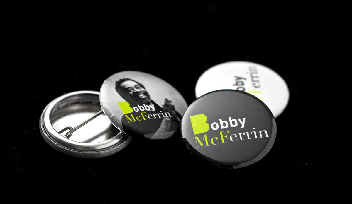
The most interesting part of the project was development of the souvenir pack and t-shirt with the tour graphics (both to be sold before and after the concerts). The souvenir pack consisted of three postcards, two stickers and three pins and was wrapped in aluminium coated plastic bags. The key element of the pack was a self-standing die-cut postcard. The t-shirt was partially printed with a phosphorescent color which glows in the dark.