

It was a long-time tradition of The Kazantip Republic to have a new brand ID—font, logo, slogan—every year along with a new season's theme. Changing a well-known and recognizable for something fresh and unknown used to complicate our life a bit, but, luckily, after a few years of such re-dressing we could afford it and it prevented us from getting boring. The year 2011 wasn't an exclusion and changes that started with the new font ended up with the totally new, modern, look of the logo. Renewed logo was presented by a volume sphere made of numerous Z letters of different size, and in a way symbolized the idea of 'World Supremacy' that was a part of The Kazantip Republic's ideology and, well, marketing strategy:)

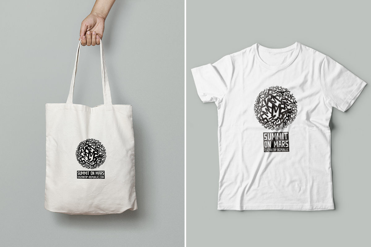
Summit on Mars, Live on Mars, Night World Government and AWE were Kazantip Republic's sub-labels and special events, and it made a lot of sense to redesign them accordingly to the new concept too. The logo-sphere of Summit On Mars is made of K, S, M; the logo of Night World Government is made of N, W, G and emphasized by a silhouette of new moon. And the logo of Live on Mars—a festival of live music within an electronic festival—is made of K, L, M and topped with a tiny antenna as a Mars rover would have.

Abbreviation AWE (Agency of Worldwide Entertainment) was visualized by 'O!' made of its set of letters, because this is the way 'awe' is being pronounced and '!' is the desirable reaction of the audience.

The toy-ish medal, a sign of belonging to the secret lodge of Night World Government.

Stamp of The Kazantip Republic

Z-meteorite installation

Summit On Mars logo


Live On Mars logo


Stickers


The territory of Mars

Live On Mars show


